Clever Tips for Designing Compact Kitchens
Just because you have a small space, doesn’t mean those culinary dreams need to be discarded. Efficiently organised, a perfectly formed kitchen will enable you to prepare and plate-up the most intricate of dishes with ease.
2. In terms of storage what would you suggest and why?
There are numerous clever accessories and gadgets available that can cleverly optimise available space. It’s the true need for and configuration of these that I advise on once I have a thorough understanding of the homeowners’ unique requirements. Be it a small or large kitchen, it’s all about quickly and instantly accessing and viewing the most-used items without bending down or struggling to see the specific spice’s label say. Then every drawer, cabinet, open shelf and appliance is pre-determined in its purpose; dimensioned to suit those particular types of items.
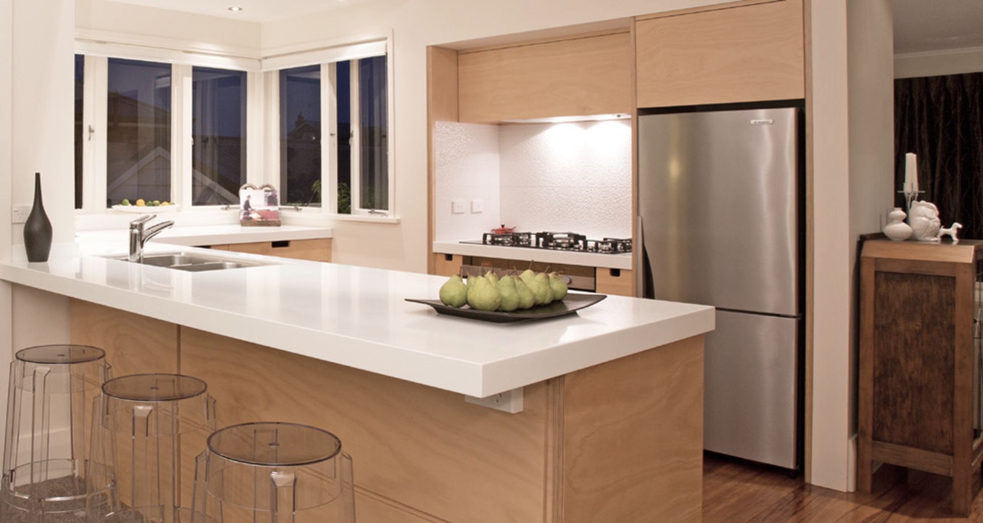
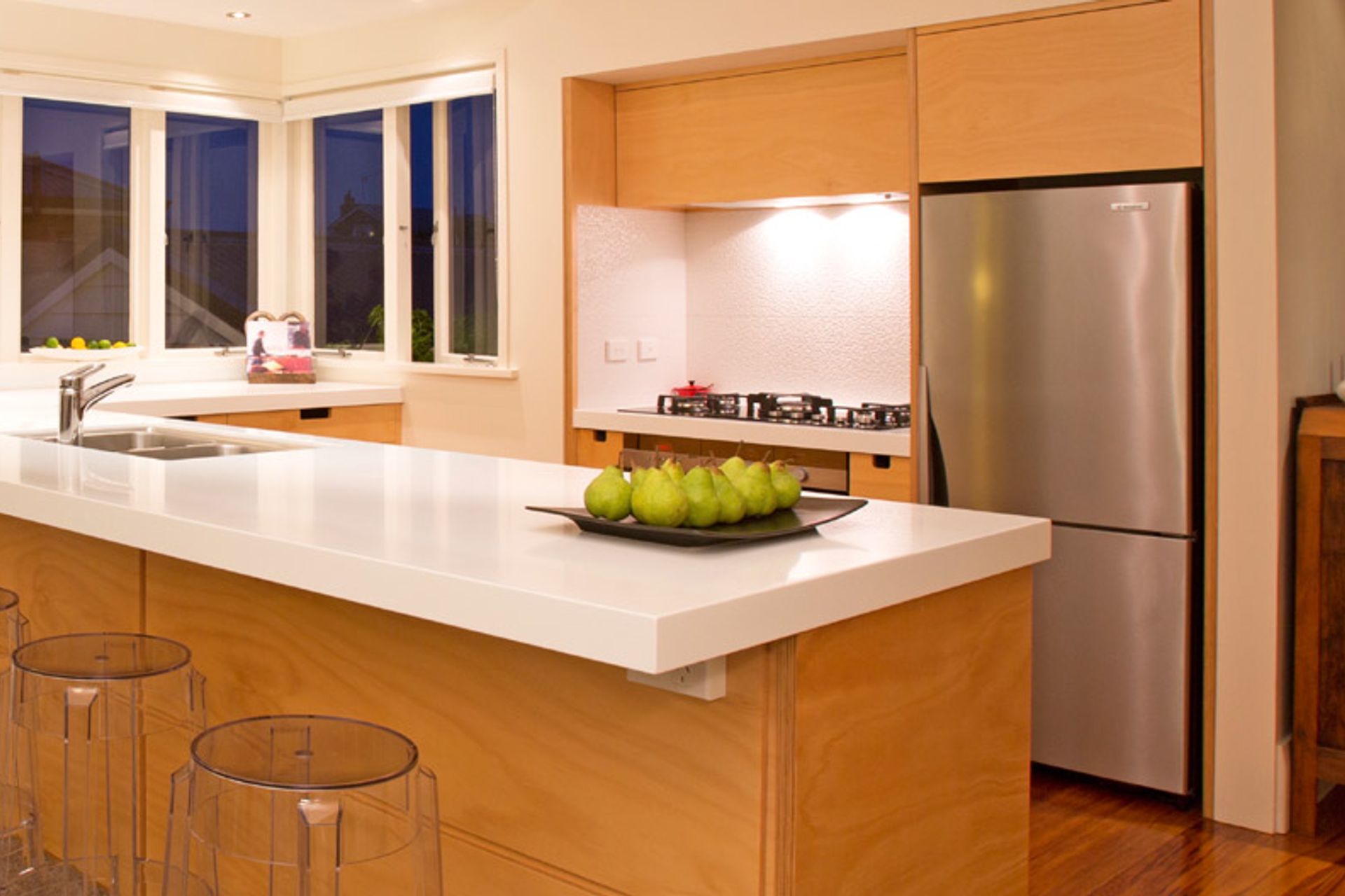
For this client in a compact townhouse, for example, a bank of five spacious drawers under the cooktop uses the toe-kick space to gain an extra storage drawer for serving platters.
While this specific allocation of function to certain drawers or shelves is desirable, its worth mentioning that flexibility to change this function over time as our food needs or cooking style changes is also important. We do this by designing adjustable divisions or relocatable inserts while ensuring a variety of configurations is possible.
3. What are the best ways to maximise bench space?
Again, most would think to fill the design with bench space, yet its more about the right size of the bench and how they are designed relative to the sink and hob. It’s about the proportions and intended functionality of that particular bench zone – be it for food prep, washing up, plating up or baking.
I usually analyse the space overall to provide at least two decent (650 wide x 650 deep minimum) bench zones for food preparation and plating up, with an additional Activity Zone™ for coffee making, home planning &/or evening drinks. Often too, sinks can be accessorised with a fitted chopping board and colander combination to ensure food preparation is mostly dealt with at the sink, leaving actual bench-tops free for other functions. Brilliant!
4. What colours are successful for small kitchen spaces?
The natural inclination is to lean towards white or light colouring in a smaller space and that is certainly desirable in most cases. The only caution is, to balance the risk of a soulless kitchen with a tasteful element of texture, colour or interesting form.
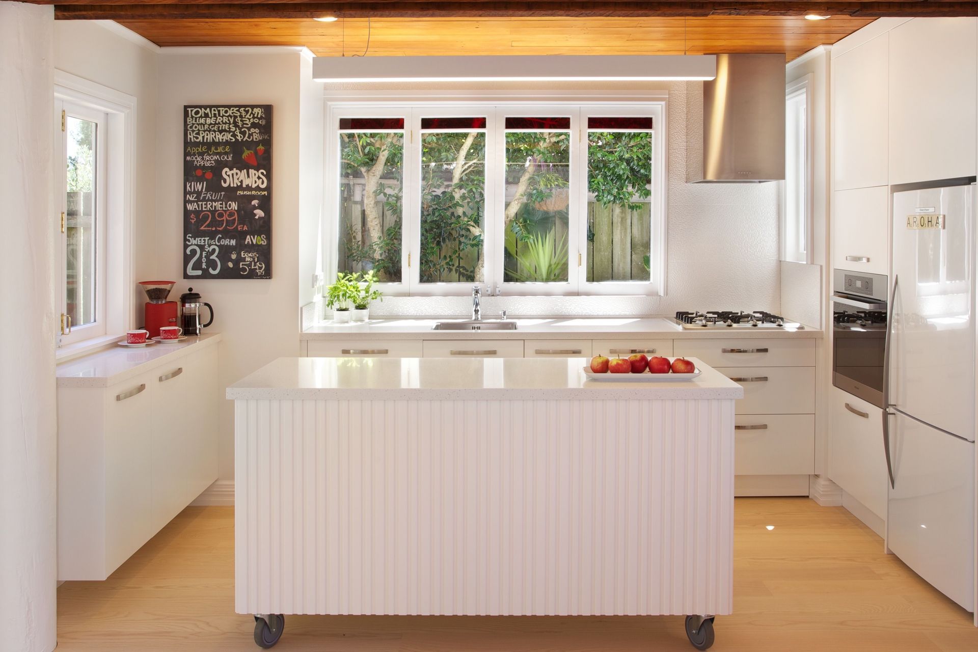
Here, the dramatic panelled timber ceiling is its own feature yet the island’s skin is detailed in a vertical shiplap texture repeating the home’s exterior cladding style. On industrial-strength roller wheels, the island can roll away to open up the living room for a large dinner party or big-game get together. Flexibility at its best!
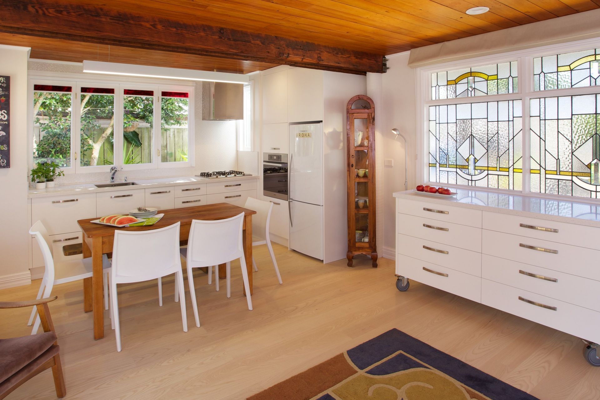
5. Are there tips for keeping the bench-tops clutter-free?
Absolutely! Getting clutter off the bench-tops is relevant no matter the kitchen size but all the more so when space is at a premium. This is usually solved by providing allocated places in drawers for sharp knives, utensils (often with divisions in a top drawer), oils, small appliances and dedicated home planning drawers or devices zone; all helping with decluttering the bench spaces. A place for everything and everything in its place – makes for a stress-free cooking experience too!
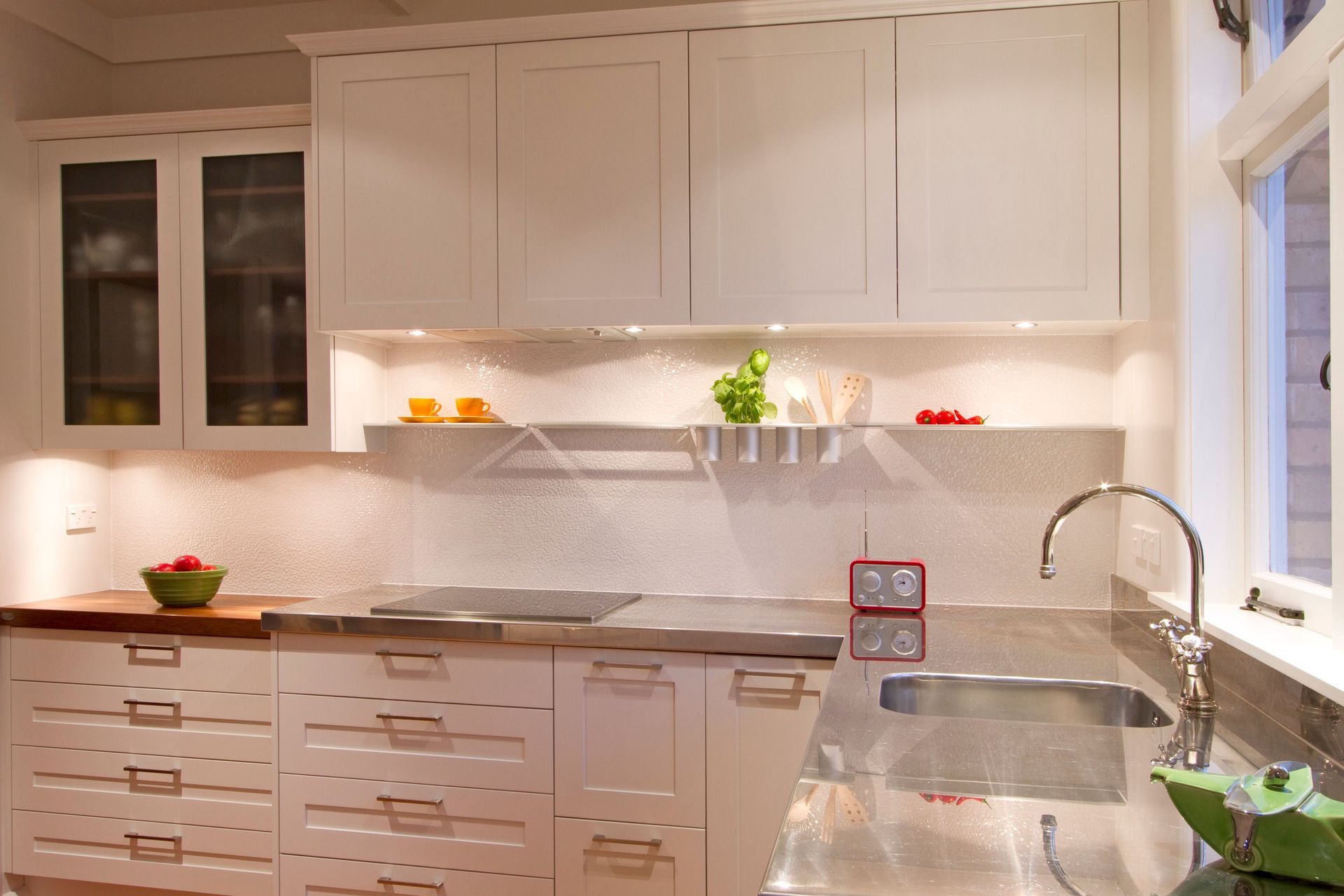
6. Should cabinets always go to the ceiling then?
Good question. It really depends on the space. If it’s a tall ceiling but a small footprint then I’d recommend not taking all cabinetry to the ceiling as the proportions would be distorted; making it feel smaller/narrower. This small 3m square room with a 3m ceiling is a classic example. On the other hand, a long deep room is often better balanced by taking cabinets to the ceiling or employing bulkheads for the same effect.
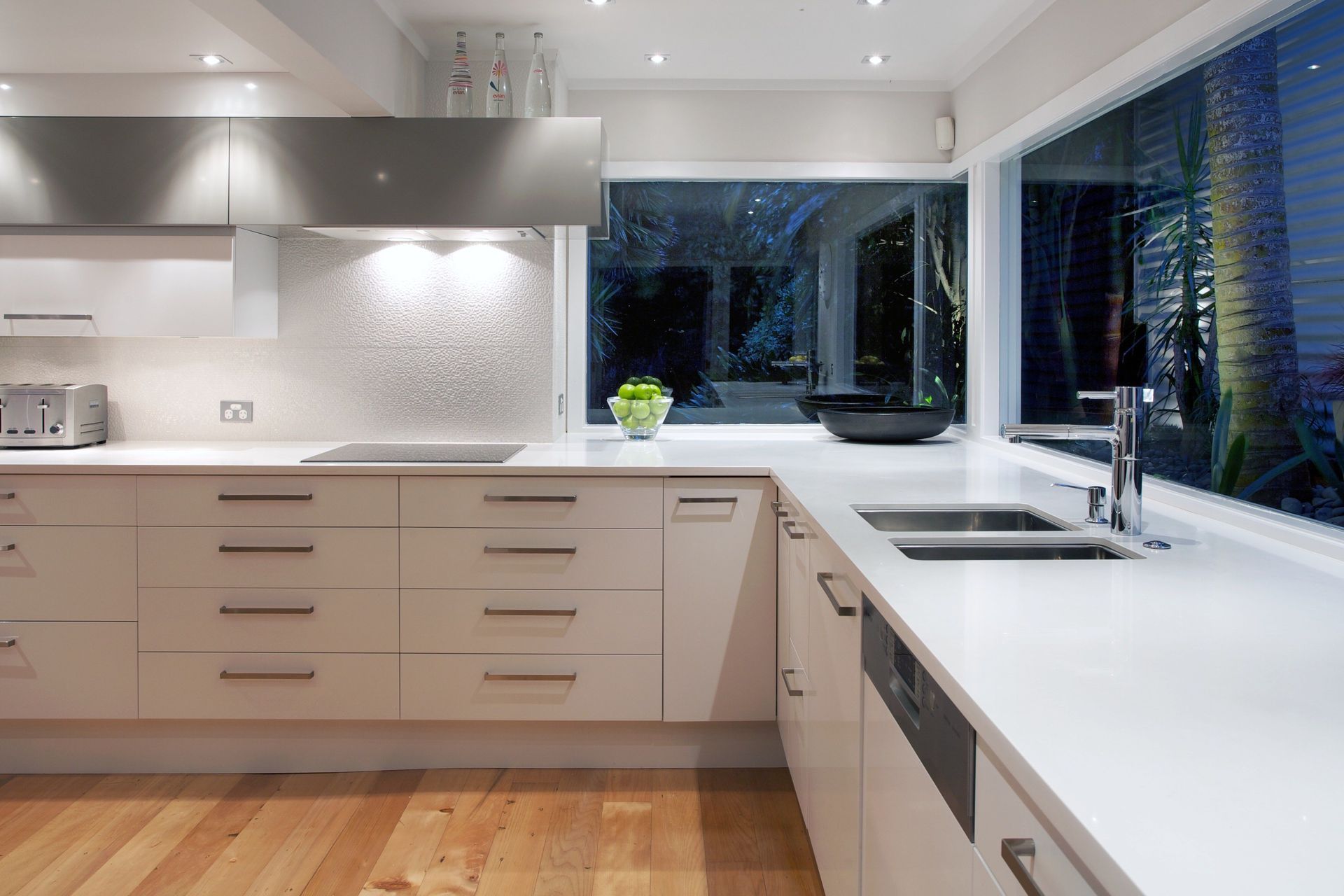
7. What other tricks do you employ to make a small kitchen space feel bigger?
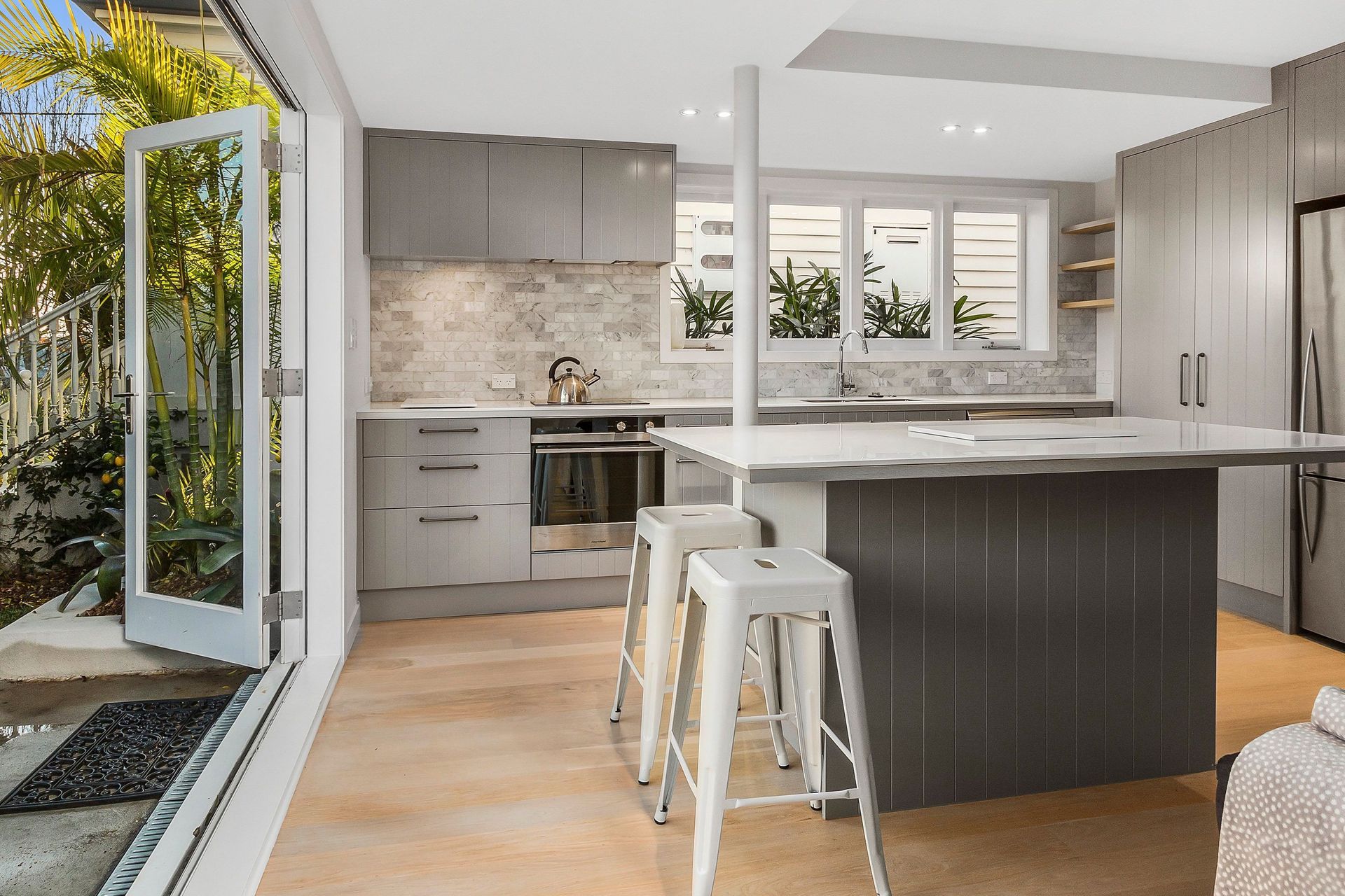
There are some rules of form that use design elements to focus the attention on the ‘good bits’. As you would with dressing with stripes or even applying make-up shadowing, you distract from the less desirable aspects by highlighting the others. This kitchen had a low ceiling and beam dividing it so a contrasting deep-taupe stripe of cabinetry running perpendicular to the beam, diverts the eye and elegantly unites the spaces as one. Friends visiting after the renovation thought the ceiling had been raised! I find the considered use of natural and auxiliary lighting is a critical element of designing for the appearance of space and openness too.
