From a showroom to the mountains: a sleek kitchen with a golden touch
Written by
30 May 2023
•
4 min read
When you make the decision to renovate your kitchen or even start it from scratch, often the logical first step is to visit the showroom of a designer you like. This is the springboard for inspiration: it can steer renovators into new and exciting territory, and introduce them to new trends, technologies and appliances.
It can also be a place to consult with professionals about design ideas, test the functionality of various fixtures, and get hands-on experience in how a food could be prepared on a day-to-day basis. For most clients, showrooms remain a space for inspiration – but for a small minority, they can be a perfect match.
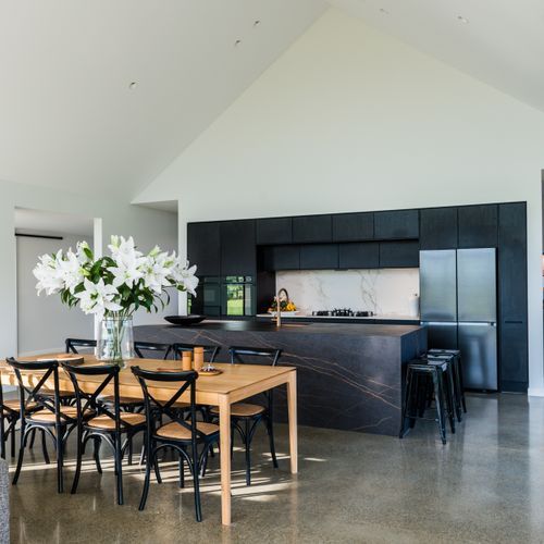
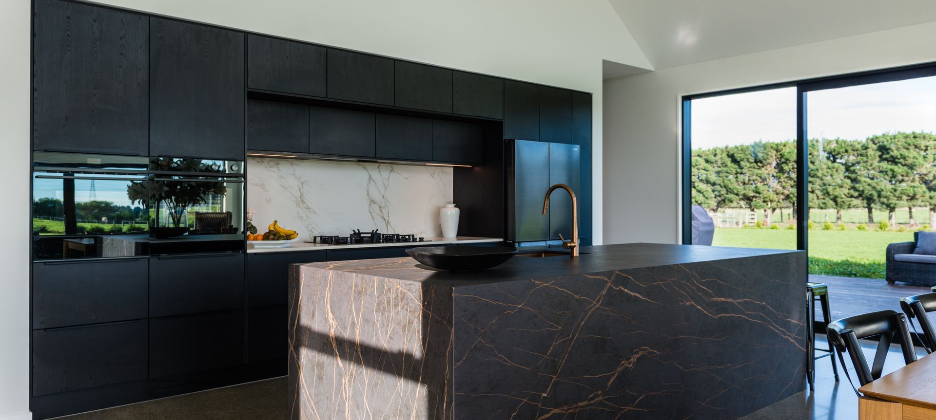
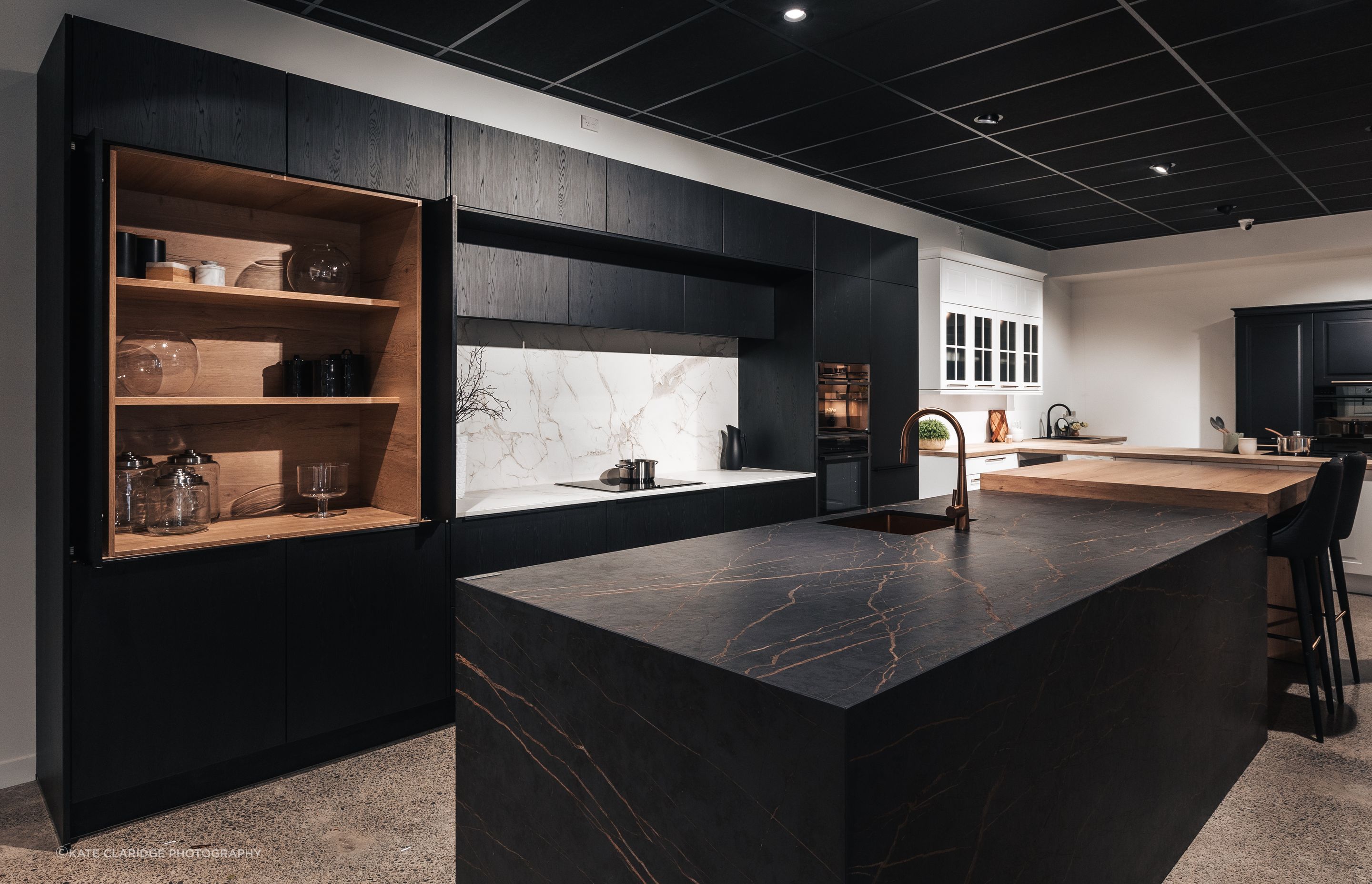
This was the case for a pair of clients looking to build their home in the shadow of the mighty Southern Alps. When they walked into Palazzo Kitchens’ showroom in Christchurch, they saw a kitchen that made a particularly strong impression: an imposing black benchtop and island that featured crisscrossed veins of gold; a white marble-look splashback; and stained oak cabinetry.
They fell in love instantly, and Palazzo Senior Designer Amanda Kingston was brought on board to help them translate the kitchen to their new build in the mountains.
The ultimate inspiration
“They told us they had been looking to use black as a primary theme in their kitchen, and were searching for the right finish – especially for the cabinetry,” says Kingston. “And when they first visited the showroom, they were really taken with the Nero oak on the cabinets. And it just so happened that they loved the entirety of the rest of the kitchen too.”
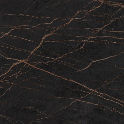
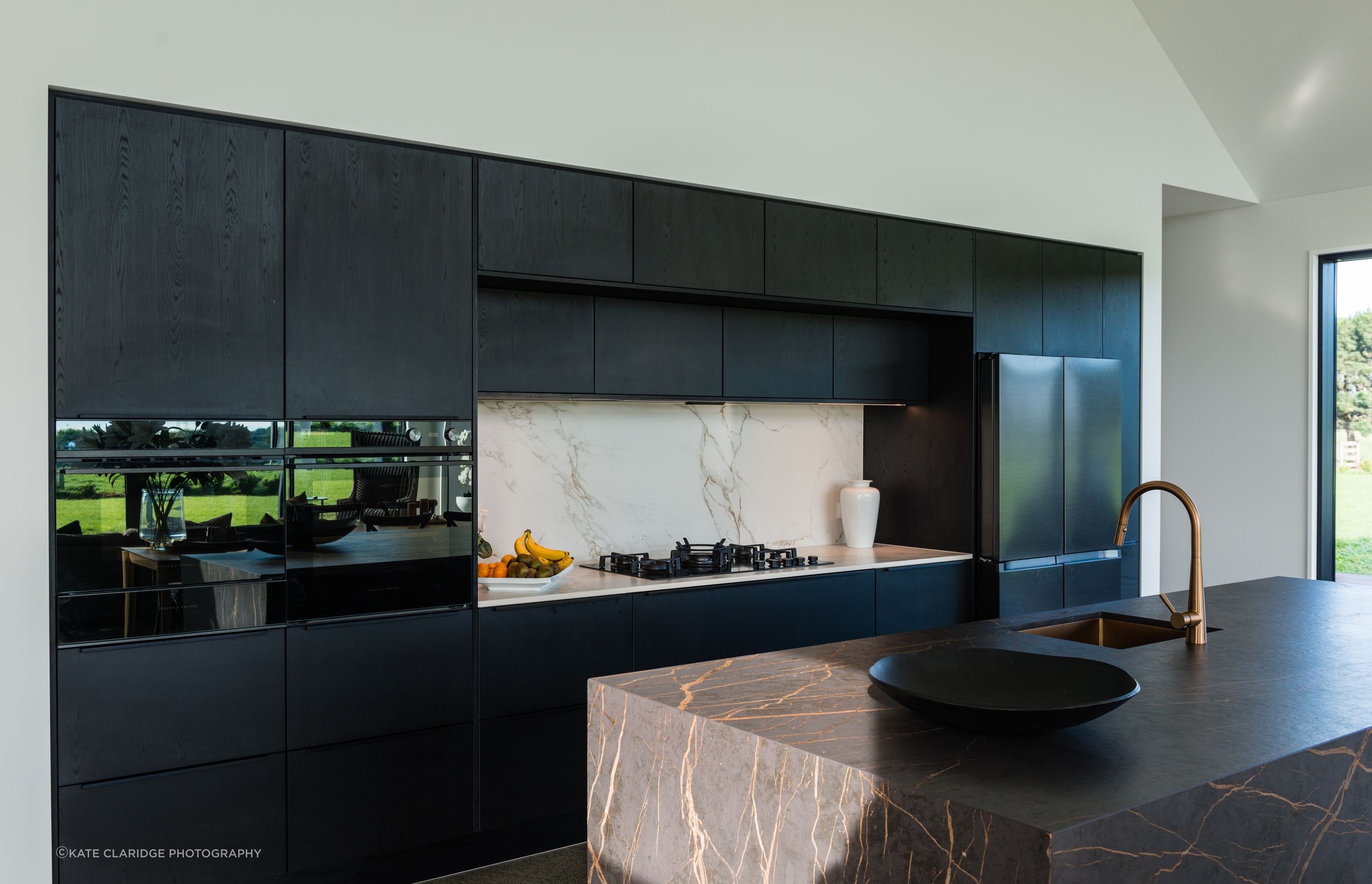
The two other main elements of the kitchen perfectly complemented the black stain finish on the cabinets for the couple. The Dekton Laurent used for the benchtop, island and the waterfall edges is an ultracompact surface, a technological material composed of a blend of raw materials, porcelain, and glass. The gold veins run rivers through the sea of black, bringing a pop of colour into a striking, moody surface.
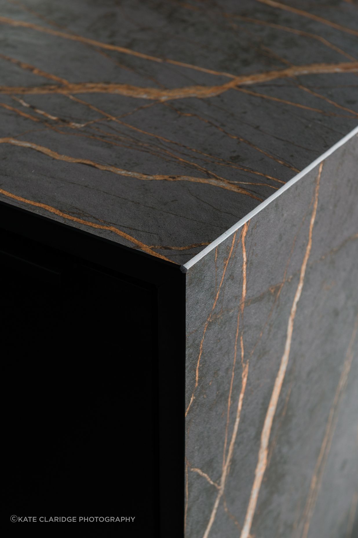
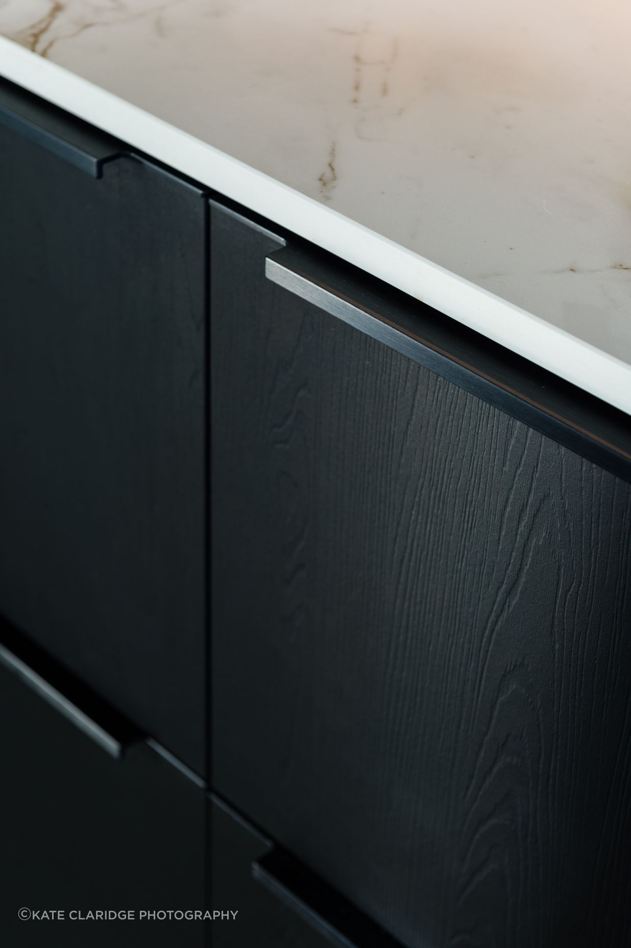
The splashback comes from the same Dekton collection. The Entzo surface is made of the same materials as the Laurent, but brings a light into the space to counter the darker shades that surround it.
Of course, it couldn’t be a like-for-like copy of the showroom – there needed to be some bespoke elements to fit into this new build.
Bringing a personal twist
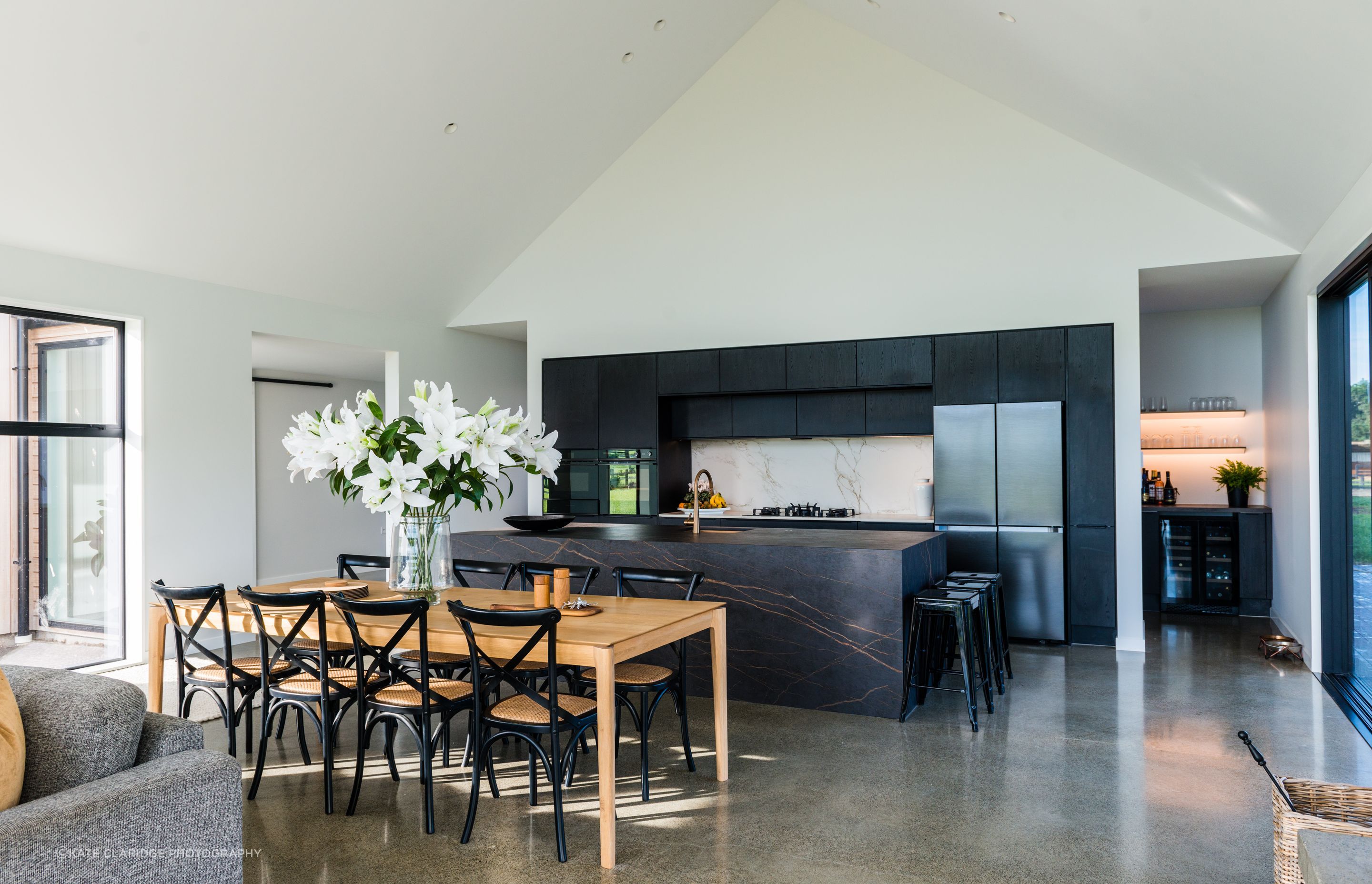
“They wanted to incorporate a whole separate space using the same materials and finishes – a scullery that wraps around the edge of the kitchen, an office area complete with the Nero oak, and a small bar area with a standout wine cooler where you could congregate when you’re hosting people,” says Kingston.
The clients also toyed with the idea of a breakfast bar at one end of the island instead of the cascading waterfall edges presented in the showroom. “They originally thought a space with barstools would be good for the teenage kids to sit at for breakfast,” says Kingston. “But the more they thought about it, the more they preferred form over function – the dining area was close enough to the kitchen, and the waterfall edges were too stunning to pass up.”
In the end, the finished kitchen looked similar to the showroom version, albeit with some small personal touches – a crockery cabinet here, a wine fridge there. But despite the similarities, the real thing outshone its counterpart by some measure – owing largely to its placement, with an awe-inspiring vista of the Southern Alps visible from the island bench.
“I went to the house to do the site measure myself, and it was obvious how special the location was,” recalls Kingston. “It’s a mix of rustic, rural and mountainous landscapes, and I think the natural woodgrains of the cabinetry especially sits well within this setting.
“It’s nice to bring those elements of warmth into this kind of home – and I think the finished product speaks for itself.”
Learn more about Palazzo Kitchens and its fitouts.
