Meet the Winners of the 35th Dulux Colour Awards


The Dulux Colour Awards 2021 NZ Grand Prix Winner - Undercurrent with Central Hotel by Naumi Hotels.
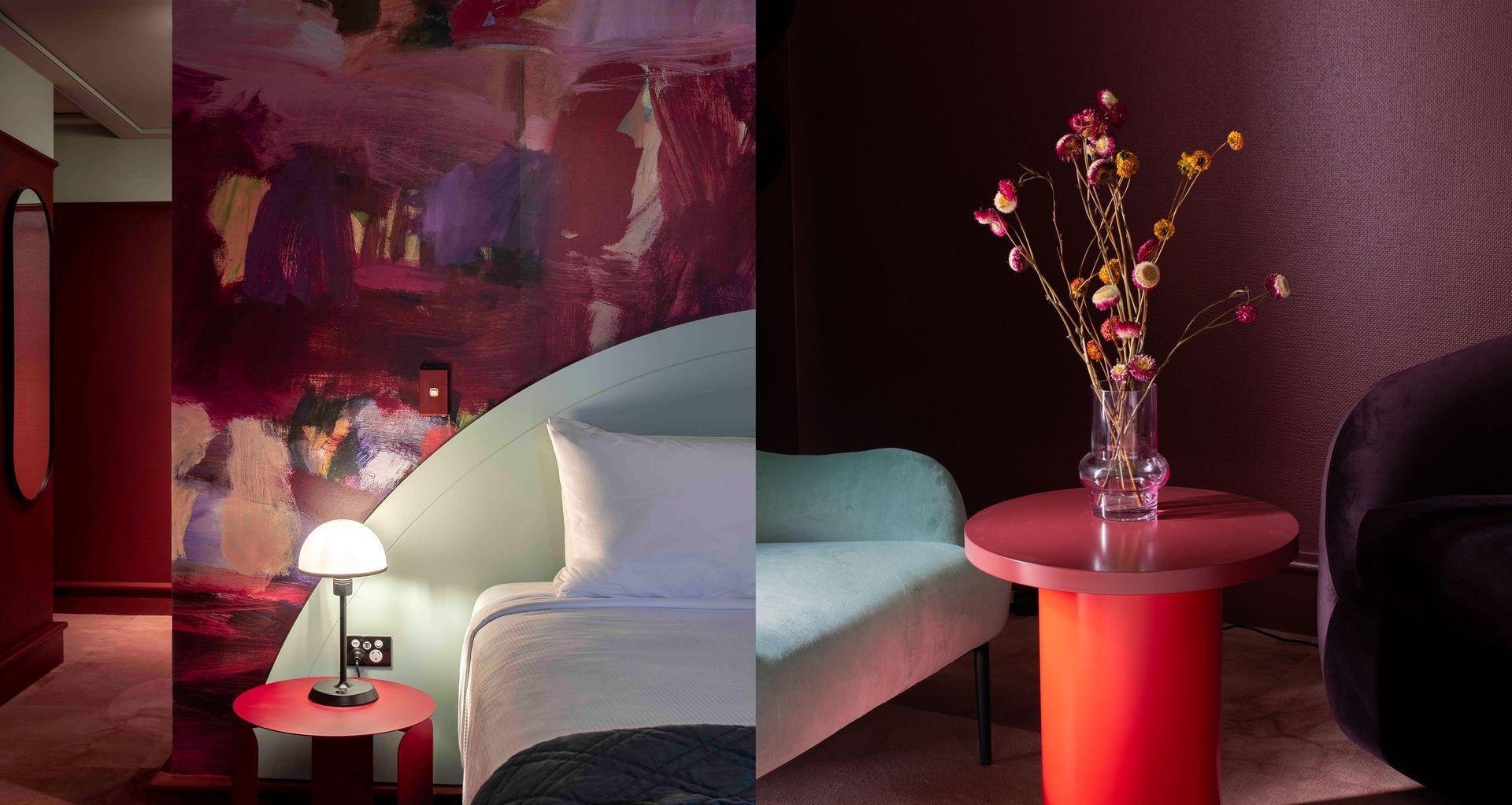
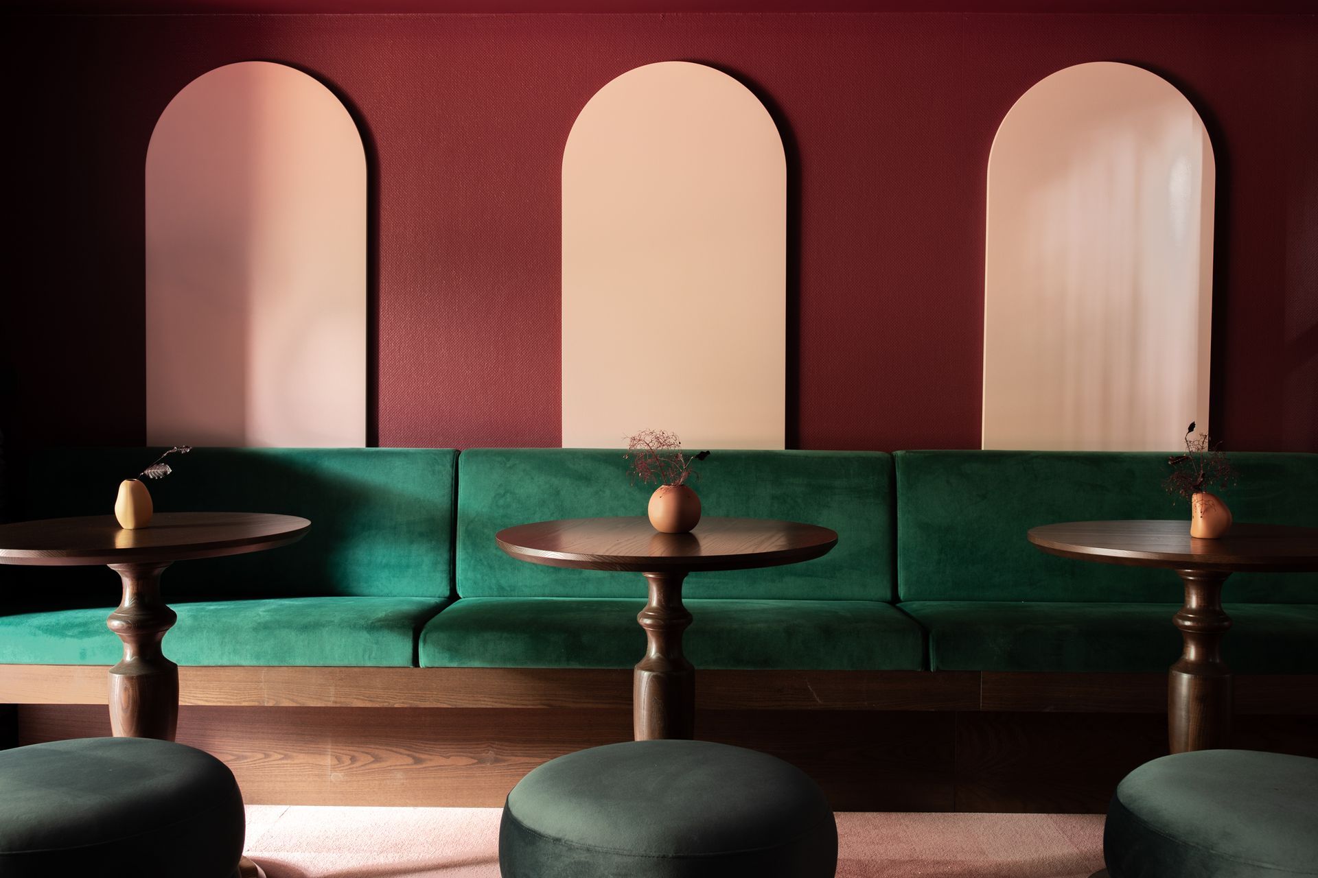
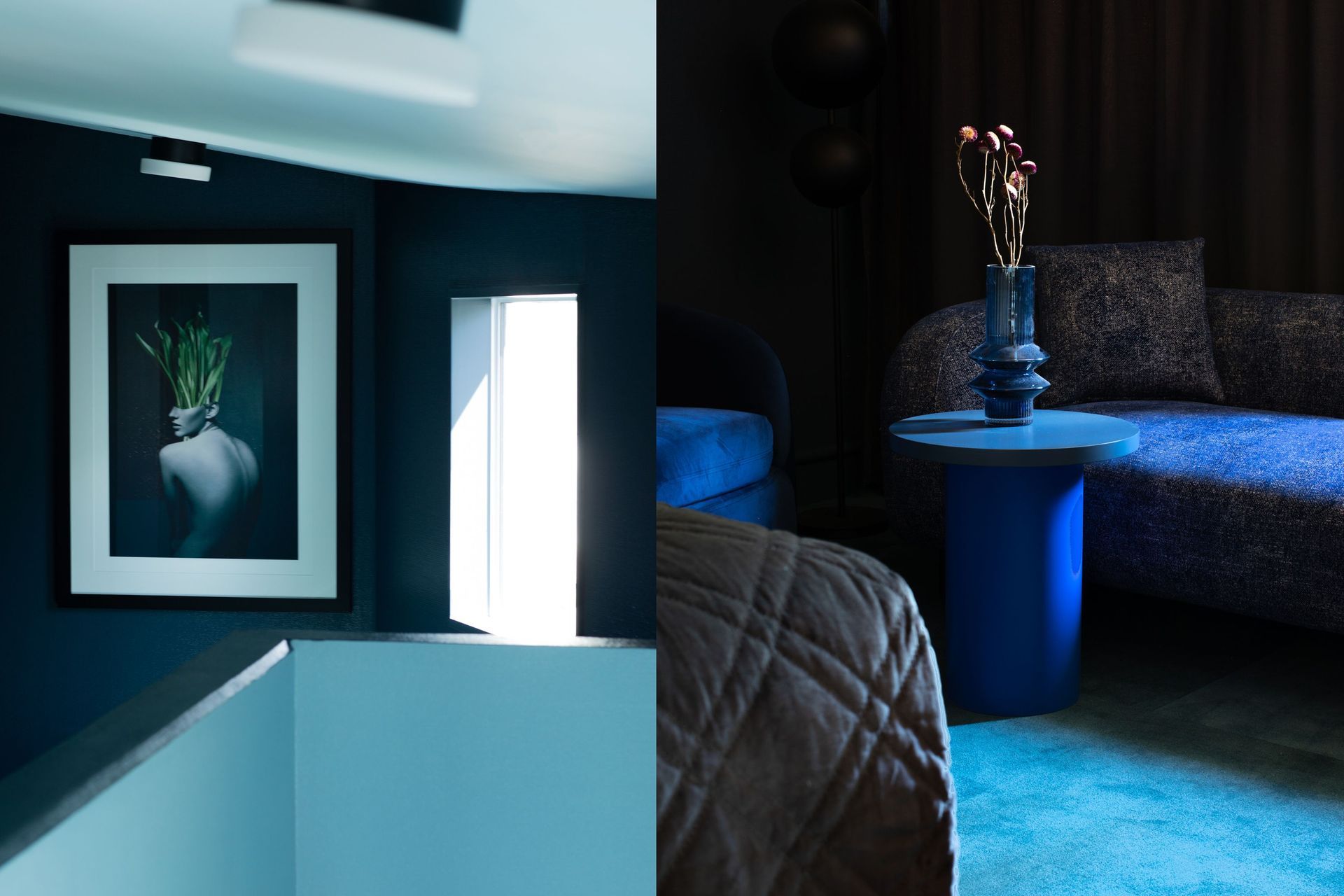
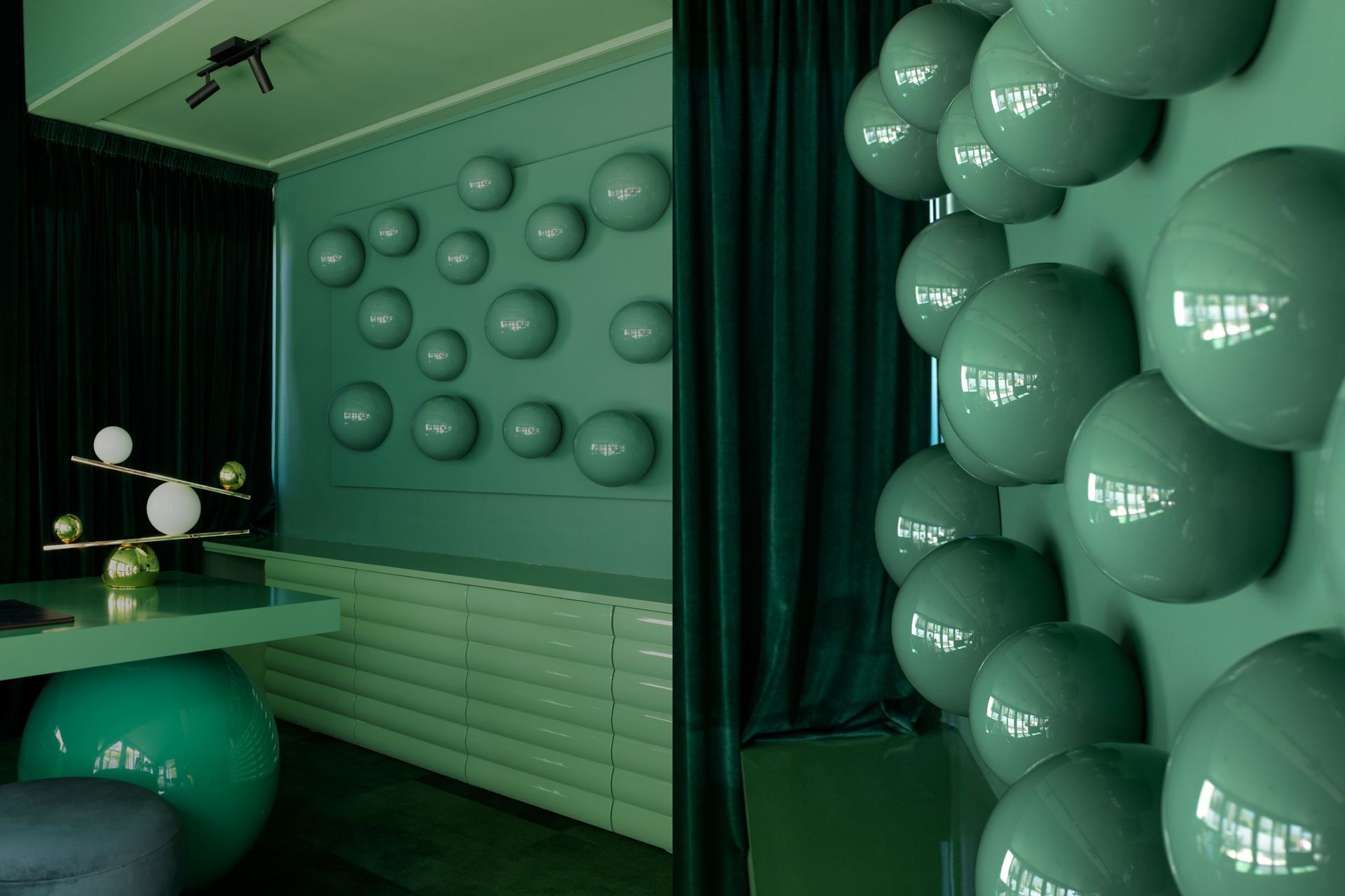
With the hotel set in the majestic mountains of Queenstown, the designer described the colour choices as a bid to recreate that moment of child-like wonder, sensed with a glance to the Southern Alps or the shake of a snow globe - striving for a bold aesthetic, verging on biophilic surrealism. The result is a whimsical wonderland with specially curated colour palettes for each level - The ground floor nods to the red tones of the flora outside; the first floor alludes to the greens of the treetops; and the second storey reflects the blue tones of the sky.
They used tone-on-tone colours in corridors in-keeping with each floor’s scheme, while inside guest rooms they paired deep tones with bold pastels. The paint colours were also referenced from the work of artist Deborah Moss, with a series of her works to an exaggerated scale. This means that when guests move from the corridor to their room, they’re greeted with a stark, whimsical contrast that gives that sense of child-like wonder.
The judges applauded ‘the profound depth of colour saturation, with its comprehensive application, across surfaces and furnishings throughout the spaces. It is memorably original and wonderfully playful. The result is a surreal sanctuary’
To see this year’s winning projects including the winner of the New Zealand Grand Prix Award visit www.dulux.co.nz/colourawards.

The judges applauded ‘the profound depth of colour saturation, with its comprehensive application, across surfaces and furnishings throughout the spaces. It is memorably original and wonderfully playful. The result is a surreal sanctuary’


