Colour Trends Forecast For 2021
Colour trends forecast – yes it’s that time of year in the interior design world where we all start talking about colours and new styles for the coming year.
So what’s in store for next year?
Next year is all about relaxing, warm neutrals. Rejuvenating, comforting and uplifting colour palettes inspired by nature to help soothe the soul. Or hopping back in time to some retro inspired palettes for some fun and pops of colour.
Let’s take a look at what’s been forecast for 2021, to help you keep your home looking fresh and on trend.
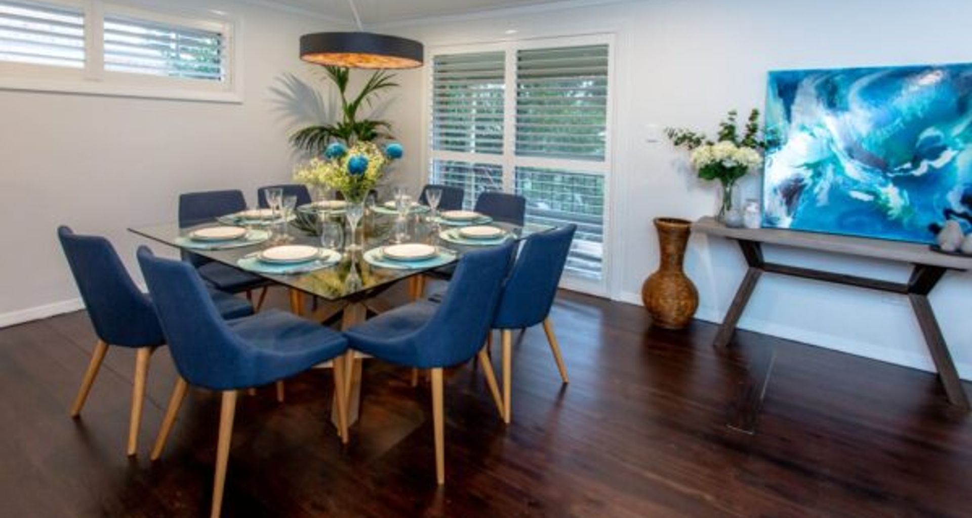
Soft Greys
Neutral greys can create a soft, contemporary or classic look and continue to be on trend through 2021.
Contrast with warm whites and darker hues such as deep stormy blues for a soothing space. Introducing natural textures such as timber will help create comfortable, flexible palettes for todays shared home/work life spaces.
Darker tones of grey and charcoals are more neutral shades. These greys are not being tinted with other hues such as yellow or blue but are remaining plain and simple. Use only as accents.

Warm Neutrals
A nurturing palette of warm neutrals creates versatility and a calming atmosphere. The use of different shades and tones of beige are big for 2021.
Draw on nature and pair with accents of mossy greens or turmeric yellows. Experiment with textures, timber and earthy hues for a connection with the outside. Keep to soft objects, botanicals and curves for simplicity and balance.
Browns such as fawns and sisals mixed with mustard yellows and leather furnishings continue to be on trend though the next year.
Retro inspired!
Be adventurous and explore the past with a jump back to the 70’s.
Nostalgic shades of tropical pastels provide a playful retro influence for a happy and beautiful space. Think colour combinations using shades of flamingo, sorbet and yellow with soft whites to give your space a new lease on life.
Many think that teal and turquoise are the same, however they are so different. Teal is the darker version of green-blue (shade) and turquoise is the lighter version of green-blue (tint). Use accents of either of these for vibrant pops of retro fun.
Contrast warm, textured timbers with smooth, cool concrete. Create an eclectic mix of old with the new for character, charm and a fun but relaxed space.
The red family
Slowly but surely the red family are making its way into the limelight for next year.
Earthy tones such as terracotta and burgundy and more favourable than the brighter options. Should be used as a just touch here and there.
Another surprising colour to be present in 2021’s colour forecast is orange.
It can be very dominant so consider using bright orange in patterns, artwork or accents of soft furnishings. Soft orange can be more relaxing to the eye but should still be used sparingly.
So that sums up our Colour Trends Forecast.
2021 is about a well-balanced approach between nature, technologies, work and home life.
Integrated living is becoming more popular, so making sustainable choices incorporating nature and the environment and high on the agenda. Earthy tones of neutrals, greens, yellows and blues are all a nod to this.
However, if you like the shapes, velvet textures and bright colours of the 70s and 80s then you can dive into the retro colour forecasts for next year!
Have fun!