The Pink Palace: the rebirth of a forgotten villa into playful commercial offices

On the fringe of Auckland City in the affluent suburb of Freemans Bay, a pink villa sat on a main arterial road for over 120 years. But as its context modernised, the villa was forgotten, eventually falling victim to the ravages of time. In a bid to preserve its history but reflect its contemporary context, Matter Architects was engaged to reconceptualise the villa for commercial use.
"We were engaged to take this dilapidated building and reimagine it into new office spaces," Jonathan Smith, Director at Matter Architects, explains. "The underlying complexities of this brief included a change of use within the special character, or heritage, overlay restrictions and the upgrade of the existing 120-plus-year-old building into new commercial tenancies."
With integrity to the site's built history and an understanding of its contemporary use, Jonathan sought to celebrate the villa's character whilst integrating modern principles, technologies, and materials. This required careful navigation of local council regulations, limited site access, and 120-year-old timbers.

"We were able to negotiate access through a neighbouring site to excavate, and once a large enough hole had been achieved, we created space and storage on-site to enable work beneath the suspended villa," Jonathan shares. "Working with 120-year-old timbers made us all aware of the strengths and weaknesses with this material; sewing the new timbers into the old became an intricate task on site."
With these challenges carefully addressed, the pink villa was reborn into the Pink Palace: a series of three built forms where various moments of human history coexist. The Pink Palace is an architectural symbol of innovation through time — a fittingly inspirational context for those working within.
To the unknowing passerby, the Pink Palace presents as a humble, well-cared-for villa. The first of its three forms is in keeping with the local architectural identity. Its Victorian timber form is painted white, framed by an idyllic, white picket fence. "This aesthetic is of a human scale, providing a sense of familiarity," Jonathan adds.
But the first hint at the building's playful nature is, quite literally, on its doorstep: the "twist", as Jonathan describes it, is "the Alice in Wonderland-like doorway".

"Internally, the traditional, compartmentalised spaces of the villa are exploded, removing all internal partitions, creating open plan interiors within the villa shell," Jonathan adds. As lines between the office and home environments become increasingly blurred, it's an entrance to the office that feels orientated towards the future.
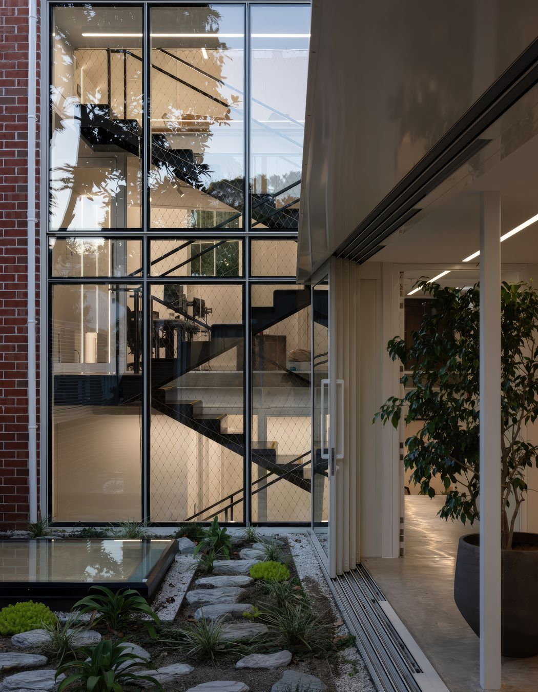
Inside the villa, a new stairway, the second of the three sections, links the original building to its new extension. Constructed of folded steel, the stairway acts as a threshold space between moments in time, leading to the new extension, which forms the third section.
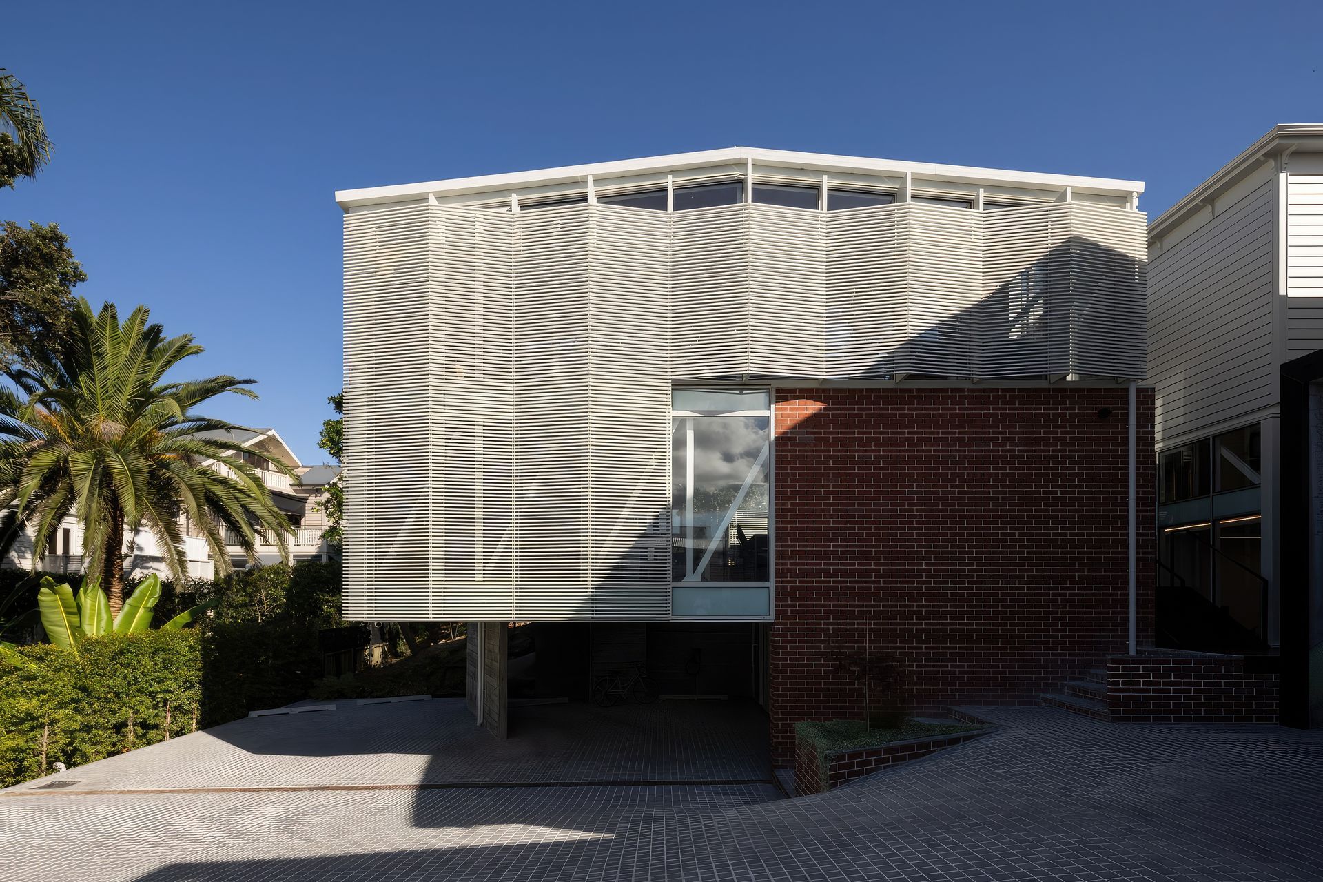
By carving into the earth beneath the original villa and constructing in-situ off-form concrete walls, Jonathan created a solid pedestal base for a three-level, cantilevered extension set a half-height below the villa. "The cantilever provides permeability and creates a covered common courtyard level, borrowing space from the exterior to give to the interiors."


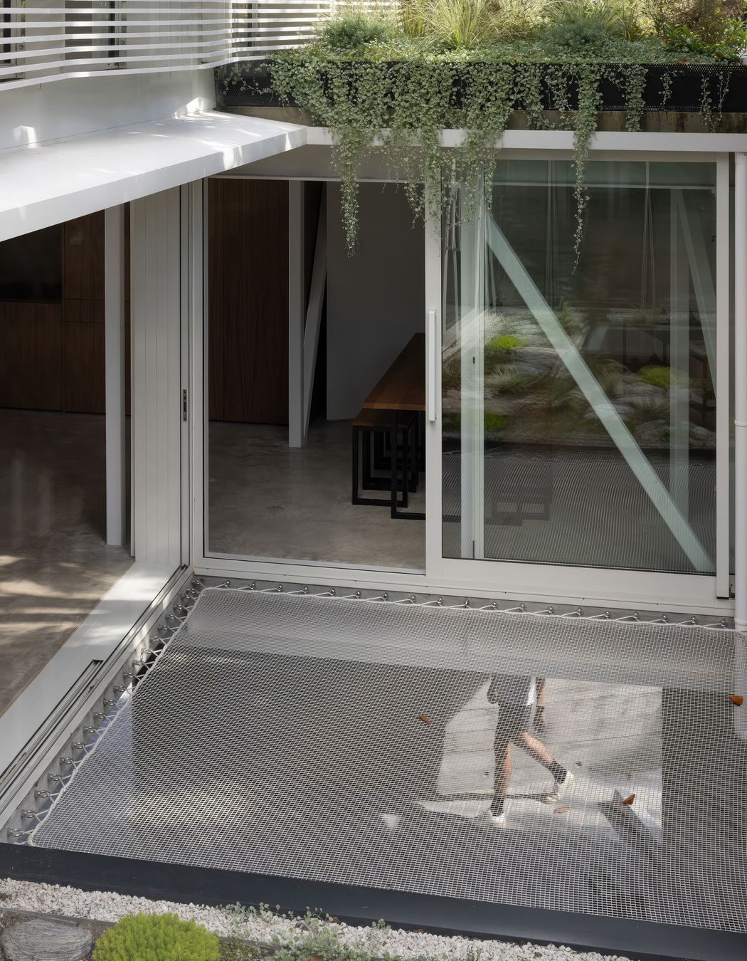
The robust materiality of these structural elements is intentionally exposed; the concrete is visible in the interior, while the steel mega brace enabling the cantilever is highlighted to the elevated tenancies. This contrasts with playful interior elements, such as stretches of hammocks. "Lying on these beneath the established trees is a wonderful moment," Jonathan muses.
The spatial organisation was primarily driven by the need to restore the villa but was also informed by extensive research into the region's requirements for office space. This was reconciled with the site, location, and tenancy opportunities. "In general, our findings directed us to design a series of smaller, flexible spaces within the overall building."
The material palette maintains both historical and contemporary relevance whilst ensuring the building's longevity: bricks, brass, copper, and bluestone align with modern elements such as steel and concrete to anchor the structure with a dual narrative.


Jonathan also collaborated with a local artist, Andrew Steel, to weave the story of their clients into the building's fabric. "Andrew created a series of raised hieroglyphic-like images that play with shadow and light throughout the day, adding texture and personality to the interiors."
The project's success results from a rich collaboration between Matter Architects, artist Andrew Steel, landscape designers at Xanthe White, and builders at C&C Renovations. Their diligent efforts have created a unique office space with thoughtful attention to detail and high-quality finishings.
"This retrofit re-imagines what office space could be – inviting, playful and interactive, blurring indoors and outdoors, and encompassing diverse and flexible boutique workspaces. Each space has distinct characteristics, from hammock ceilings to rooftop gardens."
