7 homes that prove a little colour can make a large impact
Written by
01 June 2022
•
4 min read
To achieve a clean, streamlined look, neutral hues are often the first port of call. However, a home completely devoid of colour can get bland, with a little colour going a long way to lift your mood and create a positive atmosphere around the house. Rather than repainting all your walls in vivid shades, try adding pops of colour to neutral rooms in creative ways. Unlike repainting, this gives you the flexibility to change the ambience of your space as you see fit.
Read on to discover our favourite unexpected ways to incorporate pops of colour into neutral interiors.
Blue Apartments at Lavender Bay by Walter Knoll
With expansive harbourside views, Blue Apartments don’t need to try hard to impress. The interiors at Blue Apartments don’t attempt to overshadow the spectacular water views, instead working to create calming, welcoming home that uses the blue of the water as another element of decor. A predominantly white and grey colour palette allows the eye to be drawn to even the most minute uses of colour, with a simple undulating green metallic case making a striking statement.
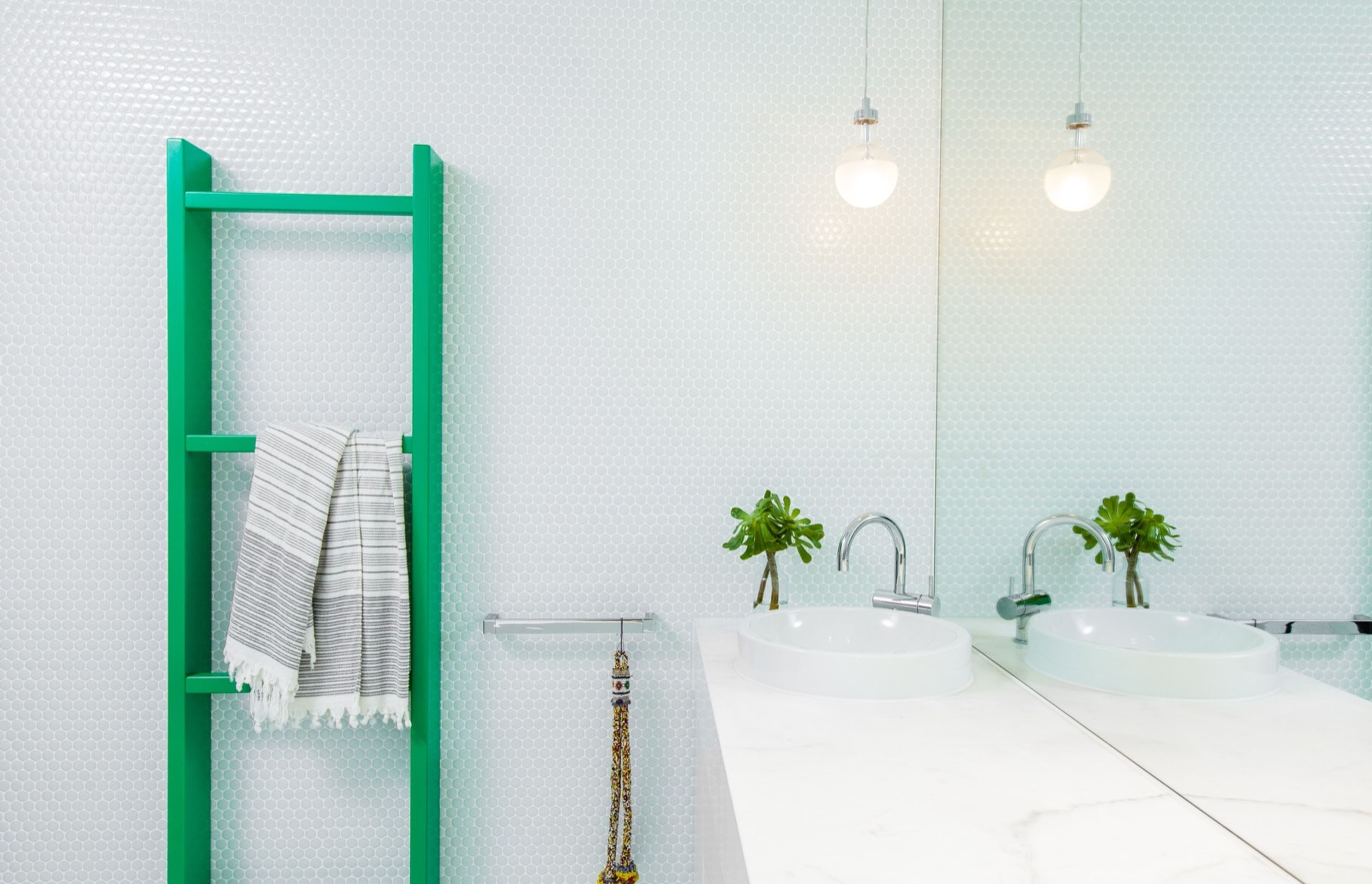
Brighton Residence by Kestie Lane Studio
Colour is used selectively but effectively in Brighton Residence, with monochromatic rooms enlivened by bold pops of colour. In the bathroom, a white marble vanity and mosaic tiling are complemented by the addition of a vibrant green towel rail. Elsewhere, red tchotchkes add interest to a moody black-and-white mantlepiece.
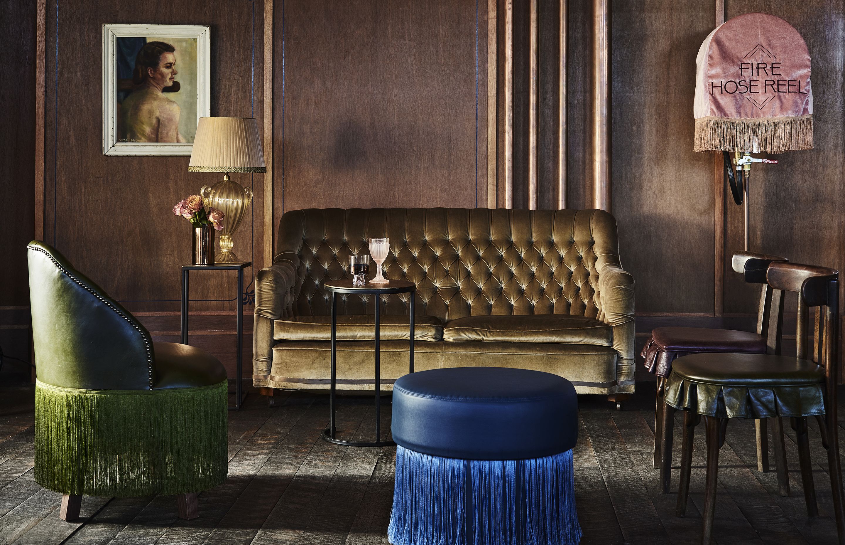
The Imperial Hotel by Alexander & Co.
Not merely limited to residential interiors, pops of colour make a dramatic impact in the lounge area of The Imperial Hotel. The lounge takes on a luxurious tone, with a rich material palette of timber and velvet in neutral, earthy tones. A fringed armchair and ottoman in lush jewel tones add interest to the space, while contributing to the overall grandeur.

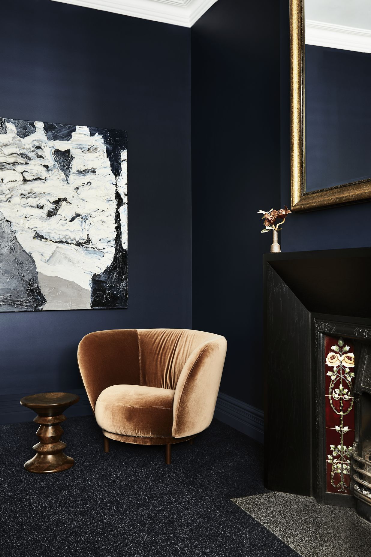
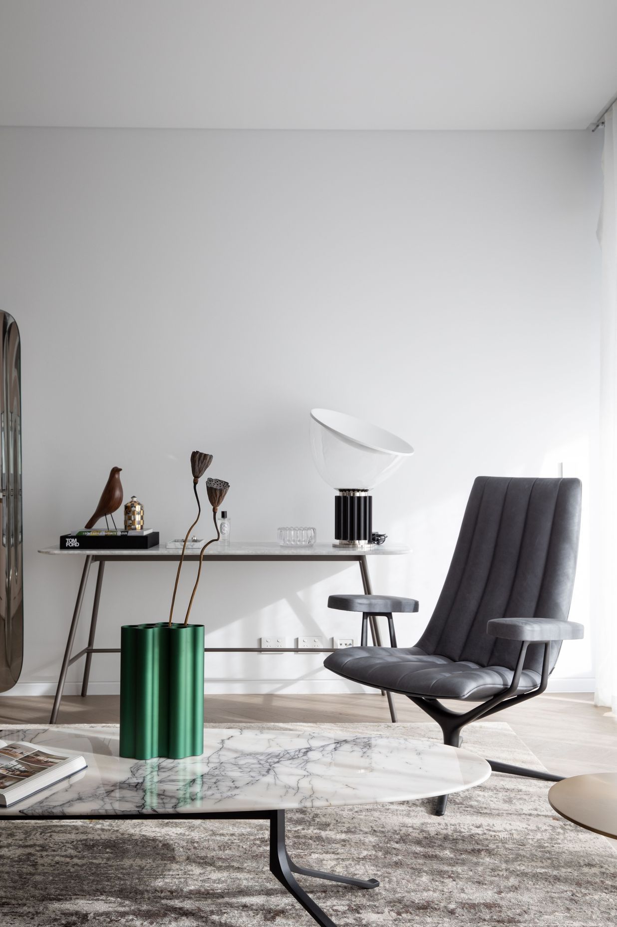
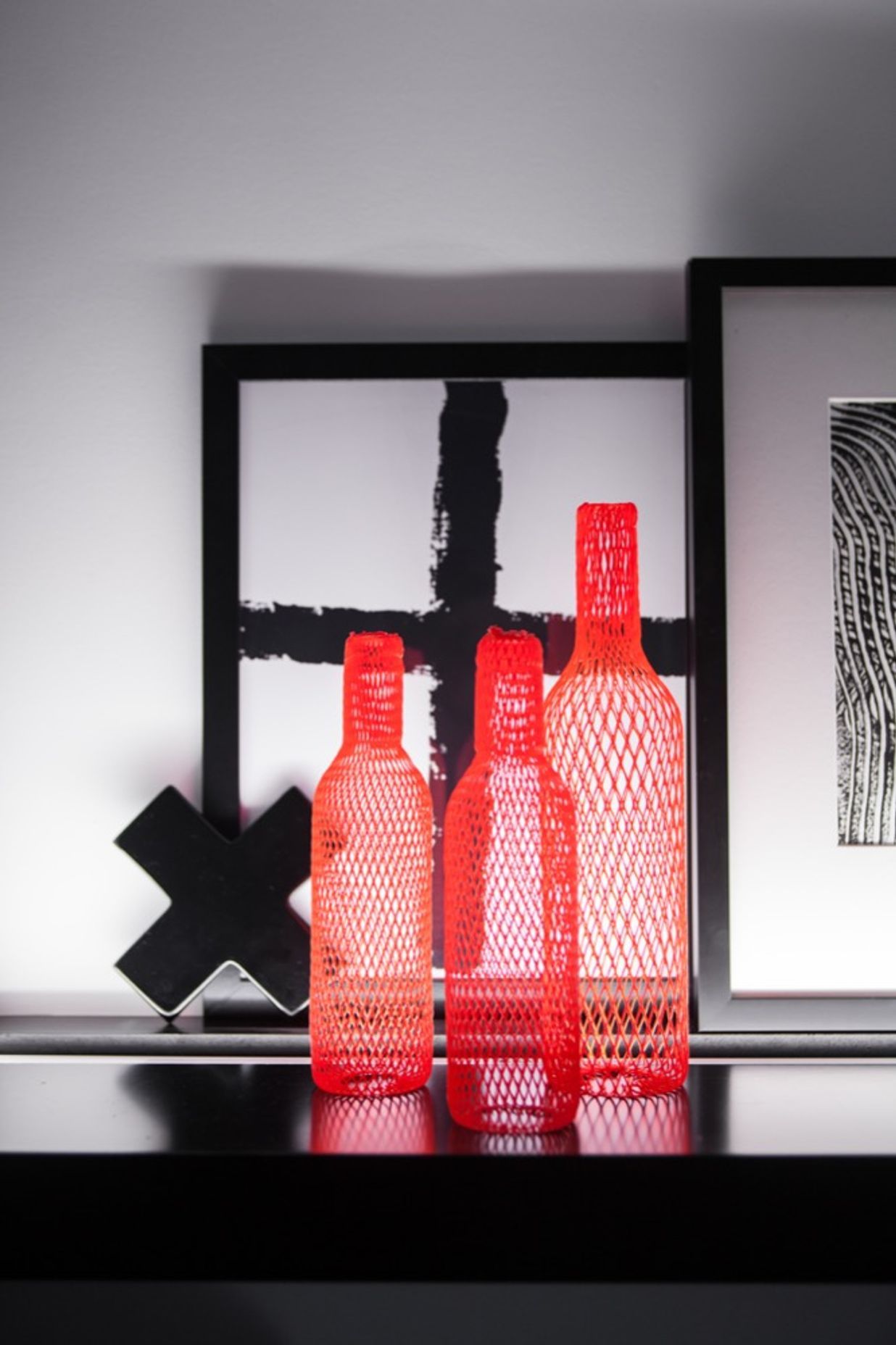
Hunter by S&K Group
Colour is used sparingly but thoughtfully throughout Hunter. An Edwardian home, Hunter seamlessly blends classic with contemporary, injecting a modern feel into the home without losing its original character. A colour palette of white and various shades of grey is accentuated with carefully chosen furniture and ornaments. In the kitchen, a pale grey and white colour scheme is tied together by a sculptural red vase, while elsewhere a bronze velvet sofa and a gilded mirror add undeniable luxury to a dark blue room.

Toorak House by Lucy Bock Design Studio
A thoughtful extension to a period home sees its interiors characterised by clean lines and minimalist decor. The floor-to-ceiling windows in Toorak House perfectly frame the surrounding foliage, turning the landscape into a green wall of its own. White painted brick, timber floorboards, and a grey marble feature wall are accented through the addition of statement sofas in deep blue and purple, as well as a green sidetable.

Warner Kitchen by Jayne Air Interiors
Proving not all colour has to be bold to be impactful, Warner Kitchen uses a muted shade of sage green to enhance a warm palette of white walls and blonde timber. The understated colour palette allows the feeling of zen from the lush surrounding landscape to flow inside, seamlessly blending indoor and outdoor spaces.

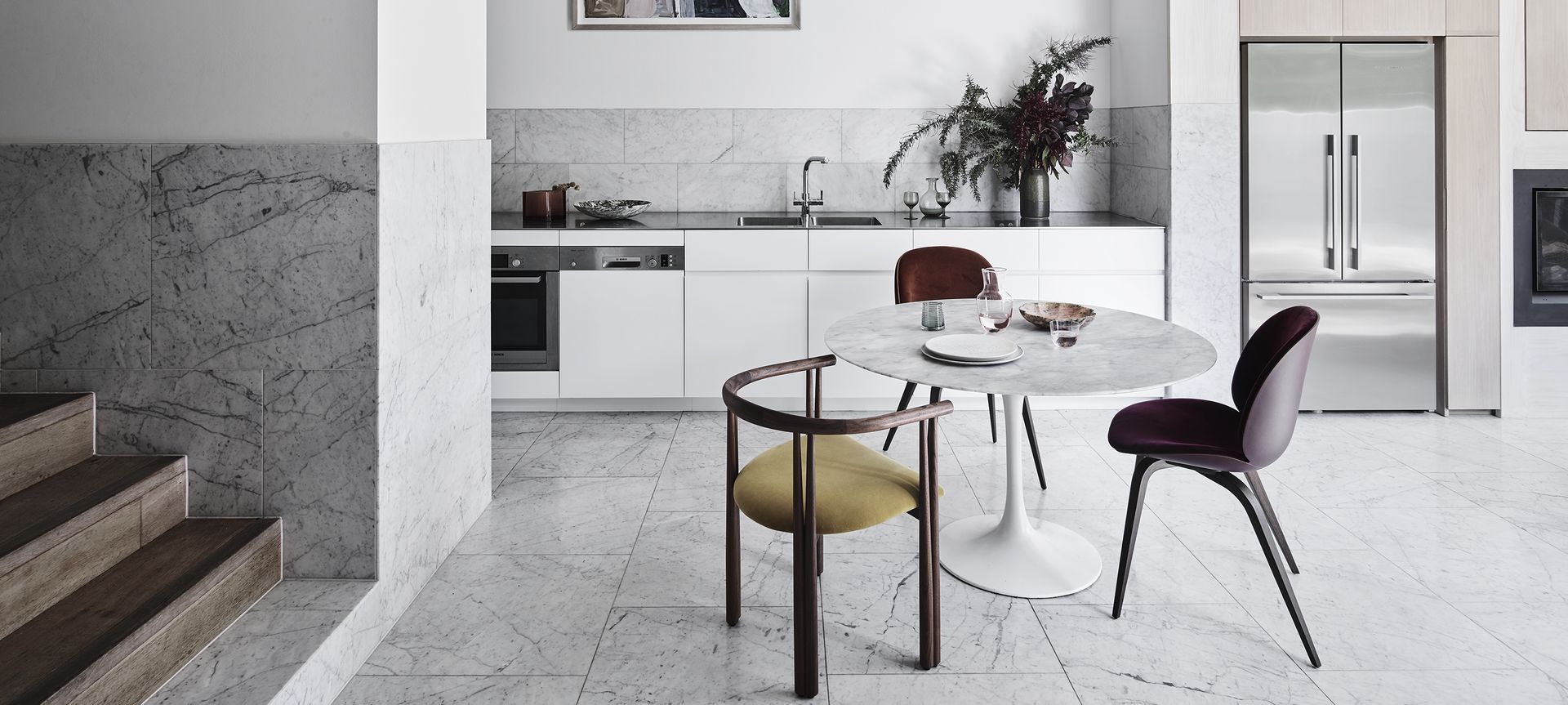
Bondi Junction House by Alexander & Co.
Bondi Junction House applies a contemporary mindset to Scandinavian architecture and design. Exposed pine, Carrera tiles, and white walls are used generously throughout, with the interiors designed to change over time with the tastes of the occupants. In the open kitchen, a marble dining table is encircled by mismatched chairs in shades of mustard yellow, ruby red, and eggplant, which inject life into the otherwise neutral space.
Words by Tanisha Angel