Happiness starts at home: how the dopamine decor trend can help boost your mood
Written by
26 July 2022
•
4 min read

Fashion and interior design are intrinsically linked, with carefully curated decor akin to dressing for the home. So, it’s only natural that trends in the fashion world would translate to interiors. After a couple of – metaphorically – dark years, people are returning to society clad in maximalist, mood-boosting hues, whether it’s Valentino’s signature shade of pink or Ganni’s colourful, pastel-laden take on Scandinavian style; a trend referred to as ‘dopamine dressing’.
Adapted for the home, dopamine decor taps into the emotive properties of not only colour but also patterns and accessories. Although a splash of paint or patterned wallpaper isn’t a cure-all for despondent minds, science shows that certain colours can have a positive impact on mood. One study found university students responded differently to various colours used around the campus, with shades of green found to be refreshing and relaxing, while red reflected excitement and entertainment.
Though neutral hues have reigned supreme throughout Australian interiors over the past decade, dopamine decor centres on creating vibrant, uplifting interiors that promote the production of dopamine. Along with serotonin, dopamine is a feel-good hormone that plays a significant role in influencing our mood, attention span, and the way we perceive and experience pleasure.
Colour can have the ability to alter your mood in both positive and negative ways. Take the protagonist in American writer Charlotte Perkins Gilman’s short story The Yellow Wallpaper, for example. “It is the strangest yellow, that wallpaper,” she journals. “It makes me think of all the yellow things I ever saw – not beautiful ones like buttercups, but old foul, bad yellow things.” While the protagonist subsequently descends into madness (no doubt in part due to the sickly yellow wallpaper), colour can be employed to energise the sense and uplift the spirits.
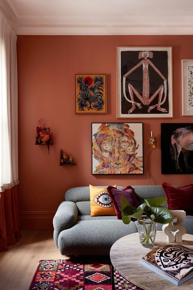
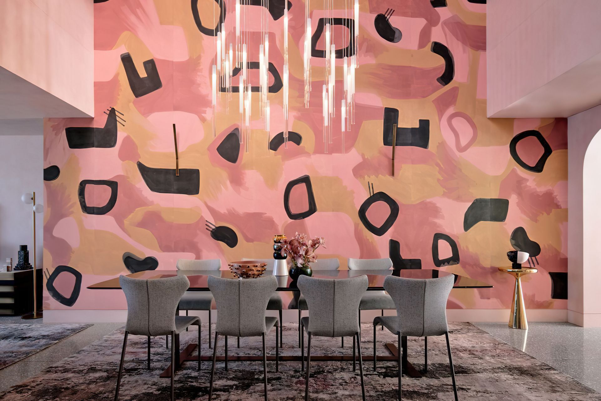
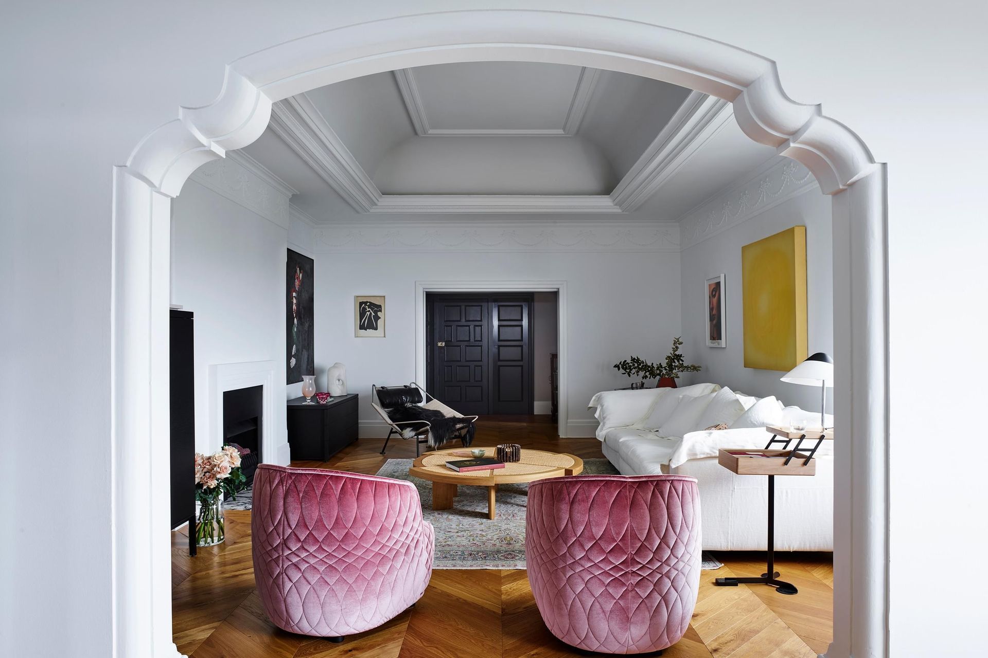
While our perceptions of and response to colour are inherently personal, colour theory proposes that certain hues elicit general responses. Warmer shades such as reds, oranges, and pinks stimulate energy, passion, and creativity, lending them to use in entertaining spaces or even bedrooms. As renowned Belgian fashion designer Martin Margiela once said, the colour red is “a blush, a flush, a fever, a command.”
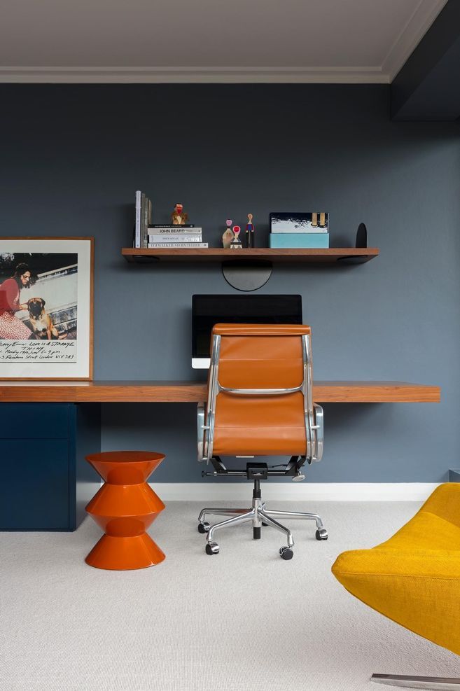
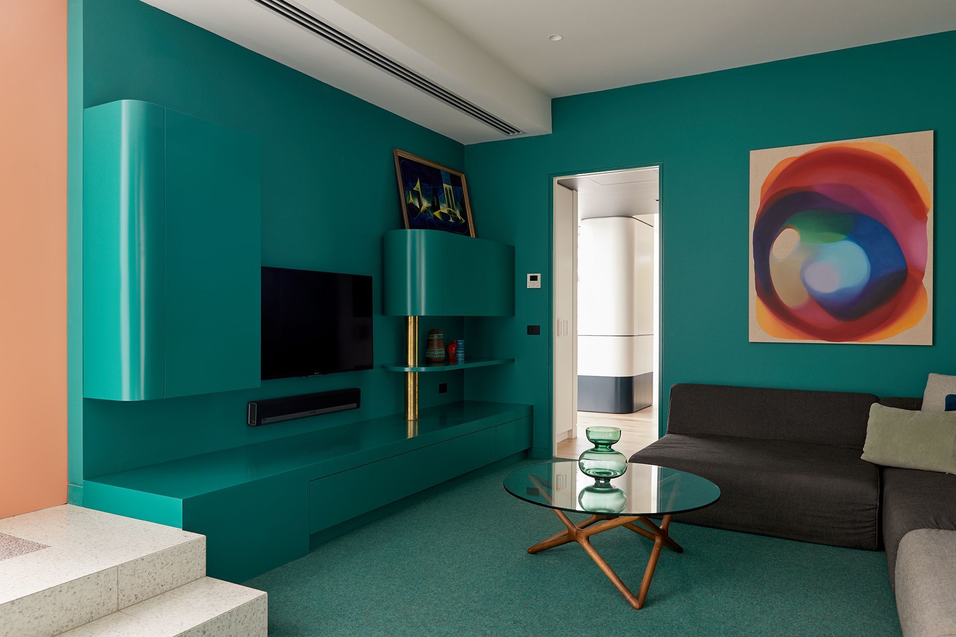
Meanwhile, cooler shades such as blues and greens are reminiscent of nature and promote a sense of calm, and relaxation; a key reason why they’re employed in bathrooms around the world. In Malvern Residence by Doherty Design Studio, a seemingly monochromatic home features unexpected pops of colour. Notably, a sitting room clad almost exclusively in teal with wooden and metal accents provides a space for creative contemplation. Blue is also a useful hue for promoting focus and concentration, making it an apt colour choice for the home office in Pyrmont Apartment by Arent&Pyke.
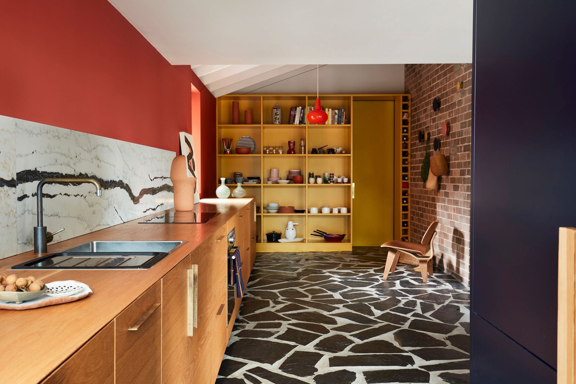
The right shade of yellow can also promote optimism, warmth, and happiness, as the kitchen in Polychrome House by YSG Studio proves. The kitchen takes on an earthy yet colourful tone reminiscent of the Australian outback, with a deep orange feature wall facing an exposed brick wall. A vibrant yellow shelving unit adds a bright, happy touch to the space.
Dopamine decor isn’t prescriptive; it’s personal
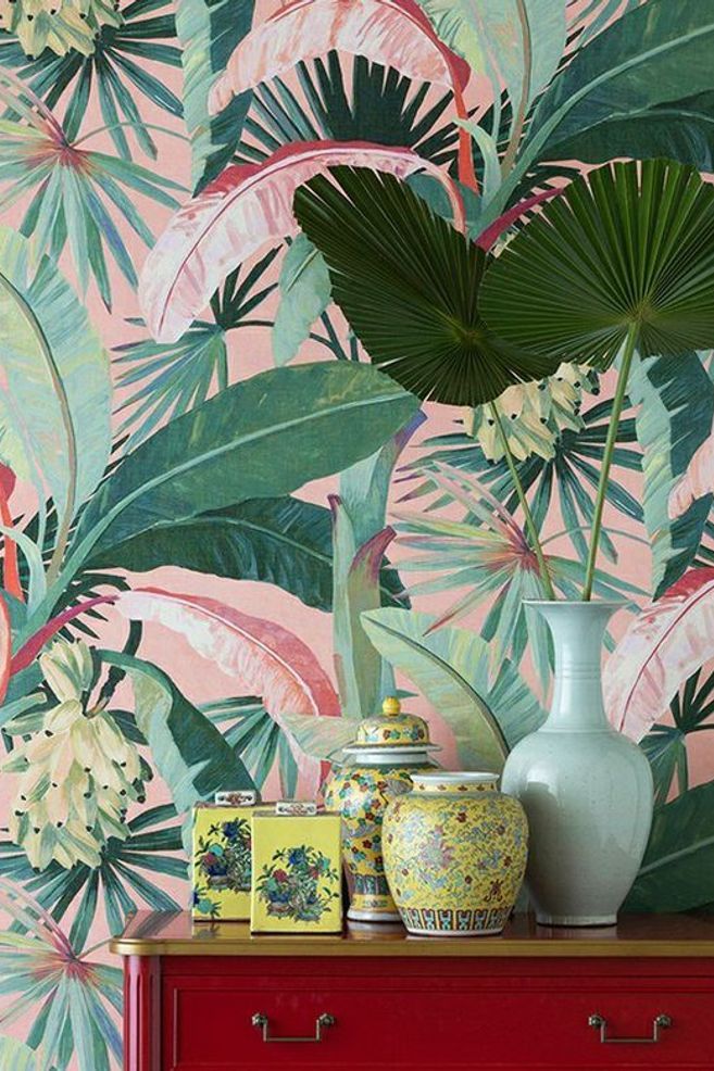
While there’s no one way to incorporate dopamine decor into your home, inspiration can be found in a variety of places. Hotels can be a good reference point for combining colours and prints, while fashion and nature can provide colour inspiration. When it comes to decor, the rise of neotenic design has proven that cute shapes and silhouettes have the ability to make us happier, making a cuddly throw pillow or puffy sofa the ideal accompaniment to a home laden with colour.
Unlike many design styles, dopamine decor isn’t prescriptive; it’s personal. Whether you embrace maximalist wallpaper and vibrant colours or prefer a slightly more subdued approach in the form of pastel hues paired with strategic accessories, the dopamine decor trend encourages you to cultivate a home that makes you happy.
Need help incorporating colour into your space? These Australian interior designers are playing with colour in innovative ways, proving bold hues and a sophisticated aesthetic needn't be mutually exclusive.
Words by Tanisha Angel