Colour trend report: paint trends of 2022 and 2023
Written by
29 August 2022
•
5 min read

Each and every colour trend report this year has been shaped by our collective experience of the pandemic, and how we wish to move on from it. From Wattyl and Dulux to Haymes Paints and Resene, each brand has predicted the popularity of palettes made up of blues, greens, neutrals and browns, accompanied by pops of pinks, purples and yellows.
Regardless of hue, almost every colour from every palette can be described as gentle, soft or muted, while the remaining few fit terms such as rich, warm and bright. Unsurprisingly, all are influenced by nature, and ideas of colour psychology have been applied to every selection.
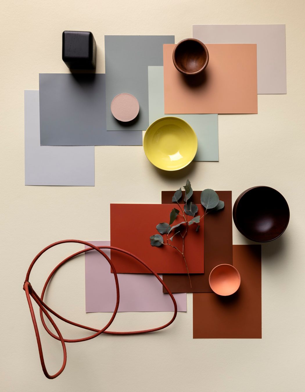
The desire to reconnect with nature while building a sanctuary within one’s own home has emerged as a common objective across the major brands, with palettes and colours given names that reinforce the intent.
Wattyl named their palettes Return To Simplicity, Local Comfort, Resilient Optimism and Conscious Connection, while Dulux dubbed theirs Revive, Connect and Balance. Light Play, Carefully Nurtured and Live Wire are the titles from Haymes Paints, while Resene’s large curation was grouped by uplifting aesthetics such as The Sky’s The Limit, Down To Earth and Lighter Than Air.
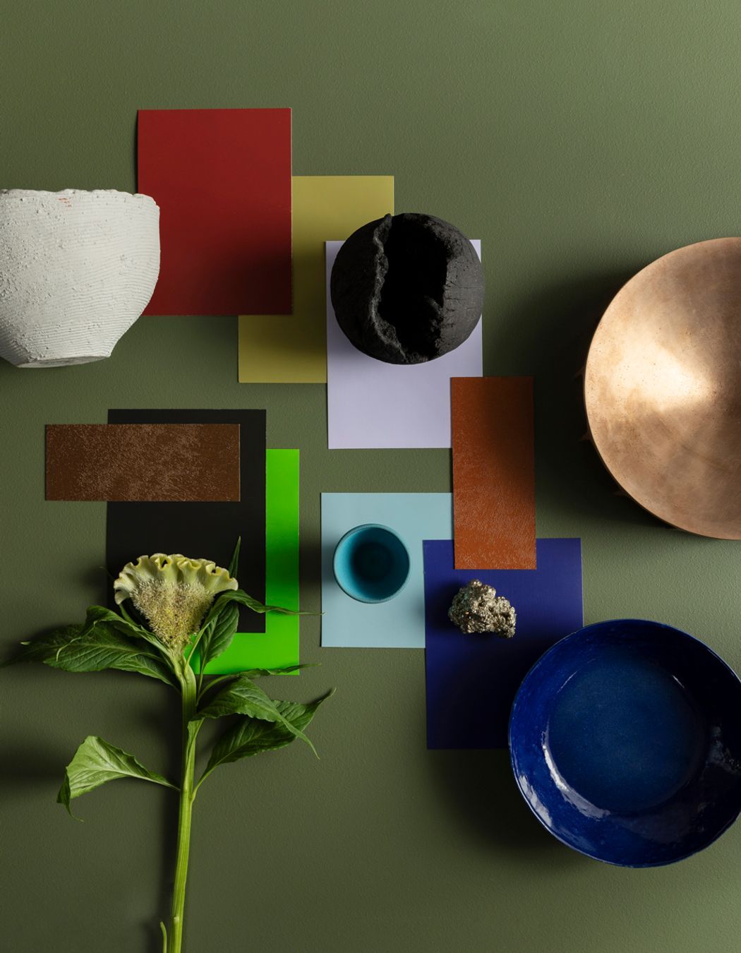
Naturally, every colour trend report for 2022 and 2023 has selected pigments that, according to colour psychology, promote rest, relaxation, rejuvenation, connection, comfort and positivity – the very things one might argue each household needs in the aftermath of a global pandemic, unprecedented inflation and increasingly extreme weather events.
“Colour forecasting for interiors is an evolution,” says Andrea Lucena-Orr, colour and communications manager at Dulux Group. “While fashion is an important influencer, the shifts in interiors are more subtle and nuanced. The palettes we can expect to see in our homes in 2023 are predominantly warm and nurturing, with nature continuing to be a key driver of trends. Brighter hues continue, however they are deeper than last year.”
Read now: How to add colour into contemporary and minimalist homes

Dulux Colour Forecast 2023
The Dulux Colour Forecast 2023 is one of the most comprehensive and is informed by Future Laboratory London, Colour Hive, Milan Design Week, trend reports and editorials, catwalks, product and design launches, engagement with global and international brands, and customised research through Dulux’s extensive networks in the UK, Italy and France. This year, the brand provides three palettes through which one can revive, reconnect and achieve balance.

Serene marine blues, gentle greens and rich garnet accents inspired by the ocean and shoreline create the Balance palette, which is said to play well with velvet and silk, curvaceous furniture and abstract art. Revive is a bold and playful mood-booster with rose pink, blue, sunshine yellow, emerald, violet and burnt orange.
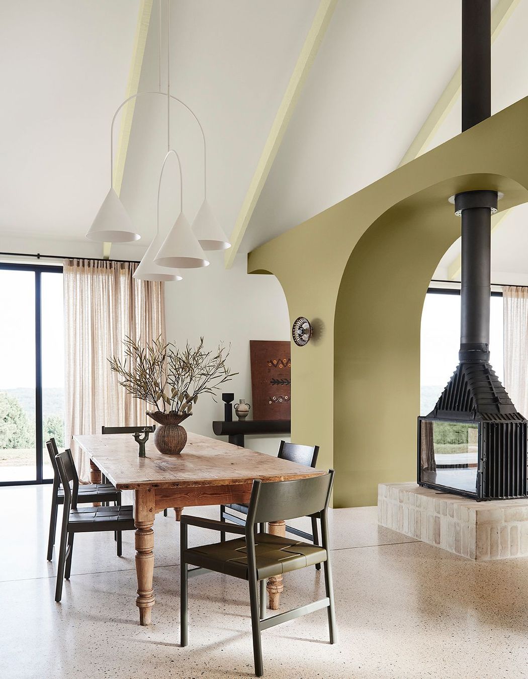
Taking inspiration from the great outdoors, hiking, cooking and gardening, Connect brings forth a warm and earthy edit of moss, wasabi, sandstone, yellow-green and burnt charcoal. “It speaks of calm, comfort and an honest approach to living, and brings in many of the pastimes we experienced during lockdown,”says Andrea. “Muddied yellow-green has something of a nostalgic, country-house feel, cinnamon is grounding, while rich purple-brown adds an indulgent and contemporary twist.”

Wattyl Colour Forecast 2022: The New Normal
This year, Wattyl presented four palettes, sixteen swatches and a slew of new colours that reflect the brand’s desire to instill a sense of calm and serenity into Australian homes. The New Normal edit addresses the unified wish to reconnect with nature and create an oasis of wellness at home with swatches of muted greens, soft beige and white – all of which pair well with natural materials.
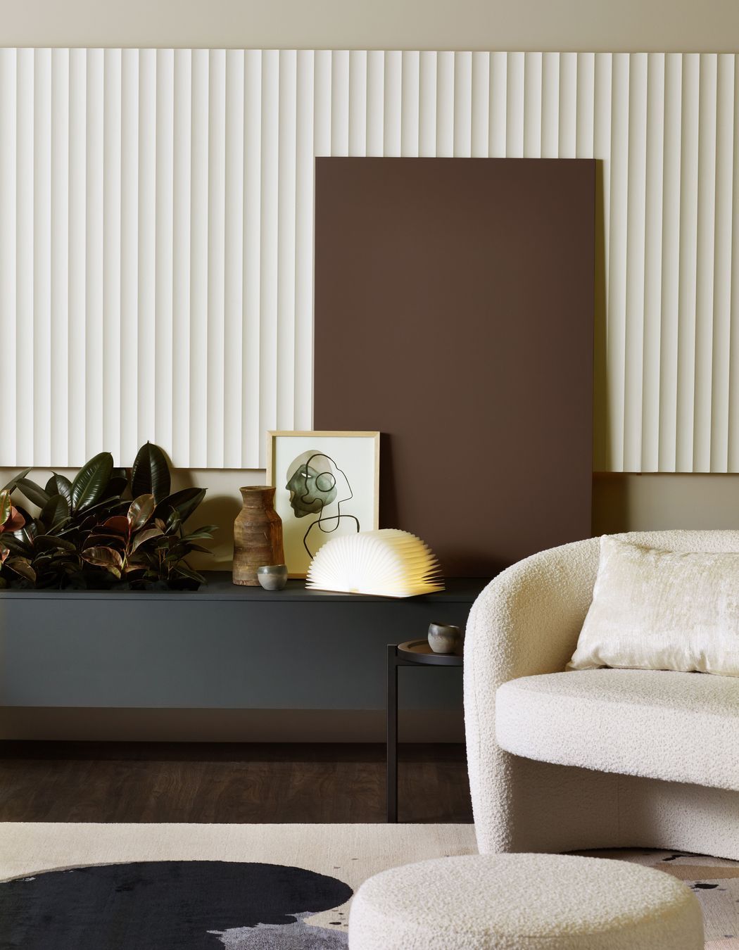
Return To Simplicity teams pale blues and soft beige with white and off-whites in an attempt to bring a sense of simplicity, ease and peace to any environment, while ivory, greige and browns create a cocooning effect in Local Comfort, which is designed to be styled with lush foliage, handmade objects and tactile surfaces.

Resilient Optimism showcases blues, soft tans and beige and takes inspiration from the coastline, while the greyscale palette of Conscious Connection is peppered with green accents.

Haymes Paint Colour Library Vol.16: Energy Shifts
Haymes Paint Colour Library Vol.16, titled Energy Shifts, encourages us to leave the uncertainty and insecurities of the past two years behind and move towards a new chapter in our lives with renewed energy fuelled by hope, appreciation and gratitude. Light Play offers up bright and fantastical shades that bring depth and intimacy to interiors while invigorating your home, with lime green, cobalt blue, duck egg blue, lilac, reds and browns.
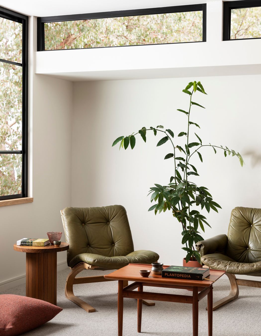
Carefully Nurtured is structured to positively impact your mood with colours chosen to heal, restore and reinvigorate mind, body and soul. Soft blues that verge on grey, salmon, dusky purple and burnt-earth reds characterise this theme.
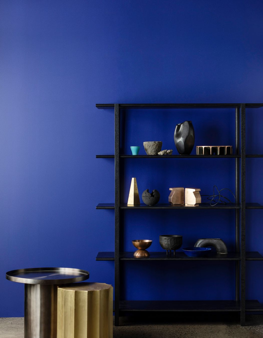
Live Wire sets out to establish the importance of creativity and individuality with a diverse range of bold colours, such as yellow, blues, oranges and greens against graphic black and white.

Resene Habitat Plus Decorating and Colour Trends
Habitat Plus Decorating and Colour Trends by Resene took a more-is-more approach to their predictions, featuring eight edits. Most noteworthy are Green Reigns Supreme, a palette that champions lush greens and leafy colours far warmer than the grey-based greens we’ve seen in the past, The Sky’s The Limit is evocative of the sea and the sky with tranquil blues, while Lighter Than Air favours warm neutrals reminiscent of linen, stone, wood and clay. Down To Earth is a grounding collection of warm browns and deeper neutrals, while Spiced Just Right is a delicious serving of caramel, toffee, chocolate, coffee and toasted, nutty hues.
Discover interior designers that decorate with colour on ArchiPro.