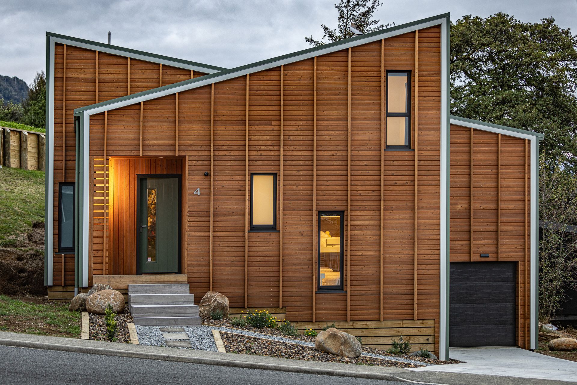
A daring alpine home spanning seven levels on a tiny section
Written by
25 October 2022
•
5 min read

When a small, sloping Ohakune section became available due to a client's departure overseas, MnM Design’s Maurice Regeer pounced on it. It was the ideal site for their company showhome and the timing was perfect. Covid had hit, and with all their other projects put on hold, Maurice had time to investigate the site to see what they could do.
The site dictated the design; with a daunting 6.7 metre drop over the site, and a five metre drop over the building platform, the original owner of the section had wanted a simple house on poles. But that option wasn’t something Maurice would consider.
“If we do something for ourselves, it has to be something spectacular – a one-of-a-kind thing. We wanted to minimise earthworks and retaining walls, and all those ugly site works, so we basically created some boxes and stacked them on top of each other.”

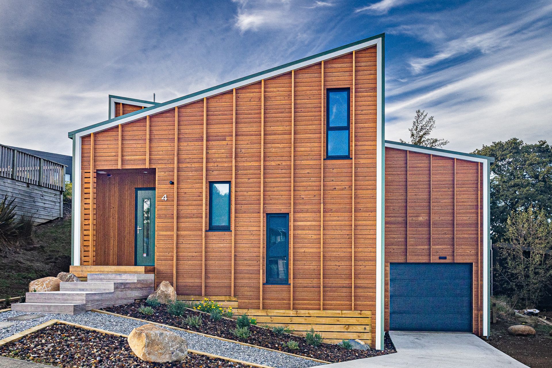
This design has created an interesting shape, over seven different levels. The small (378 sqm) section meant the floor plan needed to be compact, for the most to be made of the height. The building is in two slices, going in opposite directions. This made it possible to stack the boxes to get the necessary height, and it also created the feature that MnM call the ‘Twin Peaks’. In the middle of the two segments, at the centre of the house, is a leftover space for staircases that go up and down between the levels.
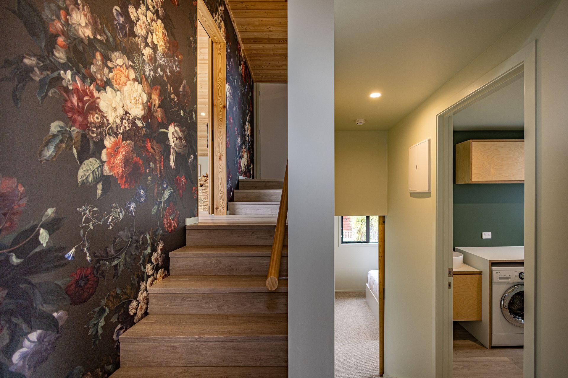
The ceilings in some of the staircases are five to six metres high, which made wallpapering, for instance, a difficult proposition. Getting scaffolding inside was a challenge, but the major challenge was physically building the place.
“The methodology of building was relatively simple but then you look at the steep hill... We had to start with the first piles – 15 piles – which was only the bottom bunk room and nothing more. So we had to go through an exercise of how we were going to push ourselves uphill into a hall.”

The exterior materials were chosen to emphasise the shape of the house, acknowledge the surroundings, and to be low maintenance. The green-hued Colorsteel trapezoidal metal and the larch weatherboards reflect the green pastures and native flora that surround the property. Vertical battens over the horizontal timber add to the sense of height, and the white trim around the façade brings more depth into the design.
The interior of Twin Peaks is an expression of Maurice’s heritage. “We’re really fond of timber. We’re from Holland, and we’ve spent an awful lot of time in Scandinavia and The Alps in Europe, and one of the things for us is having that calm feeling in a house with the use of natural materials and timber. There are studies of kindergartens that point to the calming effect that timber has on people’s mindsets.”
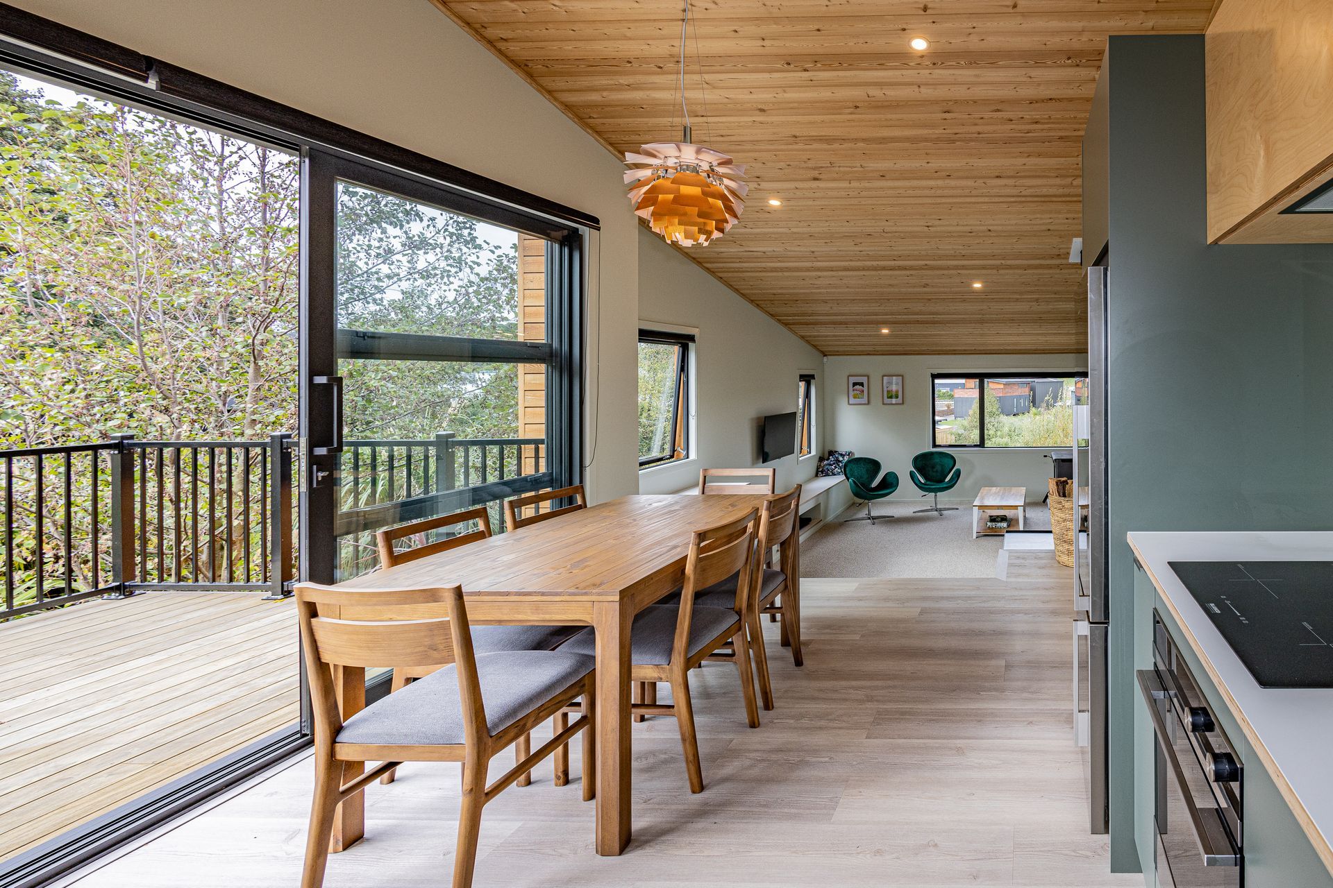
Timber is used in pretty much every room, but MnM were careful not to be excessive in its use. Plasterboard is used both for its cost-effective properties in dealing with linings, and also as an offset – it makes the timber a feature, and not just something that’s used around the entire space. Bathroom cabinetry, kitchen cabinetry, and ceilings are examples of timber features. It is also seen in the flooring. A wood-grain material - similar to vinyl – by Rhino EverCore was chosen for its look, and its hardwearing properties, with rental potential and longevity in mind.

Considering both the clever use of timber, and the rental potential of the house, the bunk room is a great example. “Through our clients, we heard that a lot of people with three kids end up having to rent, pretty much always, a three-bedroom house. So we thought we’d make a bigger bunkroom, with a couple of bunks and a double bed in there.” The bunks are flanked by timber, and the tongue and groove barn-style door gives the feeling of rustic warmth.
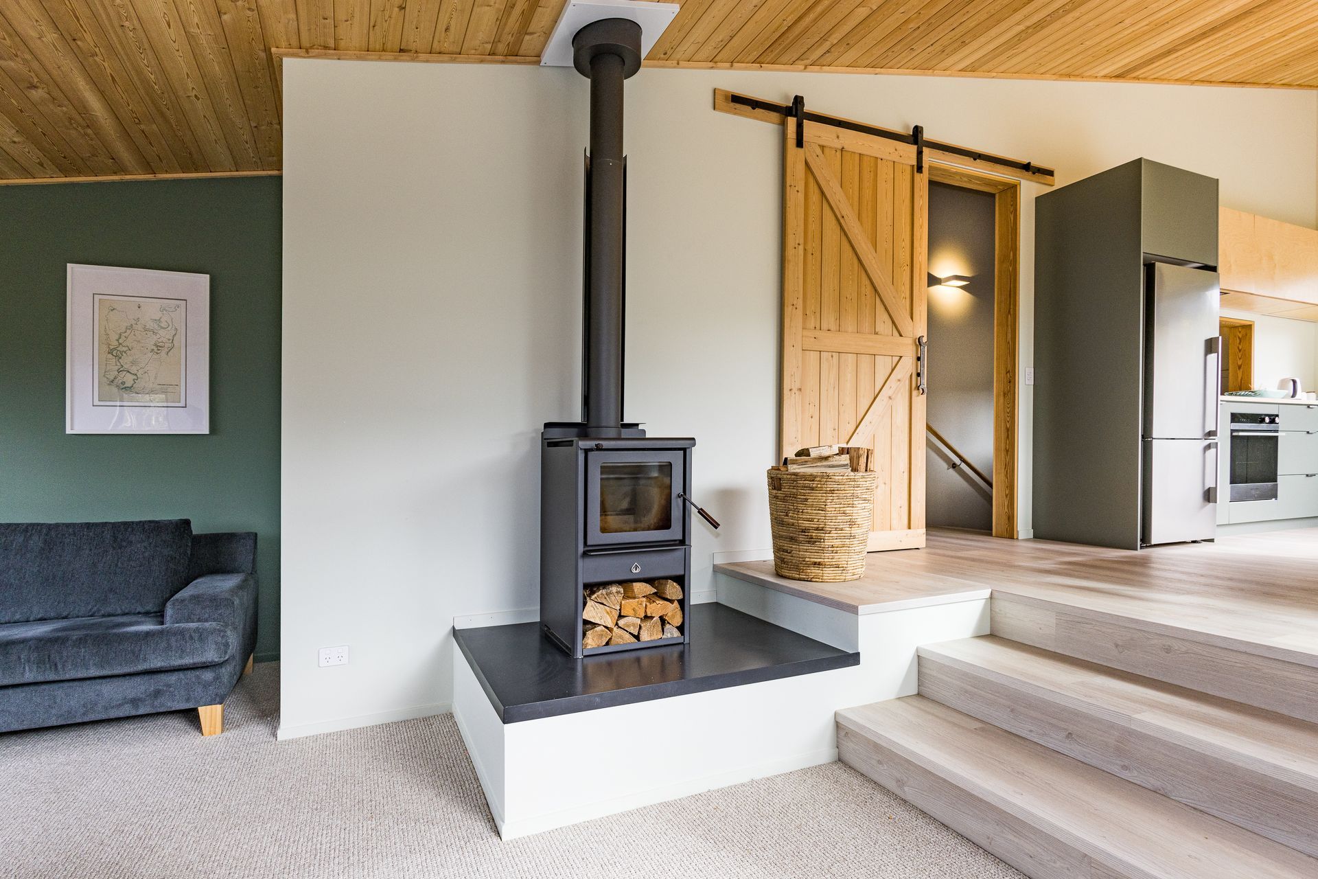
The barn door feature is used again beside a woodburner in the split-level kitchen/dining and living area. A large deck off the north-facing kitchen is the vantage point for views over native bush, and on up to Mt Ruapehu. Great views don’t end when the sun goes down on Twin Peaks. Maurice’s favourite part of the house is the master bedroom, where the snug low ceiling and skylight make it perfect for stargazing at night.
“You can design everything you like, but at the end of the day sometimes you get surprises, even with the 3D elements that we use – the 3D renderings and studies and walkabouts – there are not a lot of surprises in the house. But when it’s up, and you see, for instance, the rural view towards the morning sun – waking up and opening the curtains – well, it’s pretty spectacular. It gets me every time... That master bedroom was a good surprise.”
Words: Bardo Ashton
Images: Glyn Hubbard Photography
Explore more projects by MnM Design.
