Wellington new-build perfectly tailored for retiring in style
Written by
17 August 2022
•
3 min read

The ideal retirement looks different for everybody. For these homeowners, the vision was a move out of Wellington to the holiday town of Eastbourne, into a contemporary pavilion home – nothing too ostentatious – with mid-century inspiration and space for their art collection and piano.
“We provided a canvas for them to inhabit,” says Richard Beatson of Studio Pacific Architecture in Wellington.
Eastbourne, across the harbour from the city, has traditionally been a getaway for Wellingtonians, says Richard. “People would go over for the weekend on the old ferries, or even go out for day trips, and they still do.”
One of the pair grew up in Eastbourne so for them it really was like moving home. “They just wanted a peaceful place to settle down.”
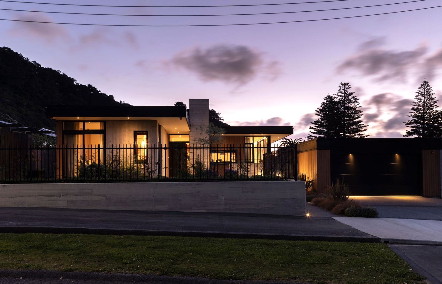
Most sections on the street are small, but this house sits over two adjacent sites so consideration was given to the surrounding environment. “The house is in a quiet, tree-lined, suburban street and is located to align with adjacent houses. From an architectural point of view you want it to sit well within the neighbourhood. I think everyone wants that.”
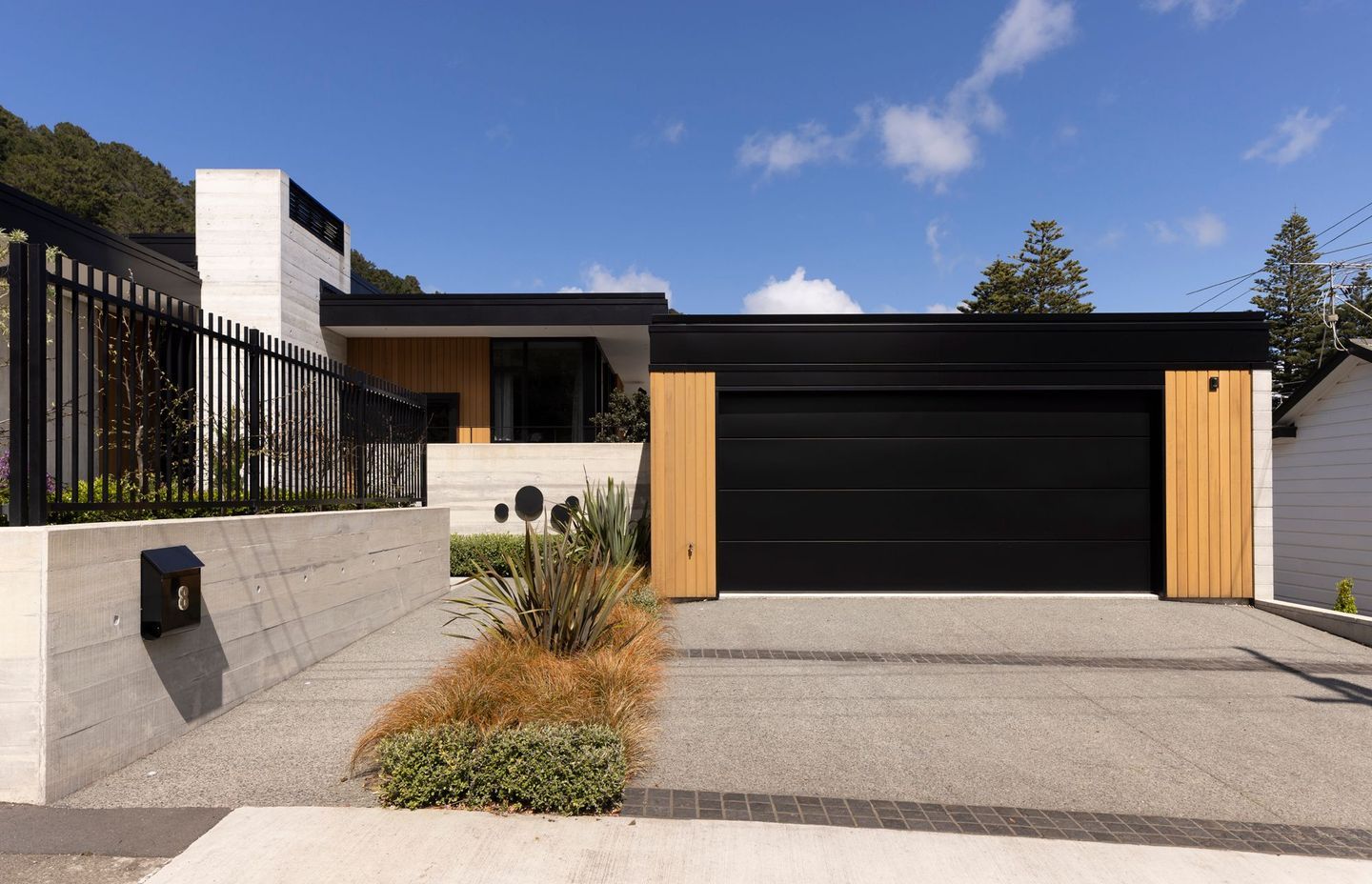
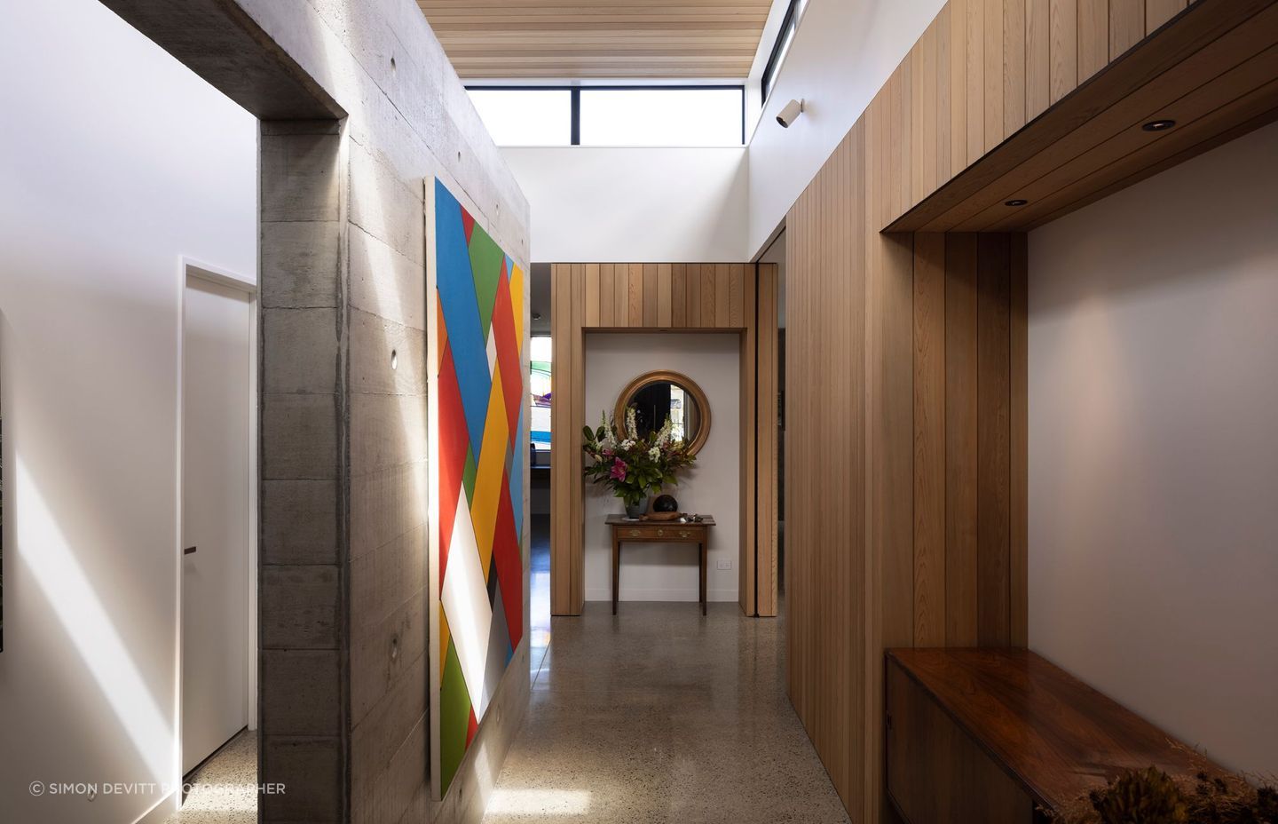
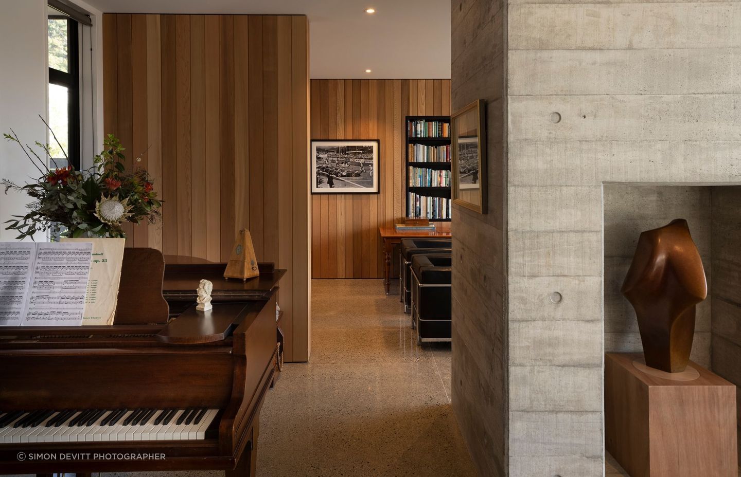
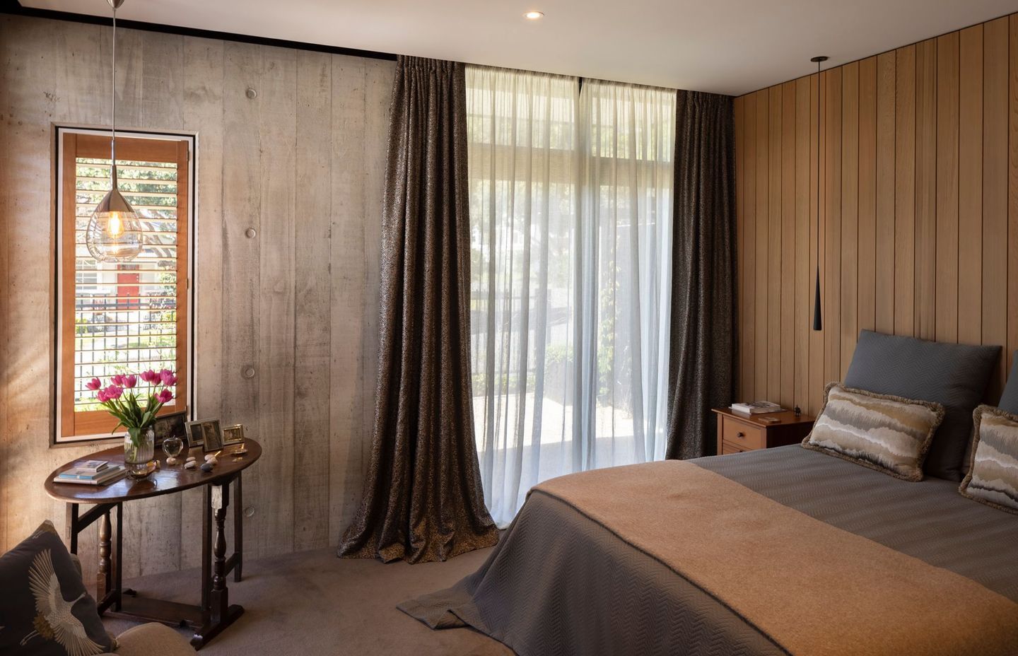
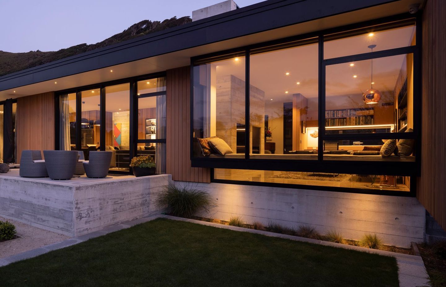
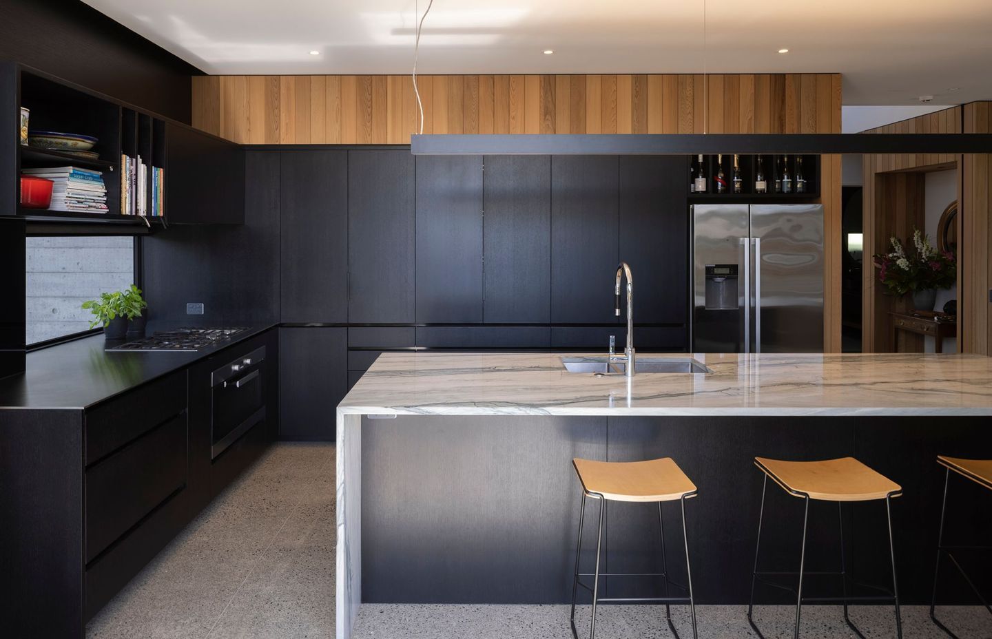
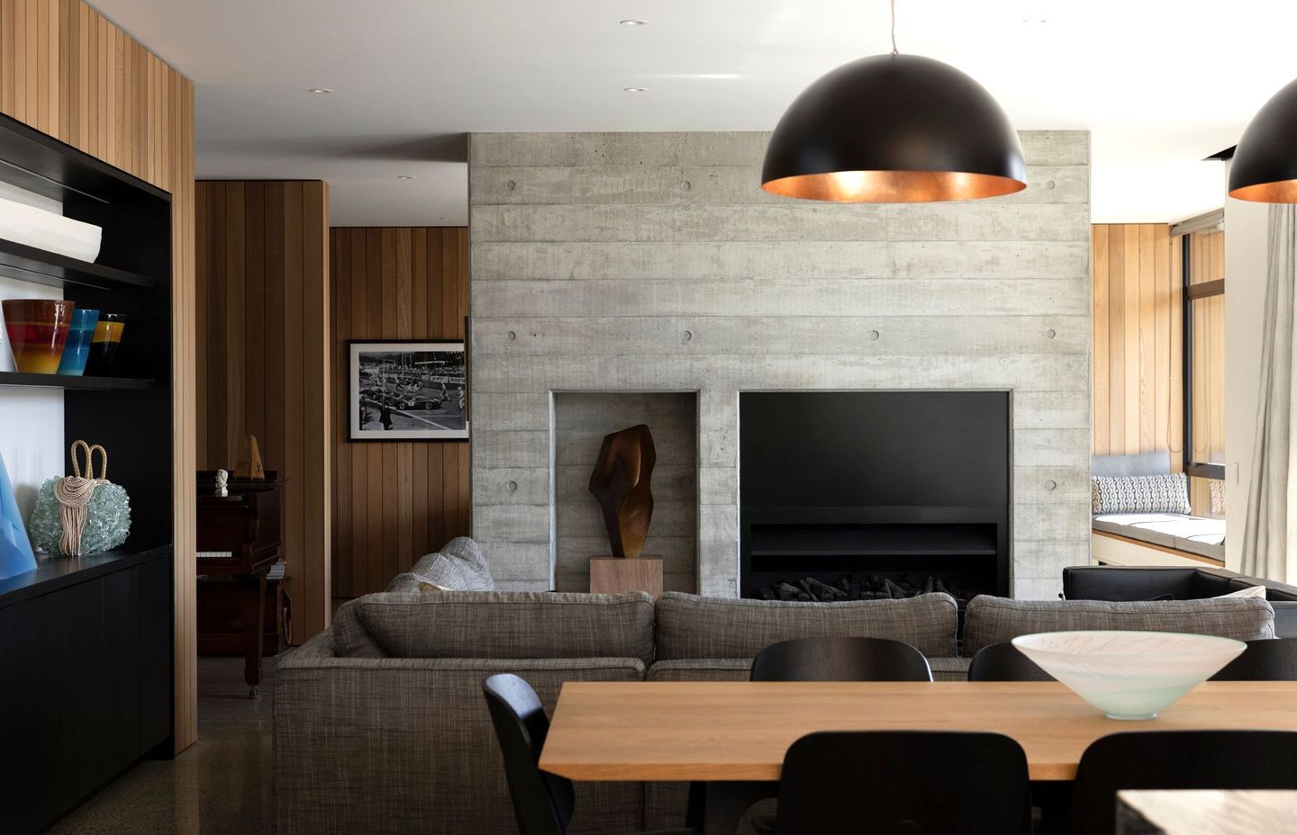
The house is predominantly textured, board-formed concrete and vertical cedar weatherboards. The concrete is highly crafted, says Richard. “It has very strong visual properties. And it’s quite haptic as well, you can hardly resist touching it. As it’s poured in-situ, you get out of it what you put into it, and of course you don’t get a second chance. But the character of the concrete with the warmth of the timber gives a real richness.”
Two eye-catching features in the formed concrete are the chimney towers, although only one is actually a chimney – the one at the front of the house contains services and storage. “Effectively they anchor the roof and ground the house.”
Richard says the roof is one of the house’s strong mid-century elements. “It’s a distinctively flat roof with quite a refined edge, and provides generous overhangs to the living space,” he says. Another nod to that design era is that the cedar wall cladding is brought through from inside to out.
“It’s generously clad in cedar on the interior,” says Richard. “There are a couple of concealed doors in the hallway, hidden in the cedar lining. Push in the right place and the door pops open.” They access storage and a powder room and are designed to keep the flow of the wall uninterrupted.
Also running down the hallway is a formed concrete wall. “It’s the strong spine of the house and really delineates private and public functions.”
The entry gallery has high clerestory glazing around the edges providing ventilation and natural light to the centre of the house and creating a gallery space for the homeowners’ art collection.
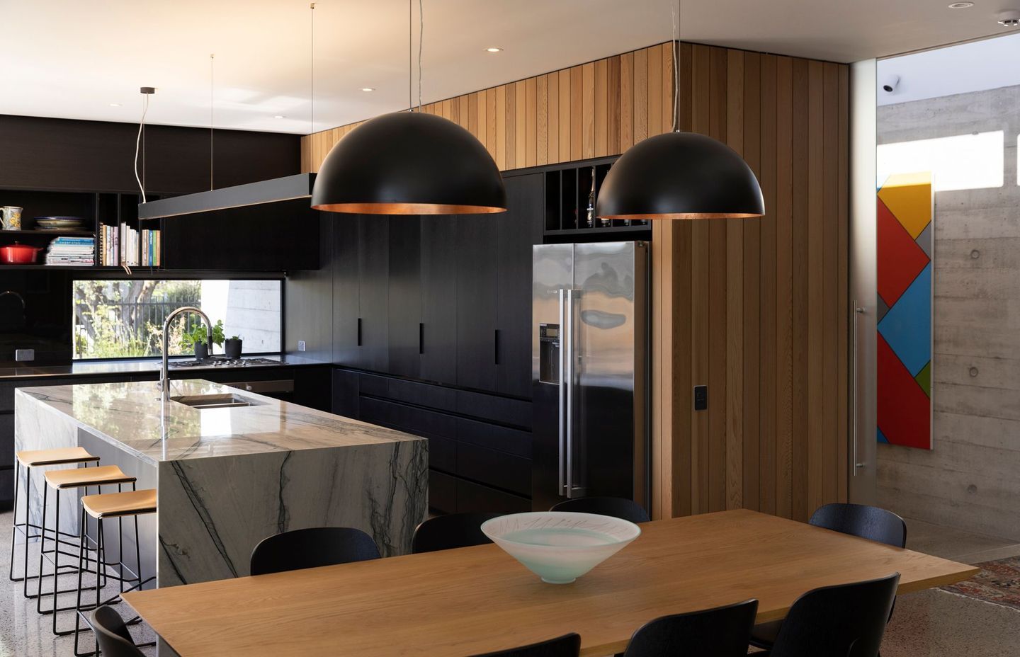
The open plan living areas also had to house a baby grand piano. “There were various spots considered for that, it was certainly about trying to find an ideal space that was protected from the sun.”
Behind the double-sided fireplace is a secondary living room with desk space, television and concealed audio equipment and a window seat in a sunny spot. “It's a bit of a luxury,” says Richard of the extra space.
He says the design process with the homeowners was very collaborative. “They were open to ideas and good at giving us direction, but also knowing when to stand back. They are probably among the best clients I’ve ever had, it was really enjoyable.”
