Black Rock Beauty

Take a look at these two remarkable projects that have harnessed the power of rock panels to transform spaces into inviting and immersive experiences. From the seafood-centric ambiance of Oyster and Chop in Auckland’s Viaduct Basin to the spatial celebration of New Zealand’s landscape within the Methven Caroma showroom, these projects are sure to inspire your next design:
Oyster and Chop Restaurant
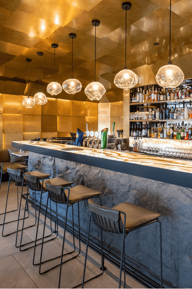
Muros Rock panels create a sleek dining experience at the Viaduct Harbour’s new extended bar and kitchen at Oyster and Chop, Viaduct Basin, Auckland. Showcasing the oyster in all its glory, the vibe is both elevated and welcoming at this seafood-centric restaurant.
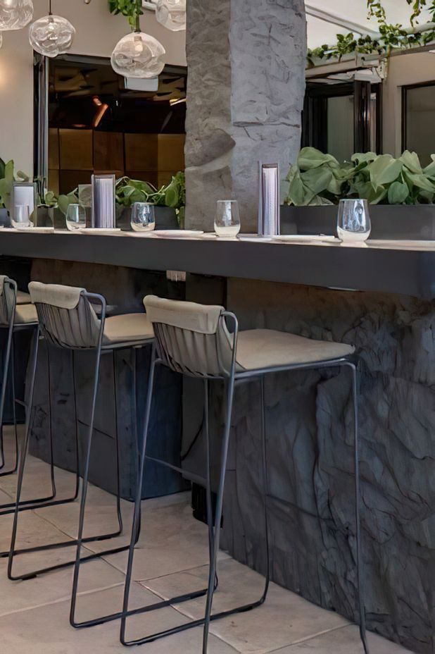
This outstanding project, specified by Jack McKinney Architects, uses Muros natural stone panelling to achieve the desired look required. Muros Rock wall panels were fitted by Complete Construction Ltd to the bar counter front and centre bar tables and column. Painted in Resene Squall, a hard-edged grey, strong in mood and presence, and reminiscent of the colour of oysters.
The result is an ‘on brand’ eye-catching variation from flat walls, bringing the dining experience to life.


The bar counter front at Oyster and Chop, using Muros Rock panels, painted in Resene Squall, to add a touch of raw natural aesthetic to this modern space.
Methven Caroma Showroom
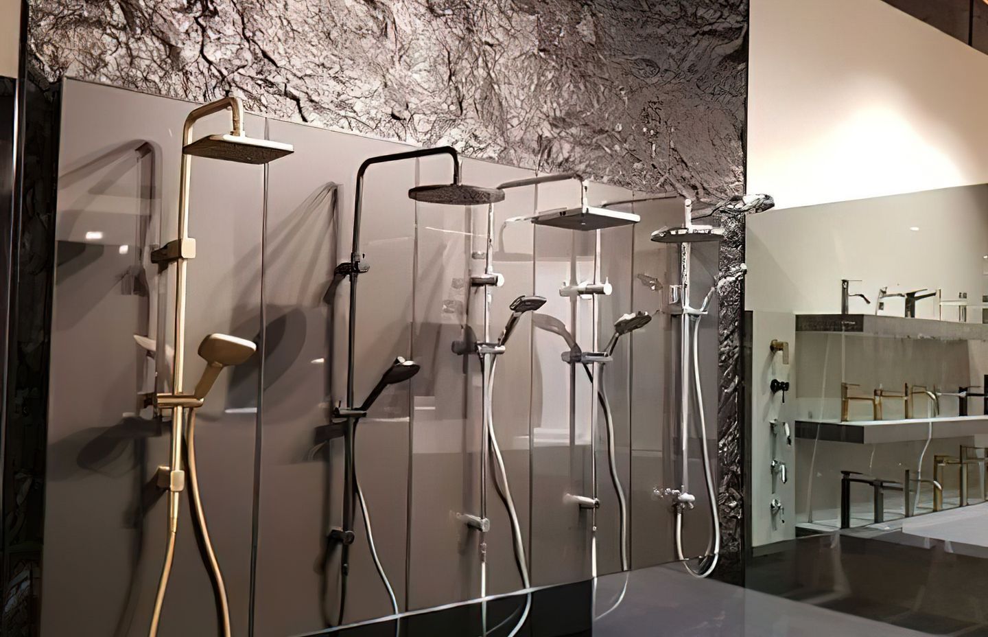
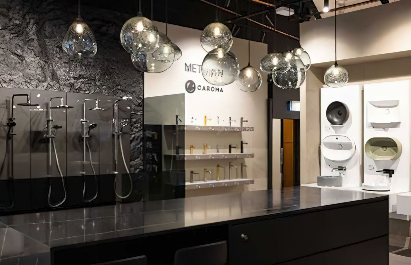
This project shows the stunning application of Muros Rock panels used in the Methven Caroma Showroom at Home Ideas Centre on The Strand, Parnell. The Home Ideas Centre is Auckland’s largest design showroom for architects, designers and homeowners and features upmarket products from leading manufacturers.
The designers, Spaceworks Interior Architecture, shopfitters, Fitout Solutions, and GWA Group received a nomination in the 2022 RED Awards for this captivating design and immersive experience.
Following the installation, Muros Rock stone panels were painted in Resene Blast Grey from the Resene Metallics and special effects range. The panels provide a dramatic backdrop for GWA Group’s Methven and Caroma bathroom brands, in the centrepiece shower display, ensuring a flawless fusion of ruggedness and sophistication.
The GWA Showroom space exists as a spatial celebration of the local landscape used to inspire the very product it displays. An enveloping of texture and depth, with scattered moments of discovery within the space, aid in the story telling of GWA’s product transporting the visitor outwards into nature.
In remaining aware of the client’s budget, this project is full of thoughtful, clever and considered detail. Within the design, paint was the companion, allowing the designers to achieve depth in a cost-effective way. Paint is capable of telling stories, exhibiting movement and feeling, and a collection of subtle tonal variations throughout the interior creates moments of faded shadow on the 3D rock panelling. Similar to how tones rest, caught between the terrain of landscapes as shadows form, this space holds depth.


