Reinventing a mid-century office block
Written by
18 October 2022
•
5 min read

The work undertaken on Brandon House in central Wellington was not just a quick refresh, says Marc Woodbury of Studio Pacific Architecture.
“Commercial property owner RJH bought the building on a corner site, and came to us looking for a full refurbishment,” he says. “And when I say full refurbishment, it was to effectively strip it back to the concrete frame. Everything came out.”
RJH knew the building had seismic issues, he says, and some work had already taken place before the purchase. “There had been a couple of schemes done before RJH bought it, to look at strengthening, and one of those solutions required a lot of work and we needed to take the facade off to do it.”
That also meant Studio Pacific Architecture knew exactly what they were dealing with in the eight-storey 1960s structure.
“We had the entire interior of the building point cloud scanned so we had accurate data of the existing building,” says Marc. “And one of the reasons we did that was because we noticed it wasn’t all the same all the way up. The first three floors had a different beam column situation, which had penetrations through the beams. The next few floors had a different configuration, and the eighth floor was slightly different again. It was critical to know, because the 1960s building wasn’t particularly heavily serviced in terms of mechanical, lighting or sprinklers and we were putting in a whole lot more to bring it up to modern standard. That required some very careful coordination and the point cloud really paid off. When we knew where penetrations in beams were, we could think about different strategies.”
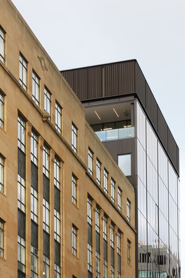
Next, RJH wanted to add some height. “Once you get above the building in front, you have some pretty spectacular views of the inner harbour. The building in front is a category listed heritage building so the likelihood of it getting higher itself is very unlikely and it was actually refurbished several years before. So it was a pretty safe bet to add two occupied floors and a mechanical plant floor.”
Bearing in mind the earthquake strengthening, there was an issue.
“The existing structure couldn’t take much more weight, and the structural engineers were looking to keep it within certain parameters. So we used a Potius building system that uses mass timber, and laminated veneer lumber,” says Marc.
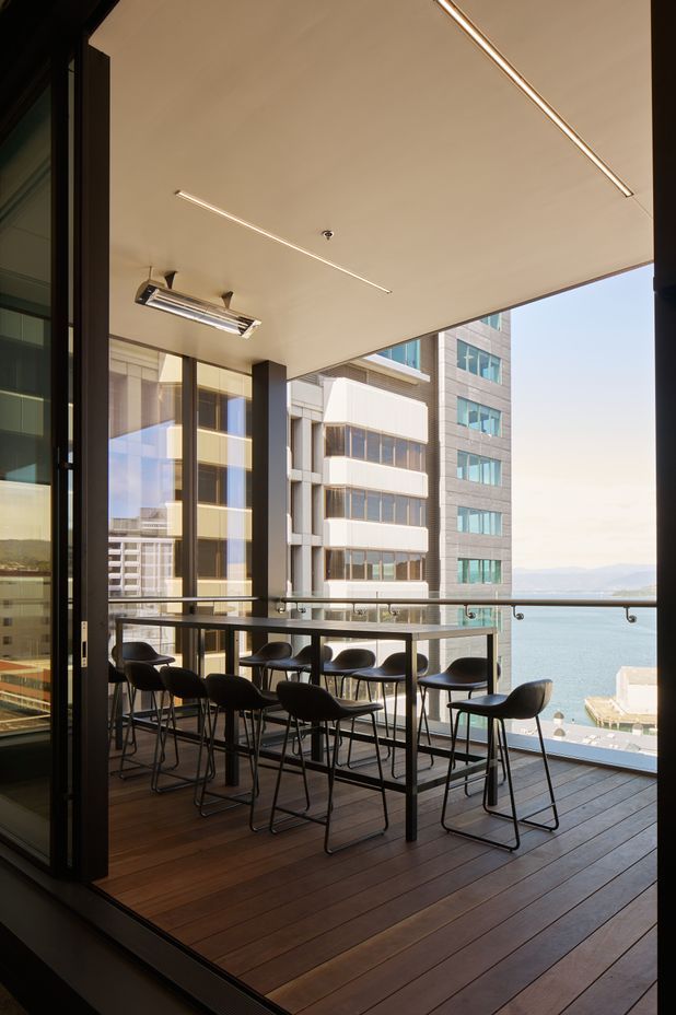
The new top floor features an open deck with views of the water. The original idea was to glaze the wall facing the harbour, says Marc, but to avoid fire rating issues on the boundary wall, openable doors were instead set further back and an open deck was created.
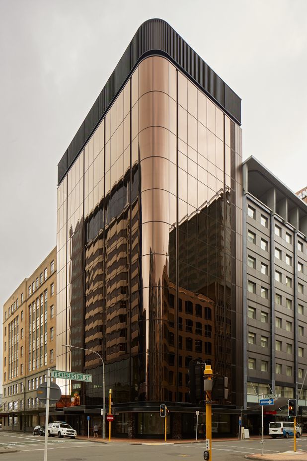
The addition of the top floors gave the building new elegant proportions, says Marc, which meant the design could be kept simple. “We didn't need to try too hard in articulating the facade of the building. There's a black negative in the facade, which aligns with the column grid inside and accentuates that verticality.”
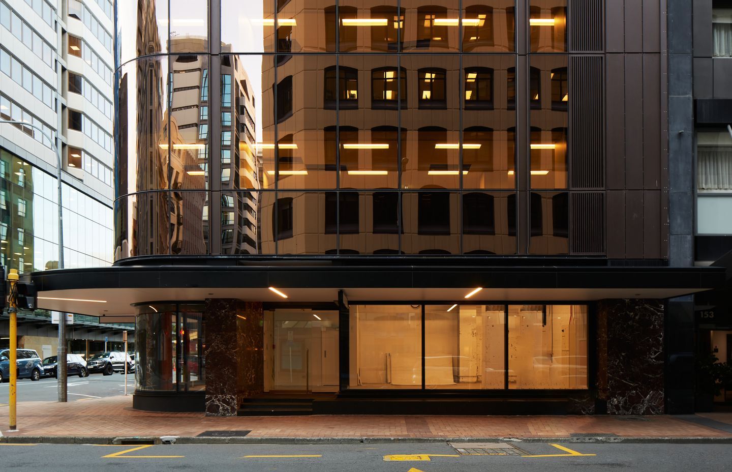
That facade is a curtain wall of bronze glass.
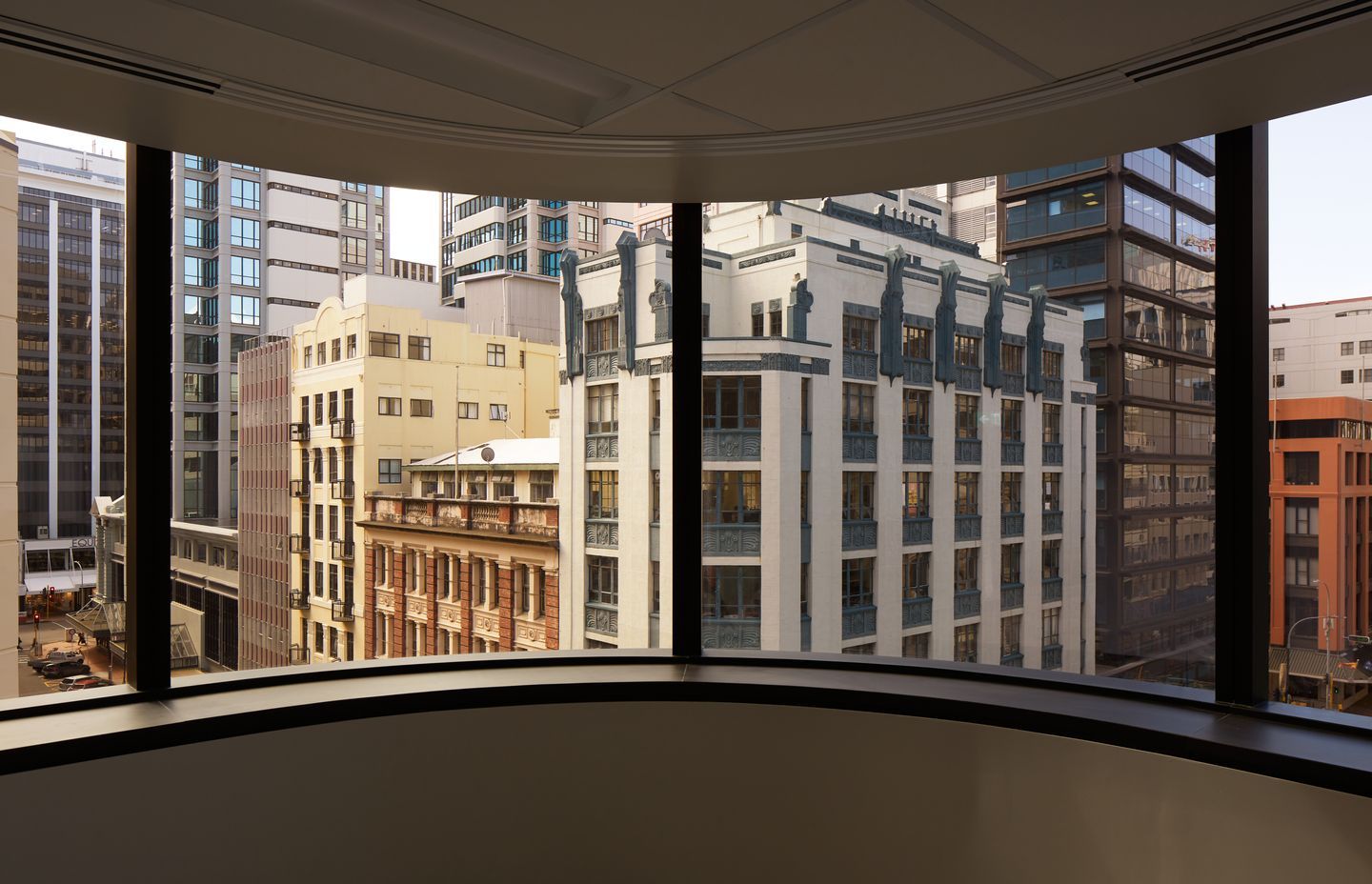
“I like to say it’s a modern twist on the 1980s bronze glass. It’s a bit darker, a bit deeper, and much more modern. The building has a curved corner on the street side so getting a bronze-tinted, double-glazed curved glass unit is pretty rare. There are only a couple of places in the world that manufacture that.”
There was a lot behind the choice of glass, says Marc. “One of the key criteria is its thermal performance. There are no external louvres or shading, that was a client preference, and office buildings tend to overheat. So the technical specifications needed to consider solar gain. That was the most fundamental thing, and then it was about the tint. We didn’t want it to be a standard blue or green glazed building, we wanted to change it up a bit.”
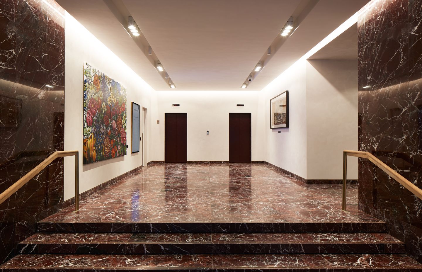
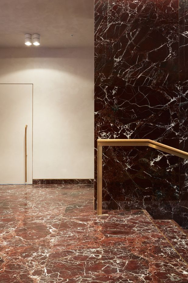
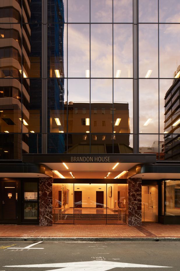
The design palette is deliberately pared back. Marc says RJH likes a relatively traditional look and feel in its buildings so the materials include timber, black joinery and brass, and a striking red stone.
“The client loves burgundy, so a lot of RJH buildings have burgundy in the lobbies,” says Marc. “So we thought we’d do it in stone. It’s a feature, it’s a little bit out there, and it suited the client. The palette of materials in the lobby is there to make that stone sing. The walls are a white Marmorino plaster finish with texture and a little sparkle. It was about trying to keep it as timeless as we could without complicating things.”
But Studio Pacific Architecture took the opportunity to push that traditional design.
“We had a pretty clear brief from the client: they know what they’re doing. As you’re presented with any project inevitably they have some sort of constraint, whether it’s preferences, budgets or time. Usually it’s a number of those things. I always think it’s those constraints that will get you the most creative output: dealing with them and coming up with something interesting. It’s always a challenge, but it’s a fun challenge.”
