Colour Through The Decades

It’s a known fact that our homes continue to evolve and change in many ways over the years. For example the way we utilise our space, the furniture styles and the choices of colours, textures and patterns are all trends.
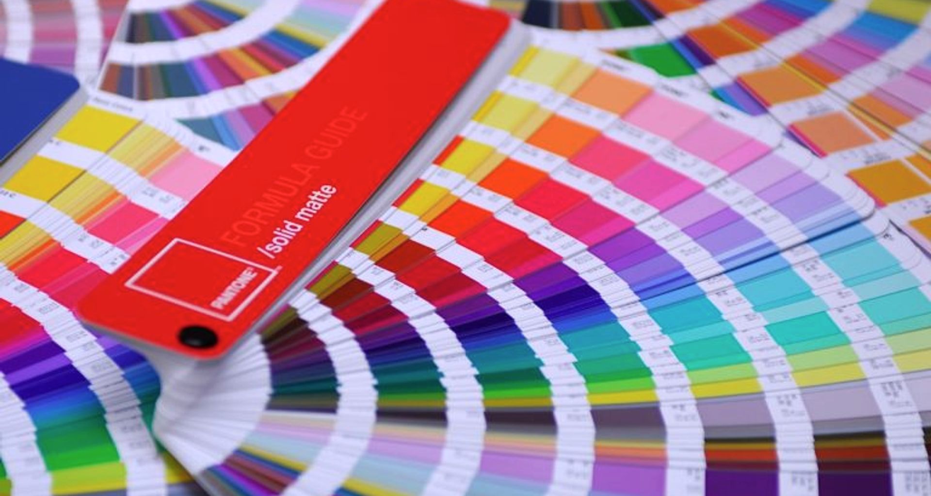
These trends are influenced by things such as fashion, music, technology and of course we can’t forget to mention, Pantone’s colour of the year.
Let’s take you back in time to have a look at how colour has changed over the years.
1920s
The 1920’s were all about luxury, elegance, happiness and adventure. The Art Deco era symbolised wealth and sophistication and influenced designers, architects and artists around the world. People experimented with new ways of dressing, dancing and travelling.
Art Deco colours are bold and contrasting. Bright rich yellows, cadmium red and ultramarine along with golds, silvers and black. Soft creams and beiges often used in bedrooms and living areas to complement the lacquered wood furniture of that period.
1940s
This decade saw decorating styles adopt a more sombre and sentimental palette with the outbreak of war in 1939 putting a stop to the glitz and glamour of the 1920s and 30s. The generation of the 1940s were grateful for what they had and their homes were smaller, practical and clutter free.
Primary colours were used along side muted military hues of olives, greens and browns. Charcoal, greys and white were also common and reflected the sombre mood of this era.

1950s
From rationing and recovery to optimism and prosperity. Postwar, 1950s homes were filled with happiness. Open-plan living and fitted kitchens were hugely popular.
Families had money to fill their homes with lots of furniture and colour became a huge focus of this period. Did you know that you could even buy coloured toilet paper during the 1950s!
There were three major colour trends during the 1950s. These were; Pastel, Modern and Scandinavian.
Ice cream shades of bubble-gum pink, baby blue, pale yellow and mint green were hugely popular pastel hues.
Primary colours of electric blue, reds and vibrant yellows were used with black and white to achieve contrast and bright ‘Mid-Century Modern’ colour schemes.
The Scandinavian influence saw colour palettes of browns, cream, greys and greens.
1960s
It’s safe to say that the 1960s didn’t really have ‘a colour’! The swinging 60s was the age of peace, love and psychedelic palettes. It was all about creating maximum impact with clashing colours and large bright prints and bold furniture.
Popular colours of the decade were tangerine orange and fuchsia pink used side-by-side and mixed with contrasting black and white. Other colours widely associated with this era were blue, purple, avocado green, dessert yellow and burnt sienna red. These colours exploded onto everything, from fashion and accessories to walls and furnishings.
1962 was the year that Pantone was founded.
1970s
From the vibrant happy colours of the 60s, the colour palette swung a 180 to sullen, earthy tones in the 1970s. The design industry took time to reflect on nature and current environmental concerns. Because of this, graphics and prints became bolder but colours more muted and mellow.
Now the dominant colours seen in every home became mustards, rust brown, burnt orange, earthy greens and beige. People were looking for a more natural aesthetic in order to connect more with nature.
The 1970s was the decade of the avocado bathroom!
1980s
The 1980s was the era of contrast!
Gone were the muddy earthy tones of the 1970s and in came extreme fluorescent neons and subtle, soft pastels.

Electric and bright colours were back on trend and it wasn’t uncommon to mix colours that shouldn’t be mixed.
Geometric patterns were hugely popular, as were mint green, flamingo pink, dusty rose and Caribbean blue.
Every colour had its neon counterpart. Going over the top with interiors and having ‘no rules’ was big during the 80s.
1990s
After the bold colours of the 80s, the 90s saw a more paired back and simple colour palette with softer and more muted tones. Earthier colours were back! Tans, forest green, midnight blue, muted greys, ivory and light beige were all popular colours for rooms around the home.
Furniture and décor were paired back in order to create a more subtle and soothing environment. Black and white started to appear on wallpaper and hints of burgundy and mauve were used as accents.
2000s
The era of the indoor/outdoor lifestyle was born in the 2000s, with the creation of luxurious outdoor living spaces blending into relaxing, stylish indoor areas. A more casual approach to everyday living was illustrated.
Warm neutral tones were popular with teals, eggplant, charcoal, black and other moody colours edging their way into peoples homes.
Hundreds of subtle variations of greys, beige, taupe, whites and even metallic hues provided neutral but expressive colours to continue with the minimalist movement.
Stainless steel appliances were big during this era and the year 2000 saw the release of the very first Pantone Colour Of The Year.
2010s
A decade where technology is king, we have become multicultural and interconnected and have access to trends and inspiration instantly. Keeping things neutral but adding individuality with key items of furniture or artwork.
Earthy hues mixed with greens and blues being on trend, with interiors featuring rustic wood finishes, stone surfaces, polished copper and brass accents with off whites and subtle tones.
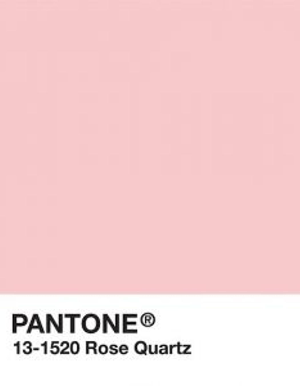
And, of course, who could forget ‘Millennial Pink’?! The most iconic colour of the decade.

And there you have it…
There isn’t much you can do to avoid colour trends! And like anything in history, don’t be surprised if many of these palettes make a comeback in future years.
Just remember that colour is a personal choice. While trends are great to follow there isn’t much point having a tangerine coloured feature wall if it doesn’t have a positive effect on you or your lifestyle.
