Commercial interior design ideas made for people
Written by
23 January 2024
•
5 min read

Elevating workspaces with innovative design, Made For is dedicated to creating exceptional spaces that are aesthetically pleasing and designed with a purpose — spaces made for people.
In this article, ArchiPro explores two of their standout projects from concept to creation: M&C Saatchi office and L1 Capital.
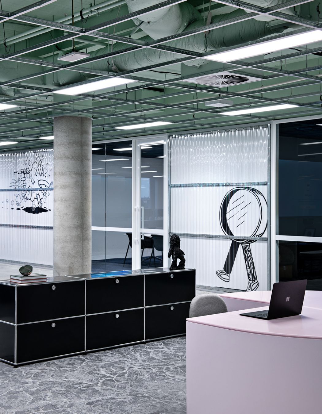
M&C Saatchi: a spatial extension of creativity
Behind the idea
M&C Saatchi, a global leader in the creative advertising industry, presented Made For with an open-ended brief for the transformation of their corporate space. Made For interior designer Sean McKee focused on creating a space that fosters connection while embodying a forward-thinking atmosphere.
“Connection in the space was paramount, something ahead of the curb. In turn, our job was to work out how to turn these ideas into a workplace that felt like a spatial and experiential extension of their brand,” says McKee.

Challenges and solutions
The initial challenge was crafting a strong and articulate return brief. Spatially, the challenge was harnessing natural light to fill the entire space seamlessly. The solution involved a borderless design, allowing light to flow freely without hindrance from full-height walls.
“The solution was a final design that felt boundary-less, allowing the light to sprawl through the floor without any full-height walls hindering its movement,” says McKee.
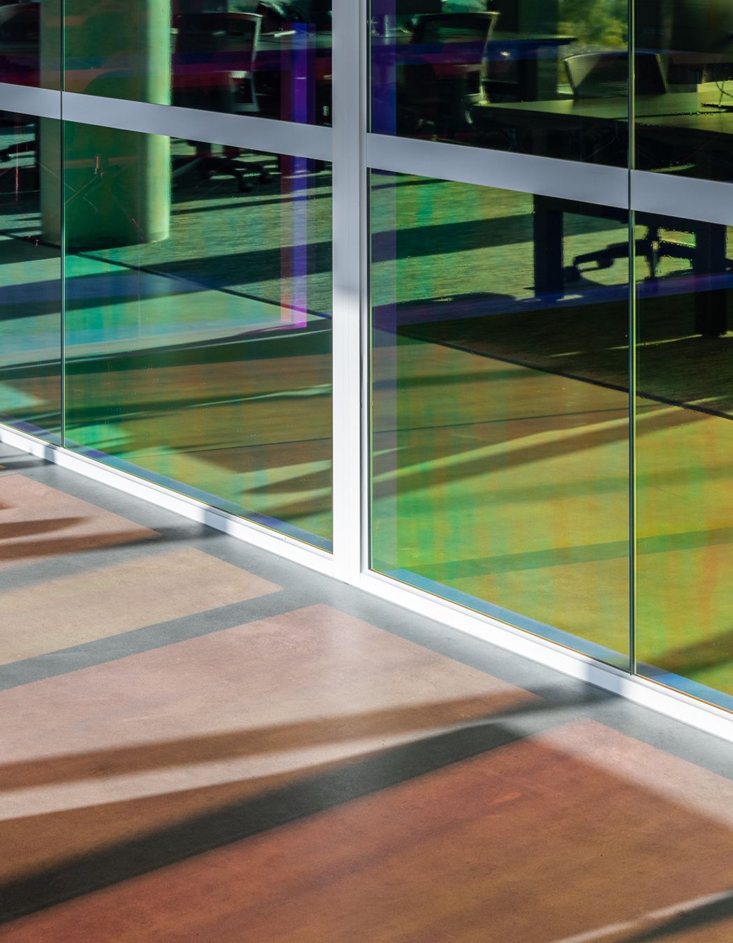
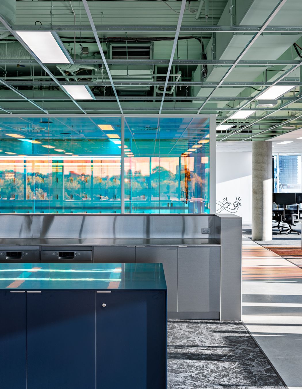
“The diachronic film on the boardroom offered privacy while maintaining an open feel, leveraging natural light. Woven vinyl flooring added a tech-leaning yet soft quality, and stainless-steel details contributed to the futuristic ambience,” McKee adds.
The result
The design results in a space that feels cohesive, light and connected. The design transcends traditional boundaries, creating an immersive experience that aligns with the M&C Saatchi brand's ethos.
“Walking through, everything is visible. It’s one organic space that’s still driven by a clear grid. The final design feels light, open and freeing. It exists almost without boundaries, connected through geometry, materiality and abundant natural light,” says McKee.
“You feel immersed in the space as you walk through it – like you’re now part of something that is a living entity.”
Project awards/nominations:
- Shortlisted for IDEA Workplace under 1000sqm

L1 Capital: balancing high-performance with homely comfort
Behind the idea
Led by interior designers Maddi Stevenson and Kaitlyn Poole, L1 Capital, a fast-paced business with a high-performance culture, tasked Made For with designing an office that seamlessly integrates efficiency and a welcoming atmosphere. The challenge included accommodating business growth while avoiding a cold, empty corporate feel.
“The brief for this project was to create an environment where it was as easy, seamless, and efficient as possible for employees to work through their day,” says Stevenson.

Challenges and solutions
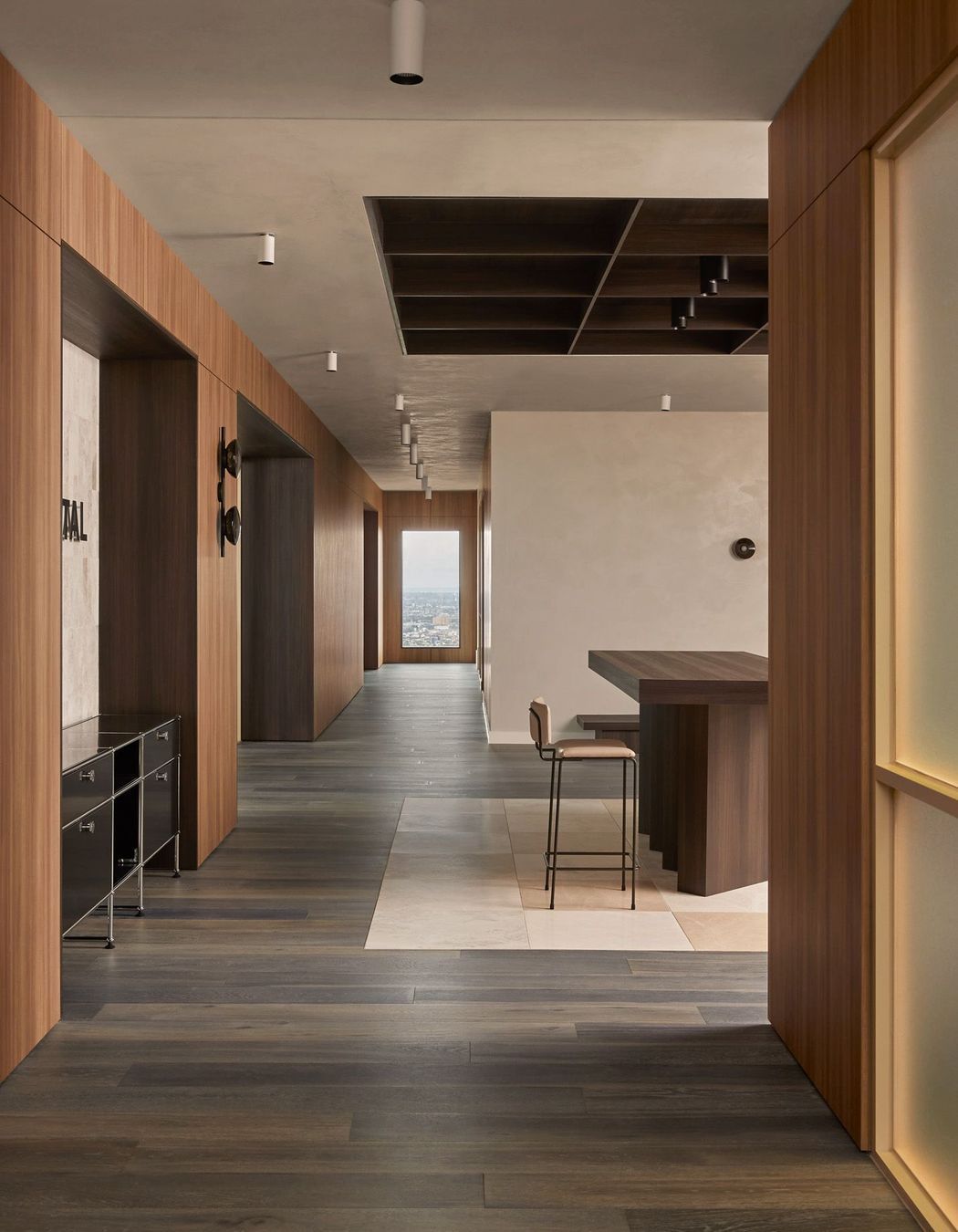
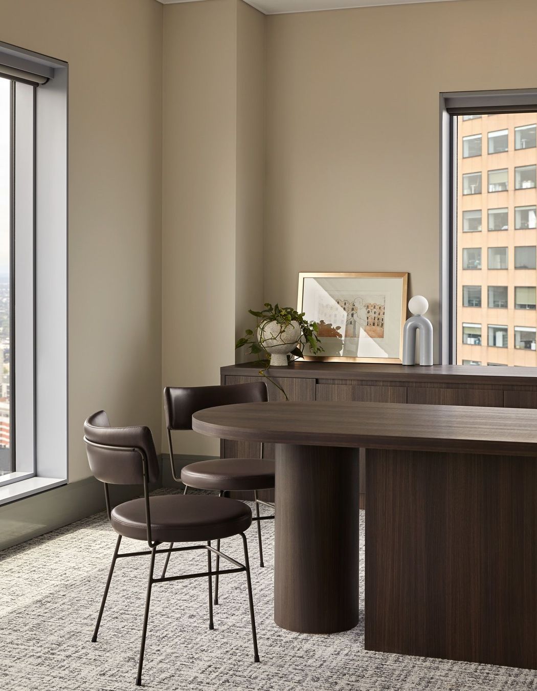
The design team sourced warm materials in muted tones to establish an inviting space, preventing it from feeling empty.
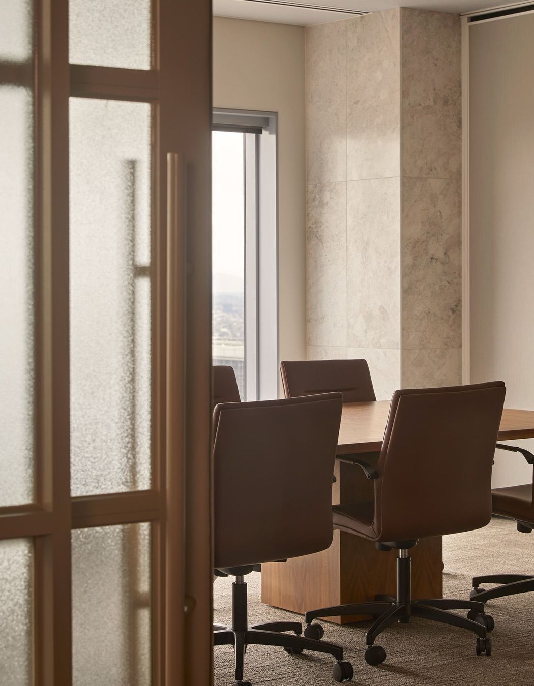
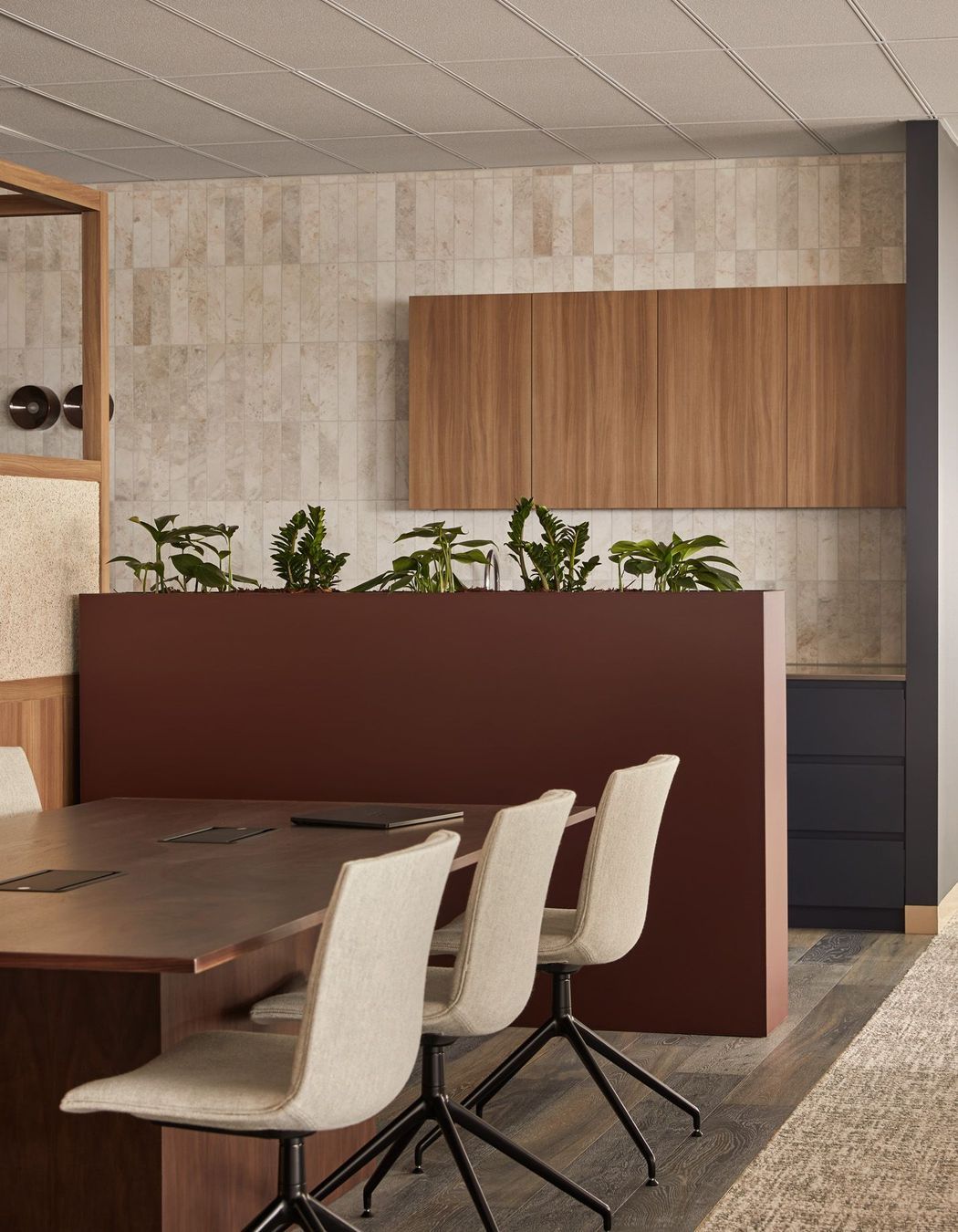
“To combat the empty spaces, we looked to materiality. We zeroed in on warm, homely materials – Navurban natural timber veneer, marble stone, muted tones and delicate patterns. These aided in creating a sense of warmth and comfort in the space,” says Poole.
“This worked two-fold, as we also wanted to achieve a homelike feel in the back of house, encouraging the breakout spaces to feel relaxing and leisurely.”
Poole continues, “We worked closely with InStyle to develop a prototype acoustic ceiling inset, which hadn’t been used before in the market for a breakout space. This solution provided premium elevated acoustics without adding weight to the space and helped achieve a calming, residential feel.”

The result
Walking through L1 Capital, the space exudes that residential feel while maintaining a strong architectural presence. The strategic use of timber, stone, and unique breakout spaces create a comfortable and calming environment for both staff and clients.
“We leveraged the materiality to make the corporate space feel warm and homely – for long days at the office. We wanted this space to feel comfortable and calming,” says Stevenson.
Upon entering the office, there is a table with custom joinery seating where a reception desk would usually stand. The endless use of timber panelling, flooring, stone insets and broadloom carpet contributes to the final corporate-meets-residential design.
“Simultaneously, the space is still architectural. A sense of strength is felt throughout; the views down the corridors with framed portals contribute to this sense of robustness and energy you feel walking through,” says Poole.
Project awards/Nominations:
- Shortlisted for AIDA 2023 - Workplace
- Master Builders Excellence in Construction – Fit-out Under $5M
- Shortlisted for IDEA Workplace over 1000sqm.

Made For continues to push the boundaries of design, creating spaces that meet the practical needs of their clients and the comfort of the users while embodying a brand's essence.
The M&C Saatchi and L1 Capital projects showcase the studio's ability to turn conceptual commercial interior design ideas into tangible, innovative, and award-worthy designs, making Made For one to watch in the design and architecture industry.
View more Made For projects on ArchiPro.
