Design influences abound in an architect’s own home
Written by
30 August 2022
•
5 min read
Architects love a new project – especially if it’s for themselves. It’s an opportunity to get a little experimental.
Clive Chapman of Pacific Environments Architects and his family bought a run-down 1940s house on a large section in Auckland’s Ponsonby in 2007. Having just renovated a Grey Lynn villa, Clive was looking for a new challenge and his wife was drawn to the large backyard, reminiscent of her Coromandel childhood. “We always intended to do a major renovation on it,” says Clive. “But being an architect, it took until 2013 to fully complete the design then another seven years to get it built.”
“Because we were interested in the sustainable aspects of it, the initial idea was to extend underneath the existing house, and then to modify and alter the upper storey. So it was all designed with that in mind. However we couldn't make it work. There was no room on site to work around the existing house. So in the end, the same design was built from scratch.”
The old house couldn’t be saved. “We explored trying to get it off site, so somebody could reuse it, but although we've got a wide street it had too many chicanes on it and the house moving company could not get it out of the street.”
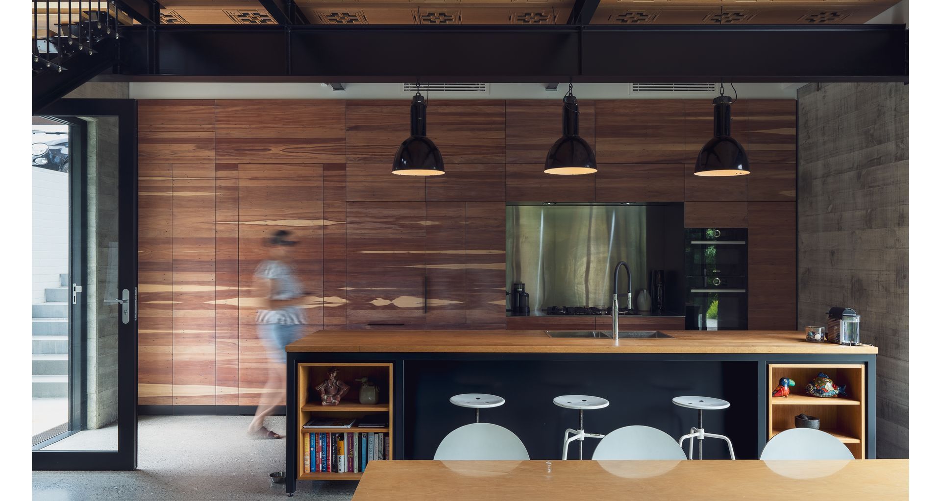
As much was salvaged as possible, says Clive. “We removed timber beams and all of the flooring was uplifted. We set up the new steelwork so that we could use the existing joists from the house. We sold all the doors, we stripped all the lights and switches, gave away the insulation we had put in, recycled the roofing, and saved the matai flooring. The matai flooring was split and match-grained to create the wall of cupboards within the kitchen and a number of furniture items for the new house. It’s something you really need to think about, you try not to just put a bulldozer through it.”
A pair of artists had lived in the original house, says Clive. “The land was a piece of property owned by the Department of Education that became surplus to their requirements. They ran a lottery for anyone who worked for them to put in a request to bid on it.”
The artist couple, who worked in education, won the bid, and they lived on the property for the rest of their lives.
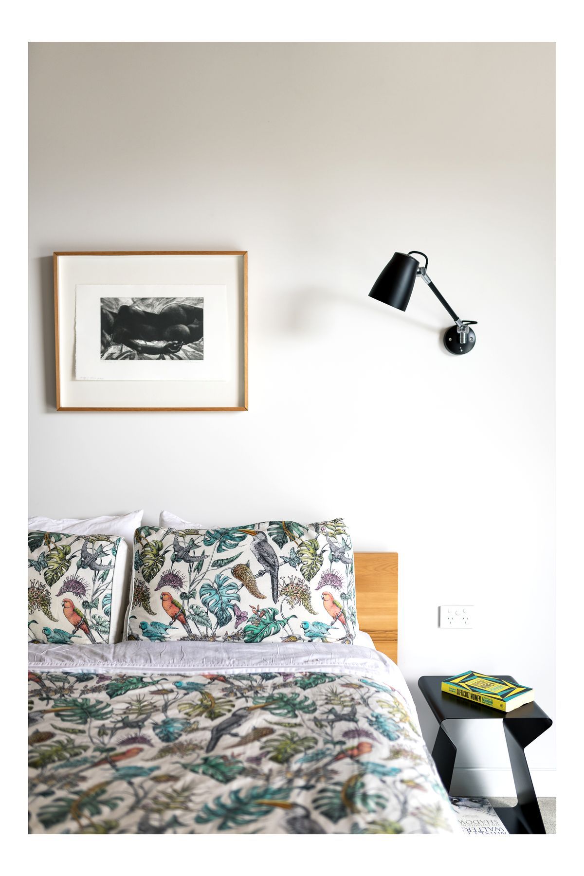
“The nice thing is that about two years ago, that family had an estate sale of a lot of their artwork. So we purchased pieces by both the husband and the wife to hang in our house.”
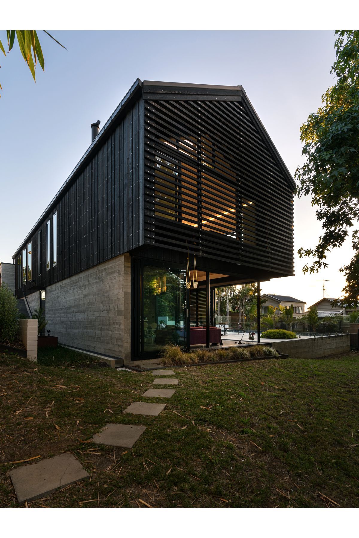
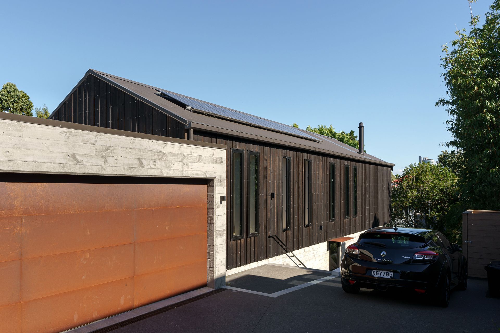
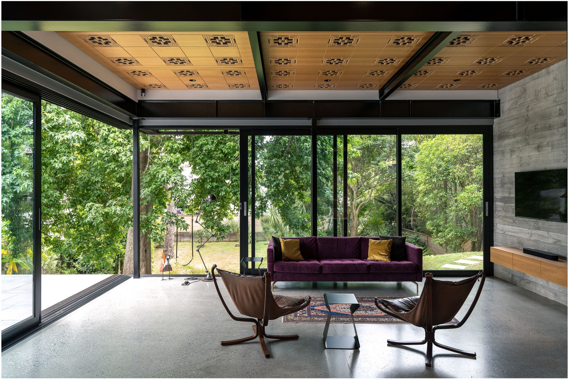
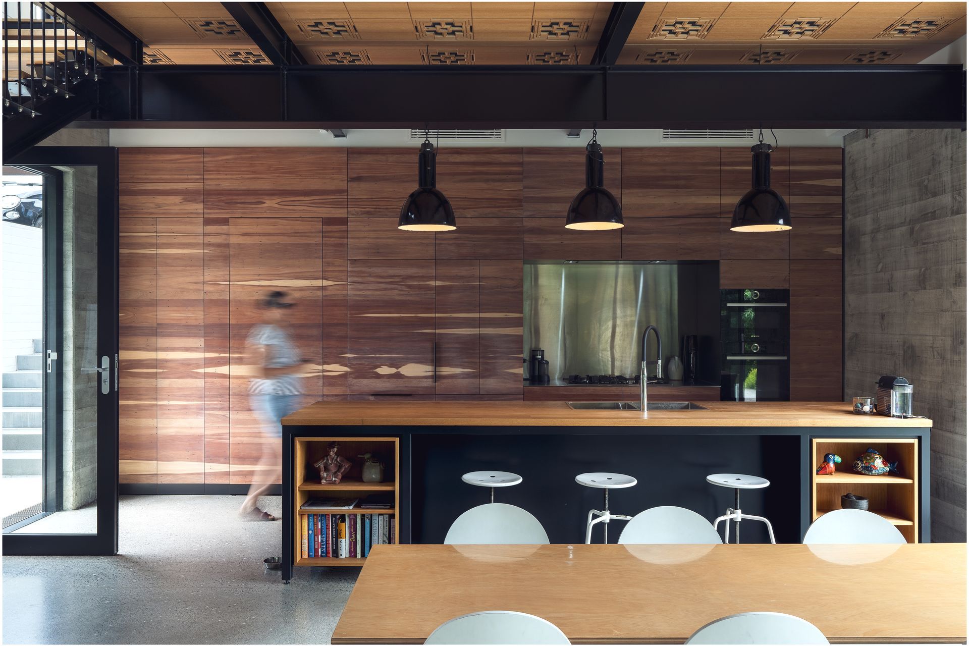
That history is just one of the aspects of the new house.
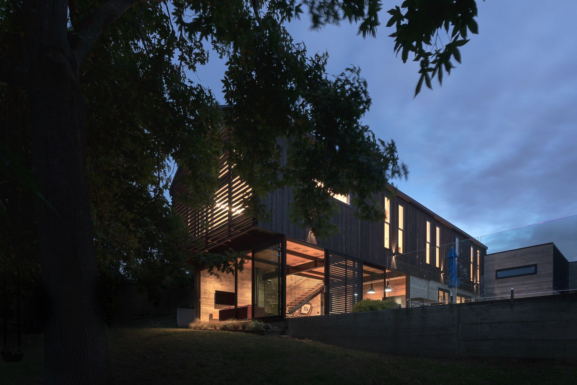
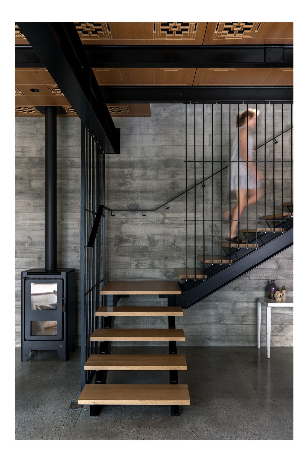
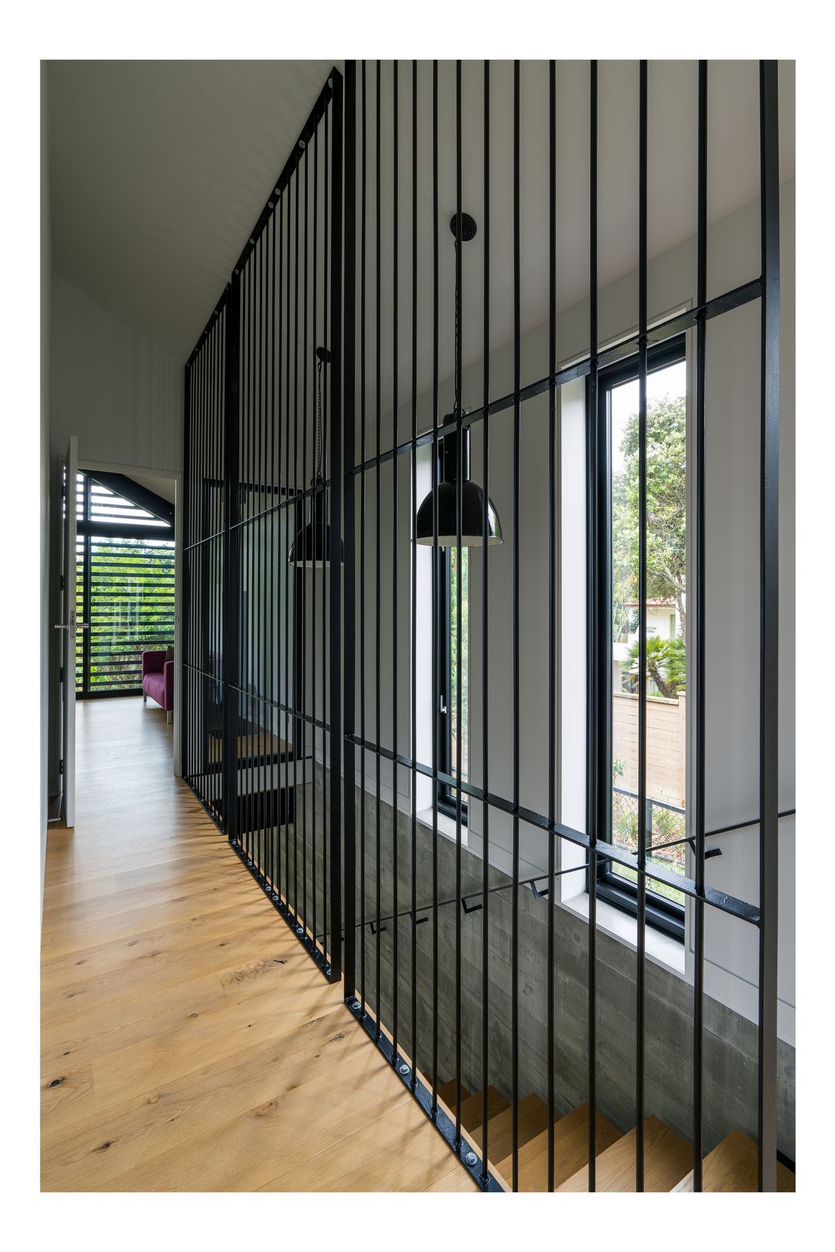
“Originally the back sections in Ponsonby were commercial. There used to be a car repair yard next door, for example. So we looked at an industrial shed feel. I do like a hard edge to my residential architecture because, to me, exposing the elements is important. I don’t want lots of layers of finish. I find an industrial shed is elegant in its own right, it is there for a purpose and all the materials were chosen because they worked for its needs. Everything here serves a function, it's not just there for decoration.”
There are other influences on the design too.
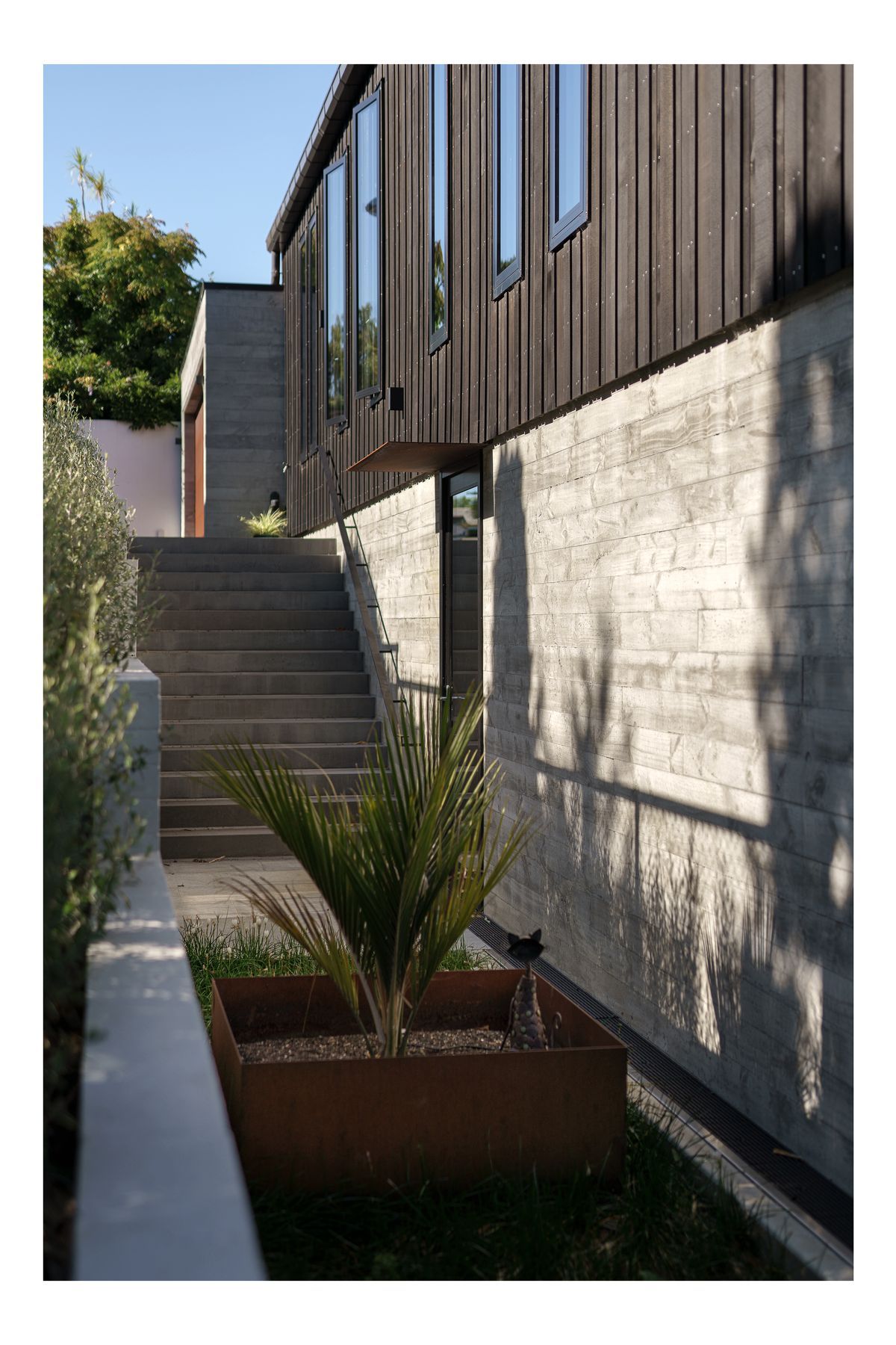
“There are certain styles of architecture that I really appreciate and have influenced me. One of them is the Case Study Houses from the mid 1940s to mid 1960s In California, they were all about floating planes, large glazing, and indoor-outdoor flow. I also love the block houses that Frank Lloyd Wright did and his use of concrete as both an exposed structure and decorative finish for the building. The whole of the downstairs area is exposed poured in-situ concrete. There's a real texture to it, and people who come in will rub their hands down the wall because it's so rough and tactile.”
The considered use of materials runs through both interior and exterior.
“The ceilings in the living area and in our bedroom are made of ply panels that we’ve had routed in a custom pattern. Parts of the pattern penetrate through the panels to create an acoustic ceiling. All the other surfaces within the building are hard and without that acoustic relief it would be very noisy. It is taking the way we would view the problem on a big commercial building and applying it to a residential building. It makes the ceiling work functionally while at the same time making it quite beautiful. The pattern pays homage to one of the blocks from a particular Frank Lloyd Wright house.”
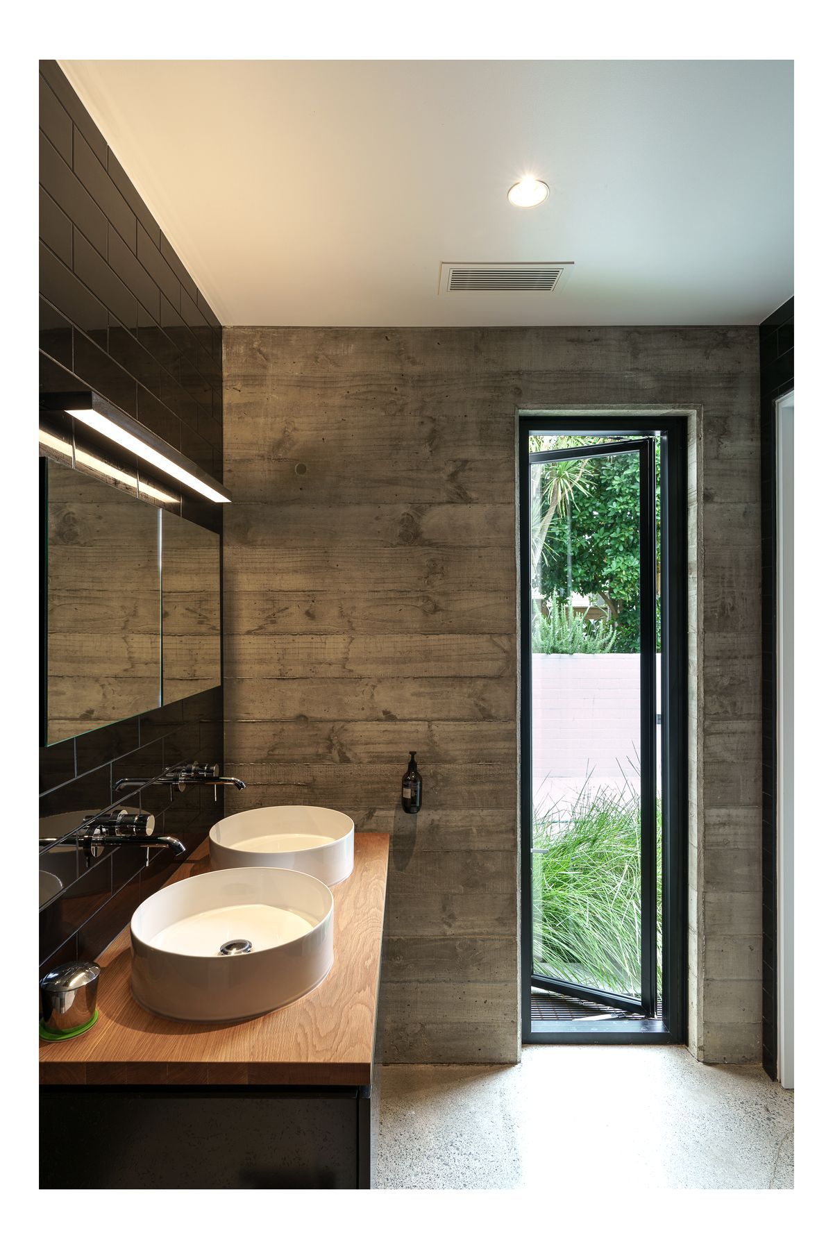
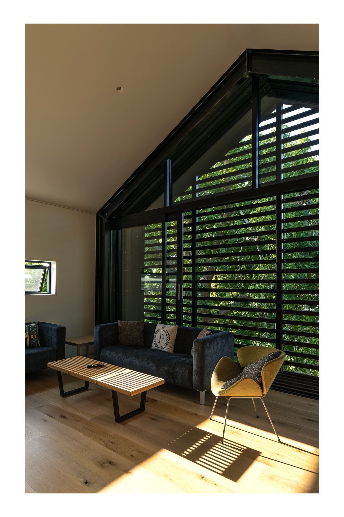
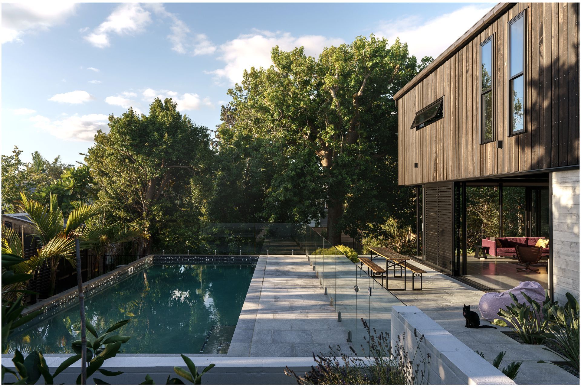
The trees and large backyard were also considered in relation to the house. Some of the older trees were becoming unsafe but a mature liquidambar provides welcome shade in summer and an outlook from upstairs. “It makes you feel like you're in the trees, which is really quite pleasant, and it gives you that privacy you wouldn't otherwise have. We wouldn’t have wanted the house to encroach any further on that.”
Existing avocado and lemon trees inspired more planting. “We’ve got banana trees, we’ve got apple, pear, and mandarin. I grew up in Canada, so I was fascinated by the idea of growing bananas in your backyard.”
After taking the design and build process slowly, the family is enjoying the house even though the couple’s children have grown a lot in that time.
“We do a lot of entertaining, and we have a lot of family overseas so we expect people to come for months at a time. Indoor-outdoor flow was something we find really important, and our living area is a truly flexible space. It’s a really nice house to live in, it’s so easy. The spaces are welcoming and the materials rugged so you don’t have to worry about them. We designed it around us and our lifestyle.”
