8 Light Houses – capturing the New Zealand sun
Written by
17 March 2020
•
9 min read

The magic of light
To transform sunlight into a magical spatial experience is a major goal of good architecture, yet the strength of the intense New Zealand sun presents many challenges when designing architecture in this country. How do you make the most of the views while protecting the interior from glare and overheating? How do architects create magical spatial experiences with sunlight?
Talk with any New Zealand architect and they'll explain that understanding the manipulation of sunlight is essential when designing a great home. Walk into a home that has been cleverly designed utilising light and a certain kind of magic happens. It's hard to explain but you immediately feel it – the atmosphere, mood, drama and movement that's created in spaces where light touches surfaces in interesting ways, and seeps through gaps and openings.
Light has been utilised by humans in architecture for thousands of years, but, it was during the Renaissance period when light really manifested throughout art and architecture, and there were two distinct responses, suggests architect Tom Rowe from Rowe Baetens Architects. “While at architecture school, I had a professor who explained that the Florentine school was interested in ‘line’, due to the harshness of their sunlight and shadow, and, correspondingly, they became adept and fascinated with sculpture and strong gutsy line drawings. He explained that the Venetian school, by contrast, was more interested in ‘tone’ due to the misty atmospheres of Venice and became experts in painting, glass and fabric design.”
“Here in New Zealand, I would describe our light as characteristically diffuse, luminous and crystalline. Over summer, we do have extremely sharp and ‘Florentine’ moments at the zenith, with a real sense of clarity and purity, but this is probably the exception rather than the rule,” he says.
Indeed, the New Zealand sun is much like you’ll find in the Mediterranean but even stronger, with less ozone and less pollution to block the UV rays, and Earth’s orbit takes the southern hemisphere closer to the sun during the southern summer than during the northern summer. As a result, the New Zealand sun can be fierce and, on average, the country receives around 2,000 hours of sunshine each year, with Blenheim and Nelson enjoying closer to 2,500 hours, and with the amount of sunshine hours currently increasing by two hours every year on average, compared to the previous year.
Designing for unique light conditions
When designing buildings, traditionally, architects have typically taken a cardboard model and a sketch book to the site to spend hours working out the design, including looking at the way the sunlight moves around the property at different times of the day to aid with mapping out the form, the arrangement of rooms and windows, and so on.
"Architects design for the environment, often to maximise sun in the winter and to maximise shade in the summer,” says Tom. “Typically, this involves planning deep eaves interlinked with courtyards, light shafts and skylights,” he says. “We also research materiality, investigating the effects of light onto surface texture and the substance of material. As an example, travertine marble or onyx have a luminosity beyond the surface that creates a sense of resonance and a subtle glow.”
Today, many architects still spend time analysing the site conditions but, with time pressures and the latest computer modelling software that uses GPS, climate data and architectural drawings, they can often quickly create virtual models to show them how the light might navigate a design, although there are still some limitations in terms of cost and scale.
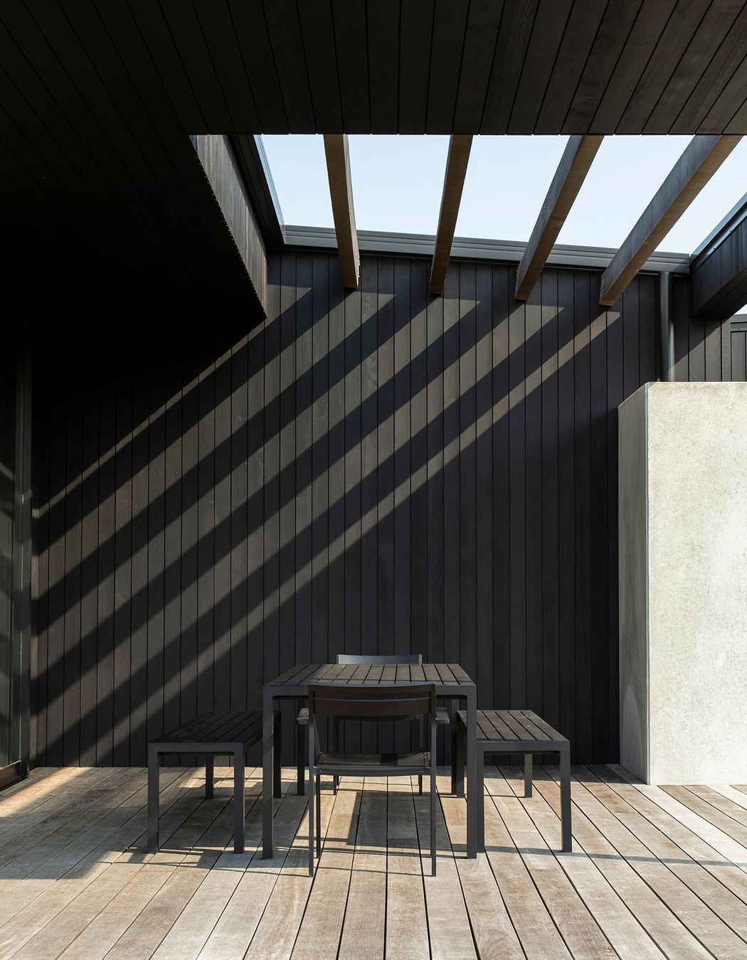
Designing light-filled houses by the way cats follow the sun
Hugh Tennent of Tennent Brown says, “The best architects discover how to use light to express space in distinct and specific ways. Controlling it carefully is the hardest thing but the results are worthwhile.” He describes the process as like thinking "about where cats want to be" because "those are the spots where you need to capture the sun."
In fact, cats actually know a thing or two because they follow the warmth of the sun to conserve their energy, in the same way that a good house design needs to retain light and warmth in the winter and protect itself from the sun to keep cool in the summer.
Here, we bring you eight light-filled homes from around the New Zealand. Each house responds to the unique light found in its location, whether it sits among mountains or pasture, beside rivers, lakes or ocean, or within an urban or suburban setting.
1. Karangahake House, Coromandel, by MAKE Architects
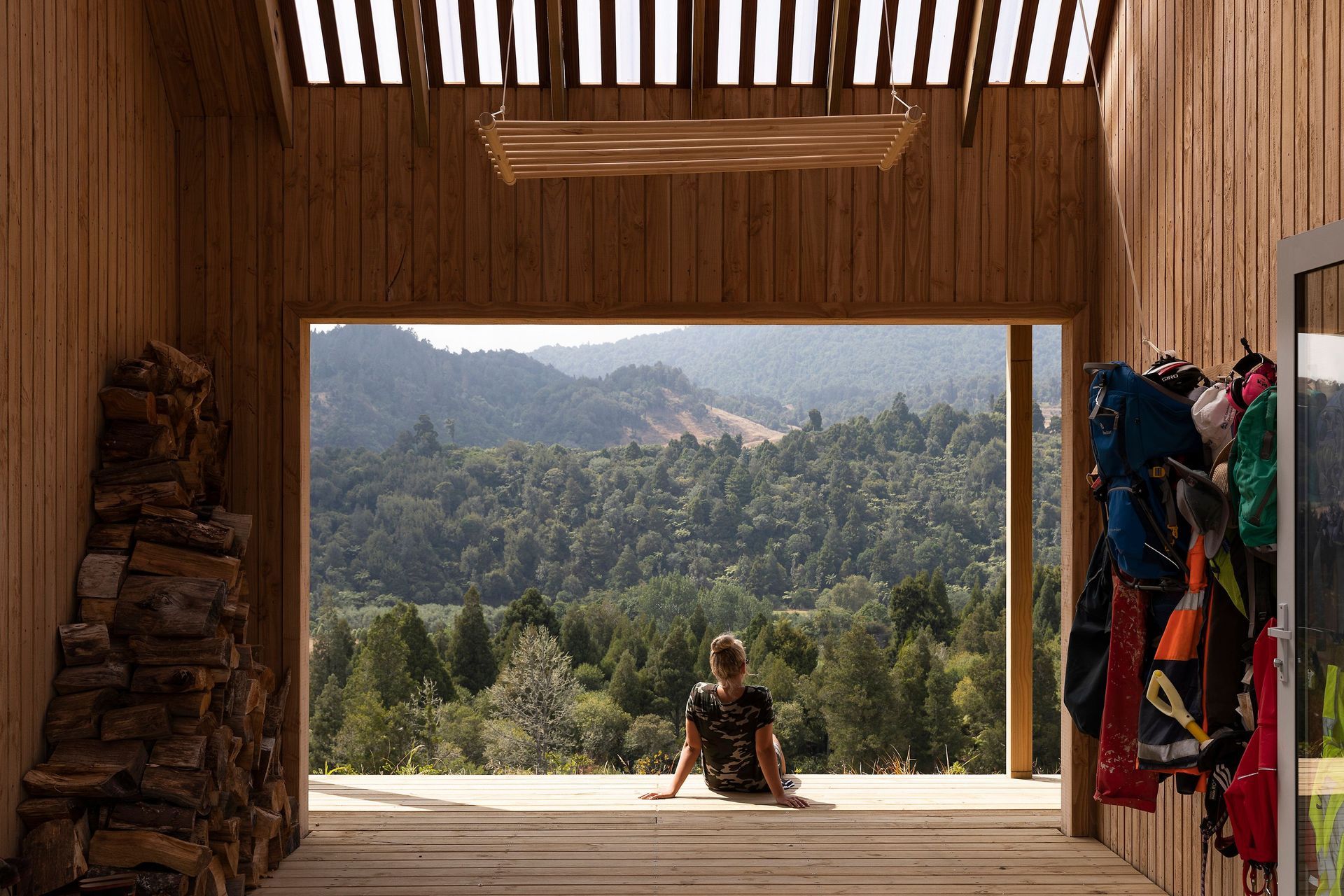
Situated within the Karangahake forests and the Kaimai Ranges, Karangahake House is a modest hilltop farmhouse with a cosy atmosphere reminiscent of classic Kiwi tramping huts. The timber-panelled outdoor room has large barn sliders on either side, opening up a protective intermediary space that connects the living spaces and welcomes in the surrounding forest. A section of roof above is covered with a semi-transparent polycarbonate that creates a lovely soft, filtered light into the space.
2. Riverside House, Christchurch, by Three Sixty Architecture
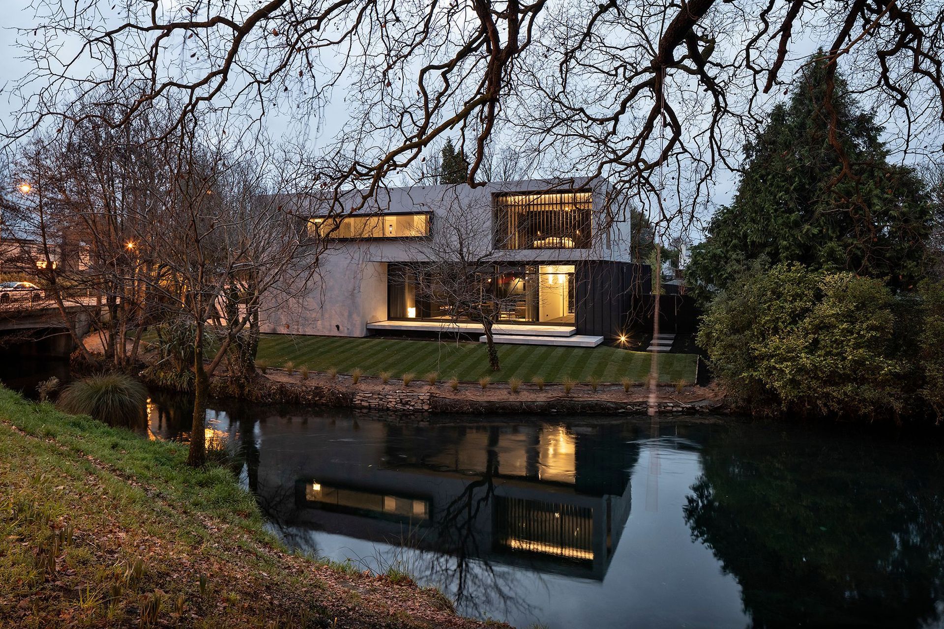
On a highly constrained site near Hagley Park, the challenge was to fit a large family home into a tight building envelope restrained by river setbacks and an existing footprint. Riverside House is a composition of interlinking stacked forms which, have been cut open to expose the interior spaces to the adjacent river and park views beyond with large sliding glass doors as well as drawing in light. The design creates privacy with screening devices – from dark vertical louvres to softer interior draping. Filtered light and shadow creates calm and ordered spaces, including the courtyard between the house and a separate garden pavilion containing a swimming pool, spa and change room.
3. Point Chevalier House, Auckland, by Context Architects
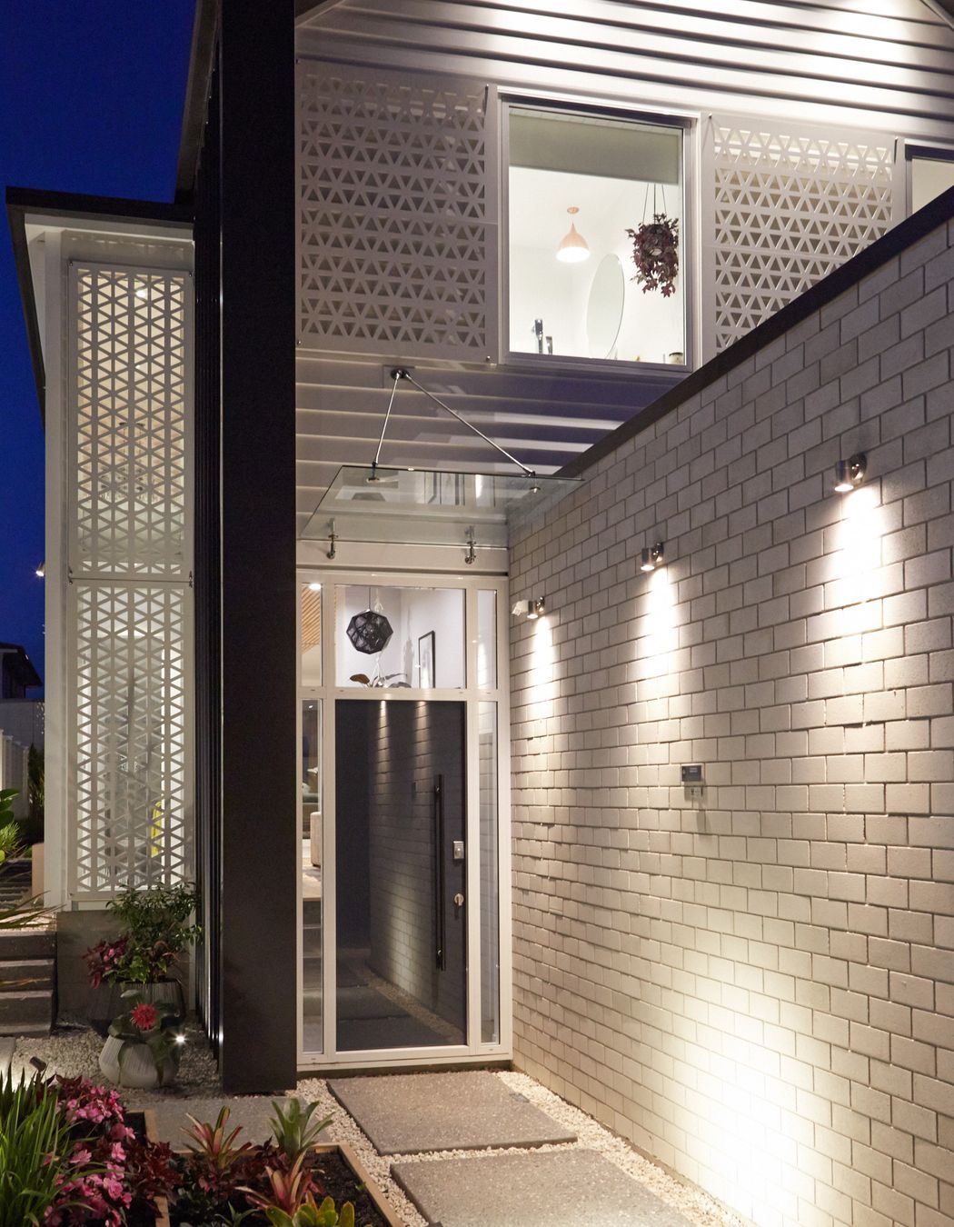
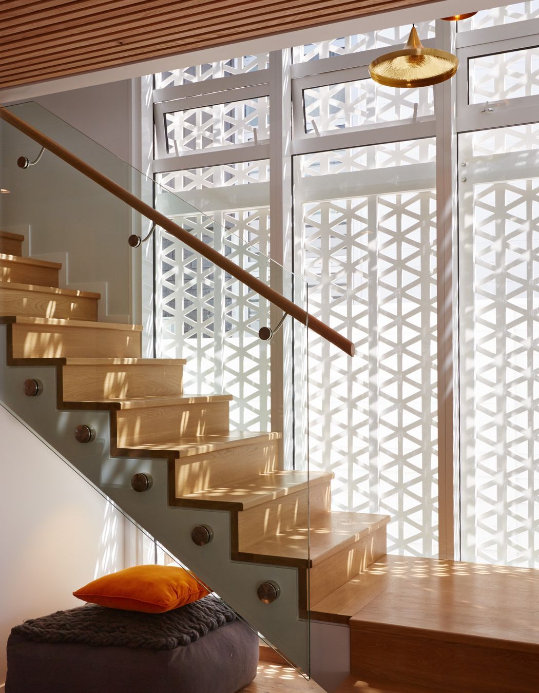
This modern, two-storeyed weatherboard home has an elegant gable form wrapped in charcoal-coloured metal cladding. Patterned screens have been positioned on key windows to provide privacy while also referencing the heritage of its neighbourhood. The design of Point Chevalier House captures views to Auckland city’s striking sky line and a bold street-facing silhouette, this home brings the local bungalow vernacular into the 21st century.
4. Vineyard House, Marlborough, by Arthouse Architects
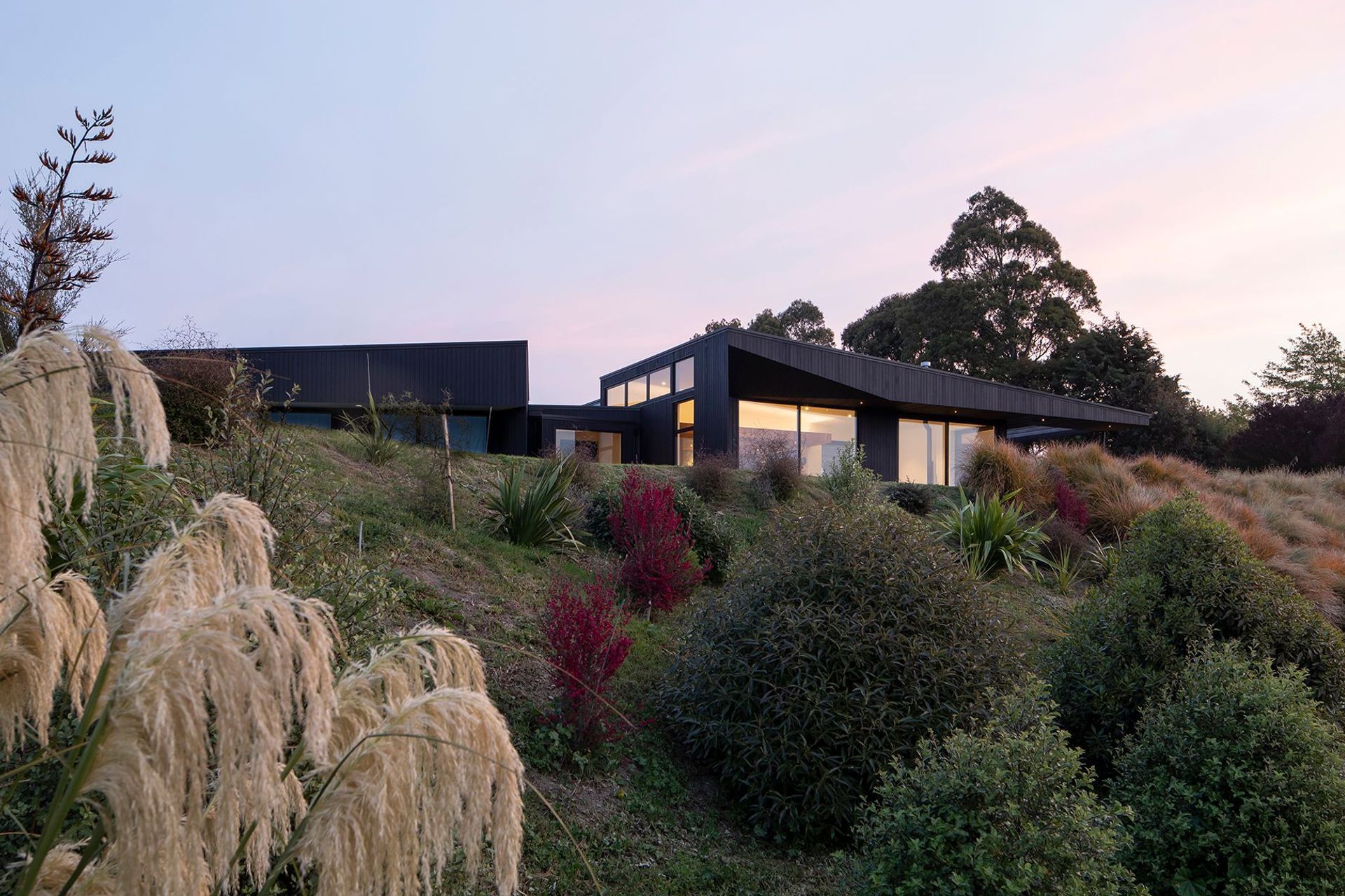
Vineyard House was designed for a growing family on the site of an old vineyard, taking in the endless rows of vines and the hills beyond as views. The bedroom end of this simple, sculptured form is cranked to face the morning sun, while the living area faces the afternoon sun and leads into a sheltered rear courtyard and separate reading/media room. A dynamic roof line is faceted, rising up to respond to the winter sun, while large eaves keep the sun from overheating the interior spaces during the summer. To the west, the large roof and a pergola offer solar control during the afternoons.
5. Northland Lake House, Northland, by RB Studio
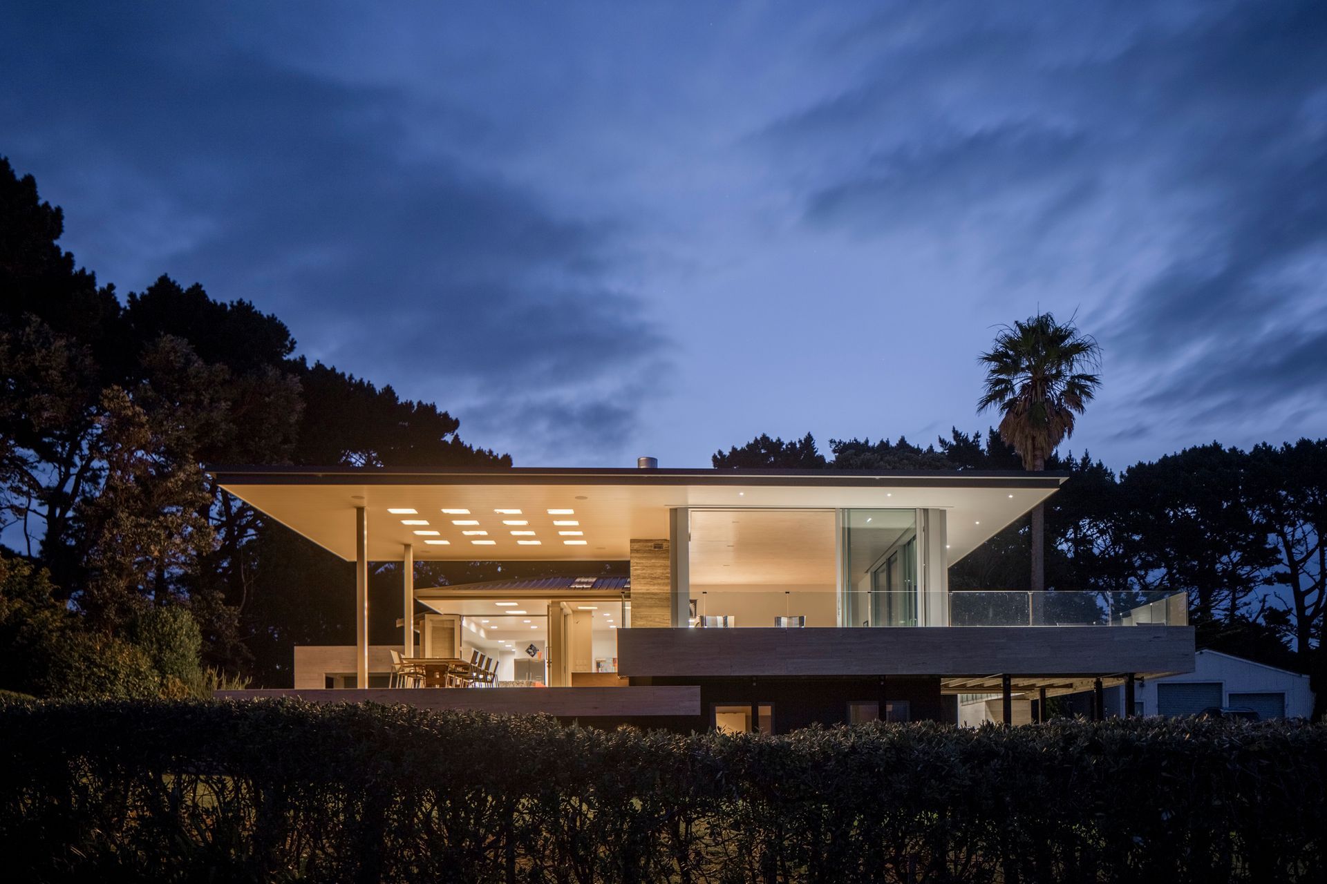
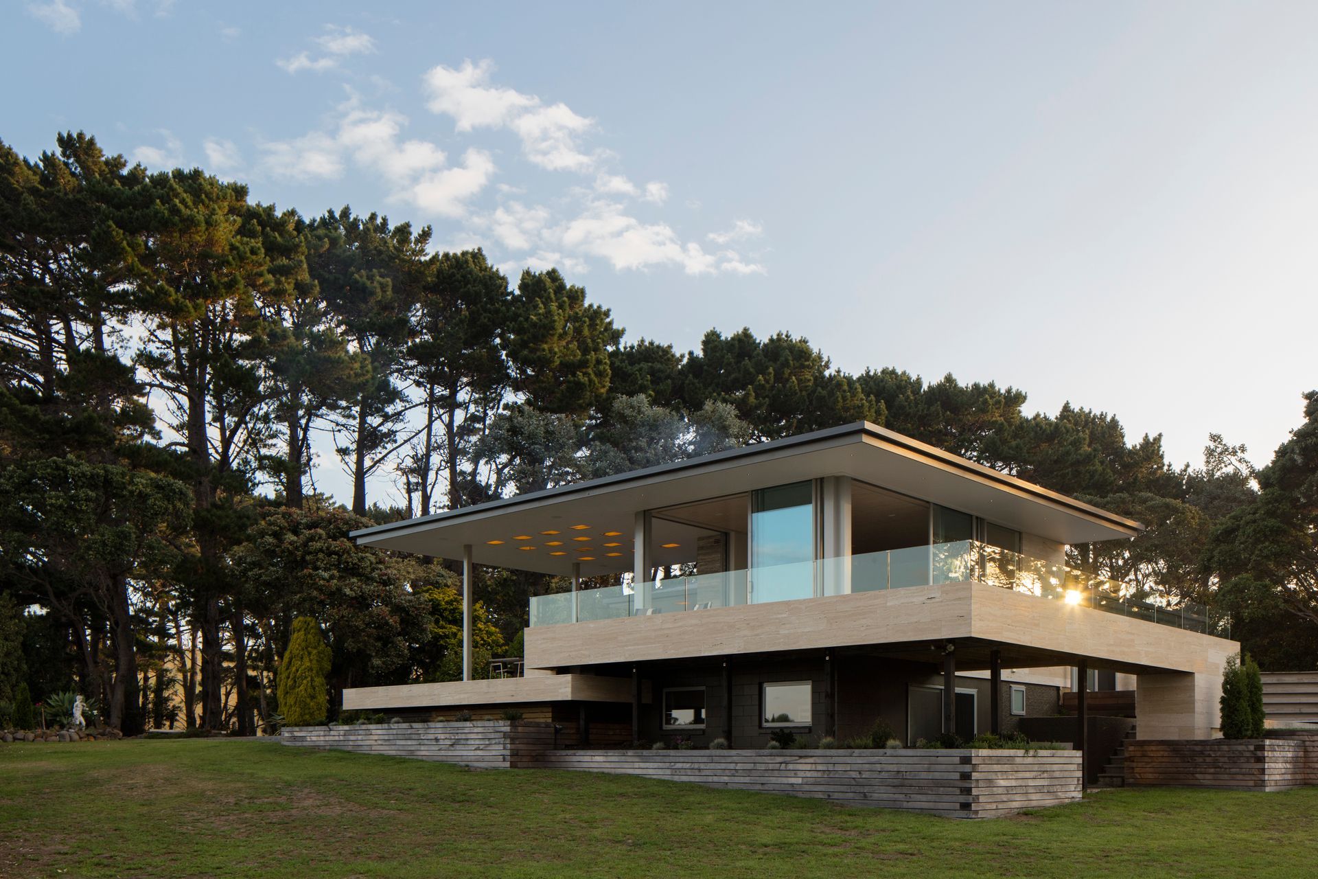
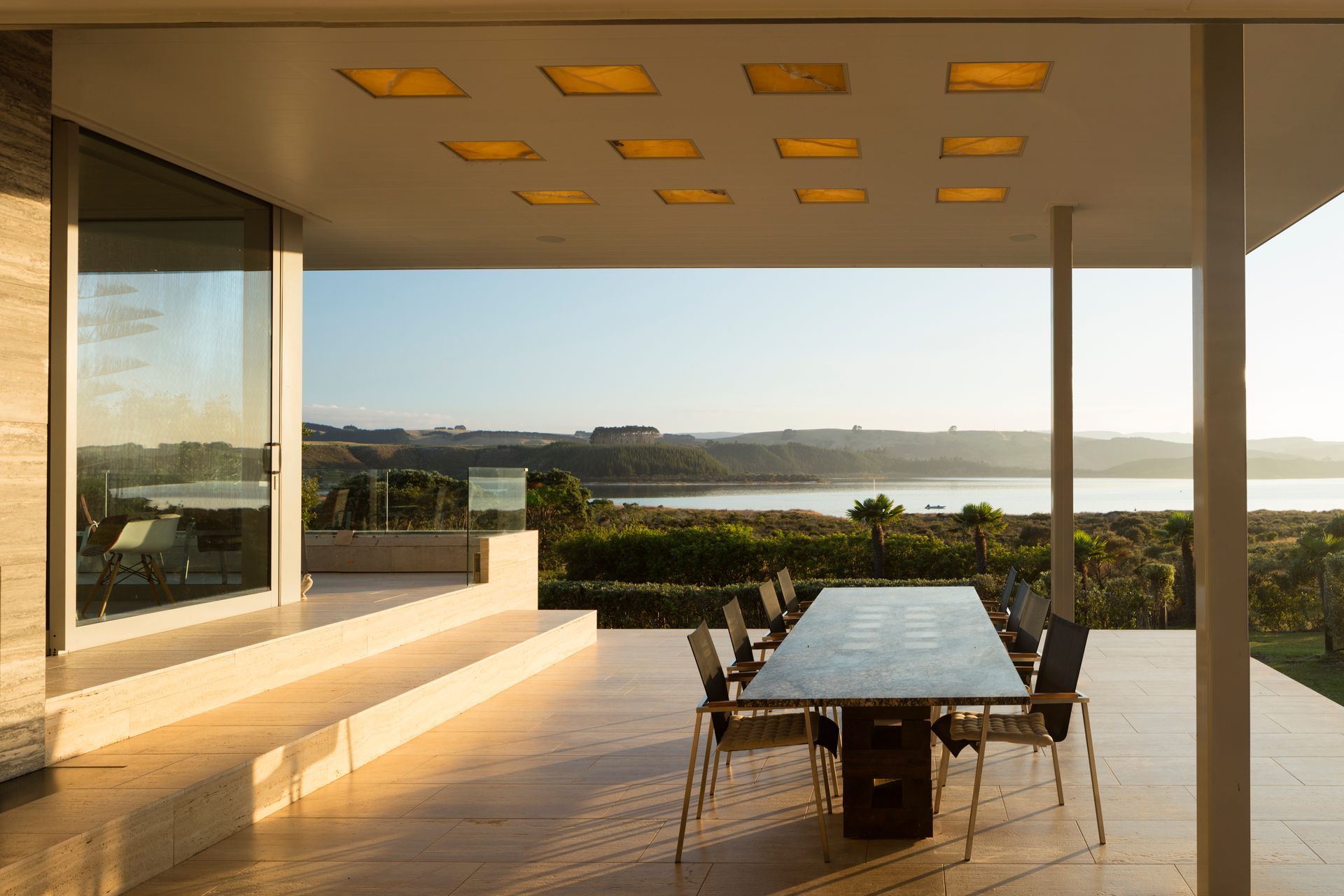
Northland Lake House features a roof that wraps around a central fireplace core that braces the structure and, then, the roof lifts off. “Free from the main part of the existing house, this gives a sense of shelter without compromising the view of the lake and landscape,” explains architect Tom Rowe. “The Russian constructivist architect El Lisitsky was famous for his Wolkenbugel ‘cloudball’ project – in simple terms, it suggests, ‘Look no hands’. Light in this house design filters in a similar manner down to a lower level bedroom, sliding between the deck and a bridge that is set free from the structure. The cubes are onyx, a warm coloured translucent stone, with a clear plastic roof over them and back light, creating a nocturnal diffuse ambience.”
6. Tapeka House, Russell, by Four Walls Architecture
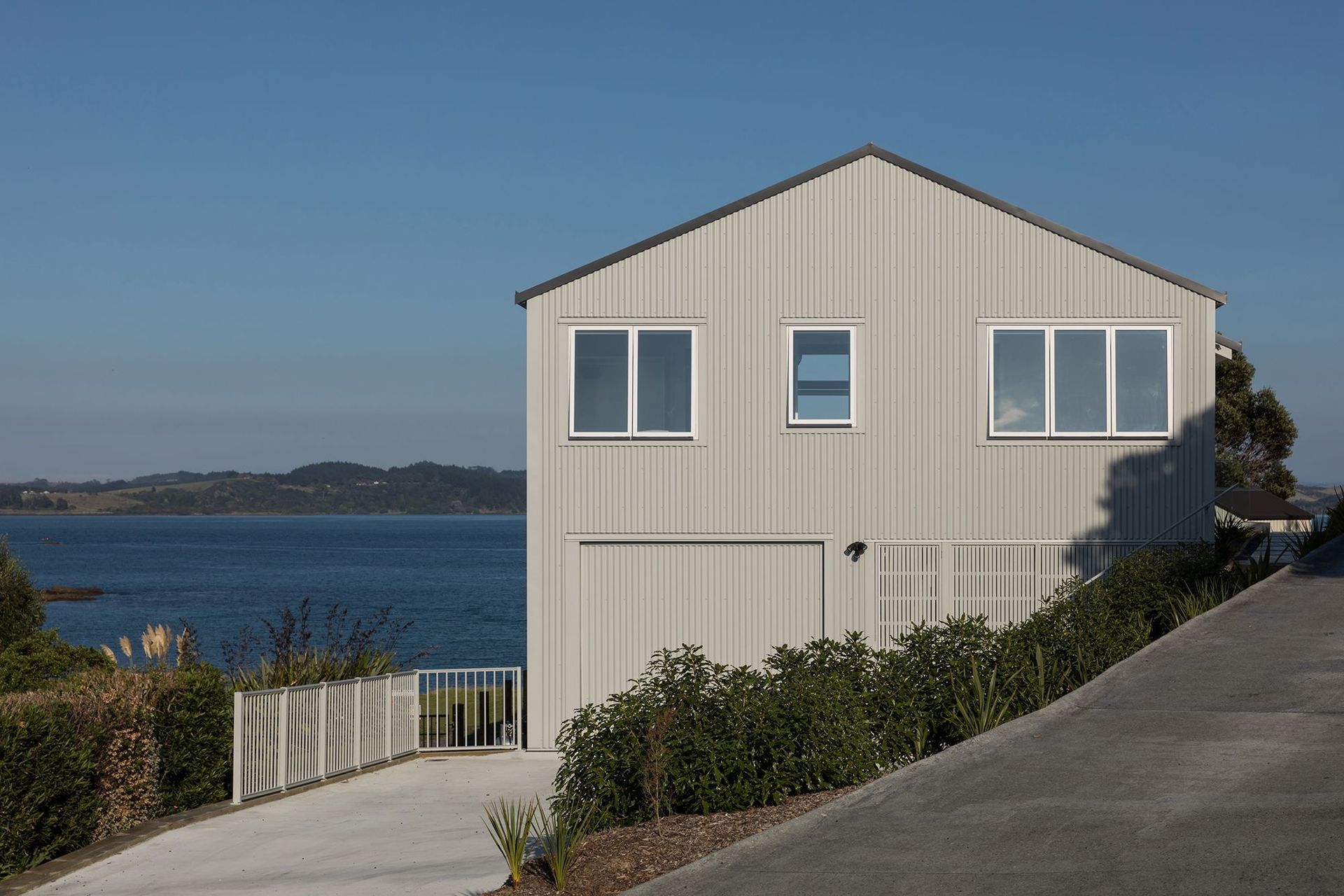
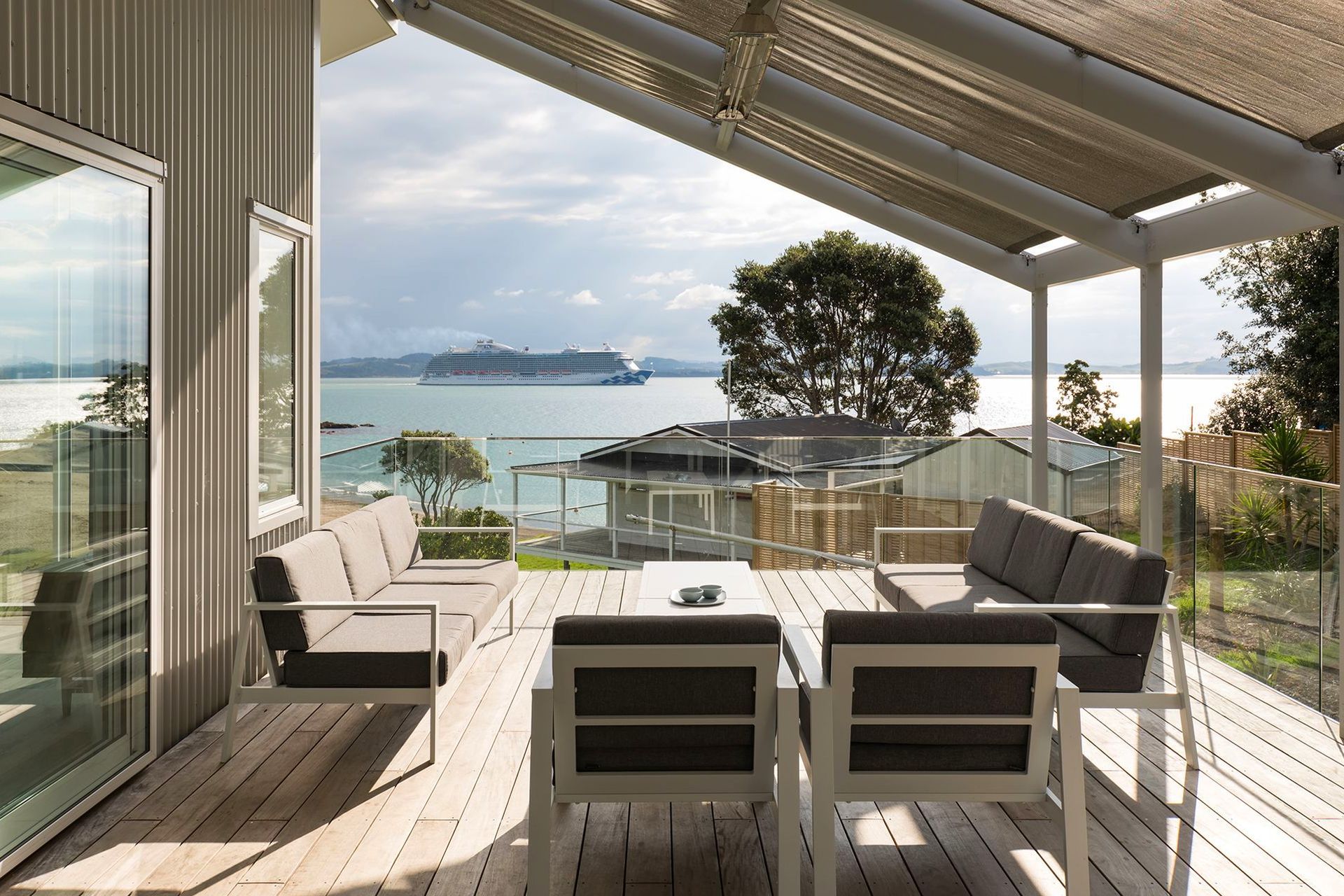
Designed for family holidays, Tapeka House is a modest beach house with a simple gable roof form that sits quietly in its suburban setting in Russell in the Bay of Islands. The first floor is positioned at the same level as the neighbour's roof ridgeline in front, ensuring unobstructed sea views from the living areas and a generous deck, which is covered by sail-like fabric shade in harmony with its location. Bedrooms capture ocean views east to the other side of the peninsula. The house makes practical use of space and utilises hardy, easy-care materials, such as corrugated steel cladding and grooved plywood interior linings.
7. Jack’s Point Home, Central Otago, by Ben Hudson Architects
This comfortable family home for four is designed to ‘naturally belong’ to the landscape. Emulating the traditional agricultural buildings of the area, the simple single-pitch ‘farm shed’ form of Jack’s Point Home is a contemporar y interpretation of the Central Otago hay barn. Both large and smaller openings respond to views, privacy and internal function at a human scale, while white surfaces throughout the interior heighten the play of light and shadow. Two distinct pavilions contain bedroom and living areas connected by a central entry set back from the main buildings. A change in angle is a response to the irregular site boundary, but it helps provide a sunny outdoor living area sheltered from the prevailing southerlies.
8. Abberley House, Christchurch, by RTA Studio
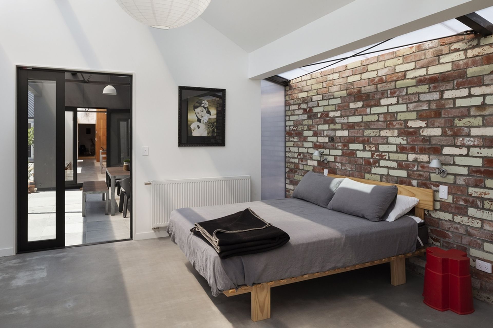
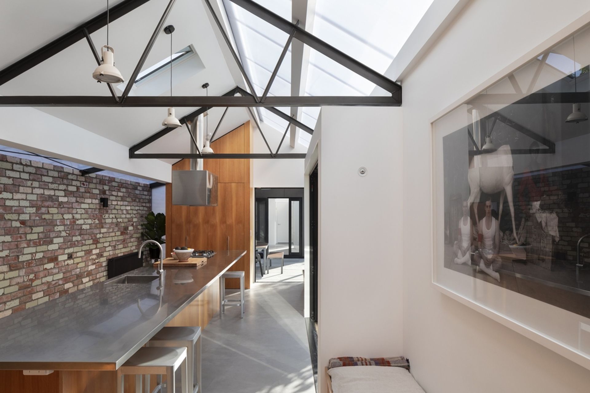
Located on a narrow property that runs between two street frontages in central Christchurch, Abberley House is an existin g Victorian workers' cottage with a new addition. Its gable roof is clad in polycarbonate to allow daylight and warmth into the new spaces, adding texture and interest to a recycled brick wall that runs the entire length of the south side of the lean-to. This greenhouse form of polycarbonate and steel is the perfect foil to the weatherboard materiality of the cottage. An outdoor room incorporates a variety of openings to draw in sunlight and natural ventilation.
