Esk Valley Bedroom Refresh

Hello and welcome to my blog, where I’ll be showing in a bit more depth some of the projects that I’ve worked on. I thought I’d start with my first project, a Room Refresh for Esther & Mark. These guys have a beautiful home with an epic view! However, with three young children their Master Bedroom had historically been a bit of an afterthought - it was a place to crash after a busy day juggling children, babies and businesses. I’d only just started out in my business a couple of years ago when Esther kindly agreed to take me on to give her a hand. No mean feat when you have very little idea what the novice Interior Designer will come back with! Esther’s only real requirement was that she wanted the stunning pic of the Marlborough Sounds - their happy place - to stay put. This was a fantastic starting point to create around it.

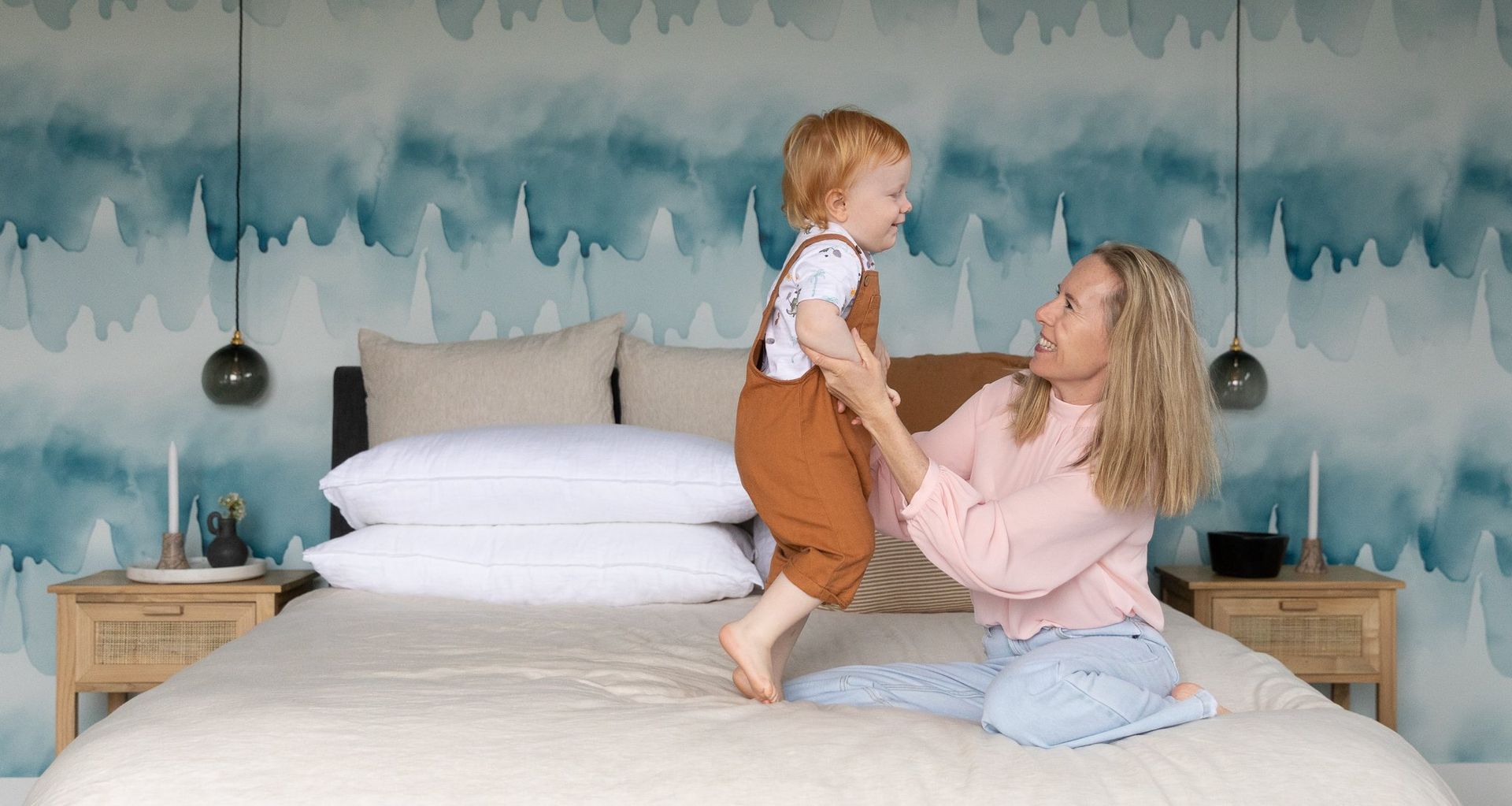
Esther and Mark have a lovely home with calm neutrals and blues throughout the living areas, so it made sense to bring those colours through into their Master. Blue is such a calming colour to have in your bedroom. But I also knew these two had enough spunk in their personalities to let me go a bit crazy with just where I brought the blue in. There was a huge wall behind their bed left bare so a wallpaper from Emma Hayes I knew would be amazing. I have loved Emma Hayes Wallpapers for such a long time. Her inspiration is often nature and she works with certified forests for her paper using organic ink free from heavy pigments. Esther and Mark have a bit of imagery from the sea and they love going out on their boat, so this wallpaper called Tidal was just right. It provided a great anchor for the rest of the room.

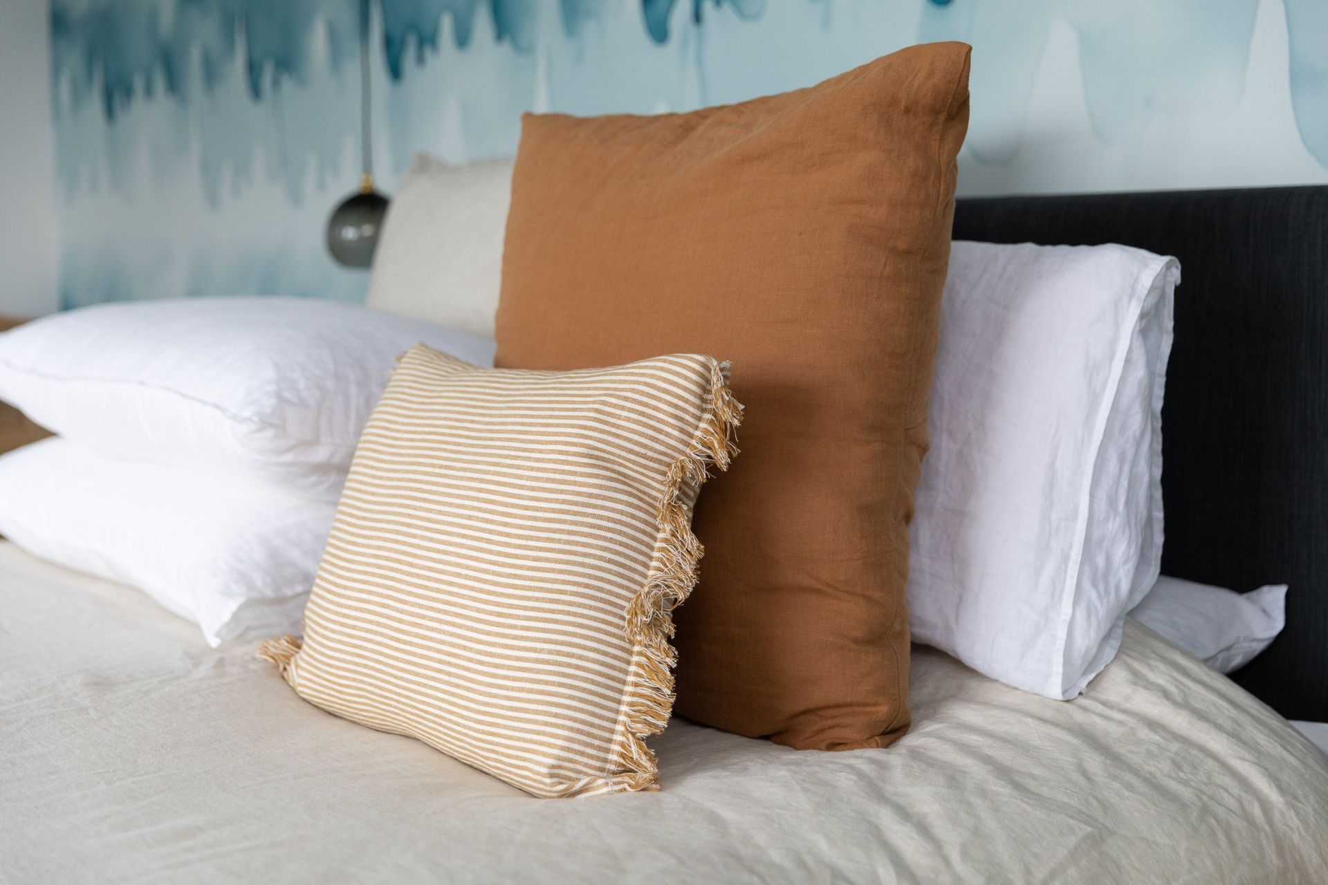
Once we had the wallpaper nailed the rest of it fell into place. The neutrals that you’d see in their living areas made the obvious choice for the rest of the room. Esther wanted to replace their current chest and bedside tables so we decided to lift it with caramel-toned wood and a more delicate style. She found these oak/rattan bedside tables and drawers which were absolutely perfect. We lifted the bed linen too with a neutral sand linen and dressed the bed with a few more textures and layers. This added not only a warm, cosy feeling to the large bedroom but added a bit more of Esther’s style and personality.

Finally, we added lights that were soft and gentle smokey glass balls, balancing nicely against the “look at me” wallpaper.

This is a great example of how a few changes to a room can make it a much happier space to live in.


