Explore the look: The Gidley
Written by
22 November 2022
•
4 min read

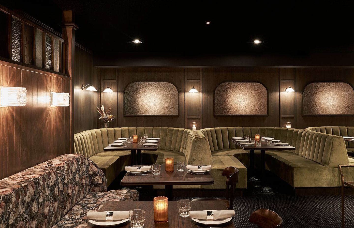
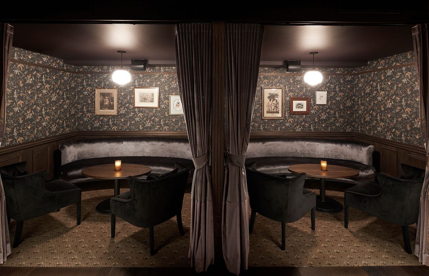
Dark, moody, tactile and layered are just a few of the many words that can be used to describe The Gidley by Tom Mark Henry. Taking inspiration from Australia’s colonial era, the interior design incorporates both colonial and federation elements to build an ageless aesthetic for this premium steak house in Sydney.
The client desired a layout that felt a little like a rabbit warren so that diners could lose themselves in the atmosphere of the venue. A central hallway is the main source of traffic and the trunk from which every other space in the venue branches. Booths, niches and nooks have been carved out of the architecture to establish a sense of secrecy and intimacy.
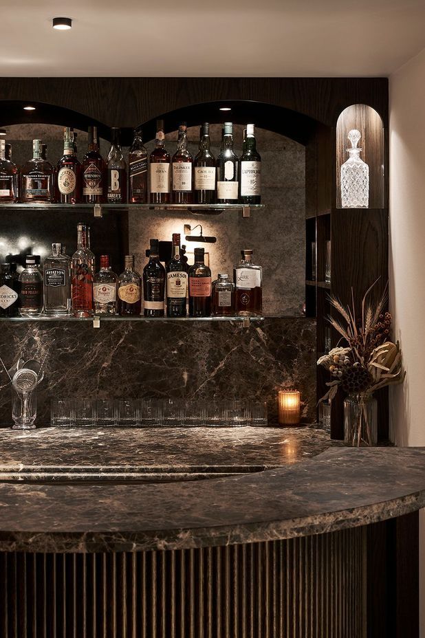
Dark timber veneer, herringbone floors, stone and patterned carpet form the foundation of the interior scheme. Velvet upholstery and drapery imbue the space with opulence, while floral wallpaper and botanical motifs stand out as moments of intrigue.
Lessons in design
Apply these decorative techniques to your own home or project to recreate your favourite elements of The Gidley.
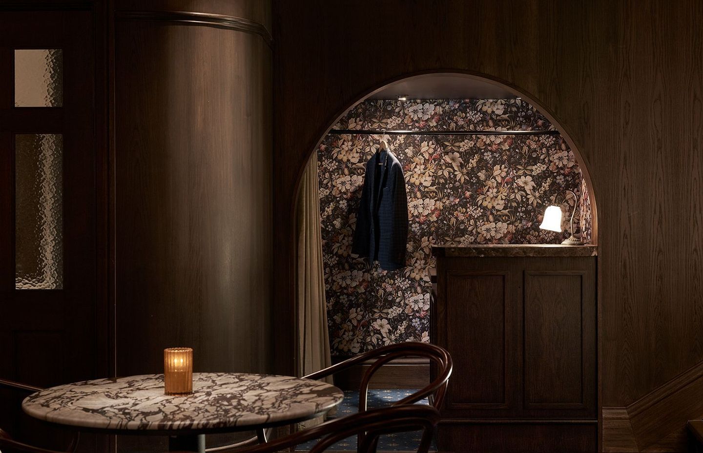
Make every space a ‘moment'
Whether you’re planning a walk-in robe, powder room or laundry, every space within your home should be a style moment that speaks to your personality. At The Gidley, even the coat rack attracts guest attention with floral wallpaper, a velvet curtain and a timber veneer desk with stone benchtop, complete with a table lamp that sets a sultry tone.
Go over to the dark side
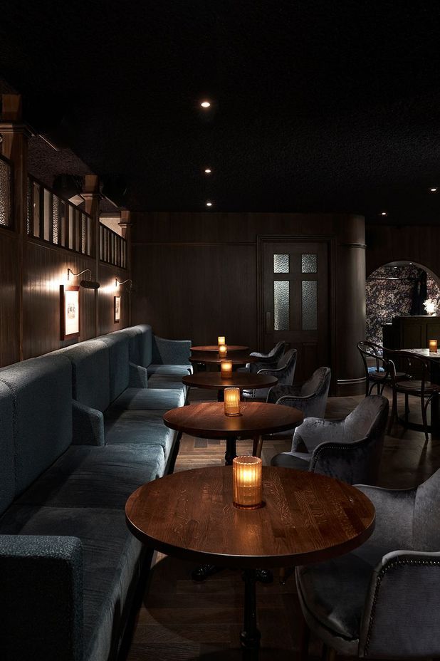
While almost every design resource will advise you to paint your walls white and decorate with neutral furniture and homewares, a dark and shadowy retreat can be twice as dramatic while feeling just as spacious. Here, the deep timber tones stretch across the walls and floor then seem to disappear into the depths of the ceiling, establishing a sense of space. Upholstery in dark shades of blue, grey and green feel cosy and warm, while decorative lighting ushers in an air of mystery.
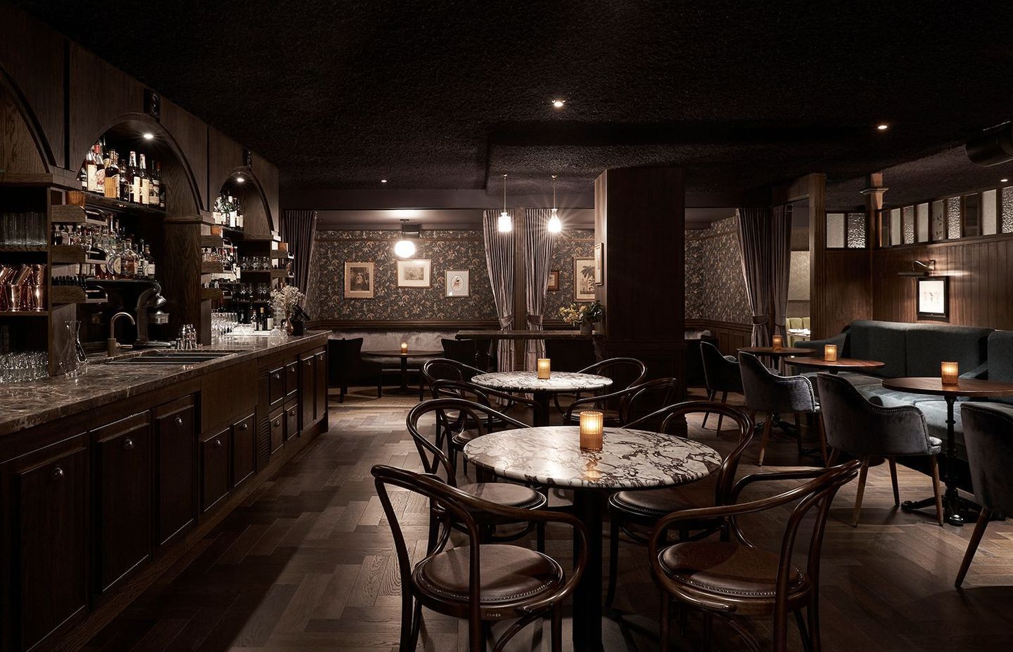
Embrace maximalism
Tom Mark Henry has used patterned carpet, botanical wallpaper, timber veneer, velvet, leather and brass all in the one space – and you can do it, too. Don’t shy away from maximalist design techniques; mix and match patterns by ensuring all share a similar colour palette, keep your colours subdued and your timbers, leather and fabrics harmonious. Use metallics as an accent feature.
Shop the look
Feeling inspired? Consider introducing these gorgeous products to your own home to create a similar interior scheme.
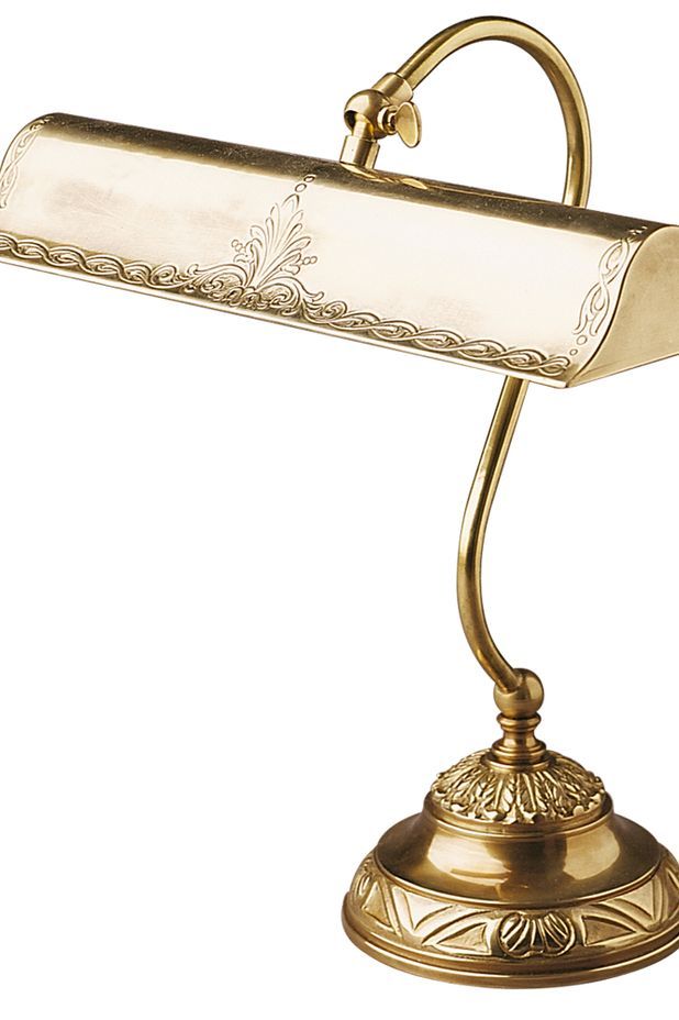
Suave, functional and undeniably romantic, this desk lamp is an essential piece for any gentlemanly study, bedroom or den. The classic design and metal make it suitable to any theme while ensuring it withstands the test of time.
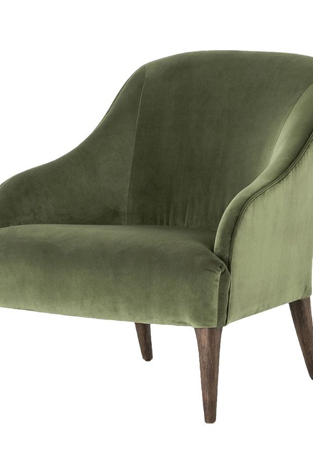
Velvet has long been associated with royalty, lavish homes and tactile interiors. Naturally, it lends itself to a vast variety of interior design schemes and elevates any given piece of furniture to sophisticated levels, such as this shapely chair.
Lavish and contemporary, this printed wallpaper is a conversation-starter no matter where it’s installed. When decorating with a statement wallpaper, ensure your furniture and homewares echo the colour palette set by your chosen print.
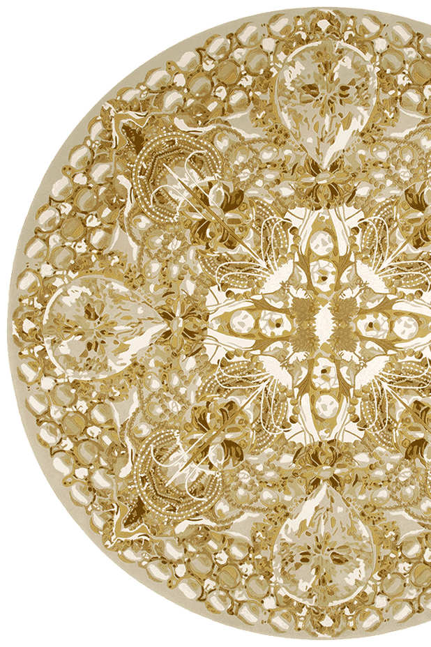
When re-carpeting isn’t an option, or soft flooring simply isn’t practical, a bold rug with a regal print can be the perfect solution to a space that requires a little zoning or softening. This particular rug is easy to style thanks to its friendly neutral scheme.
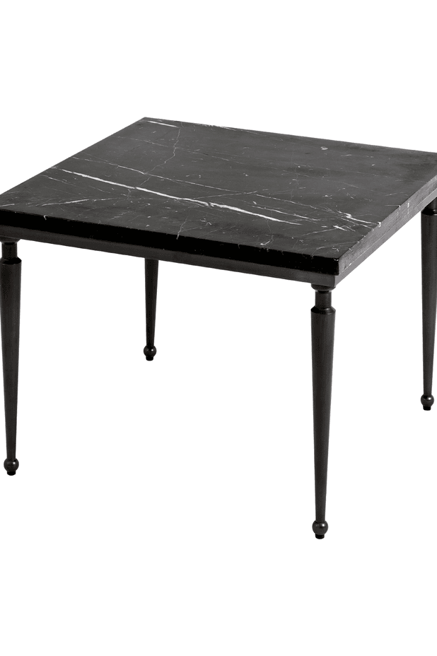
Simple, clean-cut and elegant, this marble and bronze side table suits layered interiors best. Style it with white decorative objects to bring out the white veining in the marble.
See more projects by Tom Mark Henry on ArchiPro.