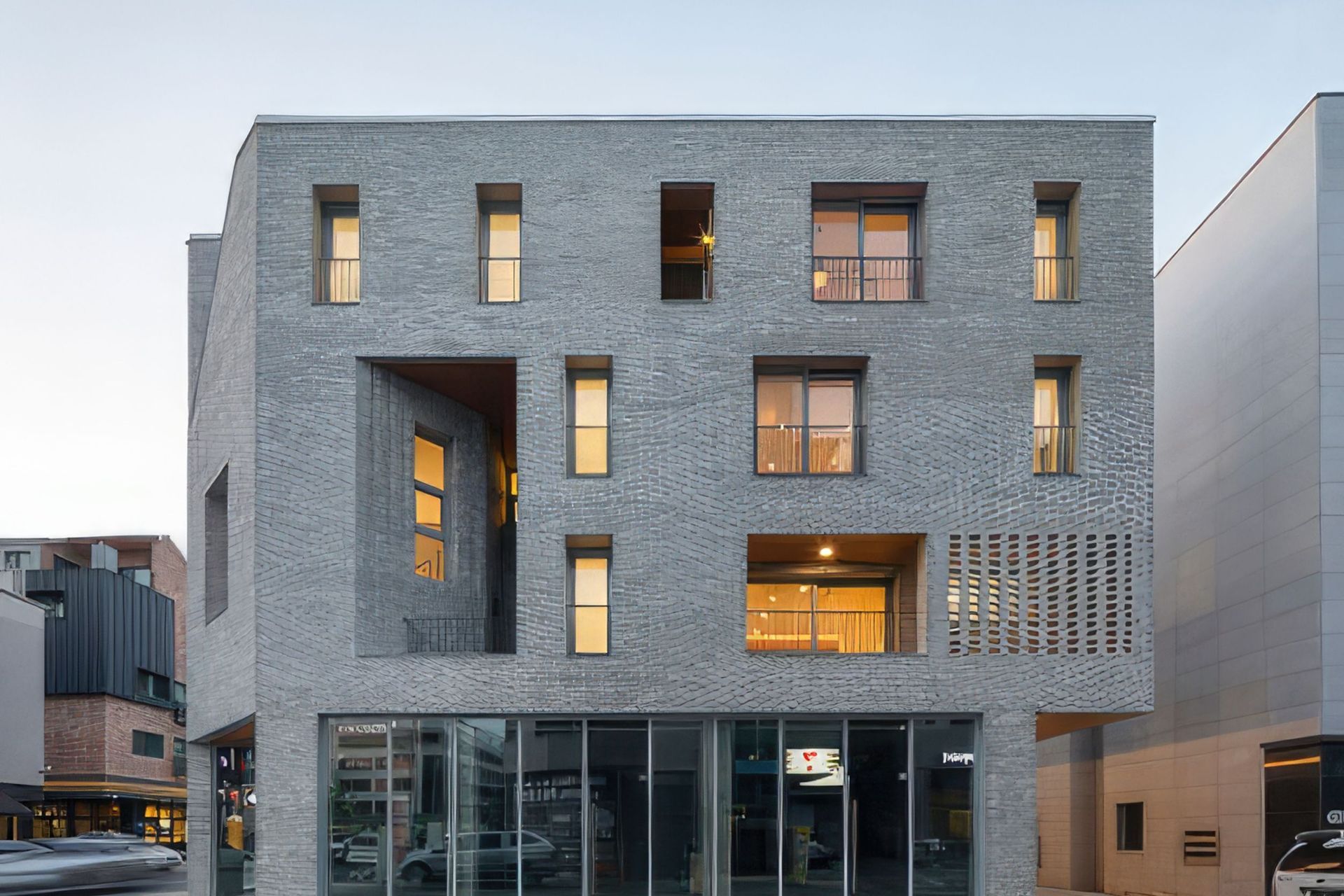
Exterior Colour: How to Choose Exterior Paint.

Choosing a colour palette that works can be a challenge. Like any recipe, the result will be hit or miss without a method. The array of paint colours available today has complicated the decision-making process for the novice renovator or property owner.
One of the first questions I am asked as a Colour Consultant is “What colour to choose?” As a Designer, I start by choosing a tonal key and chord. Once the mood of the exterior has been established, I then move on to colour. For an exterior colour scheme you will need a minimum of five colours to compliement textures or materials with a total of finishes closer to ten.
Choosing colour is not the starting point of any scheme it’s the finish.
Let me define what I mean by tone, and explain the theory behind tonal keys and chords.
Tonal key is the term that describes the overall tone of a picture or space. It is the relationship between light and dark elements which determines the mood and emotional impact of a space, object, or structure.
In the tonal scale the values are divided into three keys. As shown below, in the grayscale value 10 is white and value 1 is black. High Key: values 10, 9 & 8. Intermediate Key: values 7, 6, 5, & 4. Low Key: values 3, 2 & 1.

The term chord gauges the amount of contrast within the picture or space. Minor chord defines minimal contrast within a tonal key whereas major chord conveys a maximum contrast.
When working on interior colour palettes, lighting can be manipulated and orchestrated in specific directions, temperatures, and intensities. Context within interior spaces can be manufactured.
An exterior colour scheme is at the mercy of its external environment and full sun exposure. Note the tonal keys and chords used on adjacent buildings. Also, consider what colours complement adjacent structures. If you’re colour scheme clashes with the surrounding environment it will always look out of place despite how well it may be viewed independently of your building’s surroundings.


Designer tips...I cannot stress these next points enough!
- Always choose exterior colours when standing outside and viewing samples in full sun.
- Colour match existing elements to be retained. (New colour choices are integrated with existing colours or textures – the scheme will never be cohesive if existing elements are an afterthought).
- When viewing colours for a specific area ie. Wall, post/column, beam, eave, place the colour on the area you are choosing for. The lighting from flat to vertical and inverted areas will alter how the colour responds once applied.
The following images are examples of exterior colour schemes which convey the various combinations of tonal keys and chords.
