Fearless design elevates a family home renovation
Written by
18 July 2022
•
5 min read

For the back extension to a Ponsonby villa, it’s a brazen piece of architecture. Yet architect Jack McKinney of Jack McKinney Architects calls it “stealthy”.
The project is dubbed Super Taper, and it lives up to its name. It’s a large, single-room extension with tall ceilings that slope upwards to a single skylight.
“It’s not what you expect,” says Jack. “It was pretty experimental. The clients were happy to have quite an original solution, so that really gave us the confidence to show them something unusual. They were very trusting, which was amazing.”
He says there was only a minimal amount of debate. “They just really committed that original idea and now they’re really aware that they’ve got something special.”
It’s a different story from the road front. “You don’t really detect it from the street. The house had a heritage protection overlay so we were working within that. And our justification was that it’s a pitched roof form, that's what the rules ask for.”
The original villa was retained and restored. “That gave us a little bit of license at the back,” says Jack.
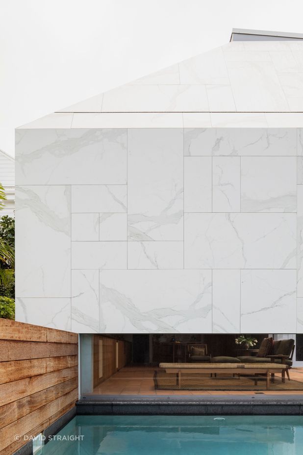
The extension is visible from the backyards of a few properties. “That’s part of the fun. There are no windows overlooking them, it doesn’t overwhelm or dominate. They get a sort of enigmatic, interesting shape. We wanted it to feel just like a sculpture in the garden, like a little square-top pyramid.”
The intention was for it to seem like it was carved from a block of stone, says Jack. “So we tiled it in a really large format porcelain tile. It’s very seamless with everything in one material. We knew we’d have a nice dialogue with the exterior of quite a traditional looking white villa.”
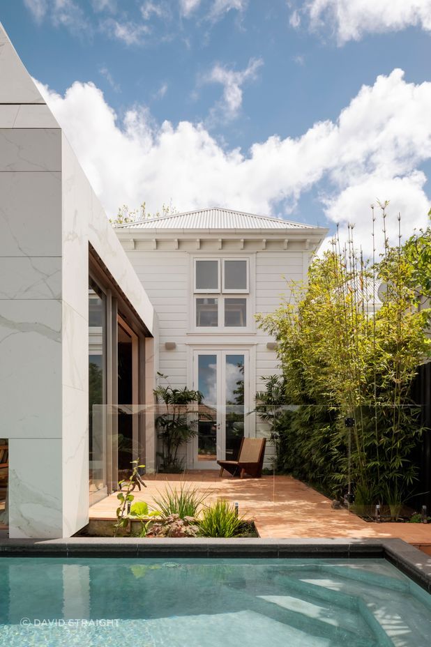
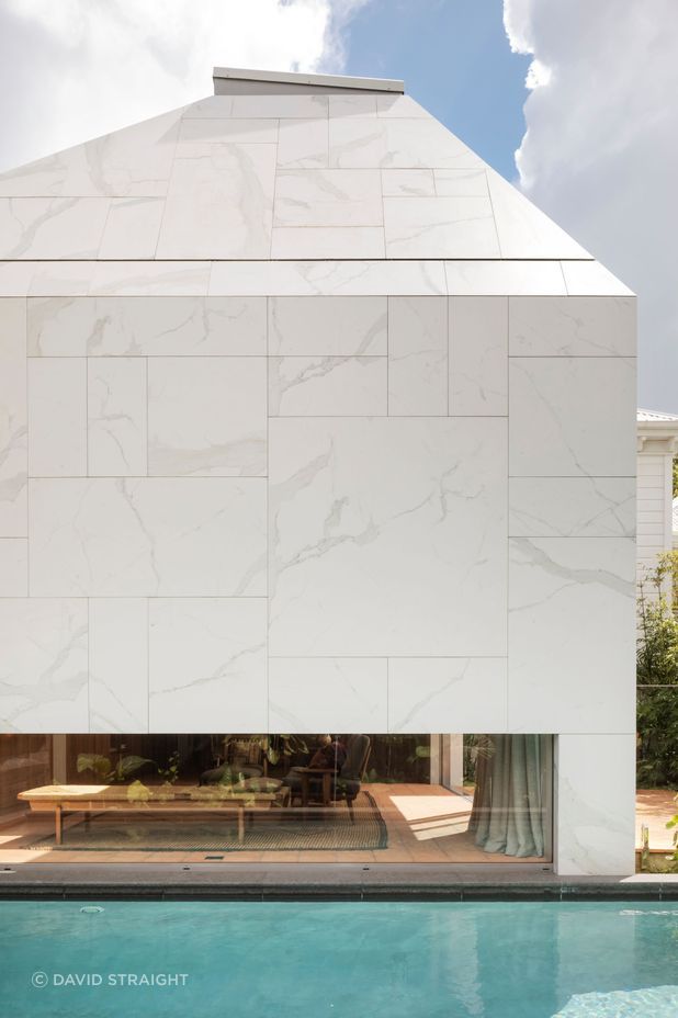
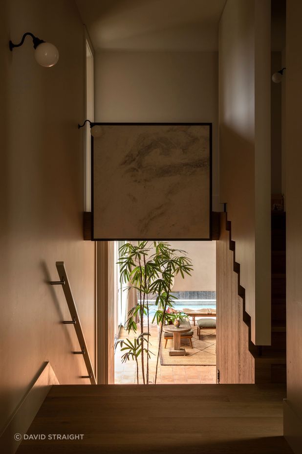
The collection of neighbouring houses at the rear is part of the reason for the unconventional design.
“We didn't have a lot of room to work with and the site's surrounded on all of its boundaries, the neighbours are quite close. We focused on creating essentially one big, beautiful room for the family to live in and there's quite an interior focus to it. Partly because it would look straight out at neighbours' roofs and backyards and we didn't want that. We wanted to create more of a feeling of peace and repose, so we've been quite careful to orchestrate the sight lines. Your eyes are drawn quite unexpectedly down through the long window that just sees the top of the pool.”
The single skylight at the peak of the taper came from a surprising influence. “One of my favorite buildings is the Pantheon in Rome. As an interior it’s spectacular. So it was, in a way, my little homage to that.”
Jack says that skylight allows the room to experience light at all times of day without relying on windows that may compromise privacy.
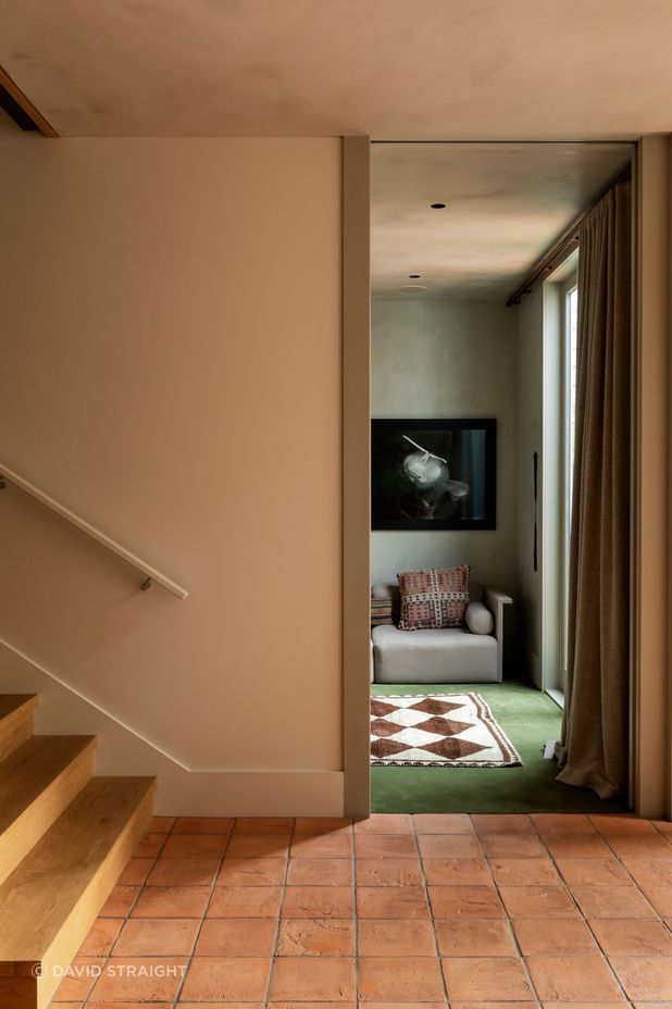
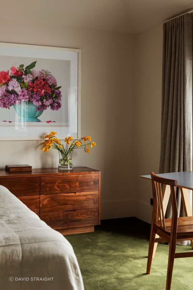
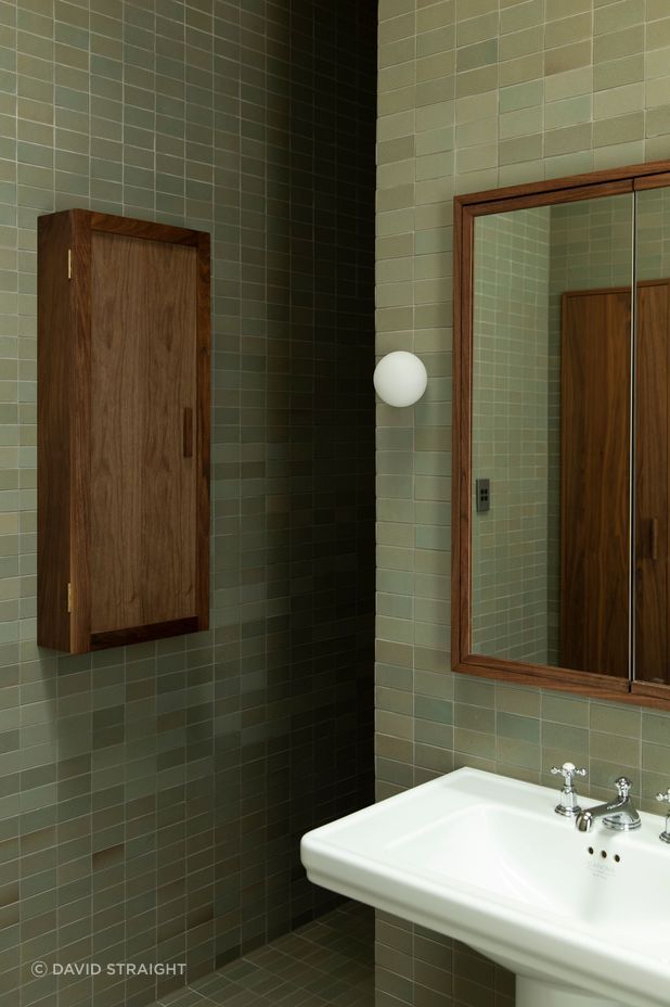
“As the light moves around you’re always getting a really strong line on one of those ceiling surfaces. We really pared back the materials palette so that it’s simple but has a lot of texture. Everything’s soft, almost the colour of a natural material, and it’s activated by the daylight moving around the space and by the people within it.”
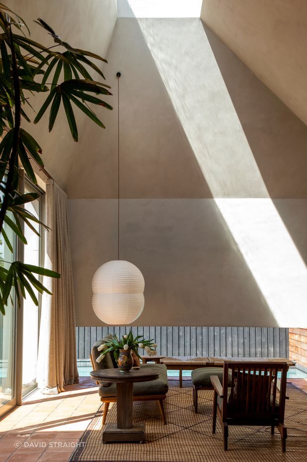
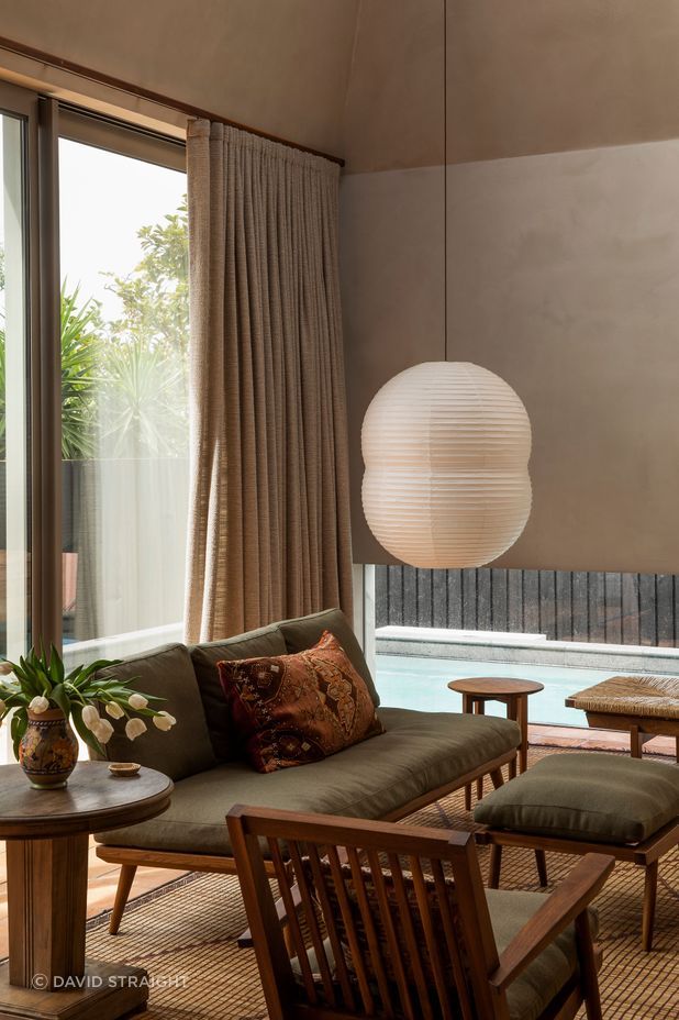
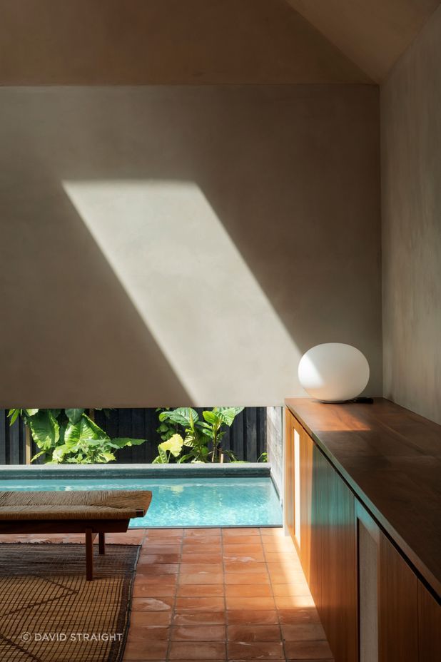
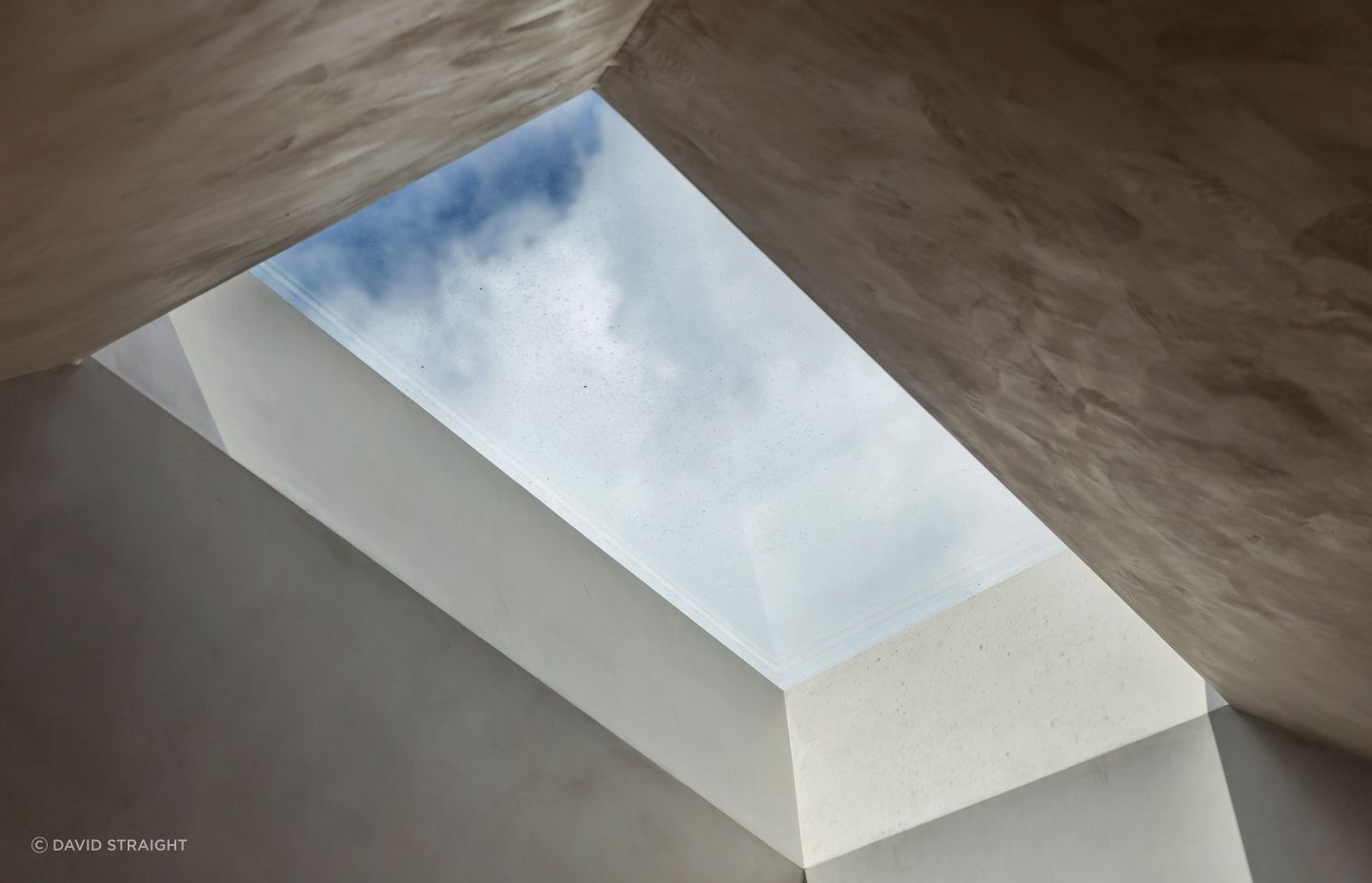
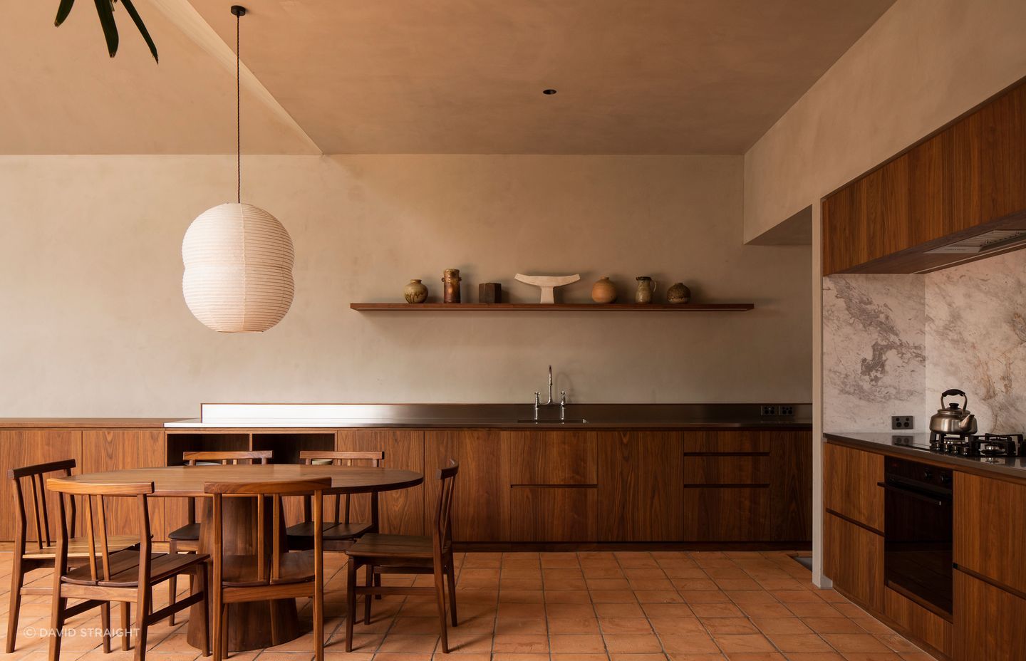
Unusually, the angles of the taper on the exterior are different to the interior angles. That’s partly due to technical issues such as concealing gutters, and partly a style choice.
“It can be quite subtle but it’s about what is the right geometry for the outside and what is the perfect geometry for the inside. Sometimes they can be slightly different. Outside, we’d created this quiet, strong shape. It’s steeper inside. We just knew that was the right place for the light to enter the room and therefore it couldn't have as much symmetry.”
Of course, that did give him pause.
“We'd have this strange asymmetry and angularity to it, which can sometimes counteract feelings of poetry and compositional stillness and might have been too energetic. That was the main thing that I was wondering about. And the other one for me was about opening the front door and essentially looking down into a blank wall. That was either going to be really counterintuitive or a smart move. Turns out it was a smart move.”
But Jack is not fazed by experimentation. “That's what I like to do but I also have to serve my clients, so it depends what their appetite is for novelty. It means that the people I'm working for get something that's truly customised to them – something that's really bespoke – and it doesn't have to be as stridently different as this one to meet that criteria.”
He says he’s thrilled with the outcome here and that the project keeps capturing people’s attention.
“I felt confident, but you can't really know until you finish it whether it was as good as you'd hoped. It’s got a really beautiful sense of place to it and it’s very calm and quite restorative. It’s doing everything that we hoped it would do.”
