Hindley & Co Milan news


Visiting the Salone del Mobile.Milano (Milan Furniture Fair) for the first time in April, we were awestruck by the city’s distinctively effortless style. Good design is absolutely everywhere. It can be found in pill-shaped slab stone benches in the subway; in the perfect colour palettes of laneway vignettes; and in the deftly arranged, immaculate silk scarves that pass you in the street. And the effortless layering of old and new architecture suggests that, for Milan, it has always been thus. The Salone offers a window into what life is like for a city with design excellence as prerequisite rather than preference. What would it take for Melbourne to identify in such a way?
Held for the duration of Milan Design Week every April, the Salone covers 210,000 square metres of exhibition space, with more than 2,300 of the world’s most respected design and creative companies’ works on display. We visited factories like B&B Italia and the Poliform showroom, and wandered countless exhibits, only scratching the surface of what was on offer.
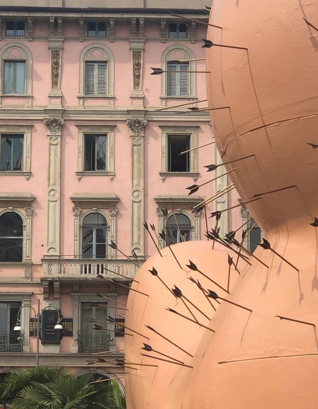
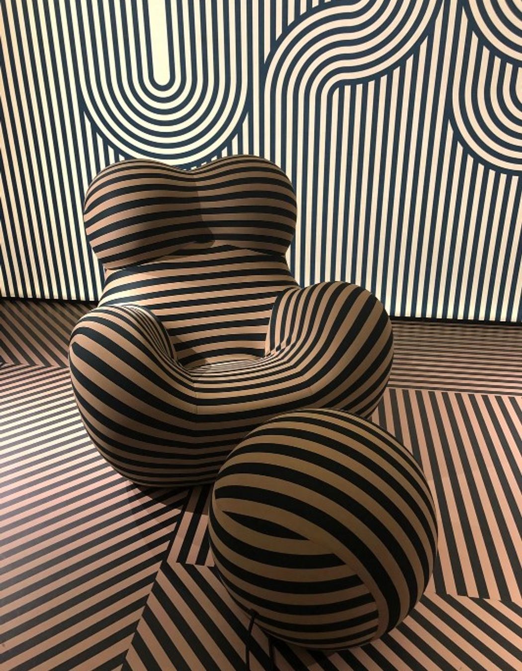
This year, the fair commemorated the 50th anniversary of Gaetano Pesce’s celebrated “Up” chair and ball ottoman with myriad colourful versions on display throughout the city. In a nod to the chair’s controversially buxom features, an eight-metre tall, flesh-toned copy occupied the Piazza Duomo, peppered with arrows. It was thrilling to witness the evolution of this iconic piece, which we’re specifying in one of our current projects. In the 90s, Anne fabricated limited edition resin products by hand in Pesce’s New York workshop. The showroom and factory visits during the Salone were a reminder of this meticulous prototyping approach from 20 years ago, which she now recognises as a very Milanese approach to design.
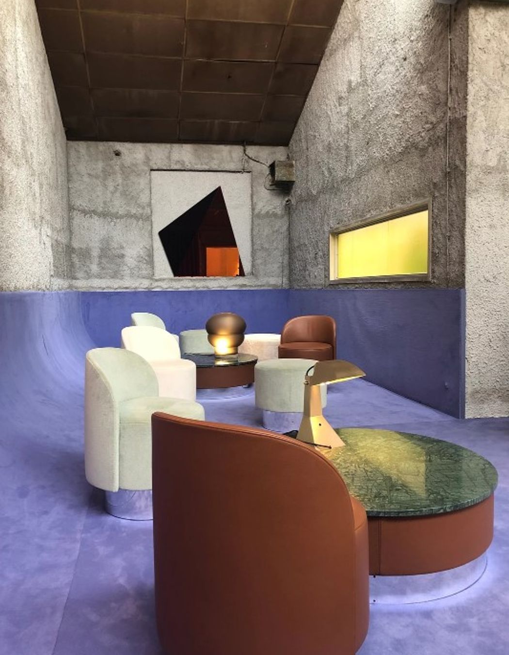
Milan design agency Studiopepe’s exhibit was a standout, primarily for its colour and textural combinations. Oxidised copper greens were contrasted with blush pinks, and we loved the bright mauve set against burnt terracotta. The shapes and colours indicate the Memphis movement is back, with its 80s vs Art Deco postmodern influences.
This year we saw plenty of artfully looped rope lights, ball pendants and wall-mounted LED tubing – no doubt in keeping with the 80s resurgence. Textured, carved or marked stone turned modest objects like basins into artworks, and ribbon glass presented an art deco-like screening option that will certainly feature in some of our future designs.
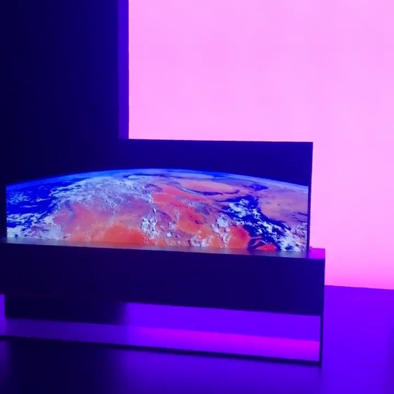
Another trend on the horizon? Paper-thin roll-up televisions. Designers have long laboured to conceal televisions within communal spaces, and it seems LG has come up with a more slimline, hidden improvement on traditional cabinetry. Like all innovations, it will no doubt take some time to enter the more affordable mainstream (the launch price for a 65-inch model in Australia is $9499!), nevertheless, we are excited by how this pioneering piece could free up design for the most lived-in room in the house.
And so it was that Milan delivered on all that was promised. Back in the office, we’ve been discussing plenty of inspiring images and product details since, and how we’ll continue to shape our own Salone-style quest for design excellence.


