How to choose the best tile colours with timeless appeal and lasting value
Written by
25 May 2025
•
6 min read

Choosing the best tile colours for any project can be a task that’s more challenging than it seems. That’s because, unlike other finishes like paint or even wallpaper, floor and wall tiles can’t be quickly (or cheaply) replaced, meaning there’s much more at stake in terms of cost and time.
We spoke to Kerry Mulry, Co-owner of Tiento, for advice on this and the approach people can take when it comes to styling their spaces for the present and the future.
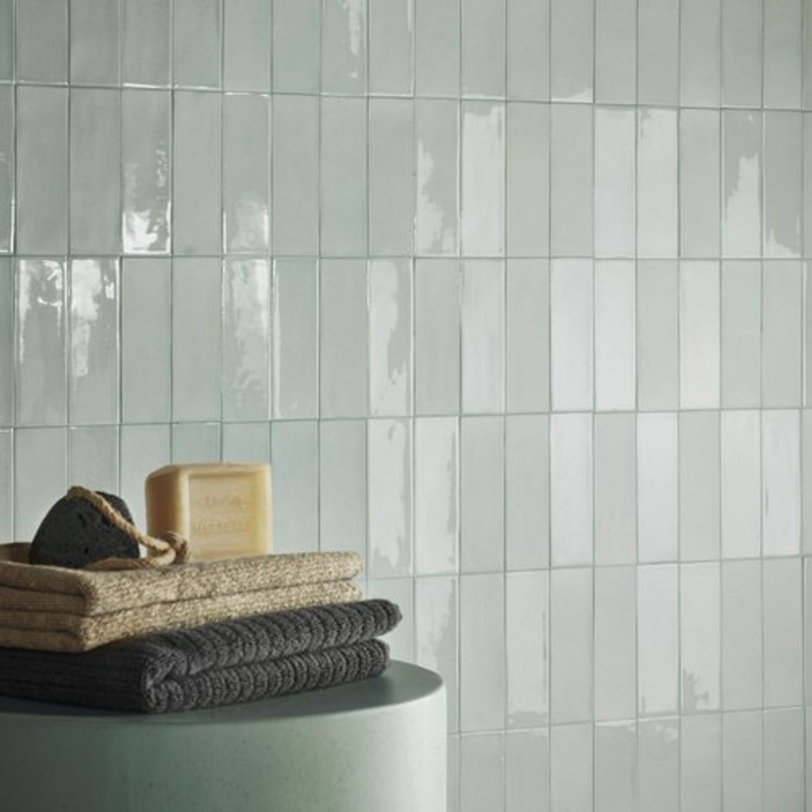
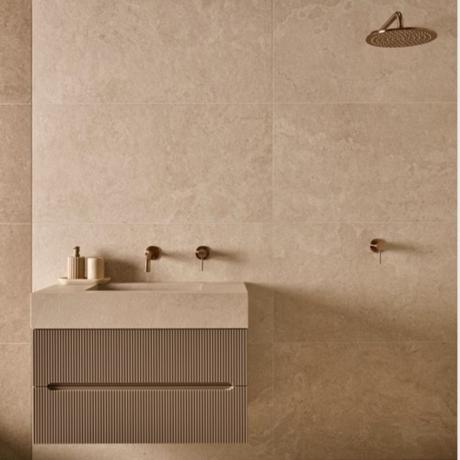
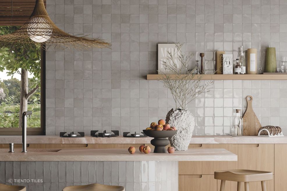
Neutrals are never far from favour
If you’re after the safest bet on the colour spectrum, it’s hard to look past neutrals. This typically includes whites, beiges and greys — soft colours that can complement a wide range of hues.
As Kerry explains, they work well with almost everything, giving them a natural, lasting quality.
“Neutral tones are easy to work with, and everything else can revolve around them. This makes them timeless, and they just don’t date. You will still look at your bathroom or kitchen in 10 years, and it’ll be fine, and won’t be offensive to anyone.”
This may not excite all, but even within neutral tones, there are plenty of options to consider. As Kerry continues, there are even trends within neutral colours that are well worth looking into.
“At the moment, the trends are beige into warm greys, whereas 5 years ago it was all cement and cold greys. White has always been there, but it’s no longer a stark white, more a cloud white.”
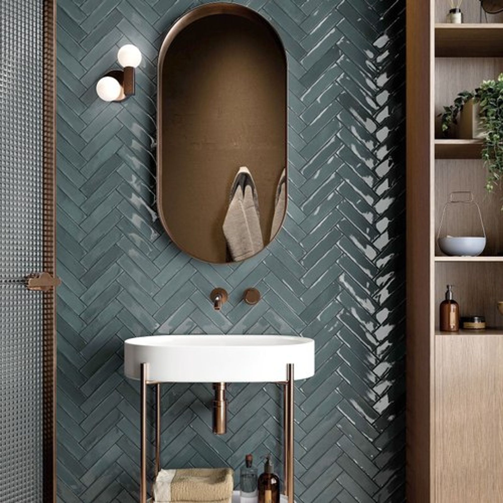
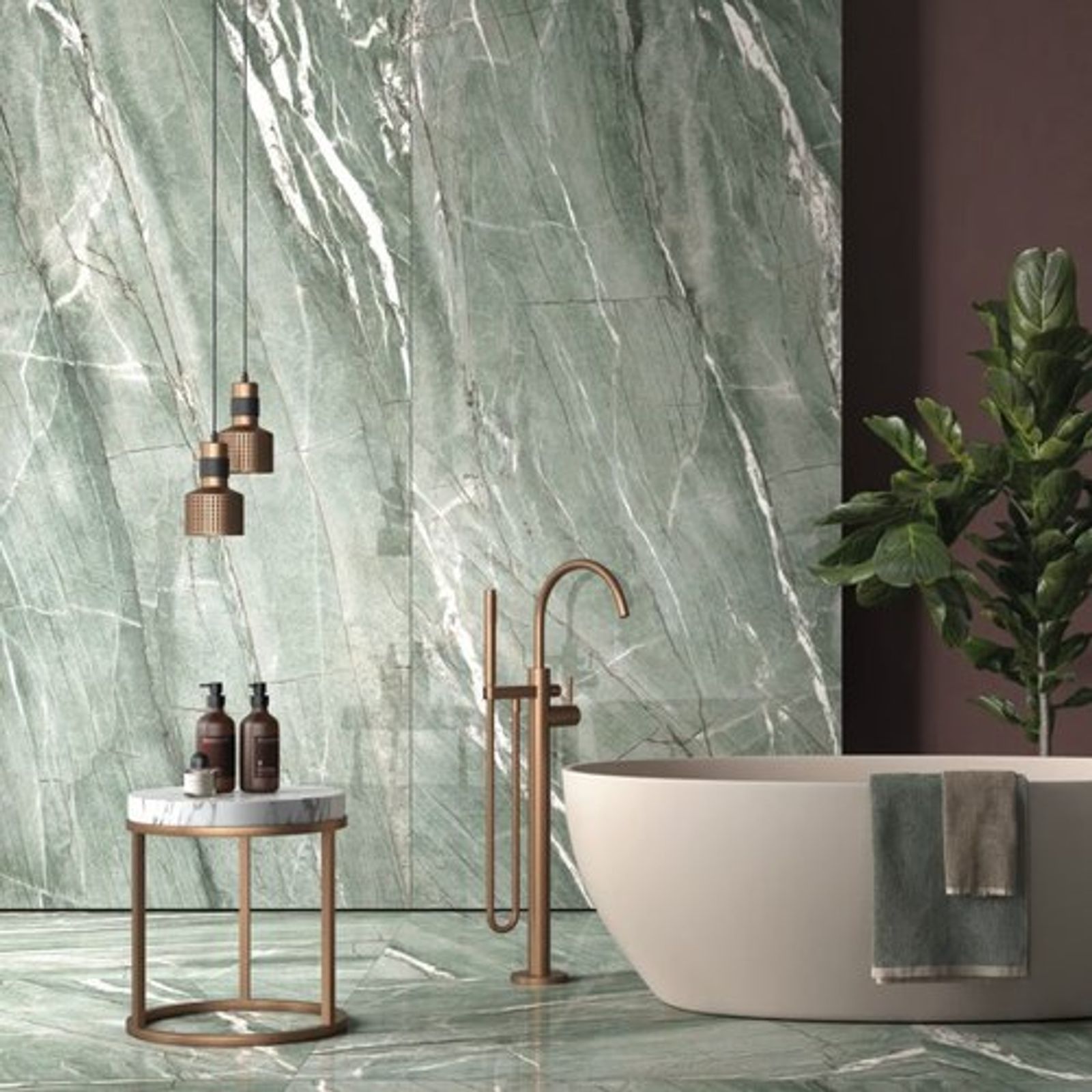
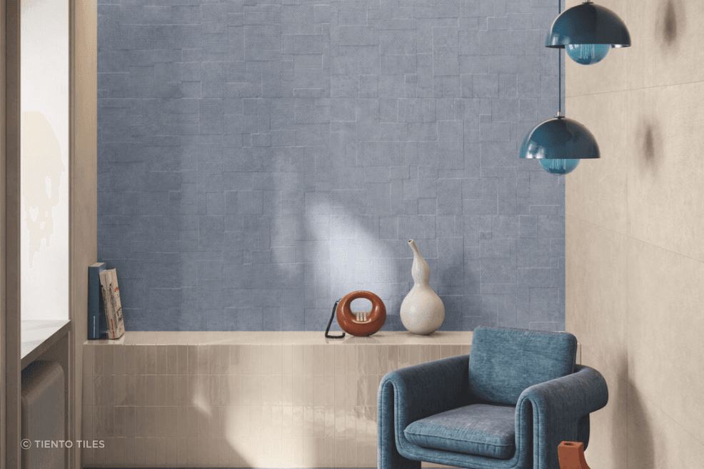
Be bold and at one with your colour scheme
Another contrasting but popular approach is to be bold, using coloured tiles to inject a bit of vibrancy into your spaces. It’s a point of differentiation that can make an interior feel much more personal and comfortable.
In the context of timeless appeal, using bold colours is potentially more risky, but Kerry says some colours have greater universal appeal, and there are also other aspects that can make your choice of bold colours easier.
“Blues and greens are probably more widely appealing, and are a little less risky than reds, for instance. If you have a colour-drenched bathroom where everything is one colour, then you can go with that as it's got an established style that won’t be seen as dated because it's got an overall aesthetic.”
Kerry also stresses the importance of taking your time with bolder choices, giving them some considered thought.
“It’s really important to think it through. We offer samples to customers to take home so they can keep looking at their selection over a few weeks, and see if they still love the colour. A lot of people initially pick something that they first saw and loved, but end up going back to a safer colour for timeless appeal and resale value.”
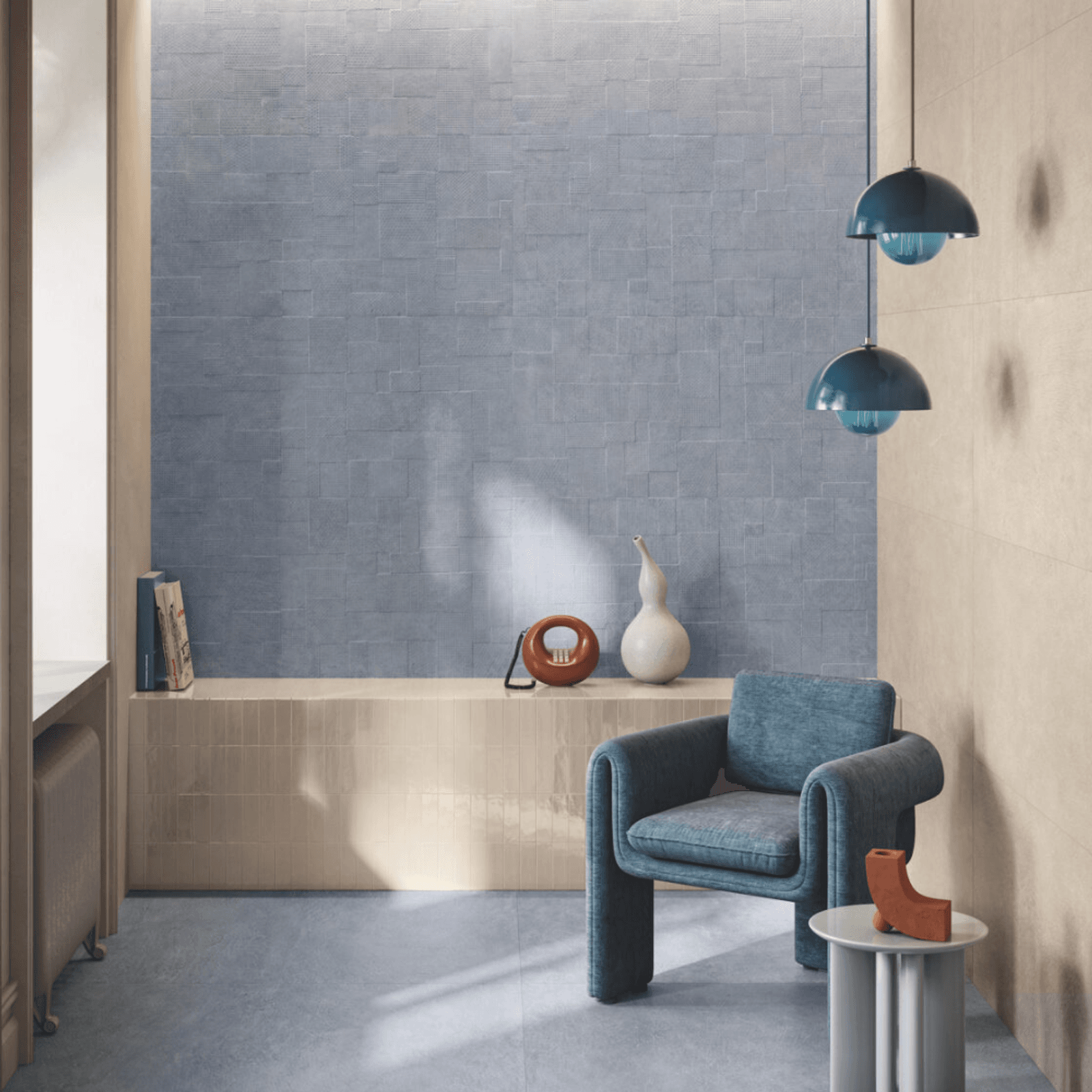
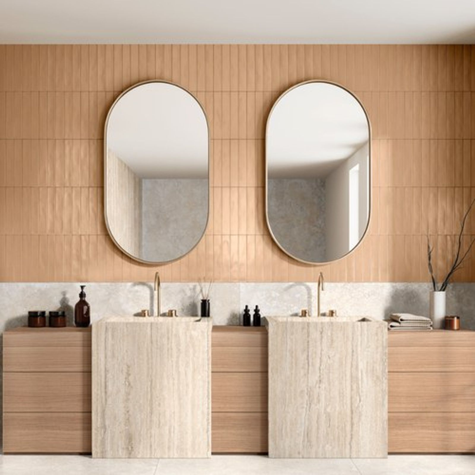
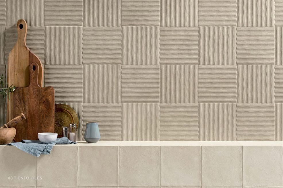
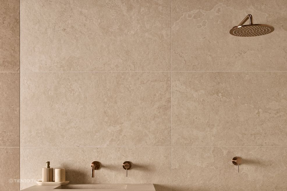
The influence of texture
There is more to picking tile colours than focusing on the specific colour choices before you. Texture can greatly influence one’s perception of colour, making it an important factor to consider.
The textural options in tiling have come a long way in recent times, especially with surface printing, as Kerry explains.
“You can have a surface print or texture in the tiles. The surface printing technology is so advanced these days. You can have a marble look, or a stone look, like limestone or a travertine crosscut print, and it looks exactly like the real thing.”
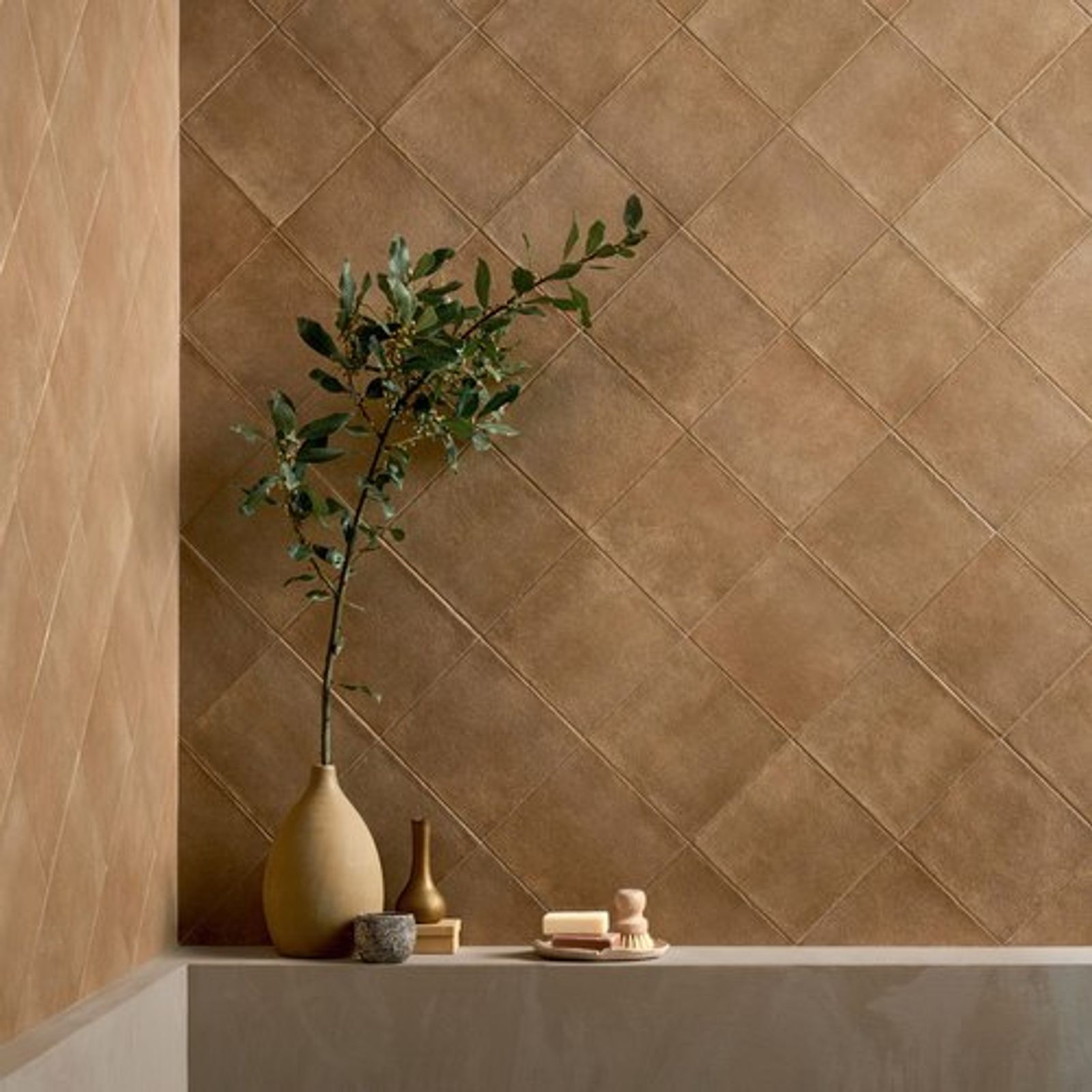
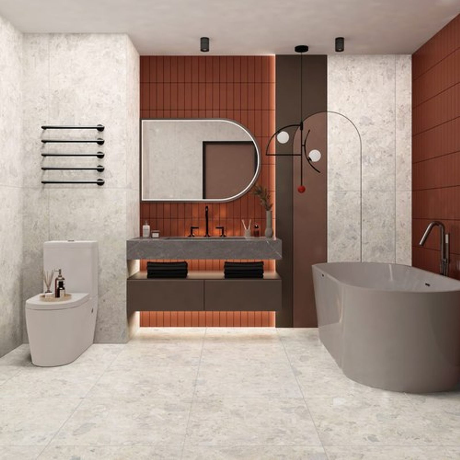
Texture in the tiles themselves also presents numerous opportunities, as Kerry continues.
“You might have uneven edges or a rippled effect on the surface, which makes it look like it’s been moulded by hand, which is very popular. Handmade tiles themselves are expensive, so the handmade look is a great option and can really elevate a space.”
While texture adds visual interest and depth, it too, can be a little more challenging when trying to achieve a feeling of timelessness. Once again, Kerry says there are strategies to mitigate this.
“Texture and colour on a wall can sometimes make it feel a bit busier, so when it comes to timelessness, you'd probably rein it back with more of a classic kind of stone look on the floor to offset the effect of it.”
Mistakes to avoid
With any important styling decision, it never hurts to understand what you shouldn’t do, learning from the mistakes of others. When it comes to tile colours, Kerry explains that these can happen innocently enough, often through overenthusiasm.
“Probably the biggest mistake is throwing too many tiles into a space. If you have a small space, using three or four different tiles is going to make it feel really busy and not so classic. That’s where coming into a tile showroom and seeing displays can help you to understand what it’s going to feel like.”
Sometimes, timings can also be off, especially when it comes to trends.
“A client might have just seen something that was more of a past trend, like a Terrazzo look, so it may be a matter of explaining the evolution of that trend in order to have a timeless look. We can show them what the interior designers and architects are loving and where the trends are going, and they love these insights.”
While not directly related to colour, there is also a misconception about choosing the right sized tile for a space.
“People often think they need small tiles for a small space, which is not true at all. Bigger tiles actually make a small space feel more open and modern because you’ve got fewer grout lines carving up the room.”
Parting advice on the direction to take
With our last question, we asked Kerry if she had any final tips for people to consider when choosing the best tile colour for their space. Her response was a great bit of advice to help drive and direct the decision for a unified approach and cohesive look, to capture that feeling of timelessness.
“My advice would be to start with one thing in the space that you really love, like a stone benchtop or the feature tile that you’re going to use. That will help set the tone around what most appeals to you. Then it’s really just taking the feedback from the experts and putting everything together, but if it flows from a feature that you love, that’s what’s going to make it timeless for you.”
Find out more about Tiento and their extensive collection of premium tiles