Interior Design: Tips on Choosing a Theme for your Home Interior.

Tip #1 - Determine the mood:
Start by thinking about the mood or feeling you want to create within the space. Do you want it to be relaxing or energizing? Light and bright or dark and mysterious. Once you have a clear idea of the mood you want to create, you can begin selecting colours that will help you achieve that mood.
Note: Textures and reflective surfaces need to be considered in your finish selection. Textures can add or subtract from a mood if not executed correctly. If unsure try the material or finish within the space and see if it works or not.

Tip #2 - Consider existing elements:
Take into account any existing fixtures or decorative elements already in the space. Choose colour placement carefully to enhance or complement those elements. When purchasing a home that requires a renovation, look for elements in the space that can offer inspiration for the new design. Some details in older homes are expensive to replace or remodel so look at ways to give interesting elements a new life without removing them altogether. This will give your interior an edge others can't purchase or imitate easily.

Tip #3 - Use colour theory:
Understanding the basics of colour theory can help you choose a tonal theme that works well together. For example, complementary colours, which are opposite each other on the color wheel, create a striking contrast that can be energising and create visual interest. Analogous colors, which are next to each other on the colour wheel, create a harmonious and calming effect. Each space within a home does not need to have the same colour scheme. As each space denotes a different task or function so too should the mood of the space. When a home interior carries the same mood throughout every space it can become overwhelming at one end of the scale and boring at the other.

Tip #4 - Think about the function of the space:
The function of the space can also play a role in determining the tonal theme. For example, a bedroom space is soothing and conducive to relaxation with a soothing color palette, while a home office may benefit from a more energising colour scheme that promotes productivity.
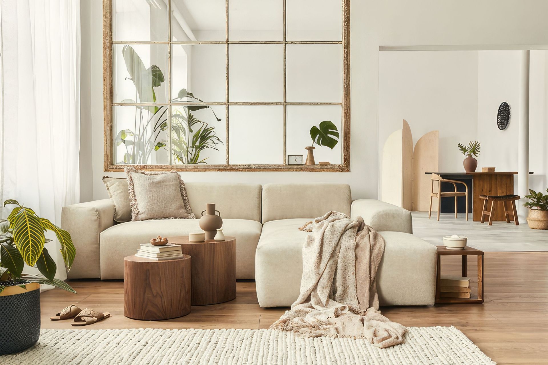
A tonal theme for a living area will be influenced by the intended experience within that space.
A living area designed off an entertaining area specific to functions will need a vibrant and playful theme for example, contrasting colours, interesting elements, and let's not forget lighting choices. A living area designed for relaxation at the end of a busy workday may be subdued in colour with plush textures and inviting soft furnishings to stimulate the tactile senses over loud visual stimuli.

Tip #5 - Experiment and test:
Once you have a general idea of the colors you want to use, experiment with different shades and tones to see what works best. You can do this by creating a mood board, using paint samples on the walls, or finding colours within nature around your local neighbourhood to inspire you.
Be aware of the natural lighting at different times of the day. If a colour is pleasing to you in the strongest natural lighting then you will enjoy it throughout the day in muted versions. In contrast, when a colour appeals to you when viewed at times of low natural lighting it may throw undertones that will displace other finishes or furnishings.

Tip #6 - Understand what you like and why:
Remember, there are no hard and fast rules when it comes to choosing a tonal theme for your home interior. Trust your instincts and choose a hue (colour) that you love and which makes you feel good in the space. It is important to consider colour chroma (intensity or purity) within a home interior. Colours of high-intensity work within living environments where we do not spend large amounts of time. For example, a vibrant restaurant interior or fast food chain, a gym, early childhood education facility, and retail chains. My personal favourite would be the overtly tacky display home interiors designed to catch your attention with an overwhelming concoction of pattern, colours, and artwork all vying for your attention.
When high chroma colours are used within home interiors they look cheap. Colours you enjoy wearing in a fashion context can inspire the colours for your interior but they need to be a subtle version of the former.
