Intersecting rhythm, light & steel: the dramatic renovation of a Sydney residence
Written by
02 September 2023
•
5 min read
When a family of four relocated from the upper north shore to the lower north shore in Sydney, there was some apprehension about how they would acclimatise to a smaller footprint. Their previous home was single-level and sprawling, whereas the new 200sqm home was spread over four compact floors.
However, the clients loved the expansive Sydney Harbour and bridge views, and were excited to work with mother and son team Patricia and James Stewart of Stewart + Stewart who had previously worked with them on two occasions.
“The ambition for the renovation project was essentially to open up the interior spaces to the views and harness as much light as we could,” says designer James Stewart.
Having worked with the clients before, the design process was natural and straightforward.
“We understand how they live in their spaces, which made it much easier to design. The brief was simple: to make it light and beautiful.”
As part of the brief, the designers repurposed some of the clients’ treasured furniture items and artworks, integrating special items into the layout.
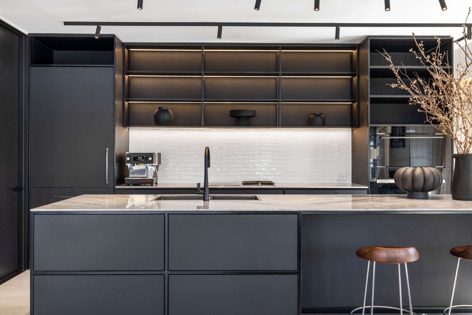
In the kitchen, this meant a beautiful antique armoire and a crystal chandelier were designed into the space, and other special pieces layer the home with the family’s history.



Aside from these special pieces, the design parameters were open, which meant first carefully considering the layout and how they could amplify the light in the living spaces.
As a starting point, all of the existing windows in the 1990s Federation-style home were replaced with floor-to-ceiling joinery.
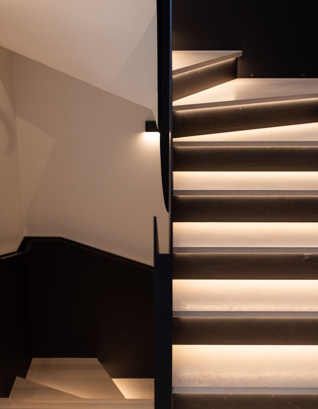
Another key focus was the relocation of the original enclosed staircase which intersected the layout almost through the middle, blocking light to the rear of the house.
“It was quite a dramatic move to relocate it on the southern side of the property, and that allowed us to open up the main living areas, which was probably the most important thing we did with this renovation,” says James.
An enclosed loft space above the main living area was also reconfigured, as the ceilings in this area were at a minimum height, creating the feeling of being closed in.
Removing the loft altogether was considered, however, doing so would mean losing the stunning water views from the loft balcony, so it was decided to suspend a steel structure within the space, bringing a sense of play and height into the living area.
Our design process is strongly reflected in the sharp graphic lines throughout the home. I feel we have a very symbiotic relationship and by converging both of our viewpoints, we create very considered designs.


The designers also made the decision not to lower the loft ceiling a further 100mm to recess halogen down-lighting and instead selected a track lighting system that creates strong intersecting grid lines, which play into the black steel features of the home.
These steel features were initially inspired by the raw and open steel loft and quickly became a dominant feature throughout the design.
“Steel is really a key element that we used throughout the project. We were fortunate enough to work with fourth-generation Italian blacksmiths. They manufactured and installed all the steelwork, including the thresholds and the floors, the reveals to the doorways, the steel doors and windows, the stair balustrades, and the stair handrails,” says James.
The steel elements appear in a raw and textural form, and contrast directly with the bleached white ceilings and walls; James says this monochromatic palette enhances the reflectivity of light.
“We feel that contrasting the black with the white elements sharpens the white even more, amplifying the light and really brightening that space.”


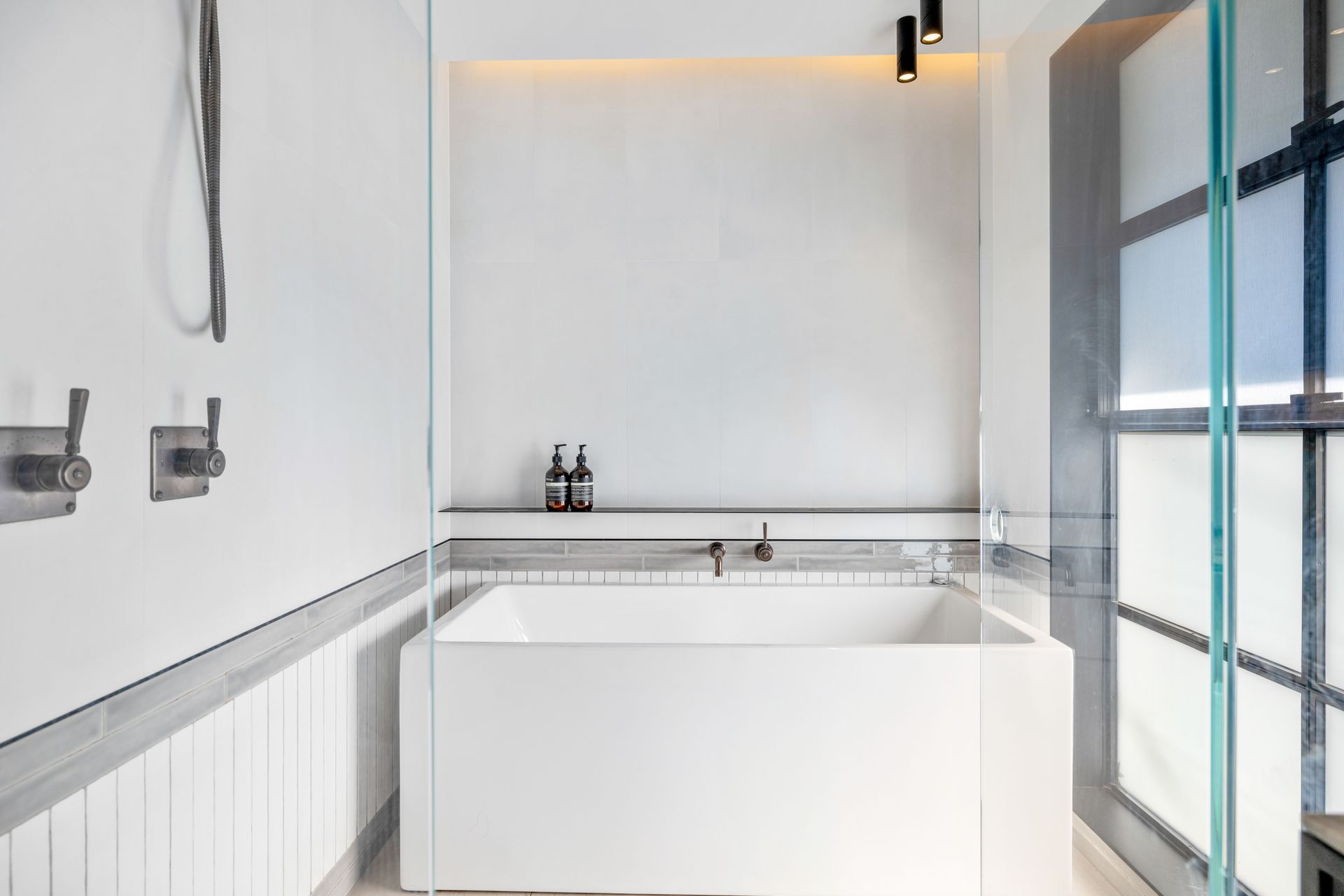
Reflective handmade long-format tiles and tonal marble benchtops further soften the home, while the elegant wallpaper and artwork dotted throughout the home grounds the spaces and offers a sophisticated counterpoint to the neutral colour palette.
“One of our signatures is to contrast the elements in a home,” says Patricia. “We use an interplay of raw and luxurious finishes.”
In this project, the designers have balanced the ombré fade of the Belgian linen curtains with the contrasting sections of the walls, and the large format Italian stone floors and handmade tiles throughout all the wet areas against the structured elements of the steel joinery.
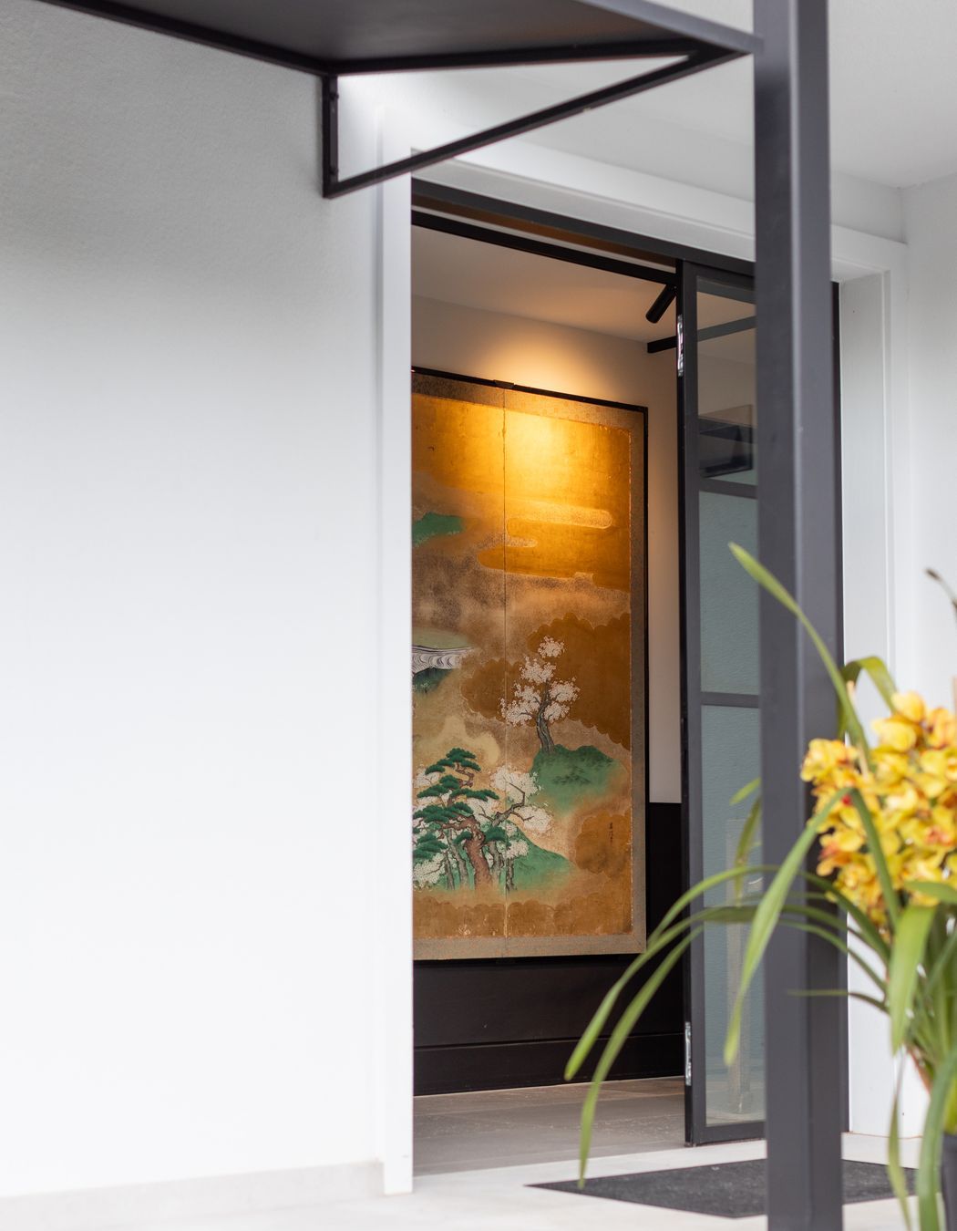
The entry is another great example of the contrast between hard and soft elements.
“To create a sense of arrival, steel doors open onto a very dramatic, antique Japanese screen that we repurposed from the previous home. We love that it adds colour and life to the space,” says Patricia.
The balance of materials and high-contrast tones gives the home a sense of rhythym.
“Our design process is strongly reflected in the sharp graphic lines throughout the home. I feel we have a very symbiotic relationship and by converging both of our viewpoints, we create very considered designs.”
Discover more projects from Stewart + Stewart

