Mirror mirror: how to achieve design harmony through symmetry
Written by
12 April 2022
•
6 min read

Though we mightn’t all be interior designers or landscape architects, we all know good design when we experience it. Whether it's an instant feeling of comfort and ease upon entering a curated living room or a sense of satisfaction upon viewing the immaculately manicured lawns of the Gardens of Versailles, our subconscious innately responds to beautiful design. In the same vein, we’re able to swiftly identify when a space doesn’t look quite right, with certain environments imbuing us with a sense of unease.
At the heart of both responses sit symmetry and balance. Symmetry in design refers to the balance of shapes, colours, and silhouettes in a space, with well-balanced design bringing order and harmony to a room or garden. While viewing images of meticulously designed rooms and gardens can be intimidating for non-designers, symmetrical styling is a key design tool decorators, interior designers, and landscapers alike use to create cohesive spaces.
As with anything, too much symmetry isn’t ideal either, with spaces that resemble exact mirror images often appearing rigid and staid. To combat that, a thoughtful balance of symmetrical components with a touch of asymmetry will serve to create a welcoming, grounding space that still feels fresh.
Why are we drawn to symmetrical design?
From paintings and sculptures to architecture and design, humans have an innate aesthetic preference for symmetry. From the Ionic columns of the Parthenon in Athens, Greece and the geometric Mughal architectural style of the Taj Mahal in Agra, India to the opulently baroque interiors of the Jesuit Church in Vienna, Austria, the principles of symmetry have been used in architecture and design since ancient times.
Gravitation towards symmetrical design has been documented in adults and children alike, with the former using symmetry as a barometer to judge the attractiveness of human faces and the latter displaying a higher attention span when viewing symmetrical images over asymmetrical ones. While both adults and children are able to perceive aesthetic symmetry, a study undertaken on focus groups of adults and children showed that only adults displayed an aesthetic preference for symmetry. This may be attributed to a feeling of familiarity through lived experience, with balance and symmetry proving easier for our brains to process and translating to feelings of comfort and peace.
How to incorporate symmetry in your home
Harnessing the power of symmetry has the potential to create visual appeal in any room of the house, but there's no need to stop there. Adding symmetrical elements or redesigning your garden with symmetry in mind can add a sense of formality and order that elevates its look and feel. Read on for inspiration on ways to introduce some pleasing symmetry to your home, inside and out.
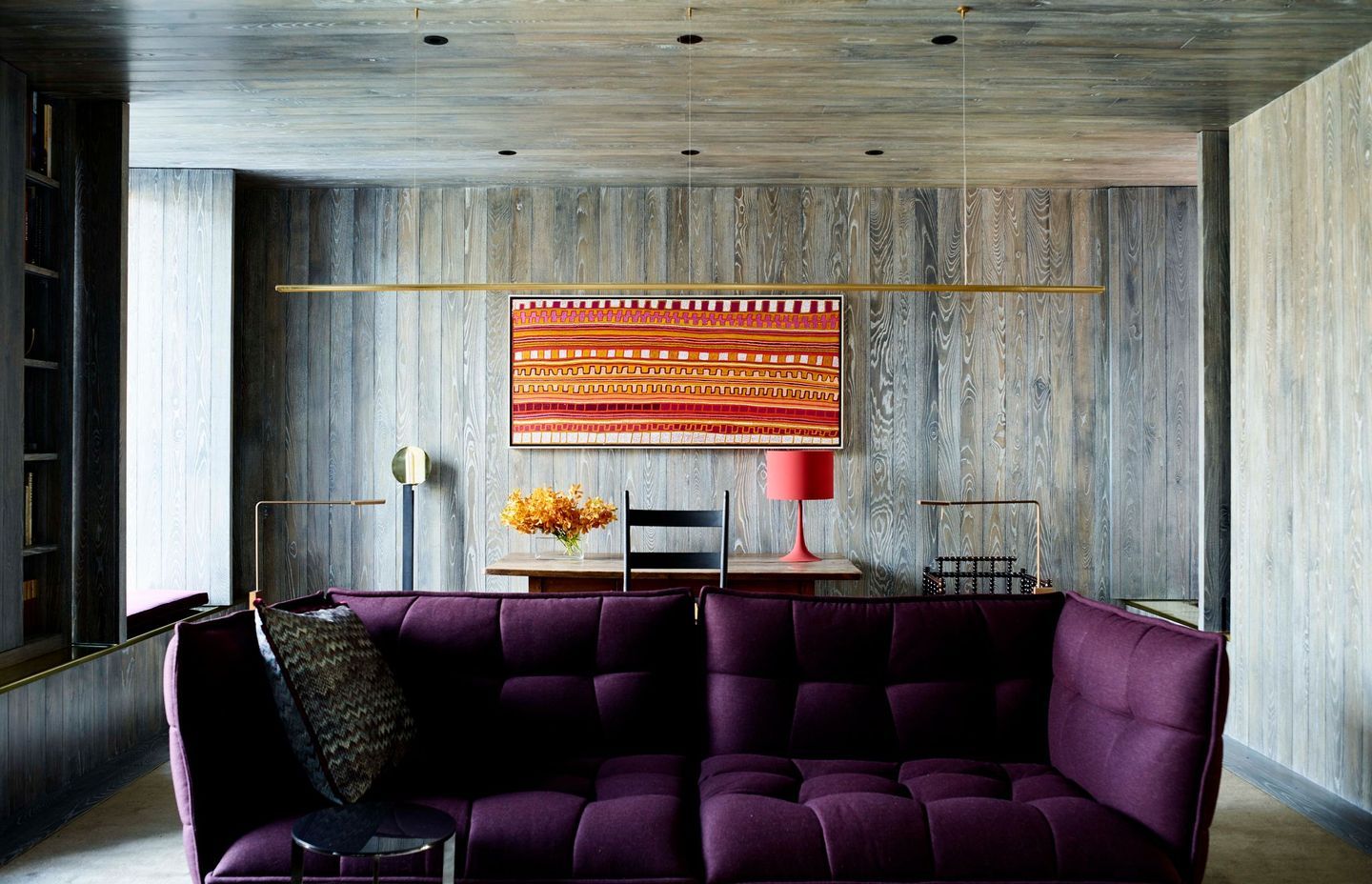
Find a focal point
To achieve true balance in a room or space, symmetrical design should stem from a focal point. Typically, this is the heaviest object in a room. In living rooms, this can be a sofa or coffee table; a benchtop, sink, or statement oven in a kitchen; and a bed within a bedroom. Similarly, those creating symmetrical gardens may select a statement sculpture or fountain as a focal point.
The focal point acts as an axis, with other design elements surrounding it. In Armadale Residence by Rob Mills Architecture & Interiors, a plush purple velvet sofa anchors the room, providing a focal point for the symmetrically arranged artwork and accent table behind it.
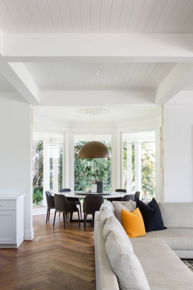
Similarly, this Hunters Hill home by Campbells Architecture uses pre-existing architectural elements to inform the set-up in the dining room. A circular dining table and statement lighting are symmetrically framed by windows in a light-filled octagonal room.
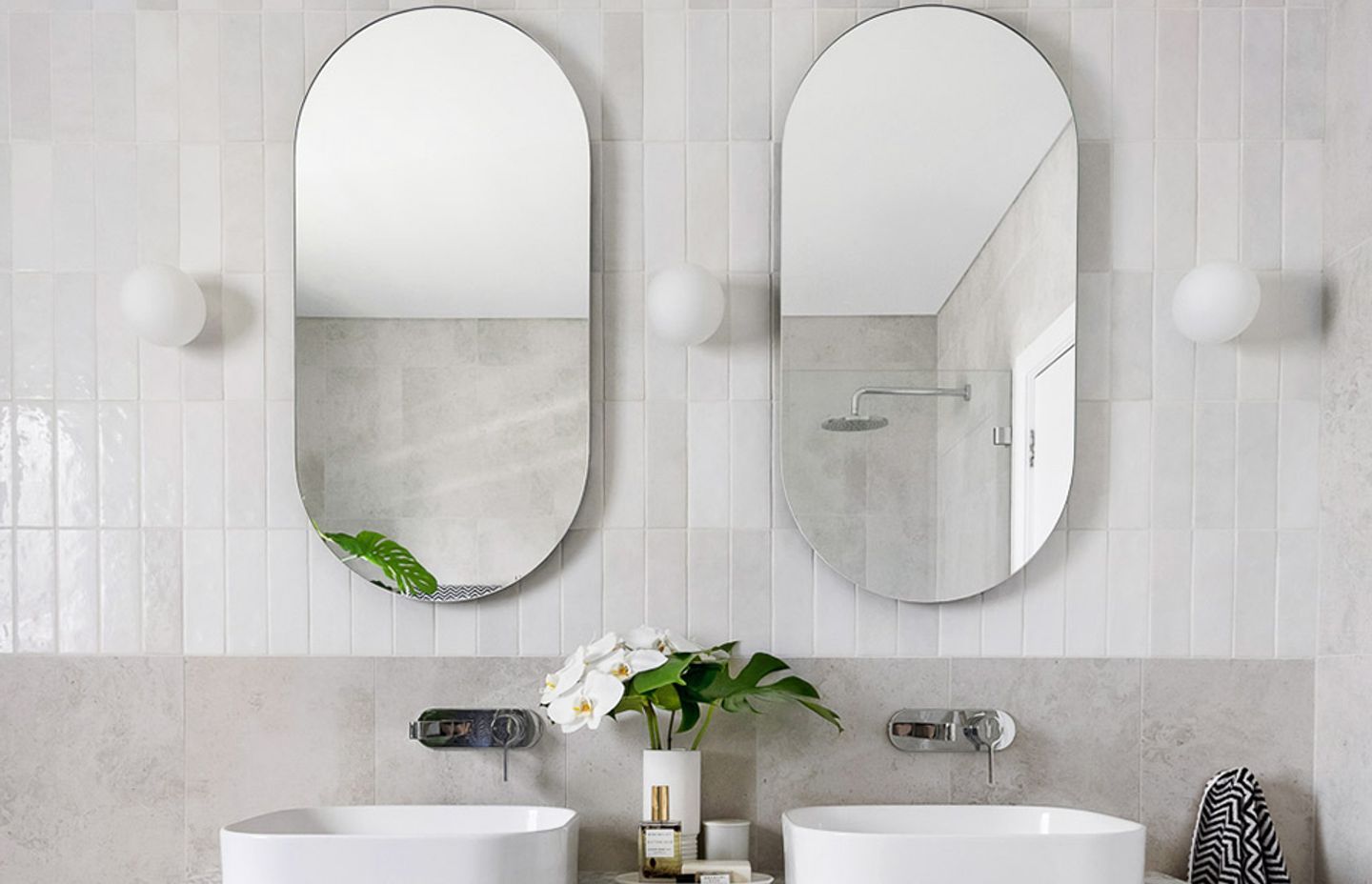
Double or nothing
Not only does having two sinks significantly reduce petty arguments in the morning, it also lends a bathroom a luxurious aesthetic reminiscent of a boutique hotel. This bathroom in Rose Bay by interior designer Jess Thomson features his-and-her sinks, with symmetry maintained through identical mirrors and light fittings, while asymmetrical greenery grounds the design.
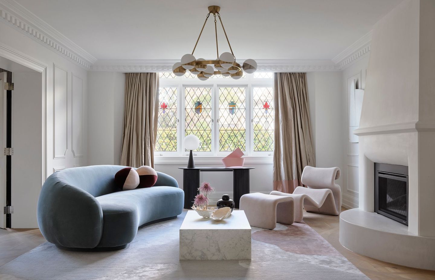
Incorporate some asymmetry
Equally important is asymmetrical design, which when used properly can bring balance to a room. Asymmetric elements can be used to create interest and prevent a room from looking stale. Proving symmetry and asymmetry can coexist in harmony, Matchpoint Residence by Duet uses furniture and decorative objects to offset the rigorous symmetry of the existing room. The key to pulling it off lies in using the same design principles as symmetrical design, with the living room focused around an axis. Here, the marble coffee table acts as a focal point, with other elements stemming from it. Placement is crucial here; though both pieces of furniture and the decorative objects on the display table under the window differ from one another, they are arranged symmetrically, bringing balance to the room.
Island dreaming
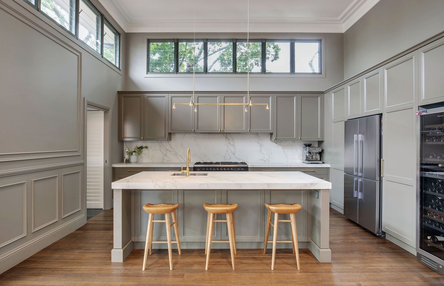
Due to their abundance of heavyweight items that can potentially serve as focal points, kitchens make for the ideal foray into the world of symmetrical design. In Northmead Kitchen by Dan Kitchens, a chic marble island countertop serves as the axis for the space, sitting centrally to the pendant lighting, cabinetry, bar stools, and appliances. To avoid the almost offputting nature of complete symmetry, the sink is placed to the side, which works to add interest to the space.
Mind your manners
Due to the unpredictable nature of natural life, symmetry in gardens can be harder to maintain than in indoor spaces. However, landscape architects and designers specialising in French and Italian-style gardens have mastered this delicate art, through manicured lawns and well-pruned hedges.
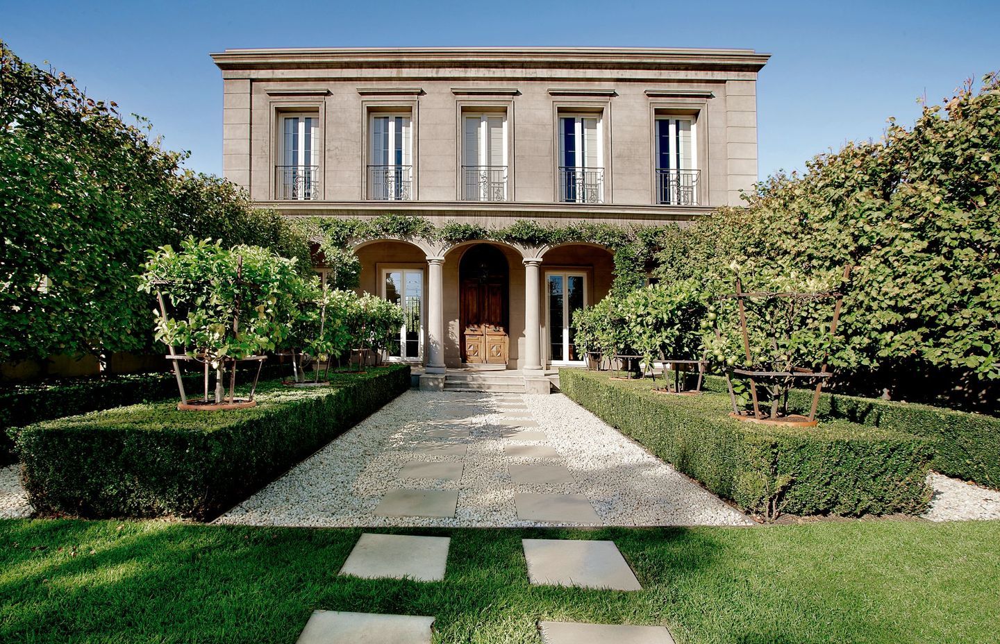
Symmetry in garden design often lends itself to an elevated European aesthetic, as seen in Kenley Court by Rob Mills Architecture & Interiors. An ornate 19th-century Italian door serves as the focal point for the entryway, which minimises maintenance requirements by replacing elements of the front lawn with white pebbles. Lined with hedges and citrus trees, Kenley Court brings a taste of old-world Italy to the suburbs of Melbourne.
Symmetrical doesn’t mean identical
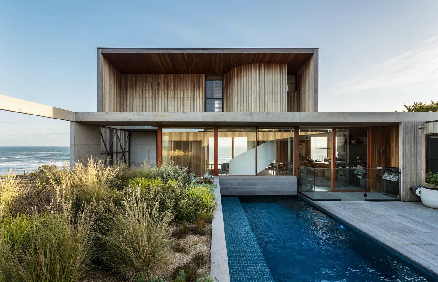
When in pursuit of balanced design, it pays to remember that symmetrical doesn’t equate to identical. In a living room, similarly-sized objects that differ in colour and composition can be positioned on either side of an axis, serving to emphasise interior symmetry. Taking this concept to the next level is Cliff House by Bethany Williamson Landscape Architecture. Created with the intention of reconciling the garden with its harsh coastal surrounds, the courtyard of this home is divided evenly in two, with the rugged native grasses and plants providing a foil for the protected courtyard and pool next to it.
Words by Tanisha Angel