Old-school diner meets contemporary café in this Hamilton eatery fit-out
Written by
26 October 2022
•
5 min read

Located on one of the busiest corners in Hamilton’s CBD, the inevitably busy Cream Eatery has been a key component in the rejuvenation of the central city since it opened in early 2020. Designed by Designwell, the café is on the ground floor of the iconic MCL Insurance building on the northwest corner of Garden Place. It’s connected to a coworking building called Panama Square – with interiors also designed by Designwell – and part of the design brief can be understood in this context. The eatery needed to service both the CBD community, and the Panama Square community already in the building.
The fit-out was driven by the branding work that Designwell had already created for Cream, and Designwell’s Alexander Wastney says they were able to have some fun with it.
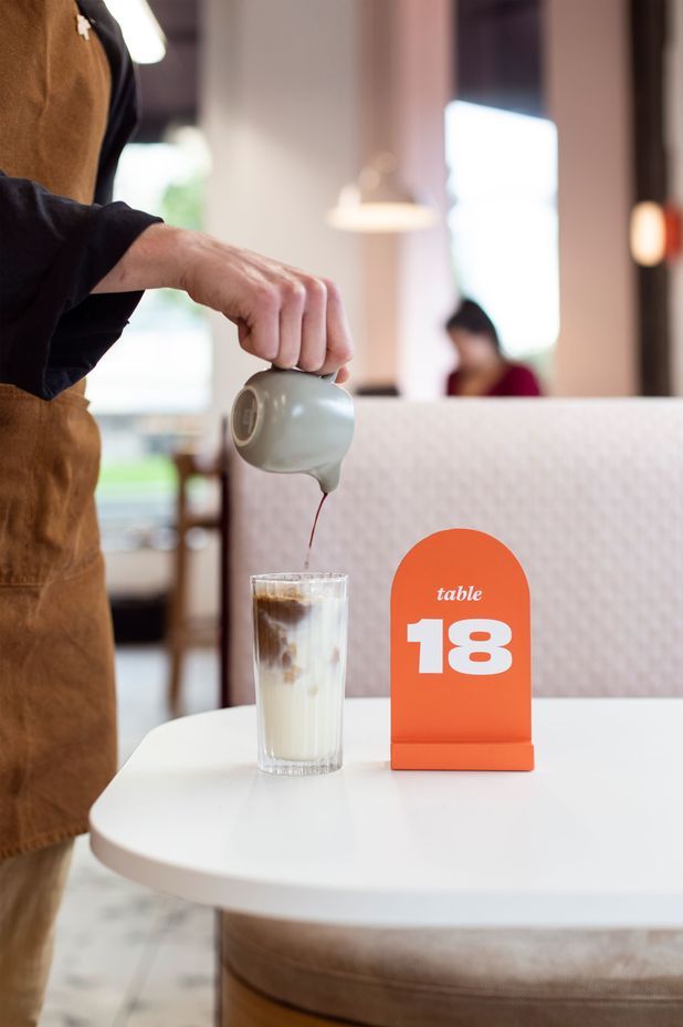
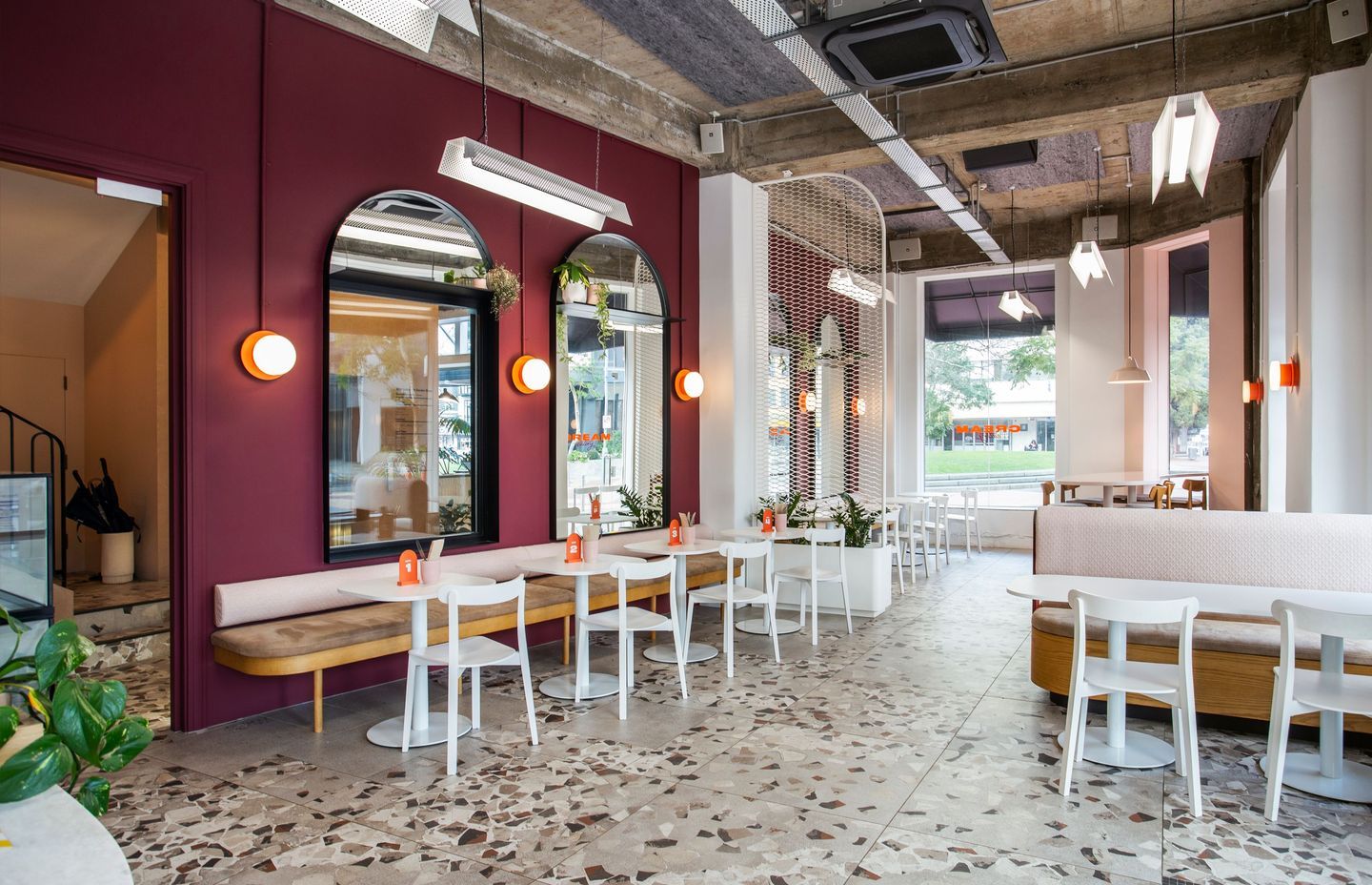
“We started with an idea of old-school diner aesthetic – white tables, white lights and industrial lighting that you would expect in an American diner, and we hashed that up with New Zealand café/eatery vibes. Unexpected colours such as the boysenberry walls and orange pop are part of that throwback idea of diner meets New Zealand café.”
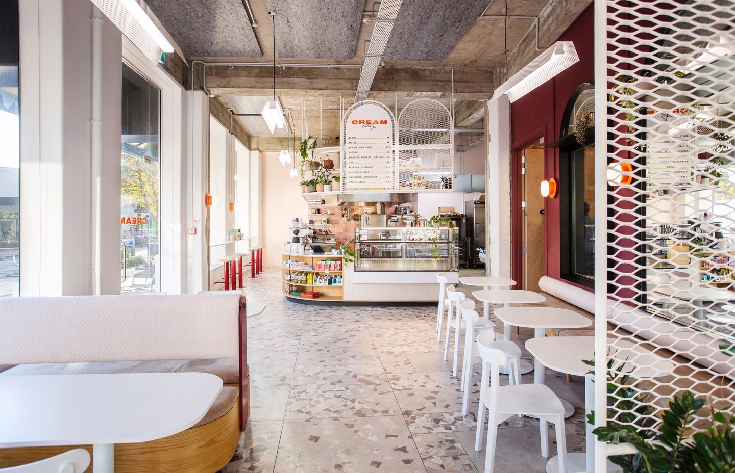
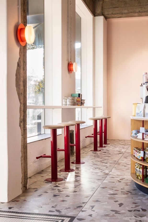
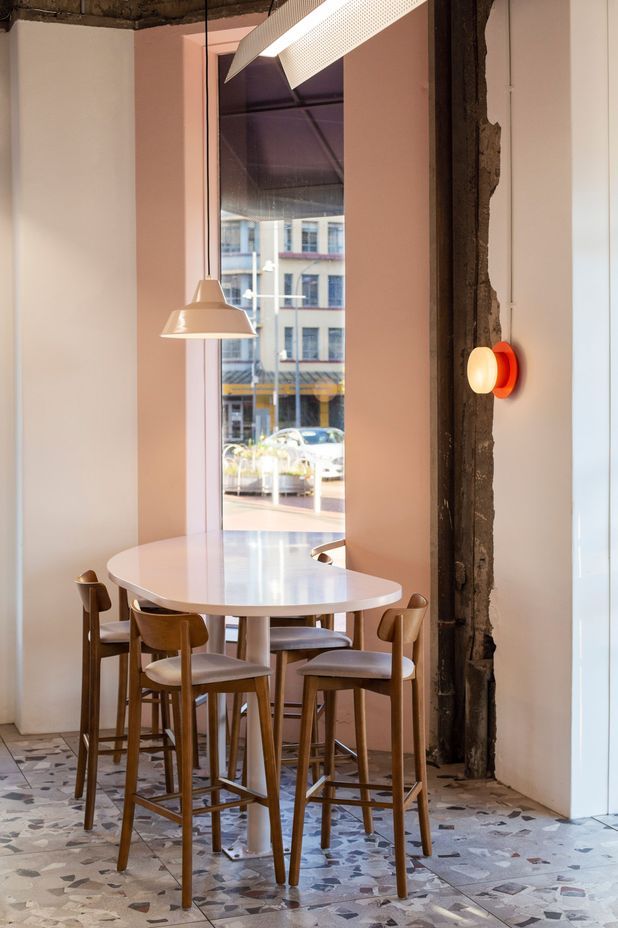
Cream is on a southwest facing corner, so part of the design challenge was to maximise light in the café. Another challenge was to create a connection to the lobby of Panama Square. Big bay windows were wrapped around the corner of the building, letting natural light in, and the ceiling was ripped out and left exposed, making the space feel big and open.
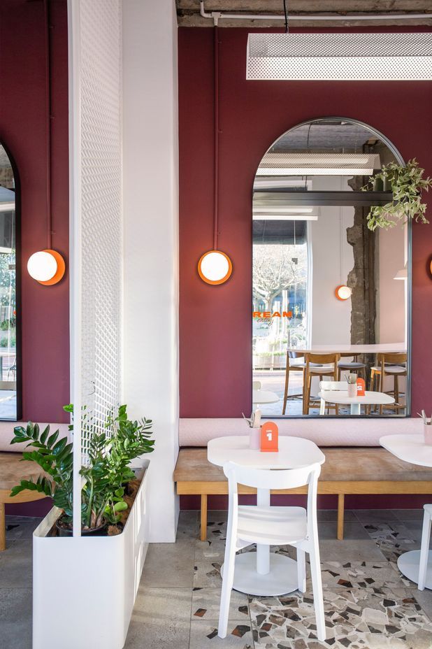
The connection to the lobby was made more difficult because each connection had to be a fire cell. “This was the most difficult technical part of the design,” says Alexander. “We got a big fire door – the biggest one we could specify – and we got a big fire glass window. The desire was to have the big arches for both windows, but as fire windows it would have cost too much, so we used mirrors as an alternative.” The mirrors create more light and space, and add to the open feel.
The café itself seems to have struck the ideal balance between kitchen and dining area. Alexander says the owners of Cream, Luke and Chrissy, are very experienced and smart operators who designed their kitchen knowing exactly what they’d be offering the market. For example, Cream also caters out of the café kitchen, so the design was a compromise between what the owners needed and the constraints of the space. Alexander says of the owners, “To their credit, they were open to the idea of doing a fully open hot-line and prep area, so that enabled us to use less space because we didn’t have to partition walls and close all that off.”
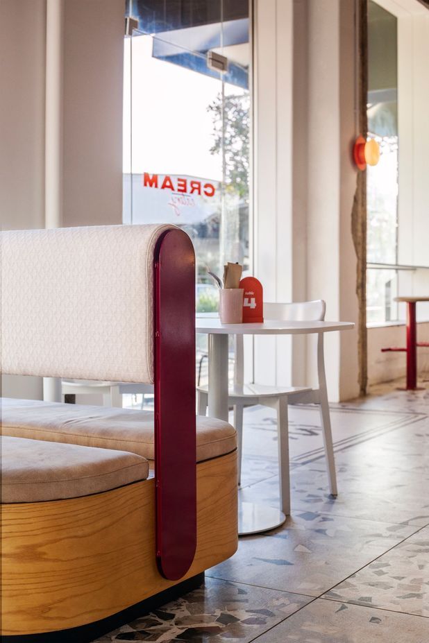
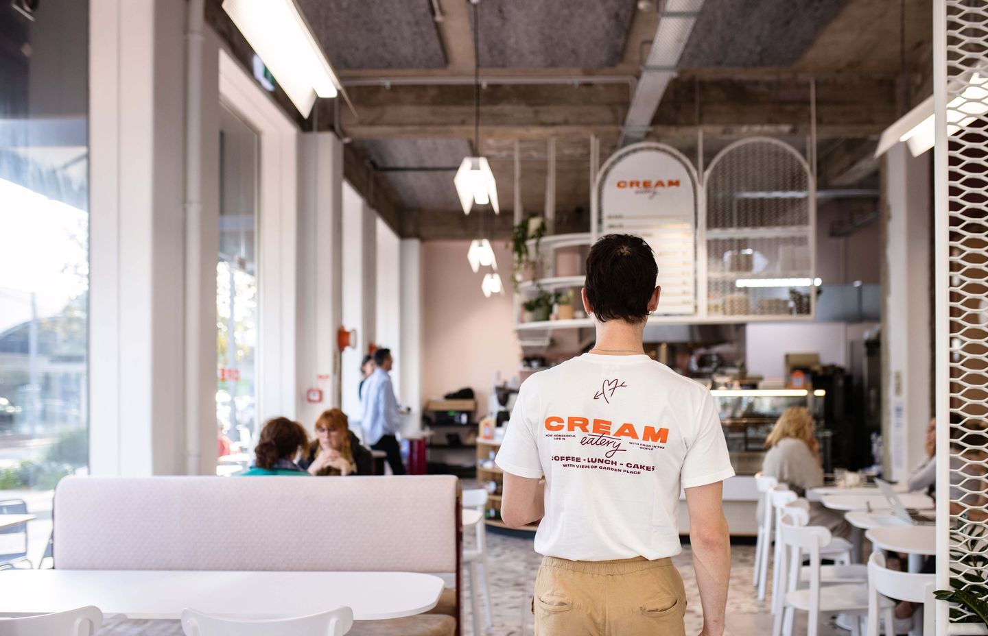
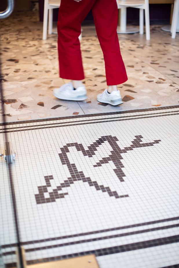
For the dining area, Designwell chose terrazzo-look tiles for the floors to create a visual connection with the Panama Square lobby. The building was built in the 1950s, and there have been a lot of different things patched in since then – there used to be four different tenancies. Designwell exposed a lot of the previous interiors, and chose to leave them bare, so people could get some idea of what had been there before.
“It has set a nice tone for everything to juxtapose against,” says Alexander. “Wherever possible, we’ve tidied it up and took the sharp edges off and left it exposed, knowing that we had a lot of higher end features that could balance that.”
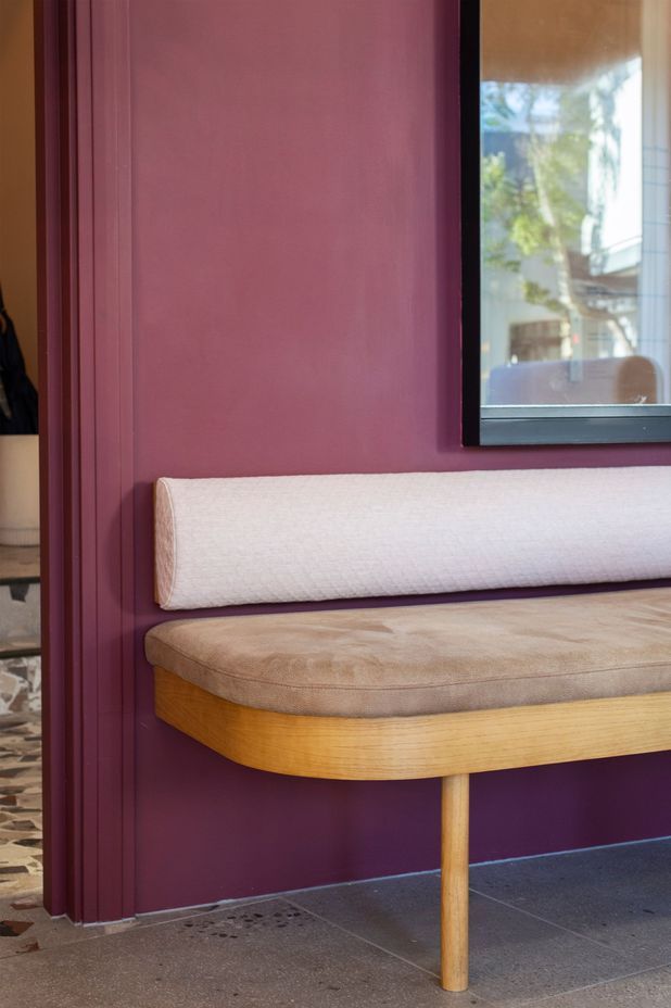
The other material finishes were chosen for their ability to communicate the brand colours. The search for colours and fabrics led to the use of custom powder-coating, and a combination of Dulux paints, and James Dunlop Textiles. The light pink faux leather on the seat bases is by Warwick Eastwood, and the backrests were upholstered in Mokum fabric, which is quite risky upholstery for a commercial space like Cream, but adds to the overall feel of originality. The white expanded mesh that features as a partition in the dining room, and again above the counter, was chosen after a visit to the Hamilton factory that makes it.
“It was nice to work with a client who was willing to push the boat out aesthetically, and not settle for standard stuff off spec,” says Alexander. “I’m really happy with the custom mirrors – they were pretty crazy – very heavy, and difficult to install, and the custom lighting and custom shelves. The only thing standard is the white chairs.”
Alexander has enjoyed seeing Cream Eatery become the busy, bustling go-to café in Hamilton, and he has enjoyed seeing the community support it. “A café is only as successful as the operators and their ability to serve good food and provide great service – and Cream have nailed that, so the space just complements their hard work.”
Read more about this project.
Words: Bardo Ashton
Photography: Jessica Koretz and Ruth Gilmour