Our Favourite Retail Interiors in Sydney
Last week we paid homage to interior design standouts in Melbourne’s retail scene, and since Alt’s second home is Sydney (or it will be, once our Surry Hills showroom is finished!) we thought this week it was Sydney’s turn. Without further ado, these retail interiors—some of which we are honoured to be involved in—are our top picks.

Aesop, Paddington - Clare Cousins Architects
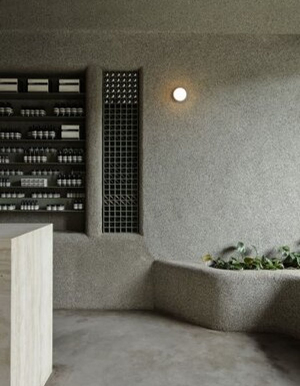
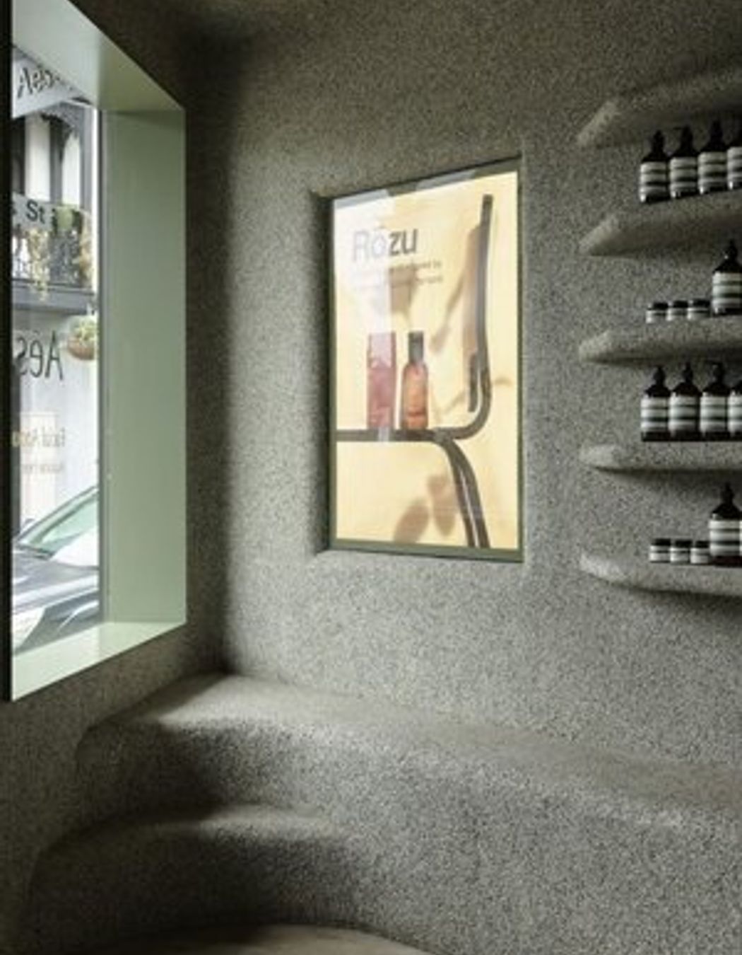
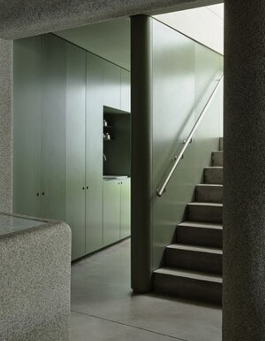
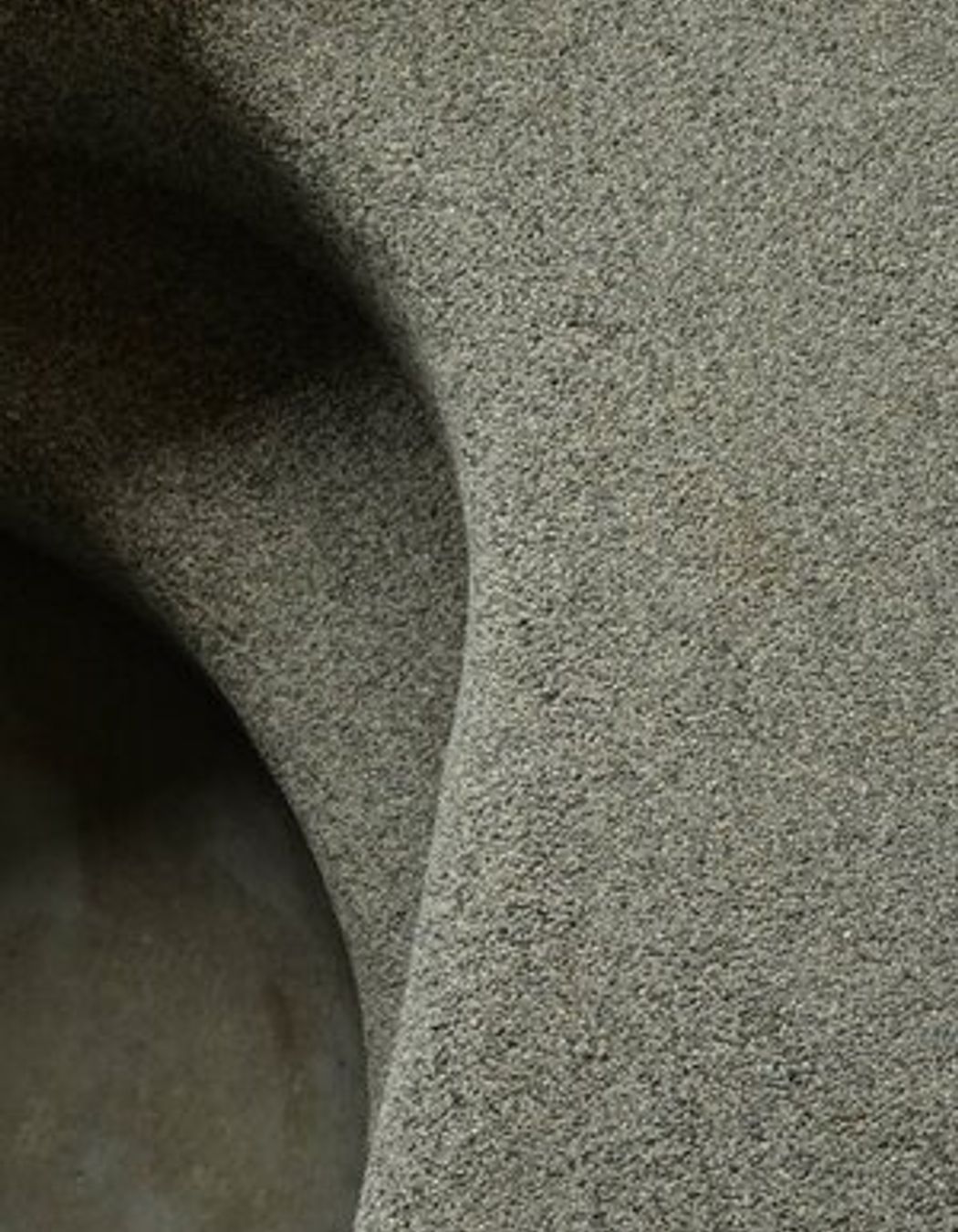
No list about retail interior design would be complete without featuring at least one Aesop store. Aesop Paddington is amongst our favourite projects we’ve ever been involved in—it’s like stepping inside an underground cave scented like heaven. Designed by Clare Cousins architects to reference all the colours and textures of Sydney's beloved swimming spots, it features our Quartz Carpet installed to the walls and joinery in that brilliant grey-green colour. The result is a pebbly cavern that references both the granular, rocky shorelines and grottos along NSW’s coast, and the sleek swimming pools Sydney is so famous for.



Ozlana, Westfield - Pattern Studio
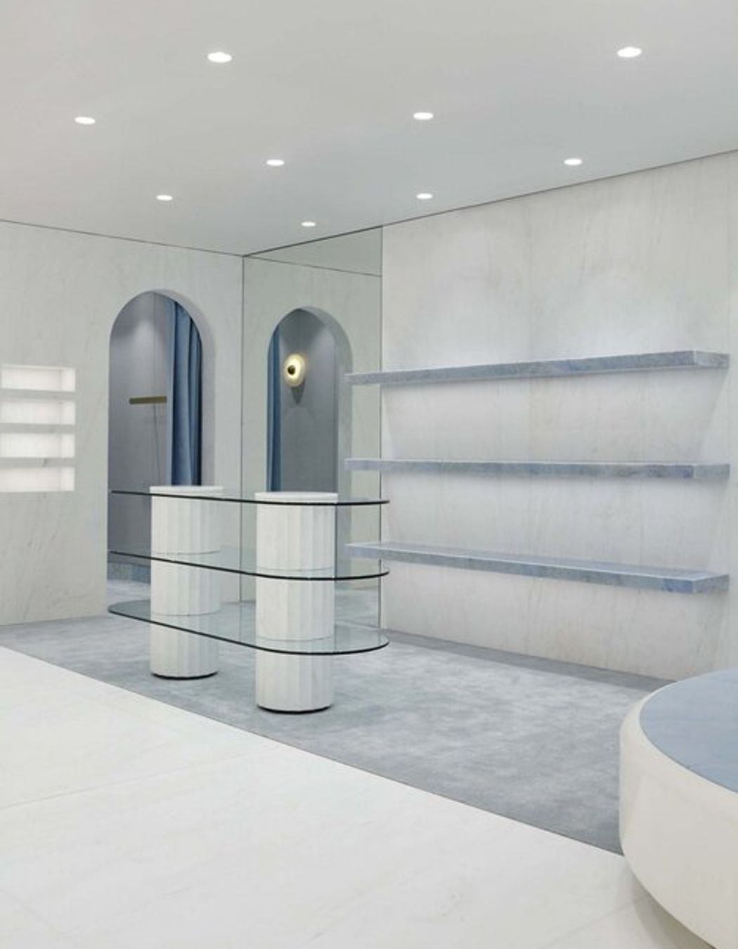
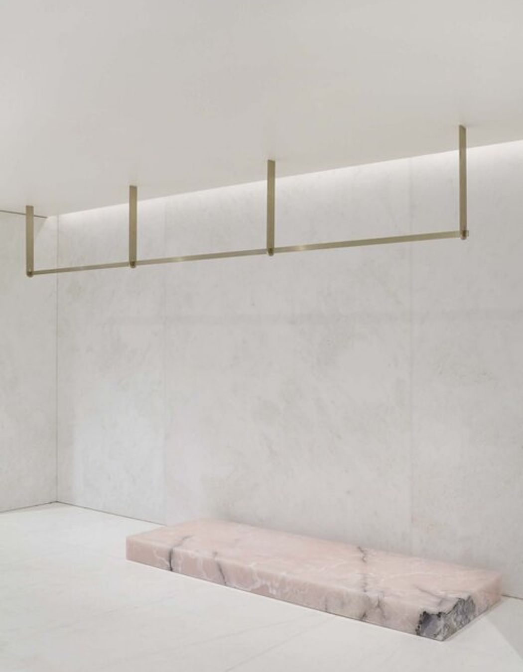
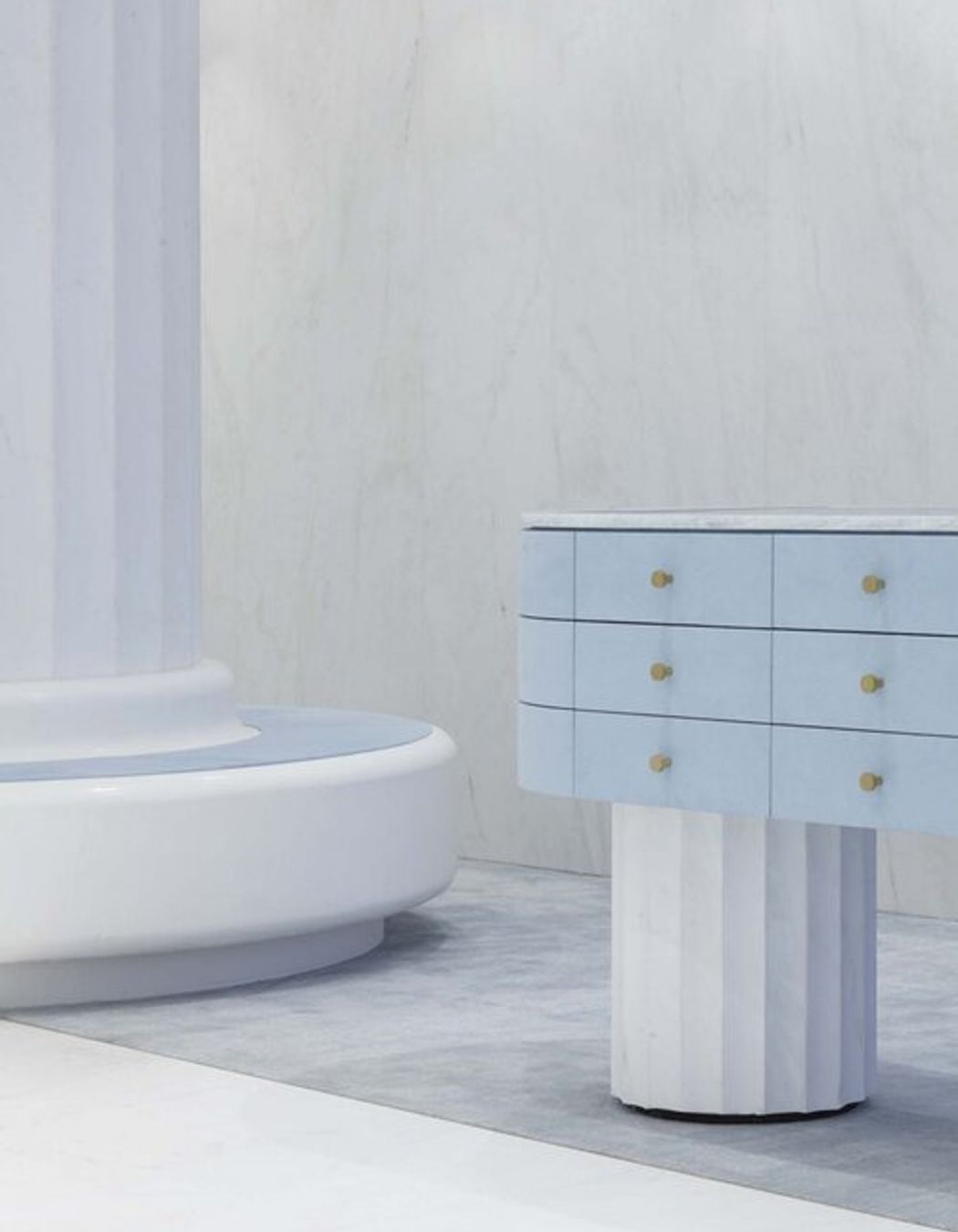
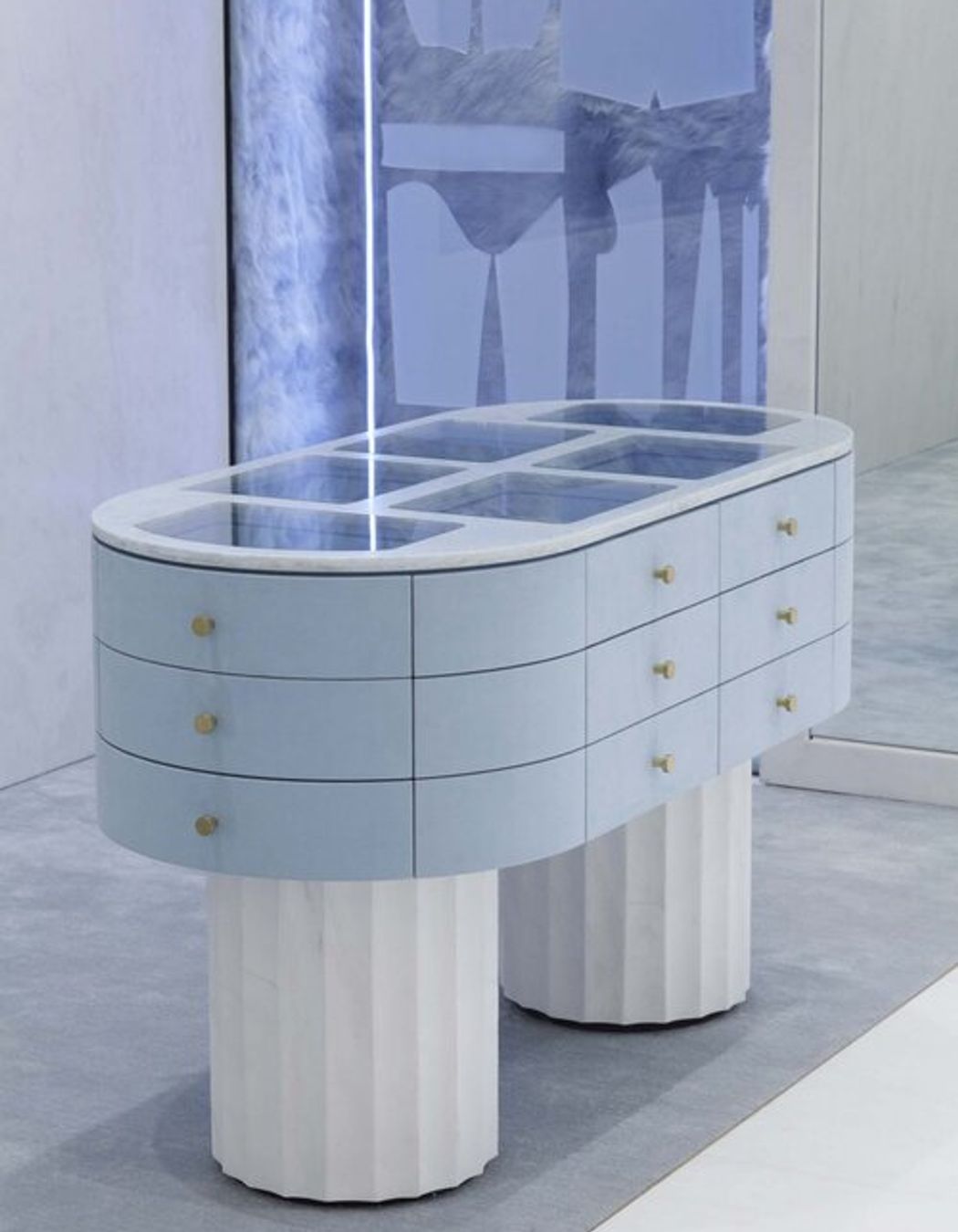
The Sydney brick-and-mortar for this previously online-based outerwear brand was transformed into a whimsical winter wonderland; covered in white marble mimicking snow, featuring icy blue glass and veiny pink onyx referencing the frozen, glacial landscape of the arctic. It’s the perfect environment for Ozlana’s signature coats and parkas, radiating a dreamlike quality that compliments the brand’s surreal and experimental approach to fashion. Stark and bright in a refreshing sense, it’s an immersive space where shoppers can peacefully browse Ozlana’s selection of delightfully out-of-this-world designs whilst feeling like they’re cocooned inside a soothing snowscape.
Viktoria & Woods, Bondi - Fiona Lynch studios
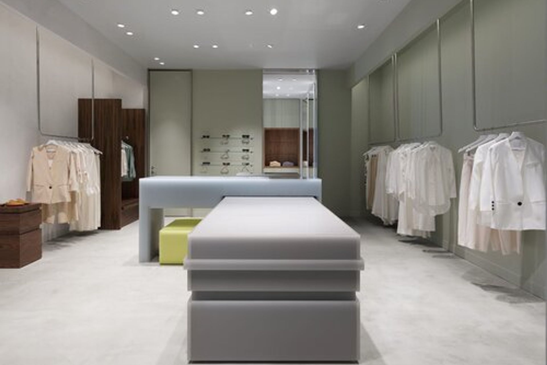
A unique perspective on colour and texture gives the Vik & Woods Bondi store an otherworldly feel which stands out from the crowd. The subdued colour palette, textured hand-trowelled X-Bond flooring, and the consistent use of translucent resin works together to create soft silhouettes, where edges seem to blur and diffuse hazily into space. The effect is a slightly futuristic and phantastic quality, which only becomes more pronounced with the interaction between reflection and light in the changing area. We like to think it’s what spaceships would look like if NASA and Fiona Lynch studios architects ever did a collab.



Tigerlilly - Room on Fire
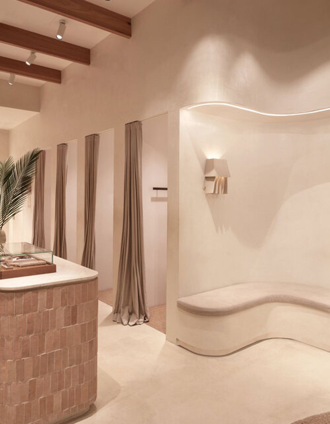
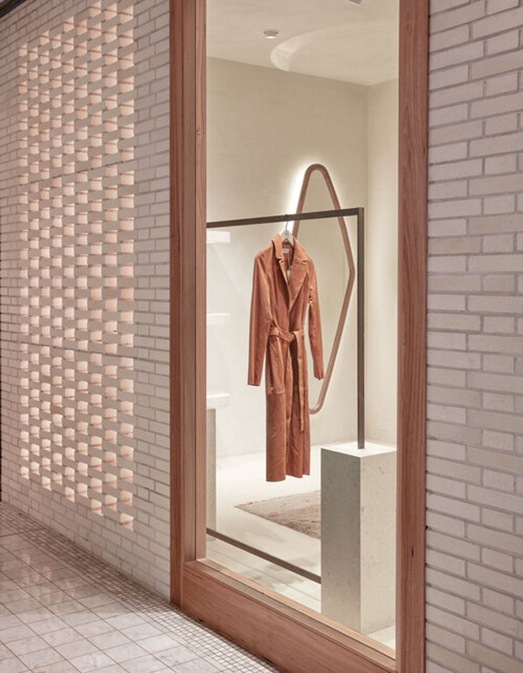
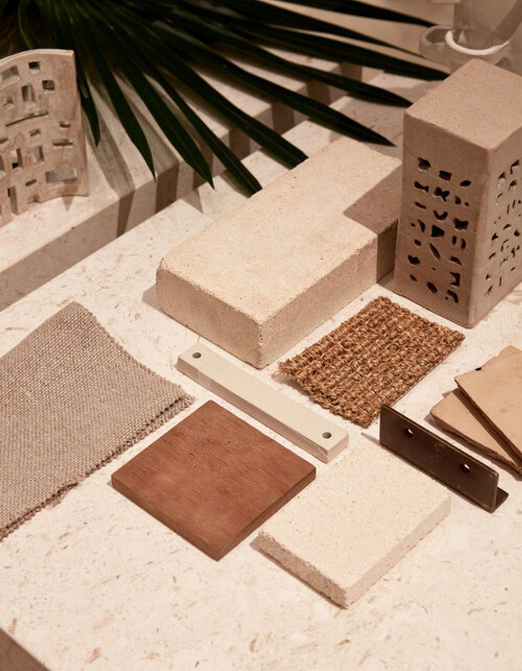
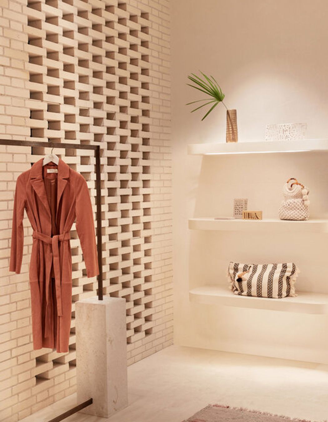
A beachy bohemian escape in the middle of the CBD, Tigerlilly’s Sydney flagship is a transportive space that feels worlds away from the Westfield shopping centre outside. It features a light and organic colour palette for a summery feel that lasts year-round, reflected in custom colour X-Bond on the walls and floors, cream bricks cladding the façade, and natural, tawny materials. The curved silhouettes and soft hand-trowelled surfaces interact beautifully with all that warm strip lighting, creating a space that literally glows from within. It’s boho-chic just like the products inside, capturing that signature Tigerlilly identity as all good retail design should.
