Porter’s Paints' new 2025 Colour Library: an intersection of innovation and timeless design
Written by
04 September 2025
•
4 min read
Porter’s Paints’ new Colour Library launched last month, marking the first major update to the brand’s offering in ten years. Artfully intertwining contemporary and timeless hues to create a broad and sophisticated palette, the 2025 collection is bound to capture the hearts and minds of design professionals throughout New Zealand.
Developed with input from customers and industry partners, the new range meets the ever-changing needs of architects, interior designers, and homeowners alike, offering versatility and character to suit a plethora of design styles and projects. It’s a testament to the brand’s heritage and history of quality and innovation.
The sophistication of the palette speaks directly to the tastes of New Zealanders, connecting to the landscape and evoking a sense of calm and belonging. Porter’s new collection feels tailored for New Zealand homes and hospitality spaces: timeless yet attuned to the subtleties of light and mood unique to Aotearoa.
Exploring the expansive new palette
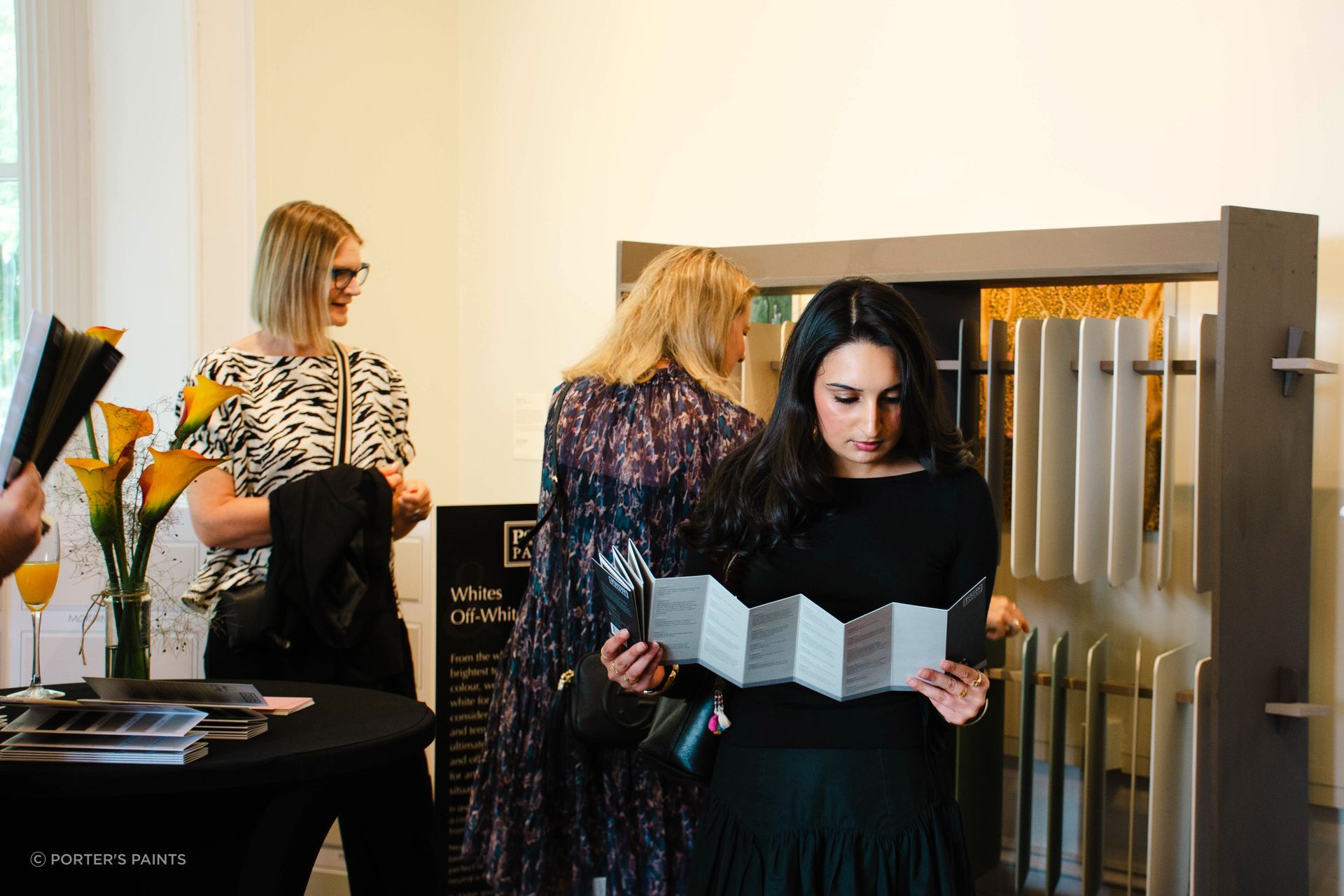
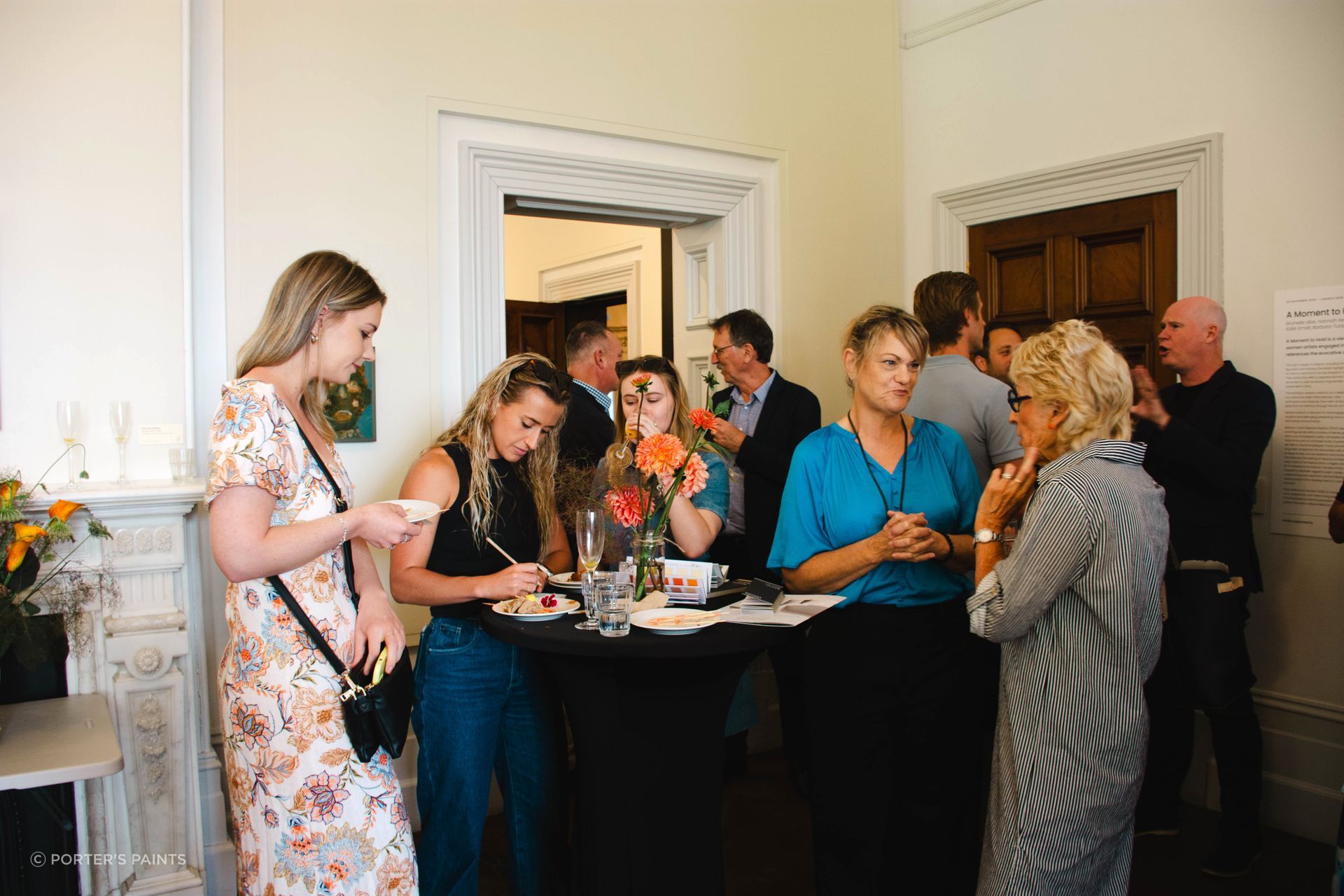
The Colour Library launch event was held in the Arts House Trust at the Pah Homestead in Auckland — a fitting location thanks to Porter’s ongoing association with the gallery. The event brought design professionals together in a venue renowned for creativity, underscoring Porter’s commitment to inspiring the local design community.
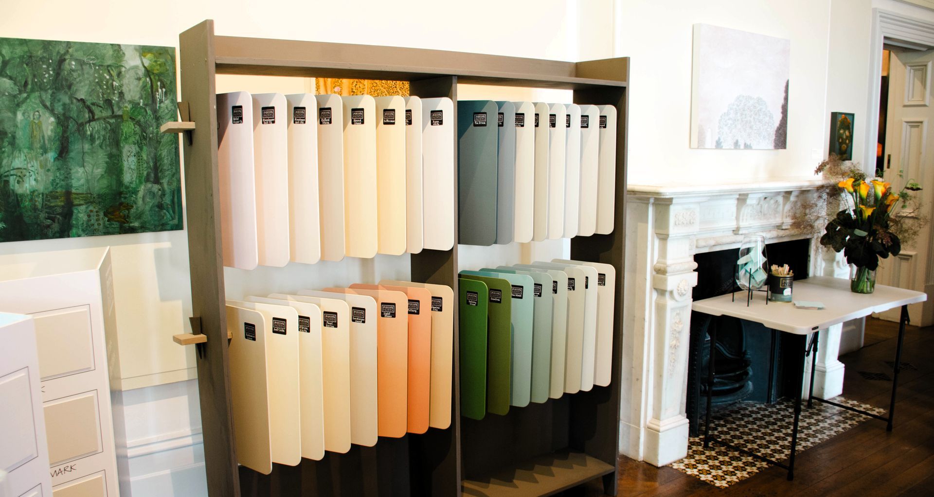
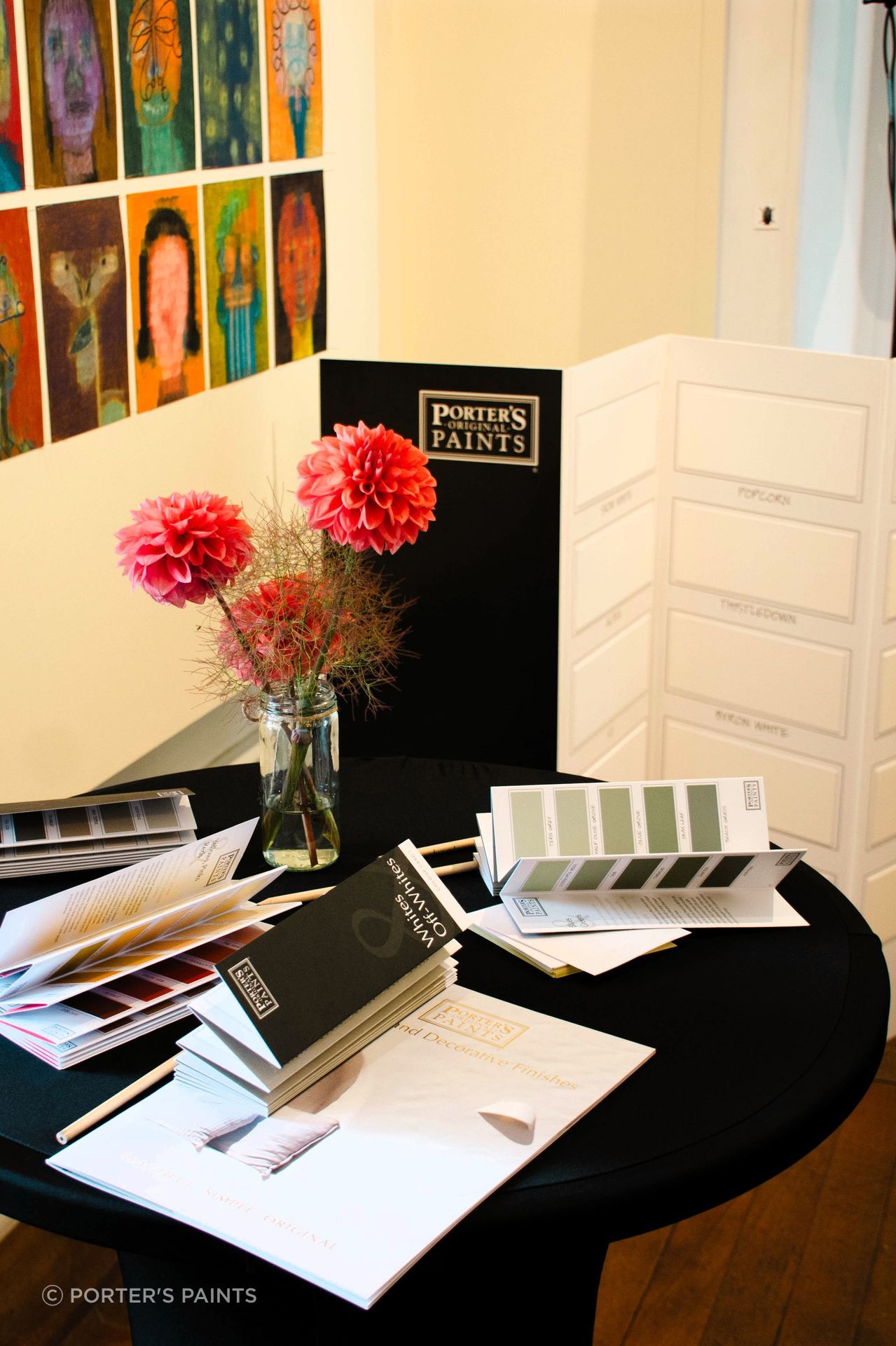
The 2025 Colour Library features a total of 300 curated hues thoughtfully organised into five concertina fan decks, with 34 new additions and 80 re-imagined shades from Porter’s archive, alongside Porter’s renowned decorative textures.
“This premium resource is designed to empower specifiers with greater confidence, accuracy, and enjoyment in their colour selection process,” says Jeremy Meates, Business Development Manager at Porter’s Paints New Zealand.
Karen Candy, Porter’s Paints New Zealand Showroom Manager and Colourist, introduced the library’s five fan decks to the audience: Neutrals & Browns; Greys & Blacks; Whites & Off Whites; Blues & Greens; Yellows, Pinks & Reds. Each shade is accompanied by clear, practical descriptions, and the printed samples are true-to-colour finish — giving specifiers and designers confidence from studio to site.
“Compact and portable, the cards are organised by tonal depth and can be folded to view complementary colours side by side, streamlining palette building and client conversations. As someone who works with colour every day, my aim was to make selection simple, inspiring, and accurate,” Karen says.
Each colour within the library has been designed to evoke emotion, create atmosphere, and support the design community’s creative vision.

Inspiration abounds
The new palette will streamline decision-making and enhance the match between samples and finished walls. Crafted from layers of exclusive tinters to create a depth and softness that’s hard to replicate, the muted tones, terracotta, blushes, light greens and warm yellows are striking.
The colours feel calm, timeless, and work beautifully in real spaces. For another layer of warmth and tactility, Porter’s recommends the addition of textures, like Fresco and French Wash.
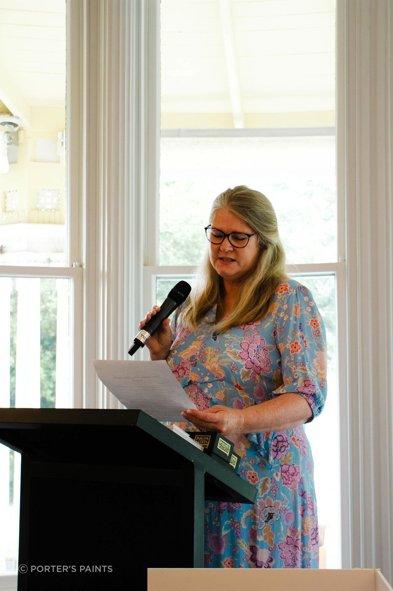
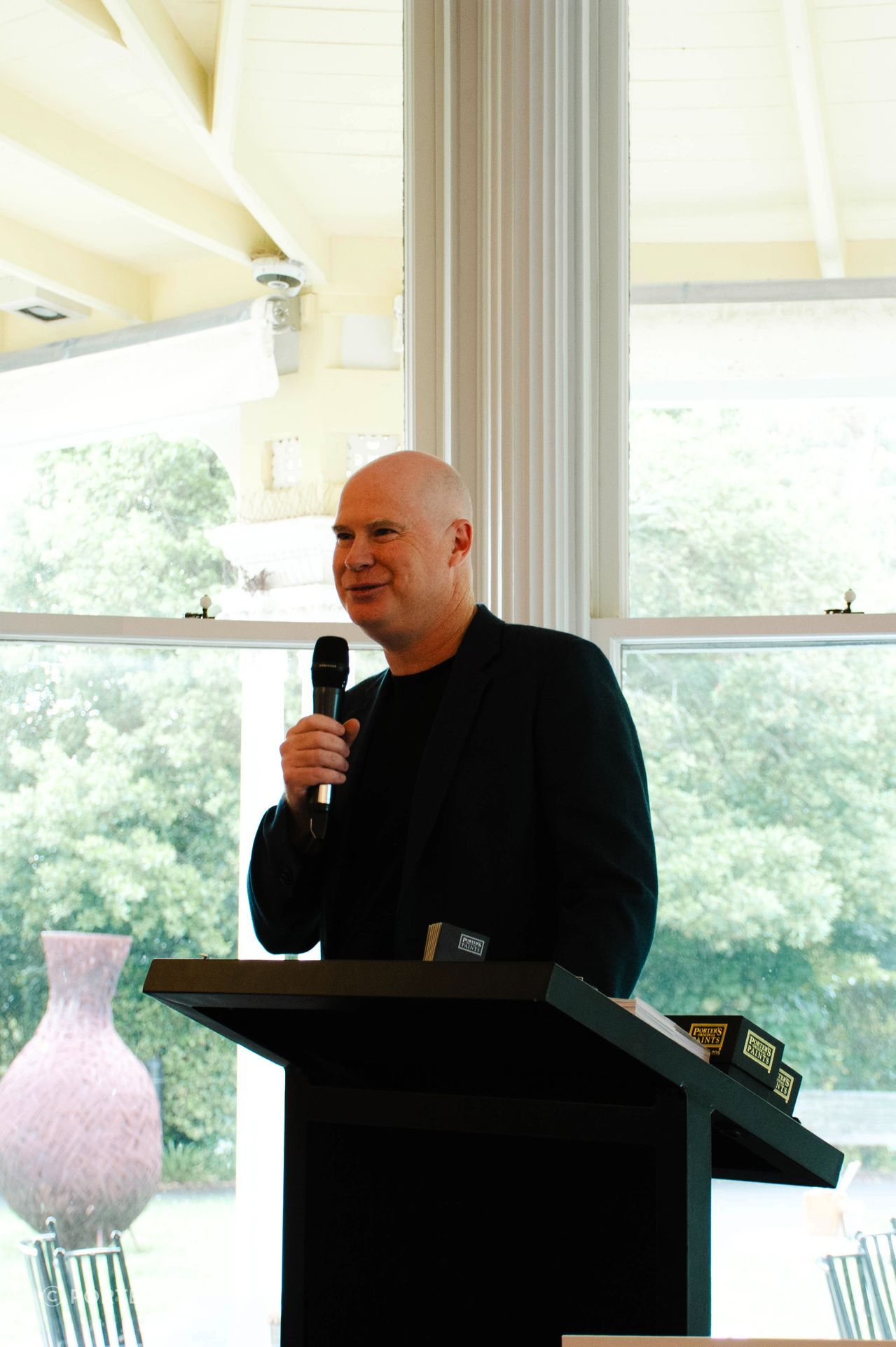
Scott Wishart, Porter’s Paints General Manager, flew in from Sydney for the launch event. Reflecting on the brand’s evolution since he joined the Dulux family in 2015, he highlights a renewed focus on colour innovation and artisan finishes, while preserving the character that sets the brand apart.
“At the heart of this journey is a philosophy that values authenticity over uniformity. Porter’s Paints celebrates colours that feel alive, changing with the light and environment, creating spaces that are rich, layered, and full of character. This perfectly-imperfect approach remains central to Porter’s ethos and continues to inspire designers seeking finishes that are as individual as the projects they create,” Scott says.
Also present was Chris Atwell, Head of Trade Sales at Dulux, alongside a team of specification and colour consultants — all enjoying the opportunity to engage with guests from the design community.
Guests enjoyed refreshments, received a complimentary set of the new Colour Library, and participated in a giveaway, making the day both informative and memorable. The launch signals a new chapter for Porter’s Paints in New Zealand, promising continued support and inspiration for designers across the region.
The Porter’s Paints team are excited to see how these colours and textures will inspire New Zealanders and weave into the stories of their spaces. Through decades of expertise and ongoing dialogue with the design community, it’s inspiring to see Porter’s Paints continue to set the benchmark for quality, creativity, and timeless Australian and New Zealand design.
Learn more about Porter’s Paints.