Resene x ArchiPro 2023 Colour Forecast
Written by
07 February 2023
•
7 min read
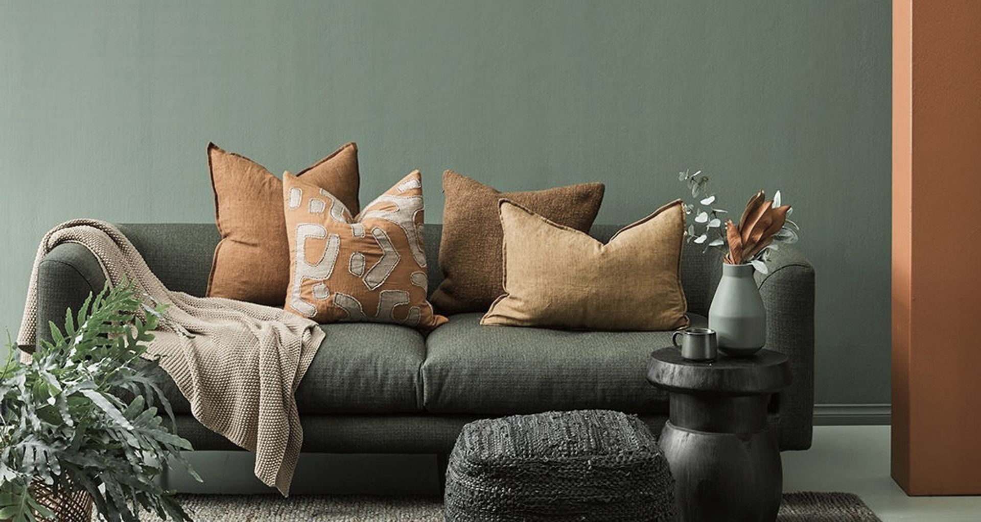
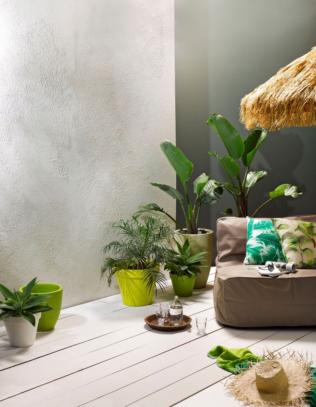
Bringing the outside in has been the colour mantra for the past few years, and it saw interior designers embrace neutrals and cool tones found in nature. In 2023, we're seeing a departure from these biophilia-inspired hues, and a resounding move towards warmer shades.
For this year's Colour Forecast, design experts from around the country have picked out their favourite hues across seven categories, and their choices show that interior colours are heating up.
Resene senior architectural representative Rebecca Long says this trend means we'll be seeing a comeback from colours on the cosier side of the colour spectrum.
"You're seeing more oranges and reds, and whites with a creamy or sandy undertone – there's definitely a rebellion against those steely greys and crisp whites."
However, the move isn't toward bright or confronting colours, instead, the trend for warmth is far more subtle.
"We're leaving behind pastel or brighter tones, and we're becoming a lot more muted. Interiors are also exploring different ways to use texture, whether that's through paint effects or using masking tape to create pattern."
Here are the top picks for 2023.
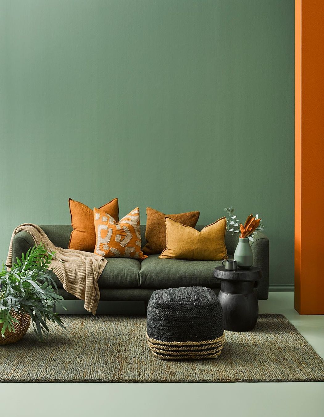
Best neutral: Elderflower
Tailor Inc. design director Julie Coutts
The shift to a warmer palette coincides with people wanting to escape the anxiety of the past few years and move towards more comforting, softer colours, says Julie.
"Within their homes, people are looking for something warm and comforting, rather than the cool greys, which we've been tending to do over the last few years."
She says Elderflower has a warmer tone than the fresher whites we've seen used recently, and the elderflower plant itself represents new beginnings.
"It has an historical reference to healing, which I think is really interesting. We're coming out of another bit of a dip and potentially into new beginnings again and I think it's really interesting that the elderflower plant has a meaning to do with death and rebirth."
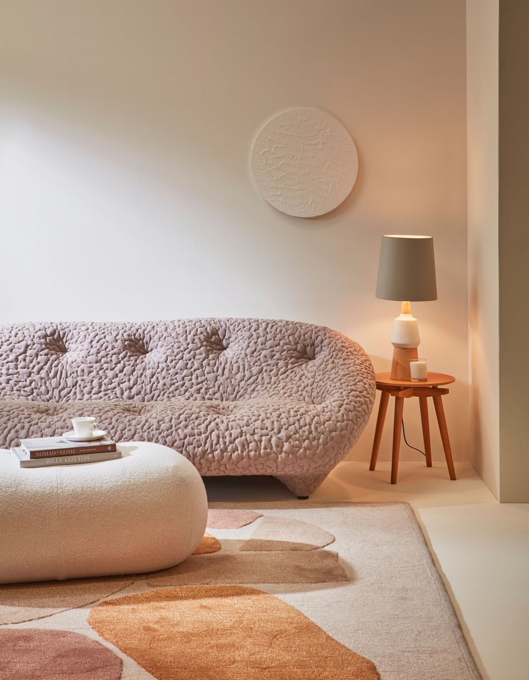
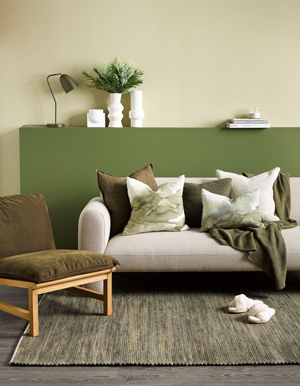
Best living room: Kangaroo
Designgroup Stapleton Elliott associate Ryan Burge
The living room is moving away from being a flexi-space, as office workers return to their offices, and reclaiming its rightful place as the cosy spot in the home.
To enhance the cosiness of this space, there's a trend towards creating character through texture and detail, and combining it with warmer hues.
"People are doing grooved panels and then painting it in brighter colours, which looks really good and adds big flavour to the wall," says Ryan.
The warm, grey-green neutral Kangaroo, is an ideal pairing with grooved panelling and creates a restful, yet comfortable back-drop for furniture.
"It just creates a more friendly, loving environment, and I think the living room suits it perfectly."
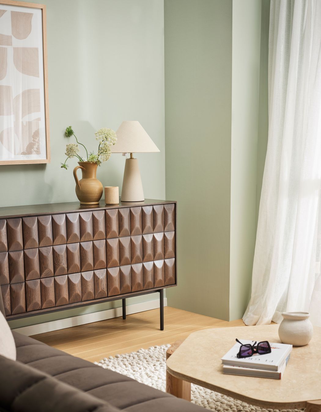
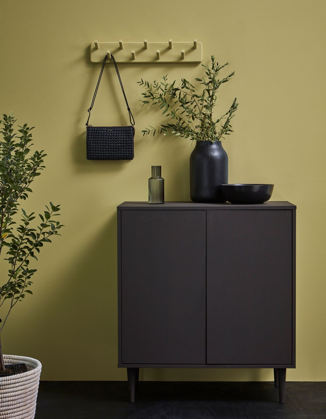
Best kitchen: Green smoke
Designer at Fabric, Amy Douglas
In the past few years people sought to bring biophilic elements into their home such as plants and flowers, and we saw cool greens and blues make an appearance in living spaces and bedrooms.
This year, the kitchen gets this treatment, however the green tone has a warmer yellow undertone that uplifts the space, says Amy.
"I personally think it's time that we get a bit braver and bring that into the kitchen space – especially a colour like Green Smoke... It works really well with those whites and neutrals, Scandi beiges and other neutral tones, but adds an extra layer of depth and a bit of life."
Amy says it also sits nicely alongside the warm and natural timbers and metals we're currently seeing in kitchens.
"It sits really well with those coppers and brasses in your tapwares, and any kind of coloured wooden flooring as well."
Best bathroom: Earthsong
Respond Architects architectural designer Luca Kornelia Kosa
If you're tired of the white-on-white trend in bathrooms, then you'll be pleased the forecast this year is to go bold with a distinctive colour on all four walls.
Earthsong fits the bill, and contrasts nicely with the warm copper and brass tapware that's currently popular in bathrooms.
"It's a nice vibrant forest colour –it's a brave colour – but it's not too harsh, not too strong, and it still has a very natural feel about it," says Luca.
The trend here is to create a moody and serene vibe that draws you into a bathing space that feels like a sanctuary away from the brighter neutrals in the bedroom and living spaces.
"I picked it because I would imagine it would be great with a darker themed bathroom with a lot of metallic fixtures."
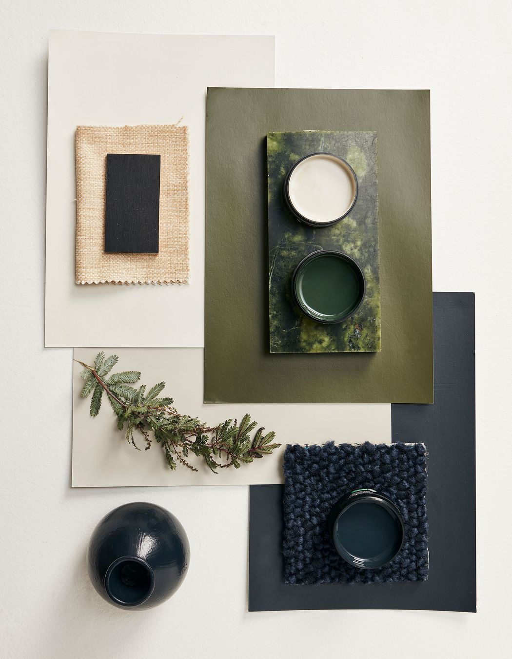
Best exterior: Karaka
Studio DB graduate designer Anna Connelly
Black gable-form homes have been a trend for quite some time now, and while the trend for dark exteriors shows no signs of abating, in 2023 we'll see dark tones given more depth through brighter undertones.
Anna says these types of complex dark hues work really well when juxtaposed against pops of brighter, bolder colour, and that's a trend she's starting to see on exteriors.
"I think people are really looking for pops of joy, with little moments in their day that uplift them."
Karaka is a great example of an exterior colour that enhances other brighter colours around it.
"I would describe it as a very deep color – I think it's more complicated than just a dark green. It has really nice hues of blues and maroon that allow it to work with those brighter colours - it's a really good base that can be supportive to other colours."
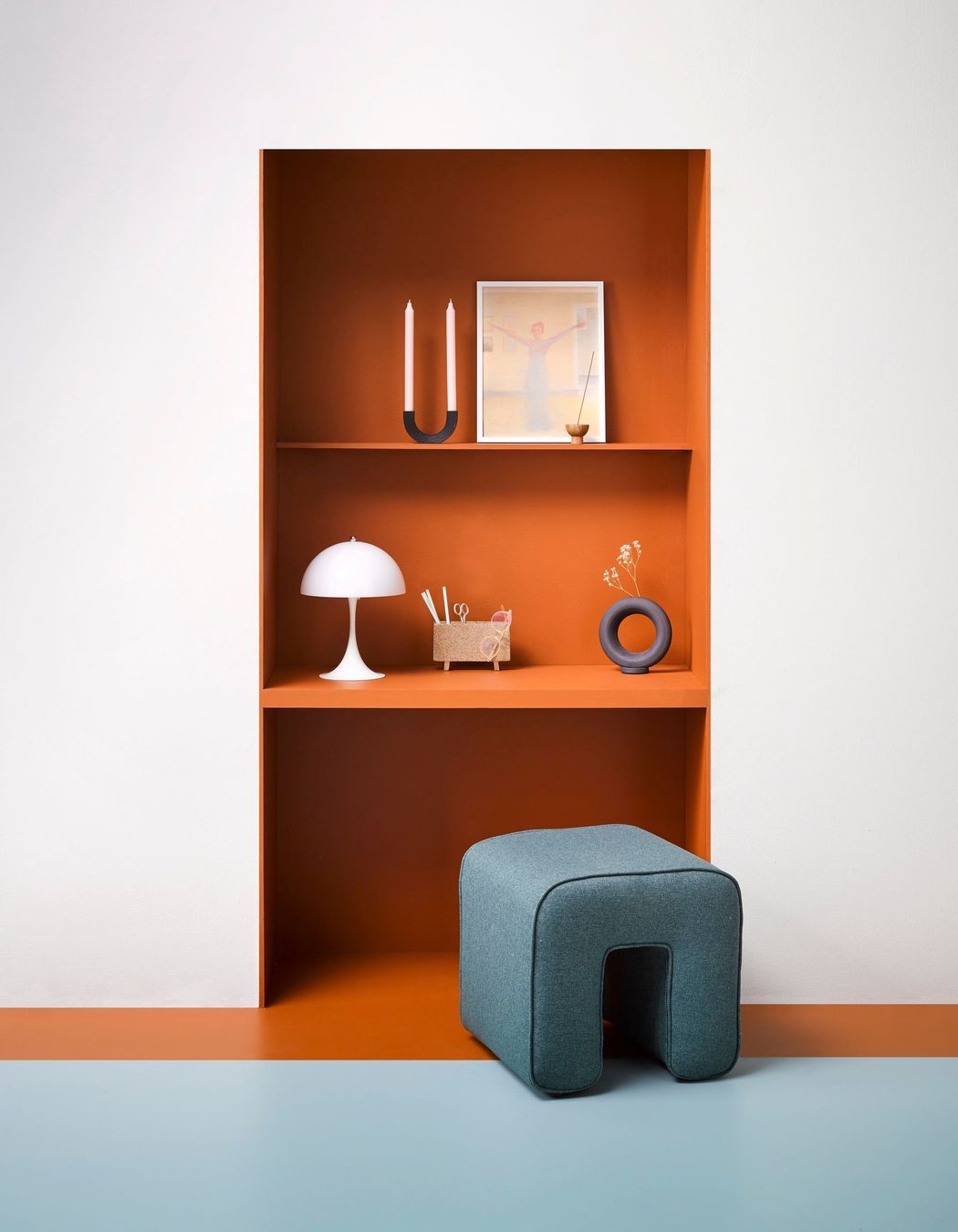
Commercial office: Clockwork orange
RCG senior designer Laura Stevenson
In the commercial office space, we're seeing a distinct move away from a strict and sterile aesthetic towards a space that feels like home. This trend has been dubbed 'resi-mercial' and in 2022 we're going to see more office spaces embrace the 'working from home at work' aesthetic.
"I think there's going to be a lot more spaces for staff, as we're seeing a lot less in-person meetings still... So making spaces work for staff is the most critical thing, whereas previously, it may have been tailored more towards visitors or clients," says Laura.
In interiors this will translate to soft plush couches, softer textures and more tactile surfaces. We'll see much warmer tones than we have in the past, which is similar to what's happening in residential spaces, says Laura, and this will mean splashes of strong, warm colour.
"I think that Clockwork Orange has a really nice mix of bold-but-muted at the same time – it's got that nice earthy tone, while still being bold enough to be a feature colour."
Laura says that we're likely to see it as a feature wall in commercial office interiors, which is an application that imitates residential interiors.
Wild card: Untamed
Green Room Studio director and interior designer Samantha Elliott
In the past few years we've seen a lot of natural, earthy colours in interiors, but the trend towards embracing bolder, stronger colours is gaining pace, says Samantha.
"I feel like they are still around a lot but I am seeing a trend around the brighter colours coming back through and there definitely seems to be more bold statements."
Timbers juxtaposed against white walls is a timeless look, but Samantha says it's nice to see clients getting more daring with colour after a long period of subdued palettes.
"Resene Untamed, for example, would be quite a cool colour to bring through into cabinetry... It is quite a natural green, which I like about it, but it's also a sophisticated green. I can see it working really well in high-end architectural houses, but also in Kiwi baches."
