Sheers - An ethereal feel
They can also be used to create a sense of mystique, something beyond,” says Phelan, who regularly uses Zepel’s collection of sheers for a variety of projects from residential projects through to hospitality.
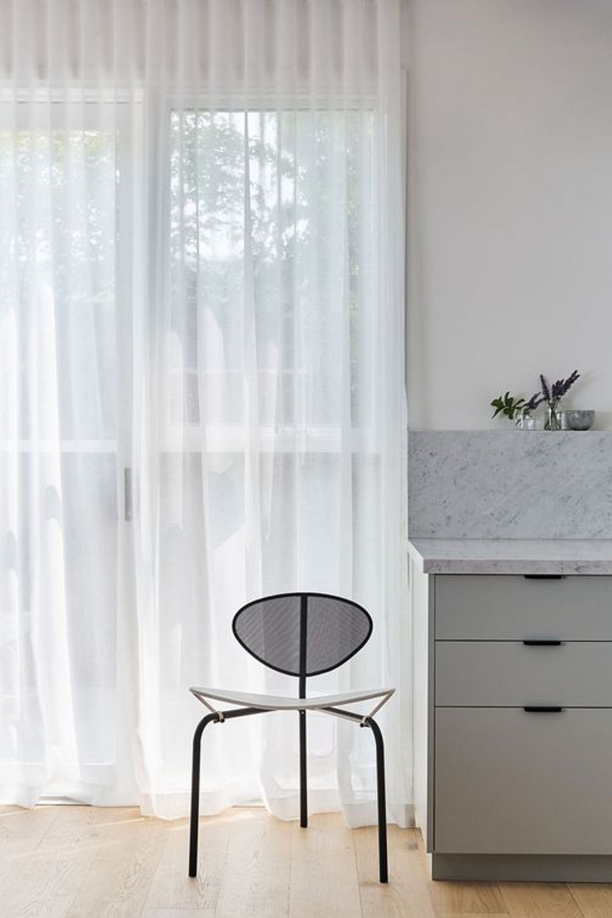
K.P.D.O.’s office in Collins Street, Melbourne, includes Zepel’s sheers, separating the directors’ office area from the main studio. Sheers also appear in a beach house, located on Victoria’s Mornington Peninsula, in all the bedrooms, the study nook, and even in the bathroom covering a floor-to-ceiling window (a block-out blind was also used behind these sheers). “At night the blind prevents people from looking in, but during the day, the sheers are more than sufficient,” says Phelan, who sees the character sheers bring to a space. “They create atmosphere during the day, and at night, they remove the coldness of a large pane of glass, adding warmth and texture.” For the beach house, K.P.D.O. used white sheers to complement the home’s white walls throughout. “Our clients were keen to have a light and airy feel.”
Goldberg used Zepel’s Hometown range when she reworked a 1980s townhouse in North Fitzroy. Completely gutted, the formerly dated and poorly-lit home has been transformed. Part of Goldberg’s brief was to create protection from sunlight for the owner’s substantial collection of vinyl records, now meticulously arranged on customised shelves in the informal meal area. One of these shelves forms a chunky wall between the dining area and the guest powder room. As this area is relatively private and orientated to the east, sheers were used. However, on the west side of the townhouse, orientated to the communal garden, sheers and a block-out blind were used. The white sheers also complement the interior palette, with pale oak floors and two-pack painted joinery in the kitchen, a colour that changes from blue grey to green, depending on the natural light.
Nido Studio also used Zepel’s sheers from its Rhyme collection for an apartment in South Yarra, directly opposite the Royal Botanic Gardens. Originally built in the 1980s, the interior failed to respond to the spectacular garden views. “The spaces were generally dark and turned their back on the gardens,” says Goldberg. Interior walls were removed and now dividing the formal lounge at the front, from the kitchen and informal lounge at the core, is joinery with glazing directly above. “I wanted to increase the sight lines through the floor plate,” says Goldberg.

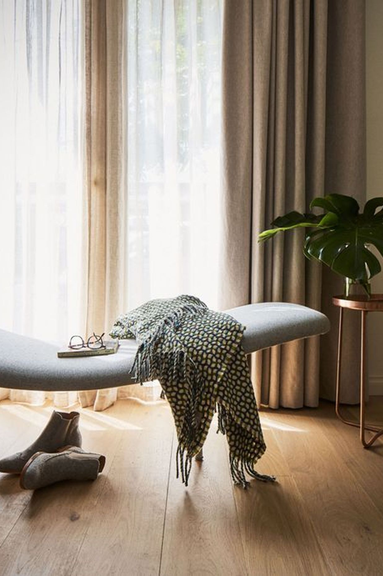
The heavy curtains that once framed the formal lounge have been replaced with white sheers that complement the soft pastel hues used for the furniture and the apartment’s pristine white walls. “I wanted to strengthen the connection to the terrace, particularly during the day, as well as allowing northern light to filter, even when the sheers are drawn,” says Goldberg, who has used a number of coloured sheers from Zepel’s ranges. However, in this instance, she was keen to ensure the aspect of the botanical gardens wasn’t impacted.

“White creates that neutral frame. One of our latest projects includes green sheers to work with the predominantly green palette we’ve used,” she says. And for Botticelli, an Italian-style restaurant in Brighton, the shop front is layered with sheers. “It just creates that sense of intrigue, of something beyond,” says Goldberg, who enjoys seeing the lights come on at night, animating the restaurant even when the sheers are drawn. As well as in the living area, there are also sheers in all the bedrooms in the South Yarra apartment, creating privacy where required, but sill allowing for dappled light.
According to Phelan, many of her clients want a sense of the outdoors, but also appreciate the privacy sheers create. “They’re like a security blanket in a sense, but importantly, allow a room to ‘breathe’. In the same way, they also create intimacy in a home or office without having to introduce walls,” says Phelan.
Text by Stephen Crafti


