Fun and practical new build for a young Auckland family
Written by
25 August 2022
•
6 min read

Architect Kate Rogan was both the client and architect of her own home on a slope in Grey Lynn. Working alongside her was friend and fellow director Eva Nash, her co-founder at Ponsonby-based practice Rogan Nash Architects.
“Eva and I designed Blackbird together and I just happened to be the client,” suggests Kate. “It was natural for us to design it together because, in our practice, we always work that way by collaborating and critiquing each other while we’re making design decisions. If I hadn’t collaborated with Eva, I think it would have been like my arm was missing as we’ve been designing together for about seven years now and we’re used to it. We always work with what clients think and want, and we design our houses to work with each scenario – so it was no different for my own house.”
Kate’s husband Matt and their two children also helped drive the design of this hard-working family home, coupled with its location, a Grey Lynn site that is accessed up a driveway. “We designed the house over two levels to account for long and narrow sloping section, which changes in height by five metres,” says Eva. “We did a sun study to understand how the site might best be utilised and we had to factor in the height-to-boundary requirements – as it sits close to the neighbouring boundaries – and other council regulations.”
“In an urban setting, you don’t want to look into the neighbours either,” adds Kate. “Even though it’s sited right in the heart of Grey Lynn, we wanted the house to still feel like a sanctuary, and to make the most of a view to the Waitakere Ranges from the south side of the house.” The architects inserted slot windows to take in that view, as well as outlooks over the rooftops to make the most of its urban location – taking inspiration from the rooftop views you find in denser European cities. The north-facing glazing has also been frosted to help protect the house from overheating.
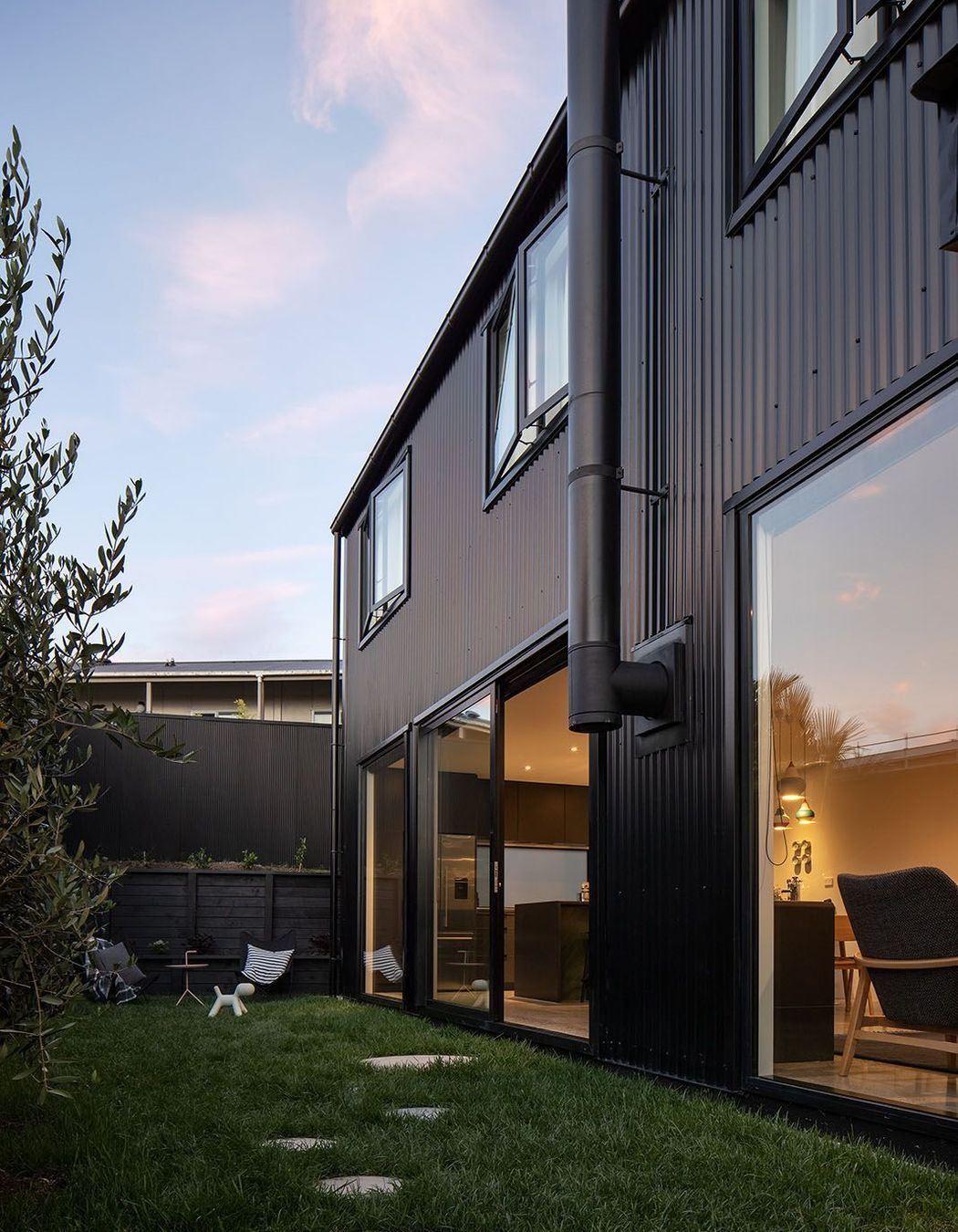
From the start, the architects wanted a black-coloured house like a blackbird – essentially, it’s a dark house sitting on the hill, suggests Eva. “We could have used dark-stained cedar but the steel corrugate is really low-maintenance and will always appear crisp and sharp, so that was both a practical and an aesthetic decision,” adds Kate.
The colours of the house nod to different locations and environments in Auckland; its black cladding reflects the dark tones of the bush and the Waitakere Ranges, while the interior looks to the sky and ocean. “It nestles into the urban environment surprisingly well, even though its sited between a mix of Grey Lynn villas and other styles,” says Kate. “And there are plenty of mature trees in the area so, from a distance, it blends nicely into this gentle sloping site.”
The architects have designed Blackbird like a courtyard house that’s without a courtyard! Instead, the fence is treated like a wall so the outside area becomes an outdoor room right up to the fenceline. “The black cladding forms a beautiful backdrop to the planting and, together, it makes the whole site look more cohesive and creates an inside-outside effect makes the house seem bigger,” explains Eva.
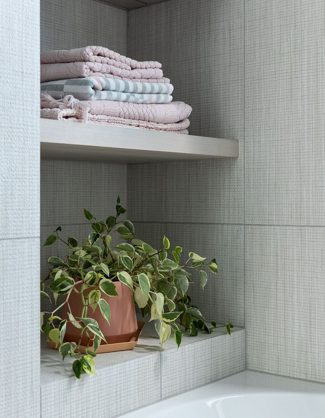
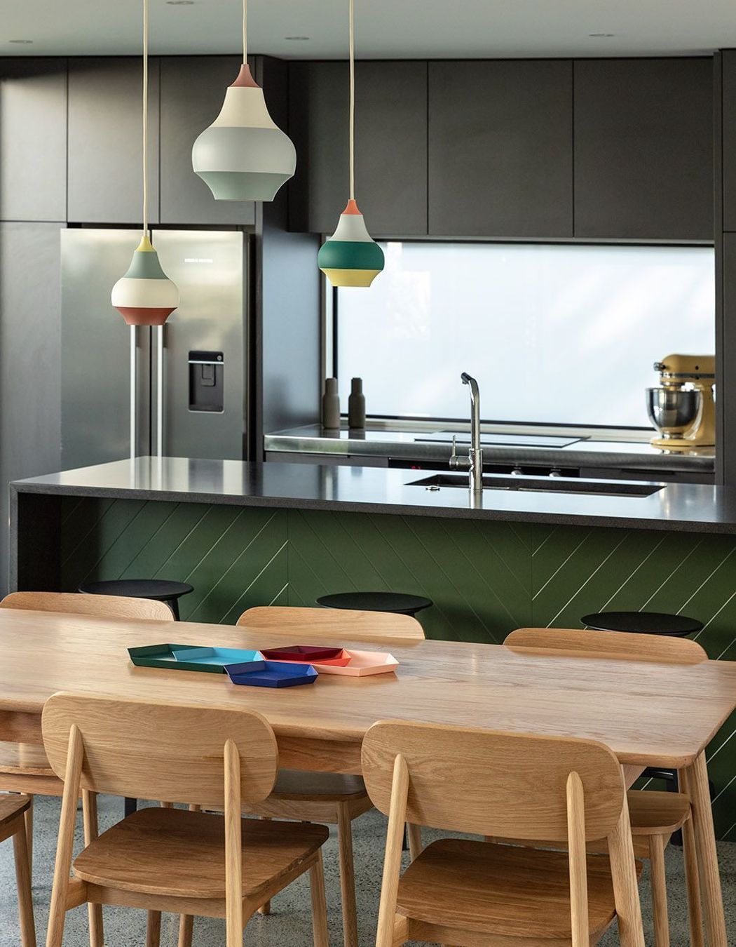
Inside, greys, pastels and sea tones continue to play off the colours of the Auckland landscape and a seaweed-green kitchen island bench is a delightful feature that works well against the concrete floor.
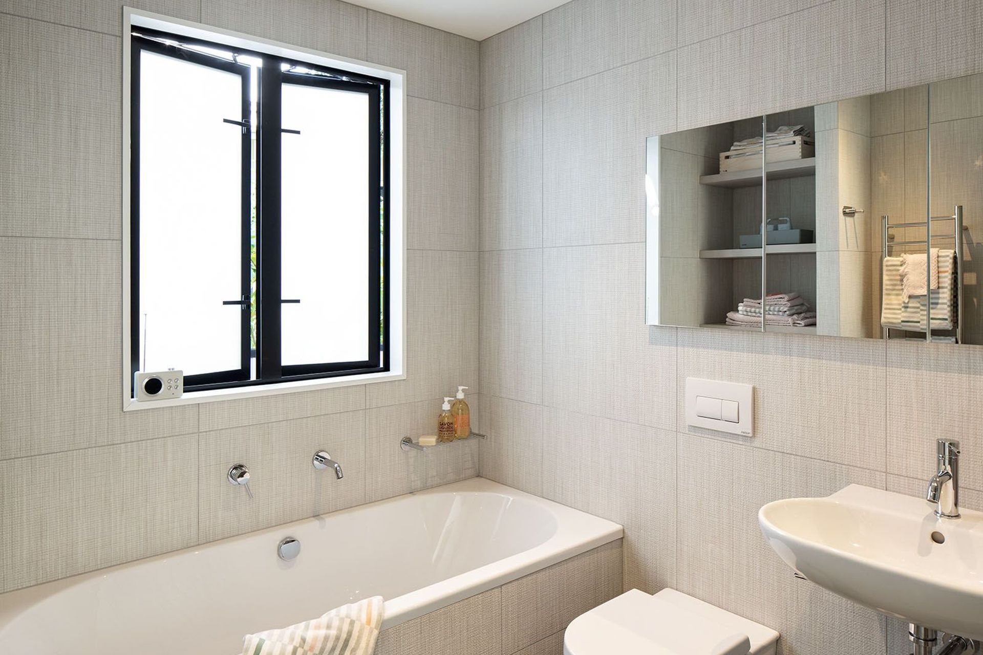
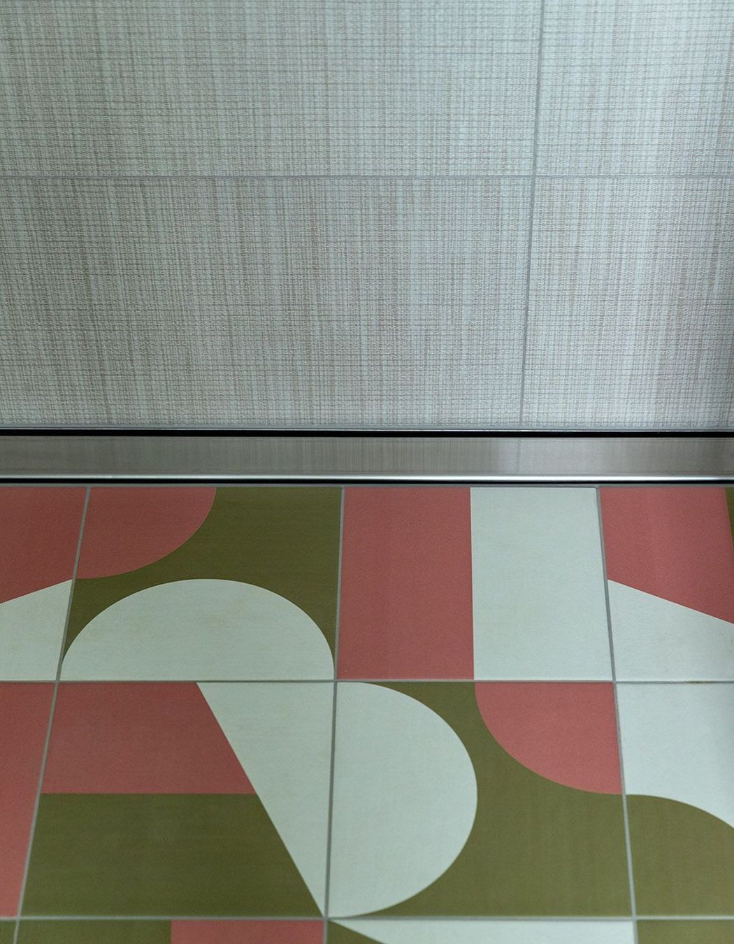
A nod to the traditional Victorian villas of Grey Lynn are the coloured tiles used as an entry mat inside the front door and the ensuite bathroom in black, white and blue, and in the upstairs bathroom in pink, green and white. “They are graphic, colourful and add a more playful element to the house, along with several patterned wallpapers,” says Kate.

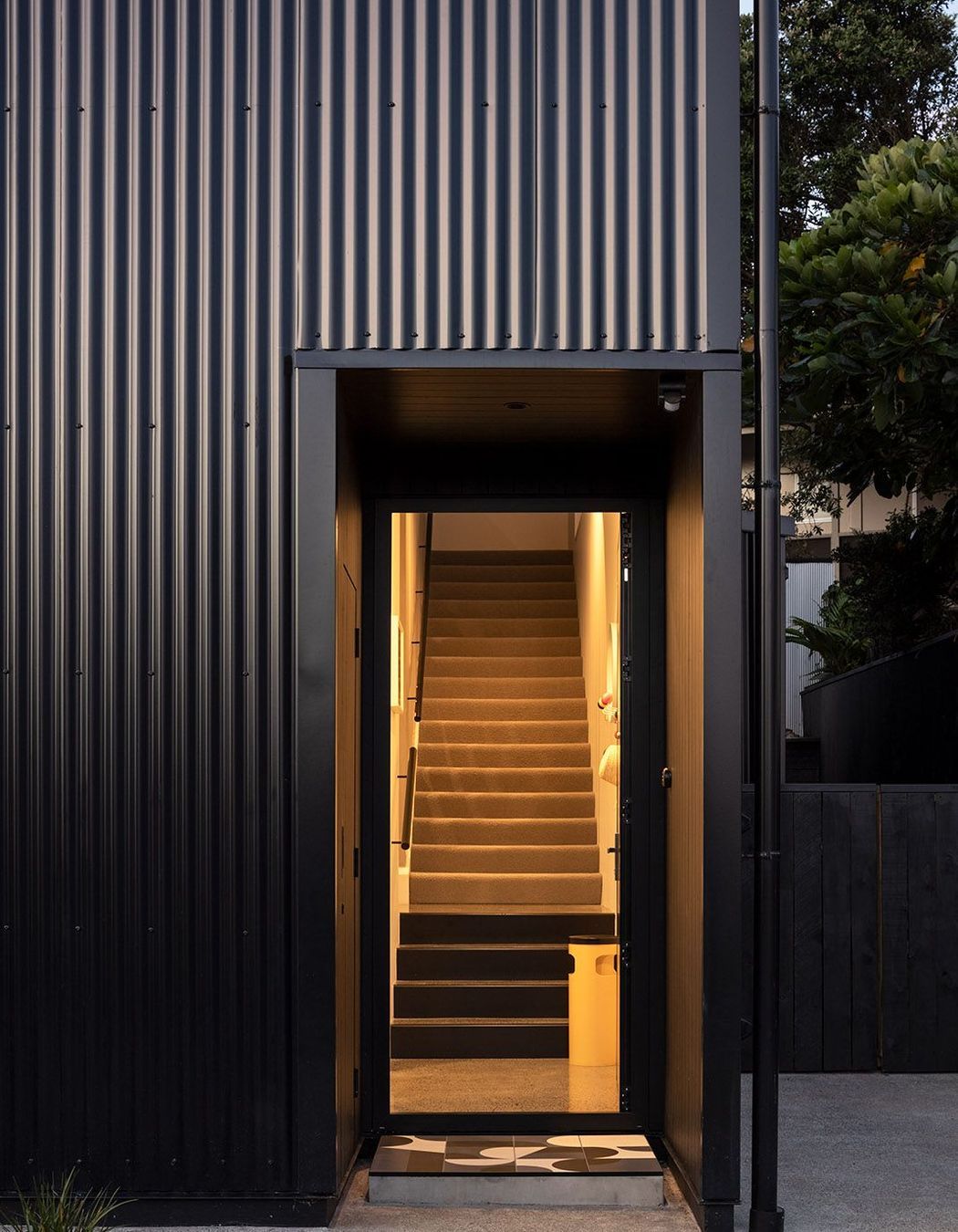
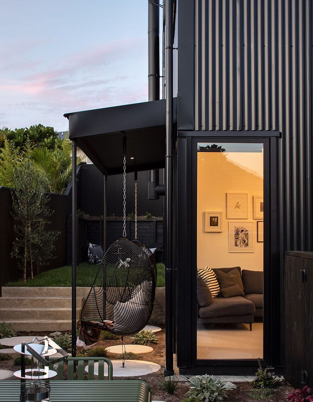


To fit the site contraints, Blackbird is a simple gable form designed as one single gesture that aligns with the access so the house can be seen straight on. “I like a hard-working house that knows it’s a house, that’s not too finicky, that knows when to hide things away and where storage is needed,” says Kate.
“The kitchen/dining area is the hardest working part of our house and works for us because we have a close-knit family and I like to invite people over for coffee and cake. We also wanted somewhere for the kids to hang out at the table and so everything is where you need it.”
Off to the side of the kitchen is an English-style scullery with a laundry and washing-up area that’s connected to what the architects describe as a service court. “Because the site is small and narrow at 305m², we were really careful about making it very practical to ensure the rubbish bins were in a useful place and don’t take over the front yard. The service area contains a washing line, a vege garden and the rubbish bin. We like an organised approach to house design,” states Kate.
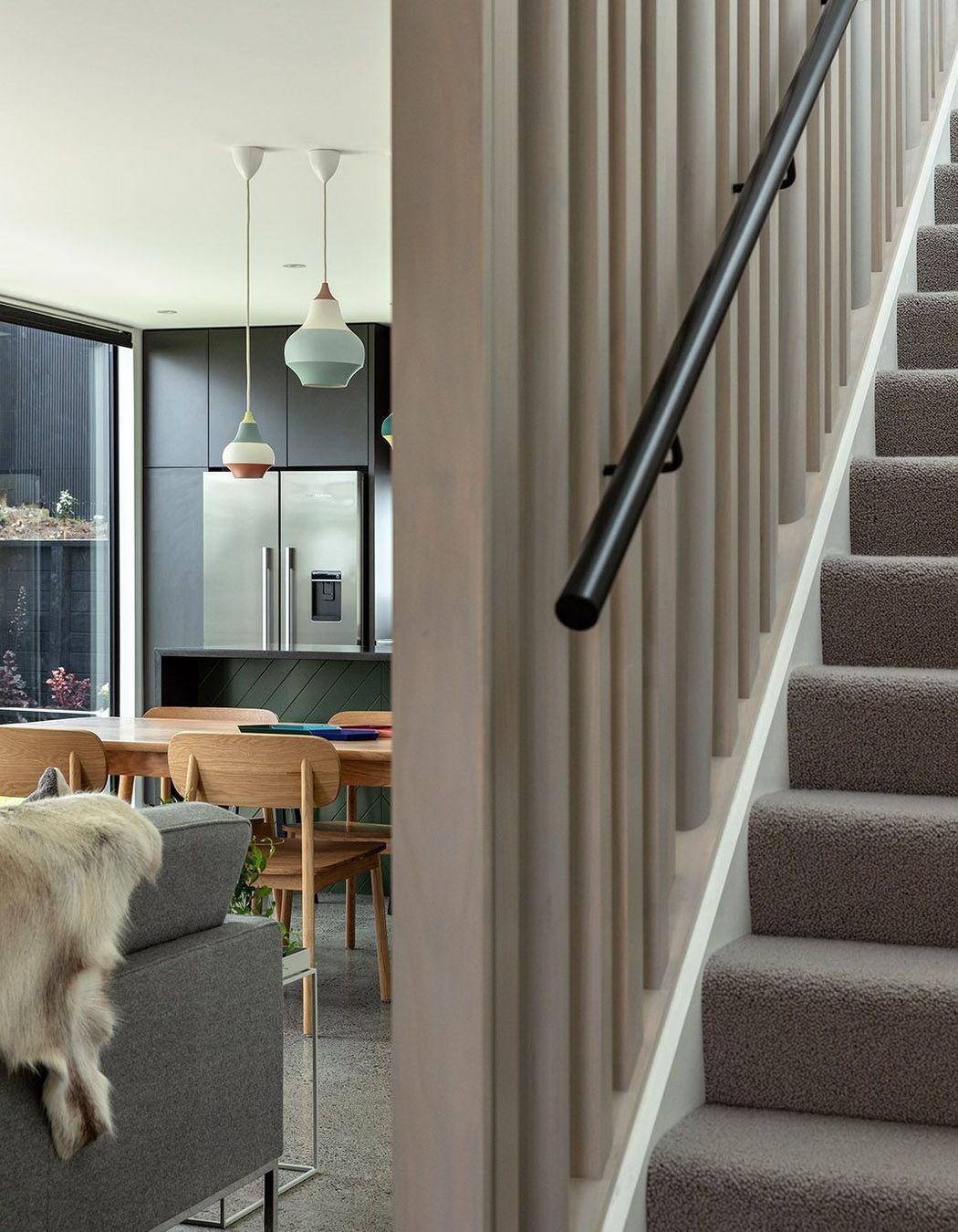
In the open-plan living area, a generous 1,200mm-wide staircase with a high, vertical balustrade helps to make the house appear bigger. “It draws in plenty of light via north-facing windows above and the screening creates a lovely play of light and shadow at different times of the day” explains Kate. Off the living area and beside the entry is a separate lounge/snug that acts like a private hideaway for watching movies and relaxing.
Upstairs is the master bedroom and en suite, a study, a family bathroom and the two children’s bedrooms. Kate’s husband is a big Star Wars fan with a large collection of memorabilia, which is on display in the study. “We always like to present our clients’ collections with some thought about how it will work, and my husband Matt’s collection was no different. We have used string shelves that are a great system and look cool, providing plenty of storage options. Matt and I work from home a lot with computers so a really good study room – all set up and ready to use – was essential for us.”
This small urban house is a fantastic example of how to create a practical home for busy mum's and dad's. Blackbird not only looks sharp and cool, it also works hard for its owners – making their lives easier by being highly functional for family life, easy to maintain and set to stand the test of time.
Words by Justine Harvey.
Photography by Simon Devitt.


