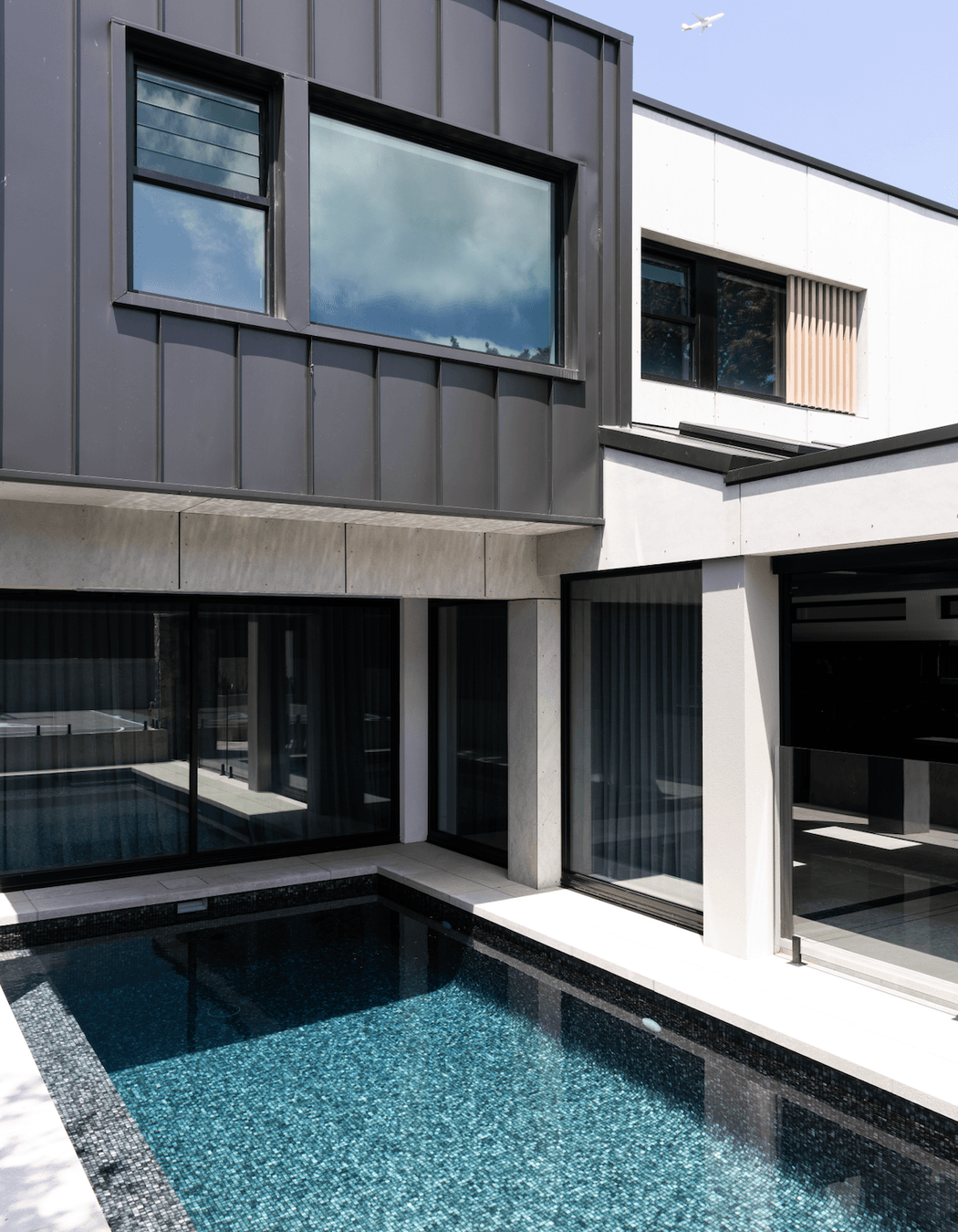
Sleek and moody: take a look inside this young family’s Sydney home
Written by
16 September 2024
•
4 min read

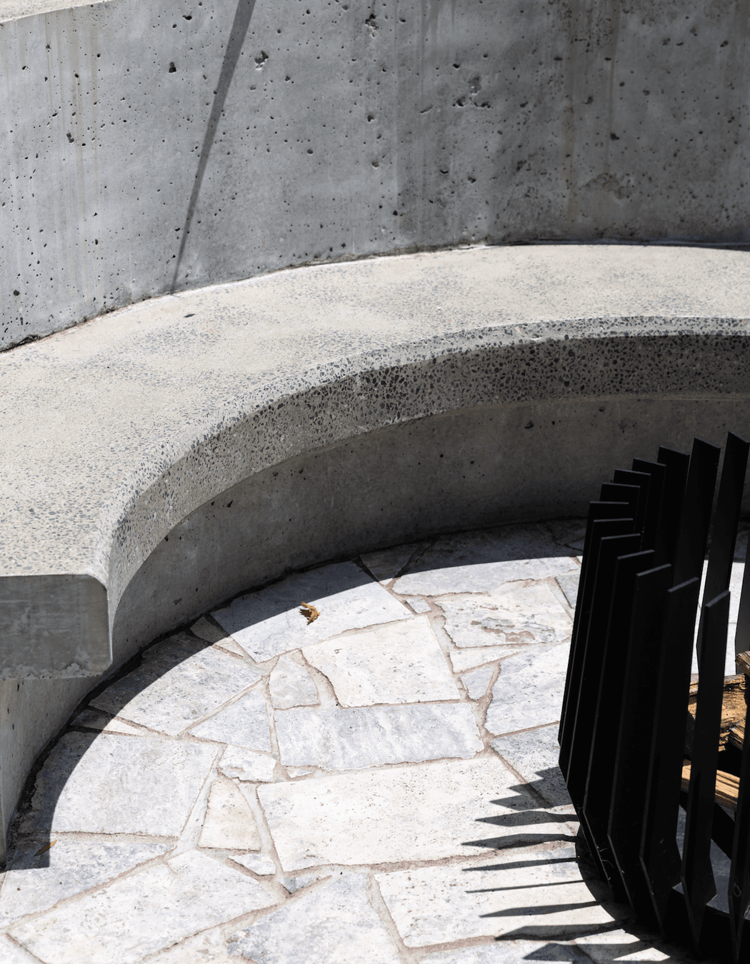
Concrete, texture, gorgeous natural stones and a dark colour palette bring a luxurious and moody feel to this home.
“This family has worked really hard to get to where they are so they wanted to leave the design of their home to a professional, and the results speak for themselves. The home has a young vibe to it, it’s quite sleek and moody – it’s what they wanted for the home,” shares Anita Nader of Anita Nader Interior Design.
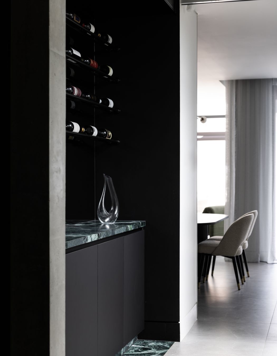
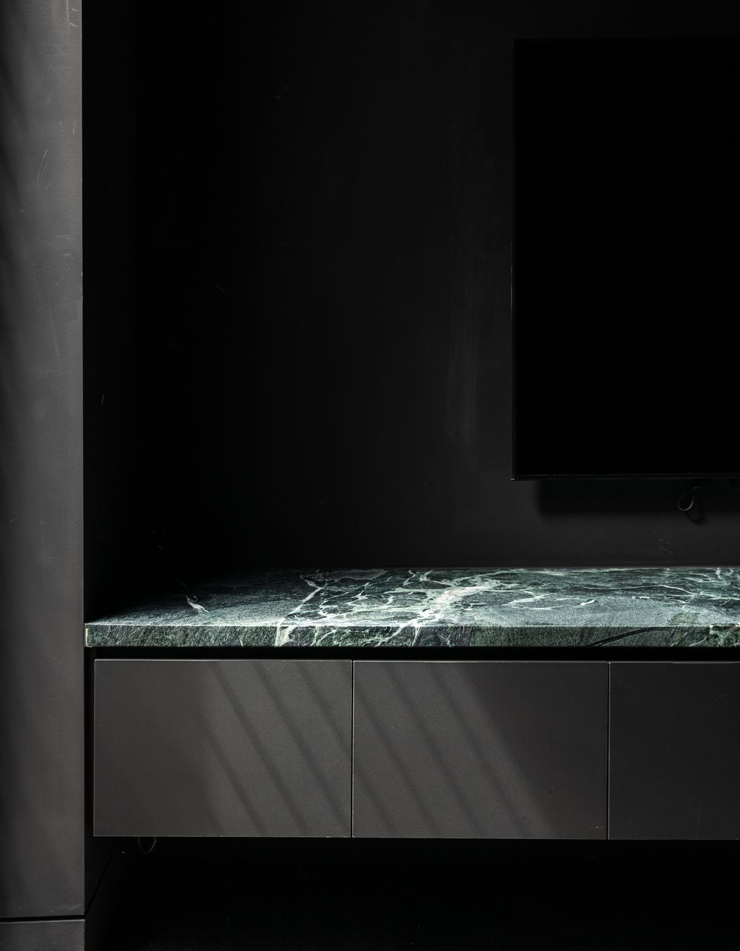
A glimpse of the home’s personality is evident from the street frontage; however, it’s once you enter the home that the full design is revealed. To the right of the entry, a reading nook with Venetian plaster walls and a deep green bookshelf elevated on a stunning natural green stone is a private space to sit and relax, while in the other direction, following the textural pre-cast concrete wall, the wine cellar and home theatre can be found.


Opening up into the back section of the house is the open kitchen, living and dining area.
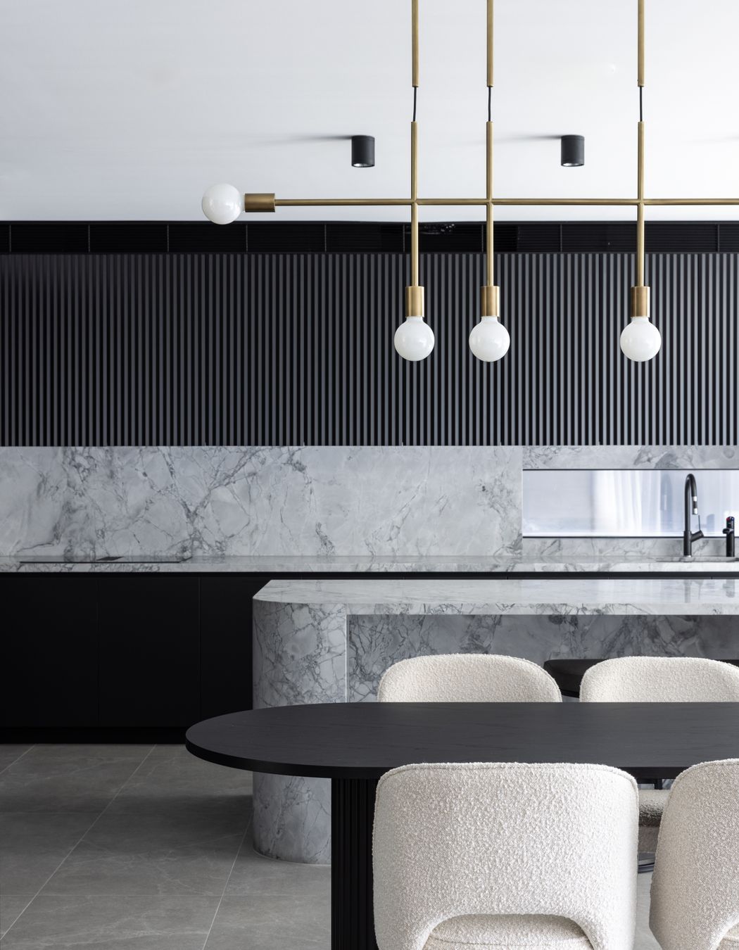
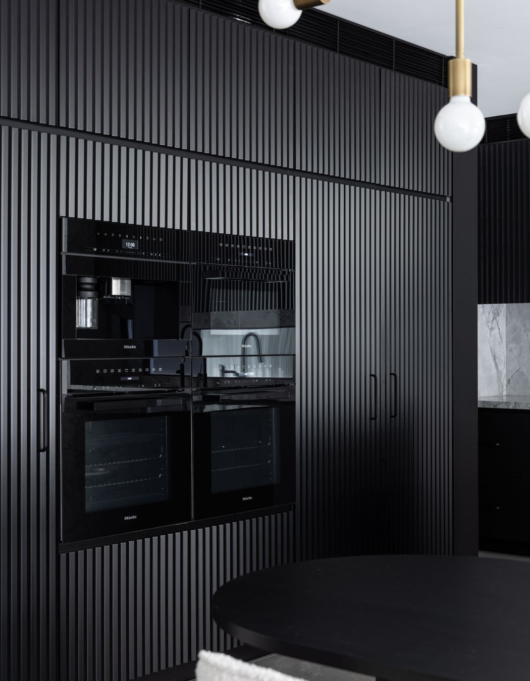
Black kitchen cabinetry with its fluted texture contrasts with the Super White dolomite stone from CAV’ART Designer Store used for the backsplash and elegantly curved island bench. The Miele ovens blend beautifully with the dark cabinetry, and the brass pendant from Volker Haug Studio makes a statement above the dining table.
“The homeowners loved the idea of incorporating the green, which we did through furniture, accessorising, and the stone that was selected. They knew that not everyone would like this dark and moody aesthetic with lots of stone, but they didn’t really care about what other people thought – they just wanted to be in love with it and they wanted to do it exactly how they dreamt of doing it,” says Nader.
Negresco quartzite with striking white vein movements has been used for the fireplace feature wall, with green introduced to the living space with a sculptural velvet occasional chair and accent cushions.
“This area also then transitions into the outdoor area which very much forms an indoor-outdoor living and entertaining area with the continuation of a fire pit and a pool.”


The upper level of the home is dedicated to the bedrooms, four bathrooms and a dedicated study nook, plus an upstairs lounge area for the kids.
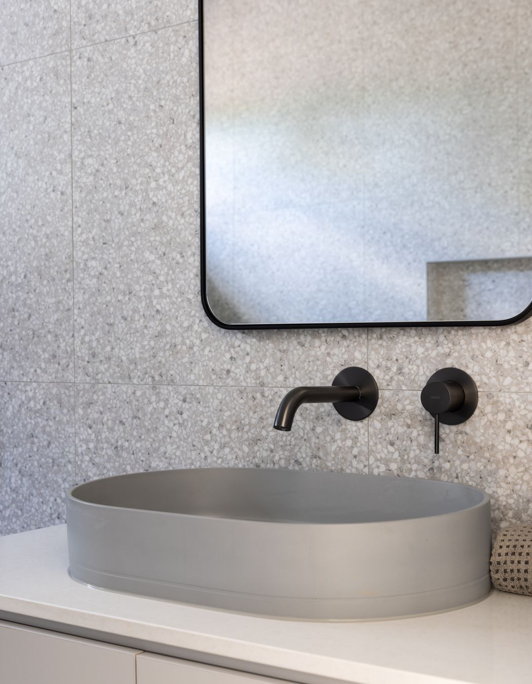
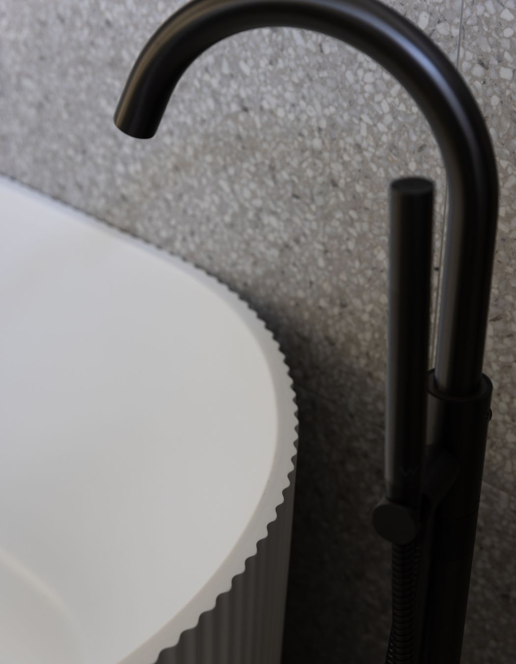
The bathrooms all mimic the moody aesthetic of the rest of the house. Floor-to-ceiling terrazzo tiles line the walls in the main bathroom, with gunmetal tapware fitting with that found throughout the rest of the home. Other bathrooms including the powder room feature the same Italian Verde Alpi green marble from CAV’ART that is repeated throughout – surrounded by dark tiles, it captivates with its dancing white veins and natural flecks.
“The power room is my favourite; with the tiles, the green stone and the brass fixture – I designed it and the client instantly said yes. It’s different and a lot to take in, but in such a small space we were able to deliver the impact she wanted.”

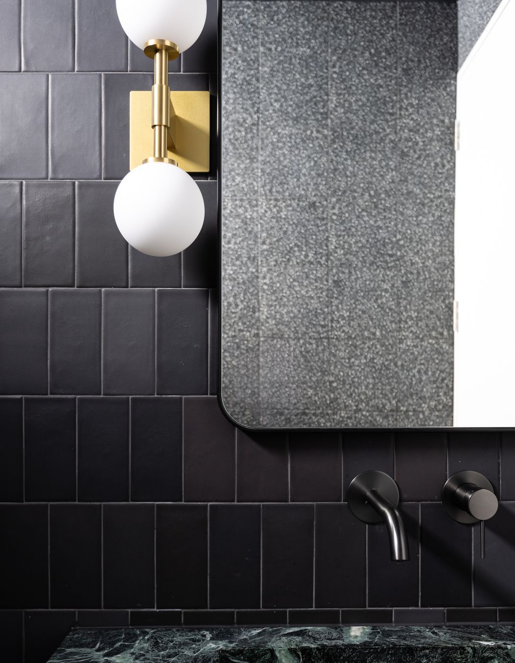
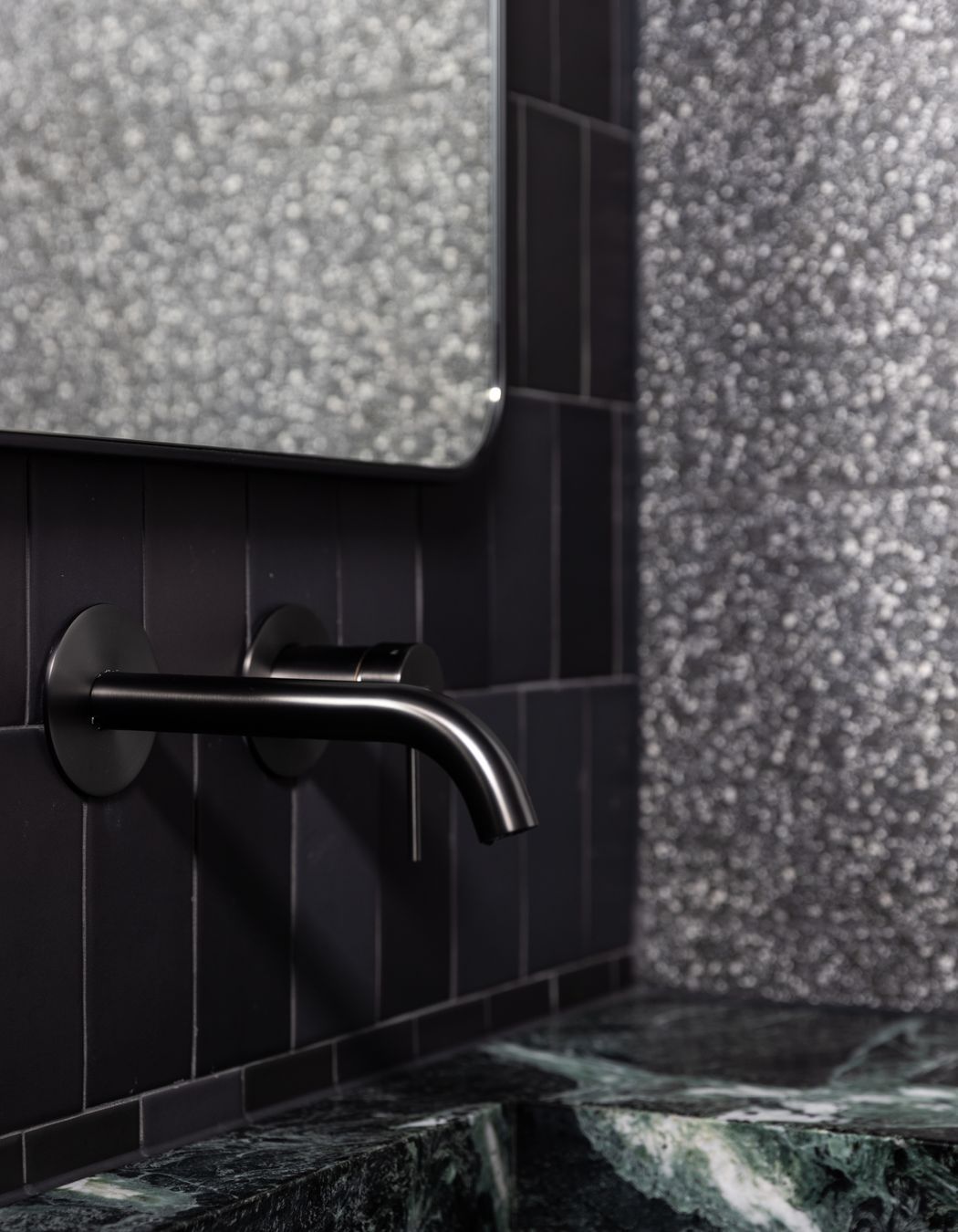
From initial conversations to the finished result, this Rodd Point project was completed over two years and is one that demonstrates Anita Nader Interior Design’s creativity and high attention to detail.
“To make a design cohesive is really important. This home is quite dramatic in certain areas, but it all still came together and feels like a beautiful family home they can grow into. Having two young children, it was about making it look good but also having a family-loving home – this is the amalgamation we wanted and that’s what we try to deliver for our clients each and every time. Yes, it’s got to look good, but we want it to feel good and we want them to just love it.”
If you’re looking for a designer who can help you create a home like this, get in touch with Anita Nader Interior Design and explore more of their projects on ArchiPro for inspiration.

