The Psychology Of Colour

The psychology of colour is the study of hues and how our brain perceives them, and how this affects human behaviour.
It’s a very important tool for interior decorators, designers and artists alike and is a huge factor in the marketing of companies and brands.
Colour stimulates the brain. It has the ability to influence our mood and manipulate our decision making in many facets of society.
Of course colour perception is subjective and can vary slightly from person to person. But every colour has an associated instinctive reaction in our mind.
Generally speaking cool colours such as blues, greens and purples give us a sense of calm and relaxation. Whereas, fiery colours like reds, oranges and yellows evoke energy and passion.
Did you know that in ancient times the Chinese and Egyptians used colours to heal and help the body function better? This is known as chromotherapy.
So let’s have a look at a few different colours which have recently been popular:-
Coral
The word coral is Greek and translates to ‘daughter of the sea’. Coral is a combination of peach, pink and orange and corresponds to the invertebrates decorating the bottom of the ocean.
It’s a fresh, vibrant colour that’s invigorating and is likely to encourage us to be social and increases physical energy.
Combine with navy or tiffany blue, taupes, greys, whites or yellows.
Use with caution as you can have too much of a good thing.
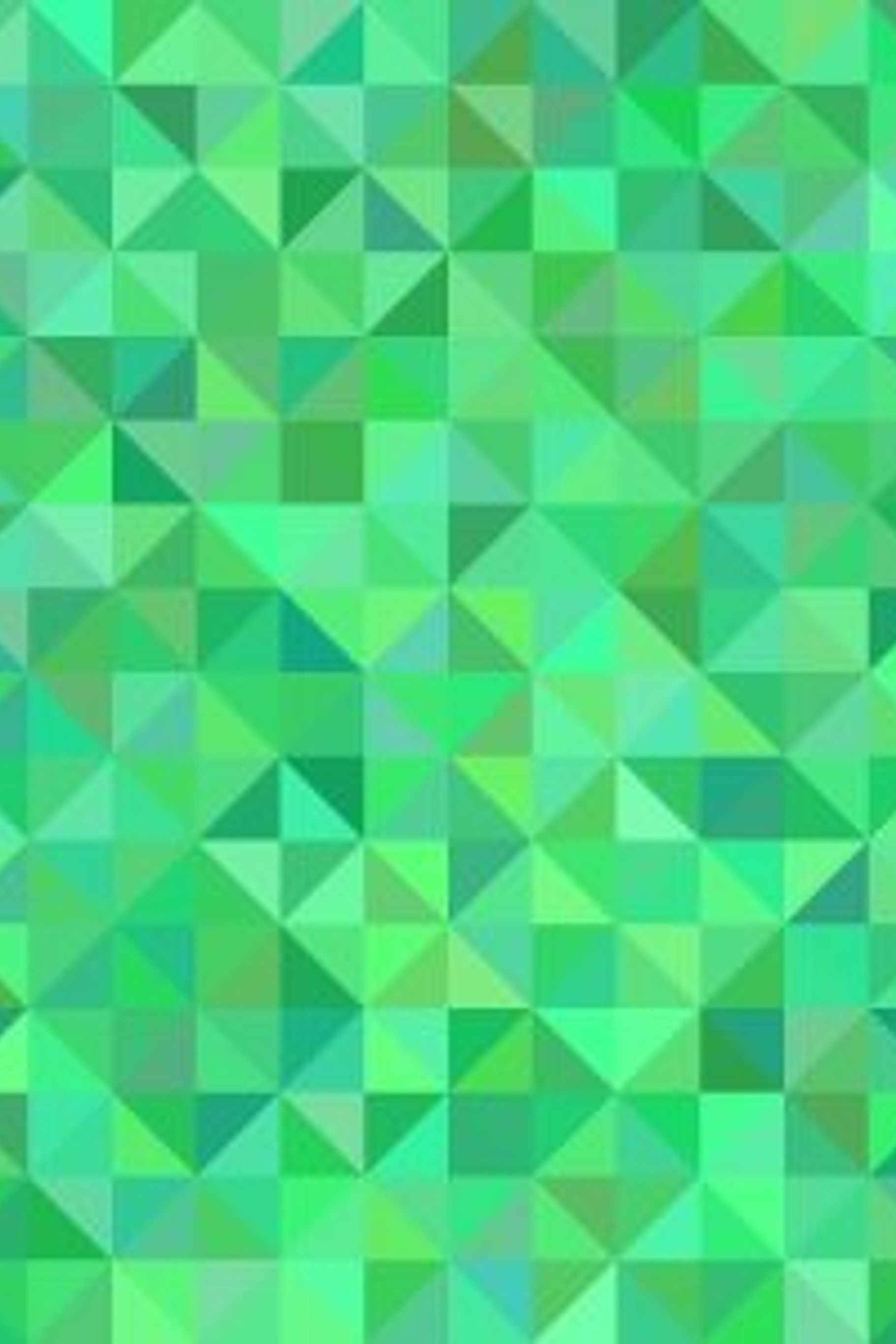
Green
The colour of nature symbolises harmony, growth, balance, peace and compassion.
It is known to have great healing power. Green can regulate blood pressure, soothe the nervous system, relax the heart and calm the whole emotional and physical body.
This colour can also stimulate creativity and encourage new ideas and ways of thinking.
Soft greens are great to use in spaces of relaxation and calmness, however, be careful when selecting a dark green. Although dark green is said to attract wealth, it can appear very dull and unattractive.
That said, dark moody greens can look beautiful in the right setting. For example, jade green paired with gold can have an absolutely stunning effect.
Teal
Teal is a deep blue-green colour. It gets its name from a common teal duck which has a stripe around its eyes.
It’s a colour that encourages analytical thinking, truth and clarity. Teal is rejuvenating but has the ability to promote repression of emotions and reduce feelings of empathy.
Used appropriately, this colour can create a space that is both stimulating yet relaxing. Combine teal with coral and white, navy, browns and metallics.
Yellow
An emotional colour which is very much associated with optimism, happiness, joy and energy. It produces a warming effect and stimulates mental activity.
The colour yellow is a strong psychological colour. While it lifts our spirits and self-esteem, if overused it can have a disturbing effect. Yellow can cause self-esteem to plummet and anxiety to appear.
Yellow is the most visible colour of the spectrum so is often used for emergency or as a cautionary colour.
A rich and natural looking yellow pairs well with beiges, cool blues and pinks.
Misty Blue
Misty blue, like most blues, calms and soothes our emotions and can communicate trust and loyalty.
It’s an elegant and timeless colour that works wonderfully well with greys, creams, whites, coral, lavender and greens.
Pink
Pink is of course a blend of red and white. There are many shades, intensities and variations depending on quantities used of each.
Interesting, although pink is a tint of red it has its very own name. For example, tints of blues and greens are known as light blue, light green etc.
It can be a delicate colour that represents tenderness and romance but can also be vibrant and bright representing playfulness and fun. Pops of magenta can be energising and uplifting.
On the down side, too much pink can be manipulating, physically draining and cause lack of motivation.
Combine soft pinks with gentle blues, purples, greens and creams or use with bright and bold colours to create a more vibrant colour palette.
Who knew that colour could be such a powerful tool!
Although there are still many questions still to be answered on the psychology of colour research shows that it has an interesting impact on our brain. Because of this it will continue to be used around the world in order to influence and manipulate everything from our mood and emotions to our decision making.
We hope you have found our blog on the psychology of colour interesting and useful.