This villa reno blends character details with spacious modern living
Written by
25 October 2022
•
5 min read

Renovation Works was tasked with restoring this Ponsonby villa after being recommended to the client by the project’s designer, Buildology.
“The house was pretty run-down with a half-garage underneath, which was only being used for storage. In fact, the chimney on the house was the only thing really keeping the house from leaning one way or the other,” explains Renovation Works director Wade Haldane.
Retaining character
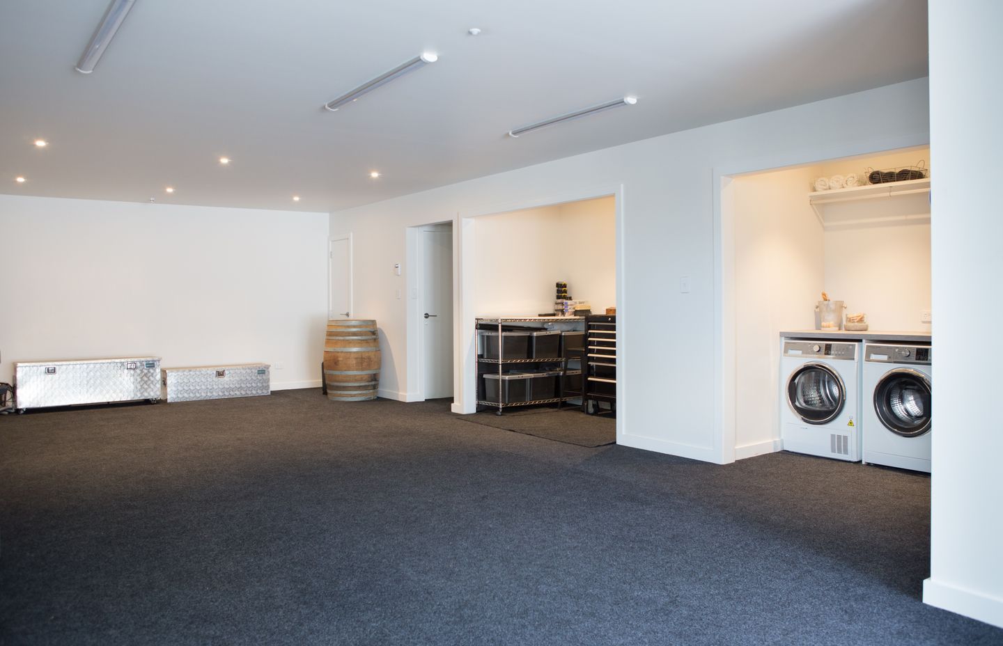
The project involved a full basement development for two to three cars, with the addition of a laundry, workshop and a lift for travel between the basement and main level. The basement also features a small wine cellar.
Embarking on a full rewire of the house, along with repiping, reroofing and repainting, Renovation Works ensured the character of the original design was retained.
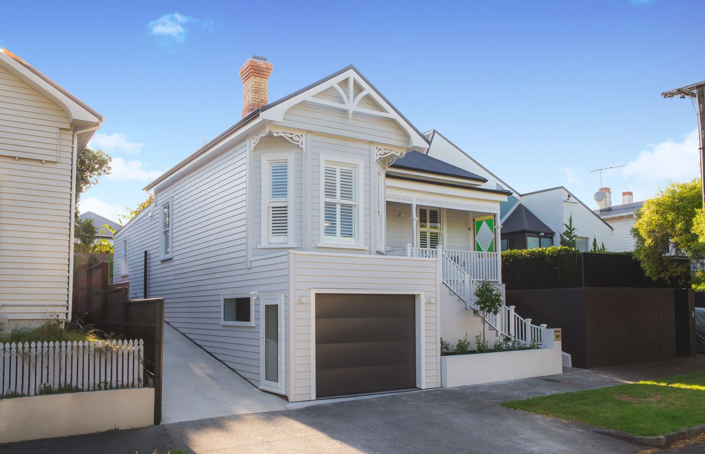
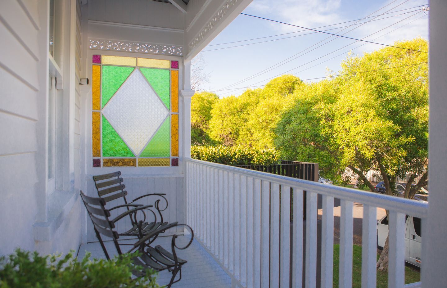
“We had to maintain everything on the front of the house. Here everything was either repaired or replaced like for like and repainted,” says Wade. The front porch structure remained with the addition of new decking.
“The front steps are existing and the balustrade is new. All the bay windows are existing, the fretwork on the gables is all existing and the chimney had to be retained. The main aspect from a character point of view is that no new style of windows can be seen from the street, and the chimney had to be as per the original chimney.
“It’s a false chimney but it has cuttings of the original brick on it to mimic the original.”
No new style of windows can be seen from the street, and the chimney had to be as per the original chimney.
The interior
Upon entry to the home is a bay window area and the master bedroom with ensuite and walk-in-wardrobe to the left, followed by a second bedroom behind. The home’s remaining two bedrooms are found on the opposite side of the hallway: “This is all that remains as part of the original house.”
Originally closer to the front door, the archway has been retained, refurbished and reinstalled further down the hallway to divide the old from the new.
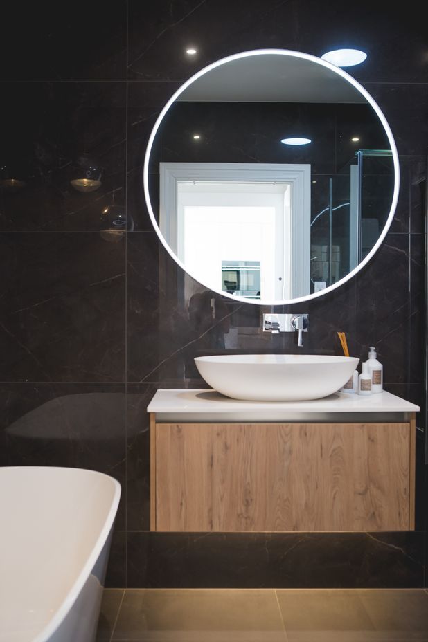
“From the archway is the new space. The lift is housed on the right-hand side of the arch, and there’s a slider doorway into the lobby for the lift, a linen cupboard and then into the main bathroom.”
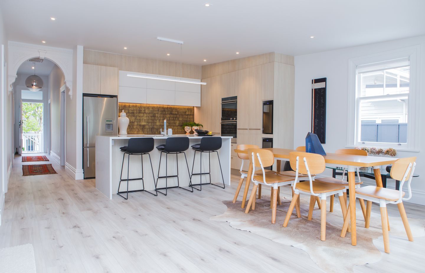
The open-plan kitchen, dining and living room are to the left.
Supplied by Innovative Kitchens, the kitchen design features a textured, brass-look splashback that contrasts against the white cabinetry. The other wall of cabinetry complements the light wood-look flooring that runs throughout this main living area.
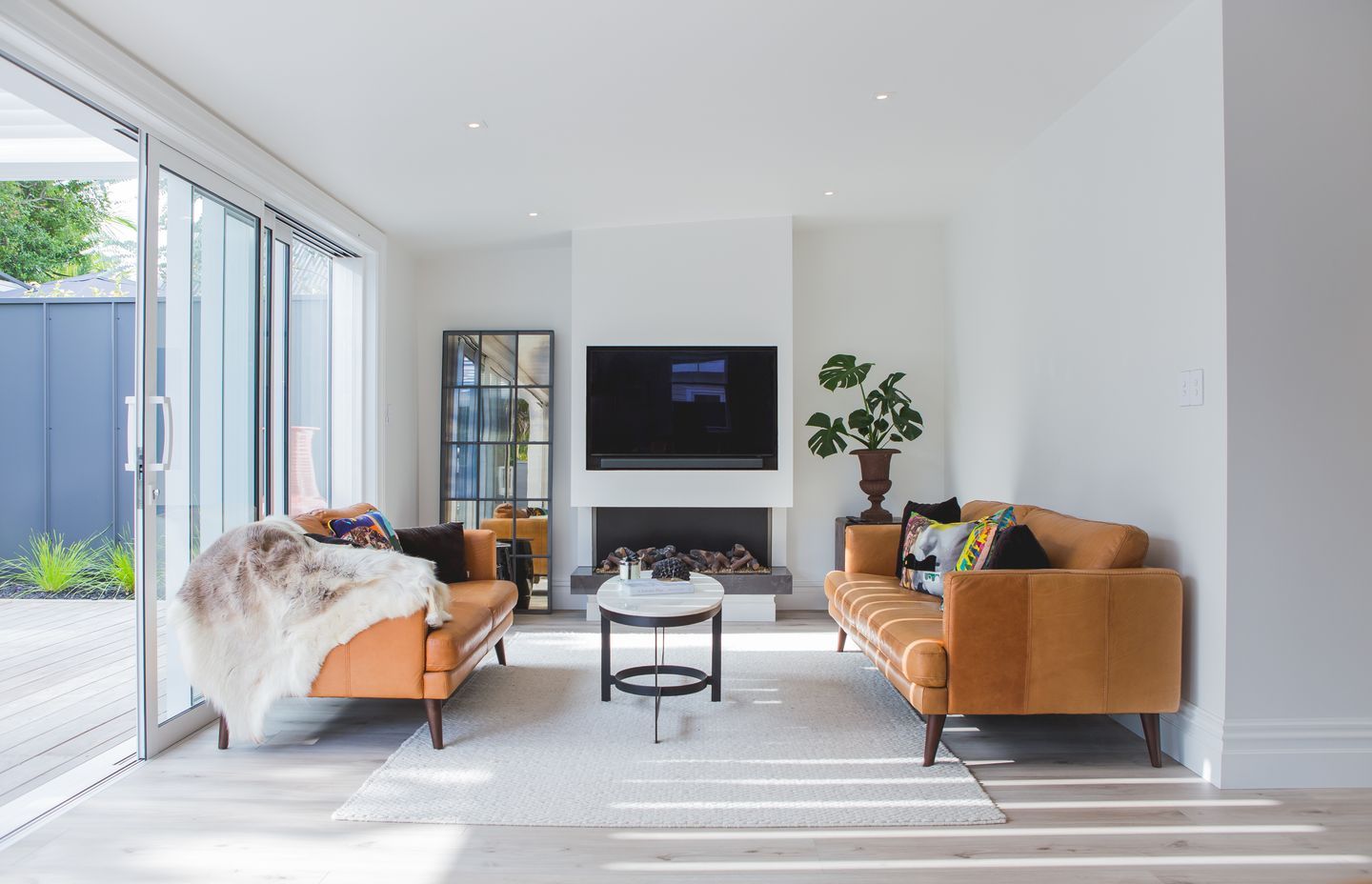
The dining room has plenty of space for family and friends to gather and the lounge area is cosy with a bespoke built-in fireplace.
The exterior
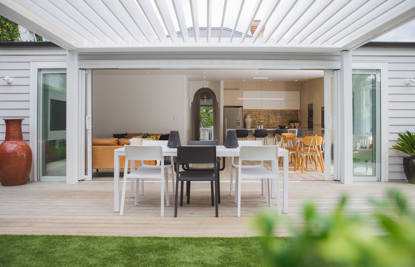
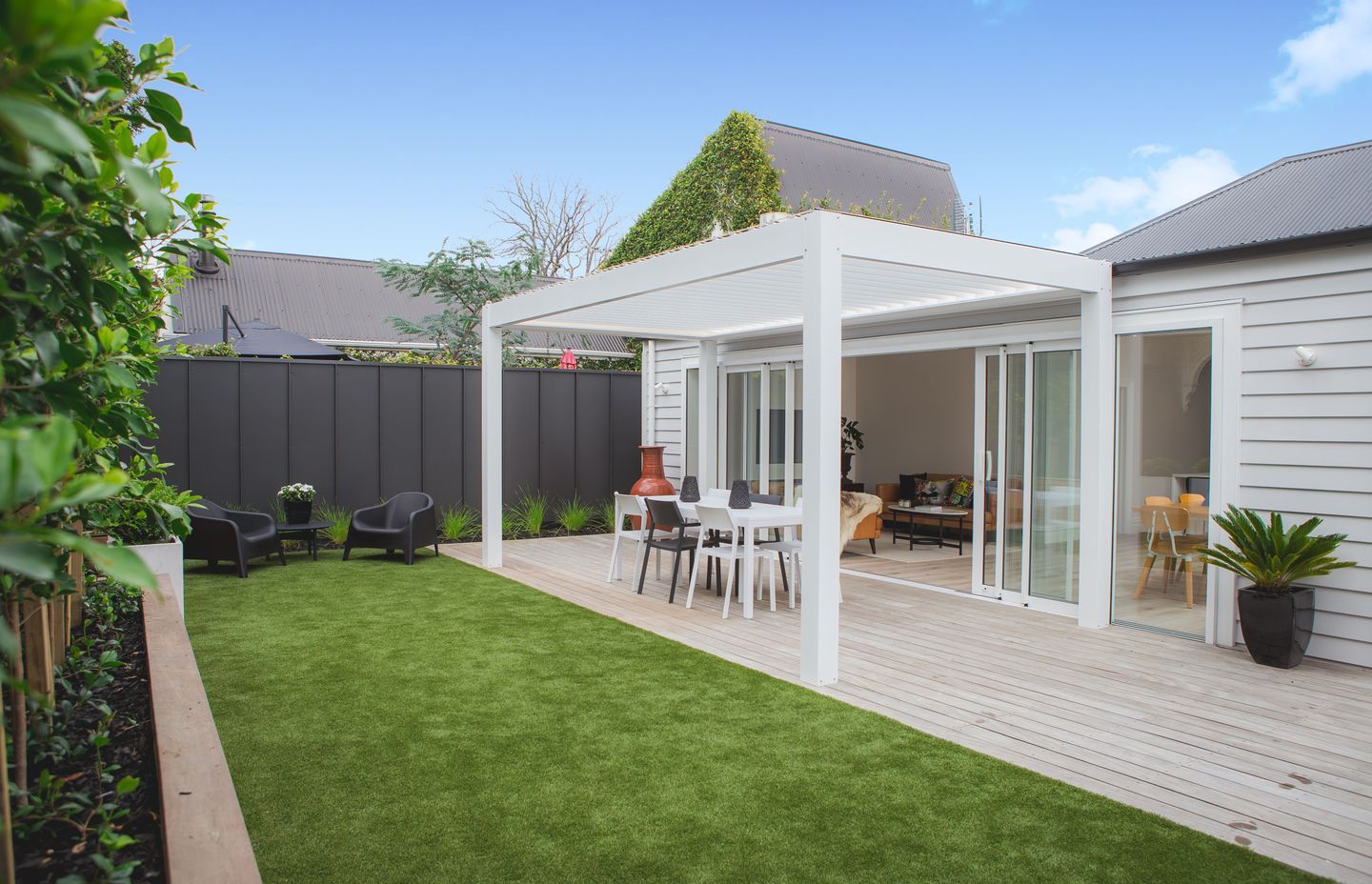
“The stack of slider doors that lead into the rear yard are framed by a structural portal which allows for little or no bracing at either end of the walls on the back end of the house,” says Wade. “NZ Louvres built the structure of the adjustable louvre roof on the back.”
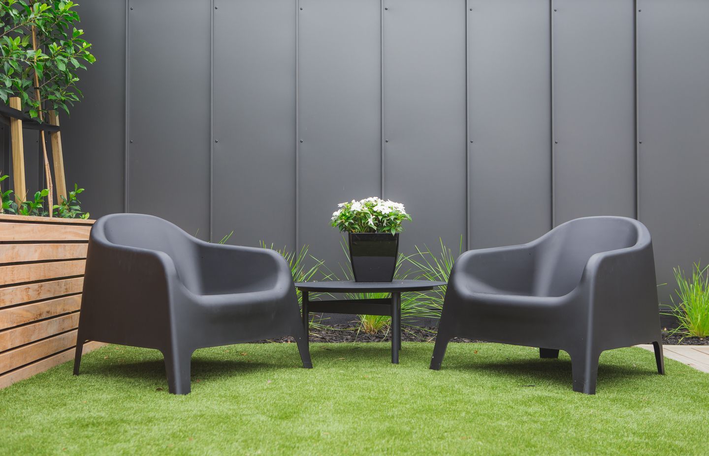
A collaboration between Wade and the homeowner saw the introduction of an innovative fence for the property. The client had seen a design but after researching, they found that it would be a time-consuming and expensive approach.
“So we came up with a product that doesn’t typically get used for fencing. It’s a tray roofing product for a standing seam roof. I think it’s one of the finishing touches on the property that really stands out.”
As well as being aesthetically pleasing, this fence design was cost-effective.
I think it’s one of the finishing touches on the property that really stands out.
Cost and timeline
“The client’s vision for the project was quite ambitious from the get-go,” says Wade. “They wanted to push the boundaries of design without spending an enormous amount of money; they wanted to push those design boundaries and get the maximum reward for doing so.
“The property itself is very simple. There's nothing fancy or outrageous about it, but it's very practical. And you can see the pragmatism that's gone into thinking to get maximum value for money.”
They wanted to push those design boundaries and get the maximum reward for doing so.
Work started on the property in July 2020 and was completed in July 2021. At a cost of approximately $800,000 – not including the design, kitchen, bathroom fixtures, floor coverings and landscaping costs – this renovation maximised the existing footprint and attracted a new buyer when the home was listed for sale.
“A lot of the cost fluctuation from contract price to final price was to do with groundworks. Also, there was some unstable soft soil that we excavated into and we had to go down deeper. These are the sorts of things that we tend to have to make provision for because we know it's going to take more cost and time to do that.”
Wade says a similar project of this scale could be achieved at a similar price point.
The Renovation Works team has now been invited to be involved in the client’s next project.
Explore more projects by Renovation Works.
Words by Cassie Birrer