Unique architectural details make this Christchurch home a standout
Written by
19 September 2022
•
4 min read

The vision
Designed by Choice Architecture, this two-storey home located on Regents Park Drive in Christchurch boasts three bedrooms plus a separate office, as well as a four-car garage. But it’s the entry and open-plan living spaces that answer the client’s brief for an ‘entertainer’s home’.
“When a house had to be demolished due to the earthquake, a rare opportunity to purchase a blank section in Regent Park came about,” explains Choice Architecture’s Joe Armitage.
“While we did want the house to stand out, we were careful to ensure we didn’t deviate too much from the style of the rest of the homes on the street so the house wouldn’t look out of place.”
A sophisticated exterior
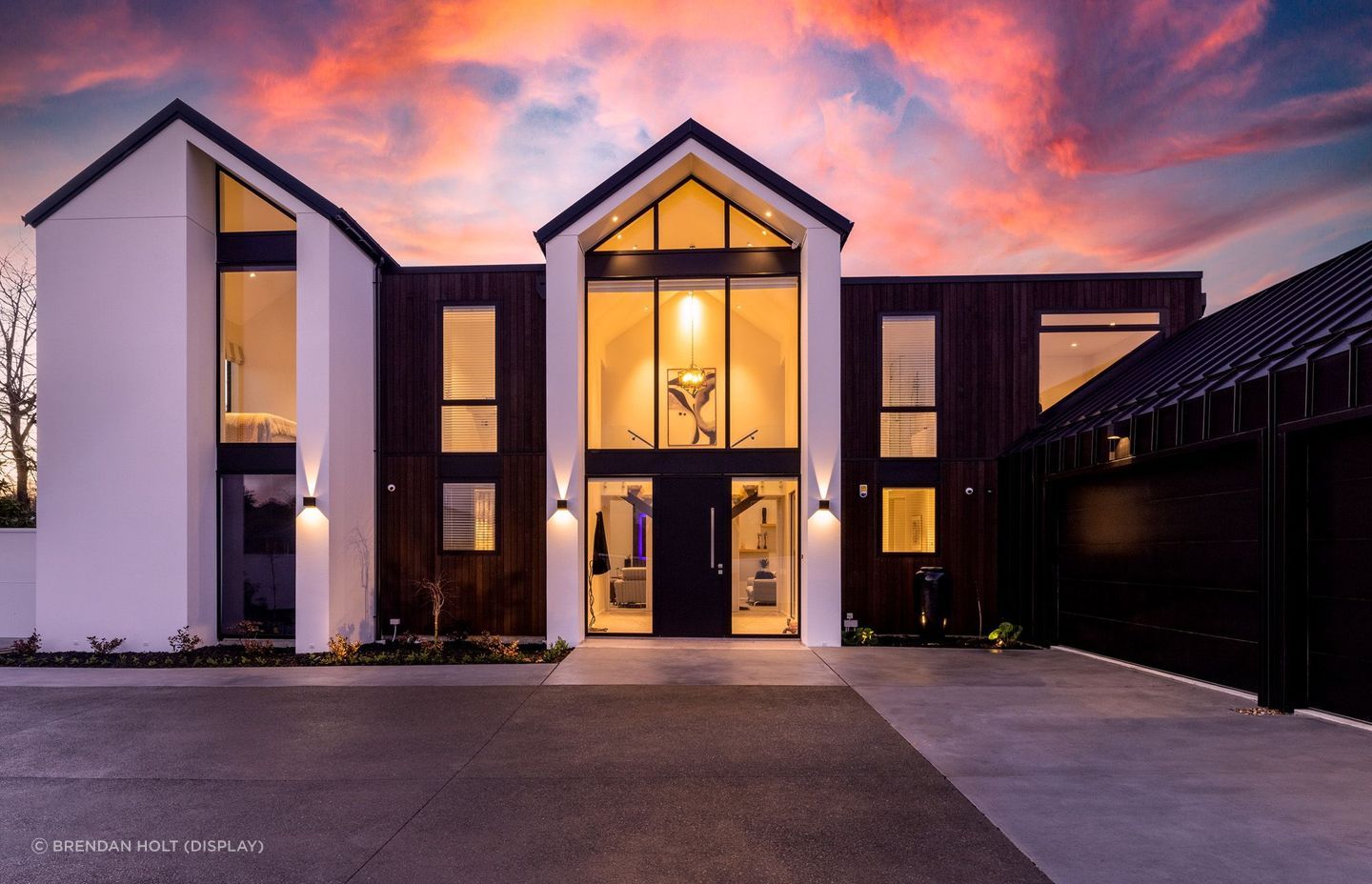
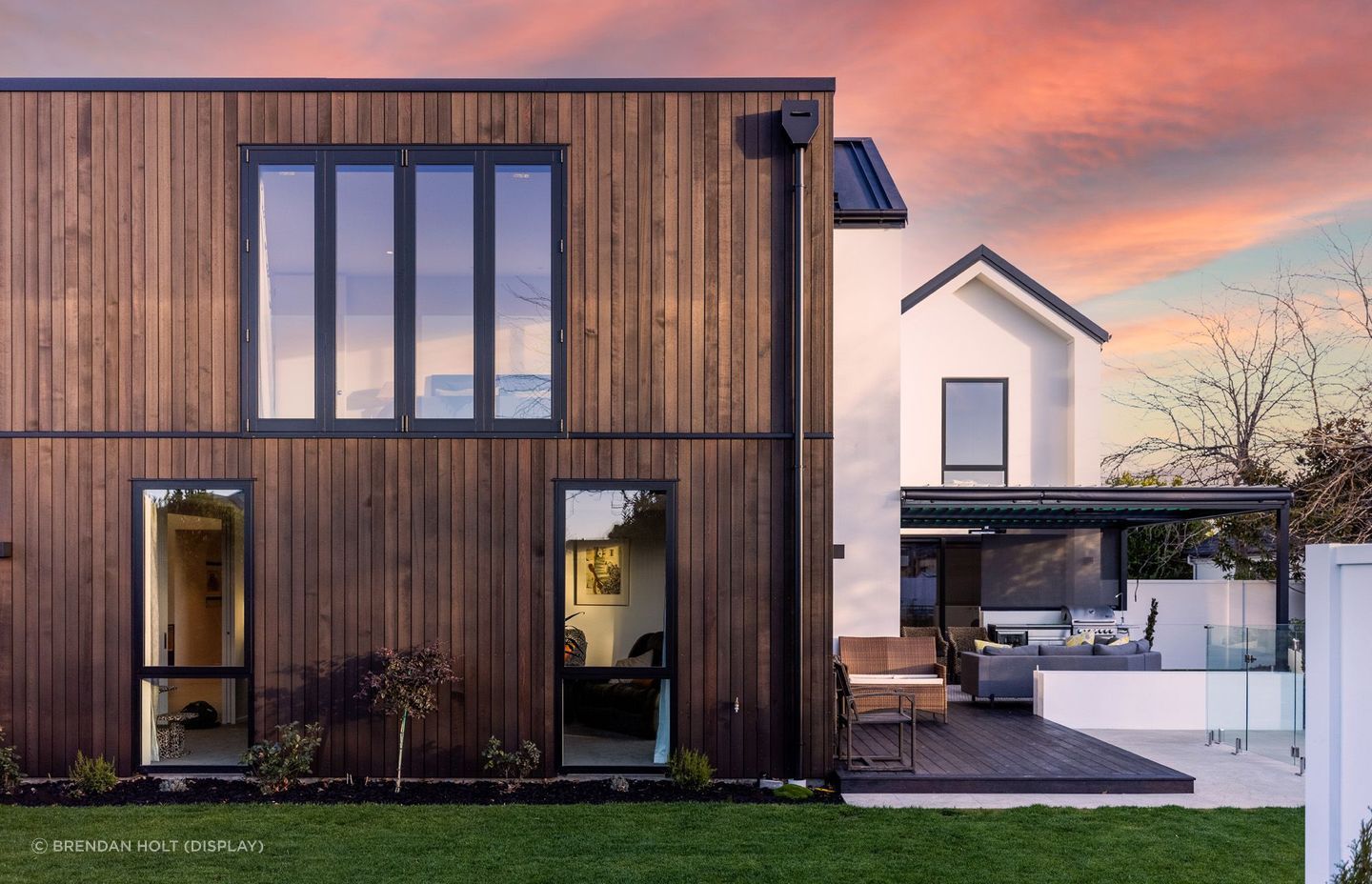
With a combination of flat roof areas and gables, the house is clad in a combination of contrasting AAC panel, cedar and Colorsteel Eurotray – helping the house to both blend with the area's existing homes while making a style statement.
“We wanted to use contemporary cladding materials that contrasted with the more traditional building shape to give it a more modern look,” says Joe. “The clean vertical lines and darker colours of the shiplap weatherboards and tray-style Colorsteel contrast with the monolithic plaster.”
An entertainer’s dream
Entering through one of the gabled sections, a floating staircase with solid timber treads, glass balustrade and black steel handrails greets guests – a geometric pendant suspended above.
“Our clients are big entertainers, not shy of throwing a party or two, so it was important to have a grand entrance for guests as they enter the house.
“Our clients are also wine connoisseurs so needed somewhere to store their bottles. We decided to make a feature of their amazing collection and located the cellar next to the entry foyer to be admired by guests upon their arrival.”
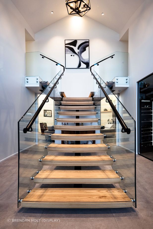
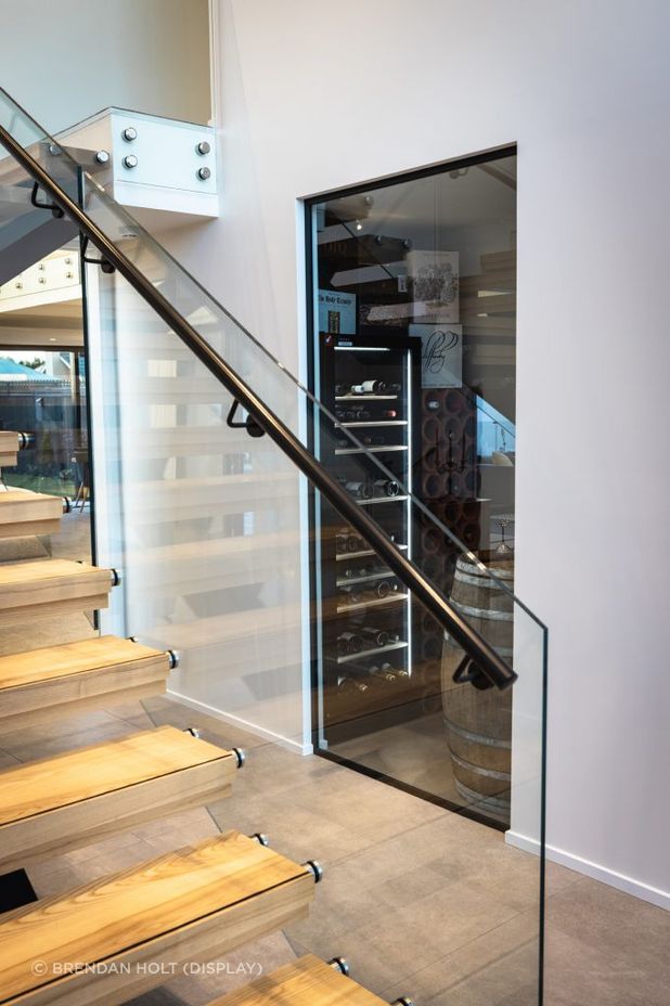
Our clients are big entertainers, not shy of throwing a party or two, so it was important to have a grand entrance for guests as they enter the house.
Continuing through the house on the ground floor, the space opens out from the foyer into the open-plan living, kitchen and dining area.
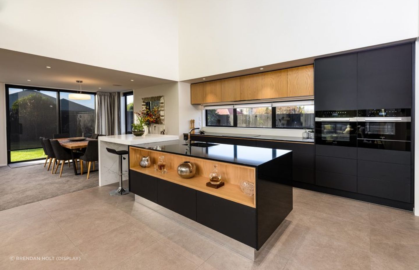
Complementing the exterior materiality as well as the stairs in the foyer, the kitchen features black Miele appliances and black and American white oak joinery – a contrast against the surrounding white of the interior.
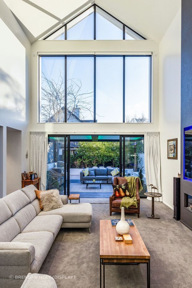
Similarly, the Gazco E-Reflex 195R inset electric fire in the living area is surrounded by a double-height, floor-to-ceiling black feature surround.
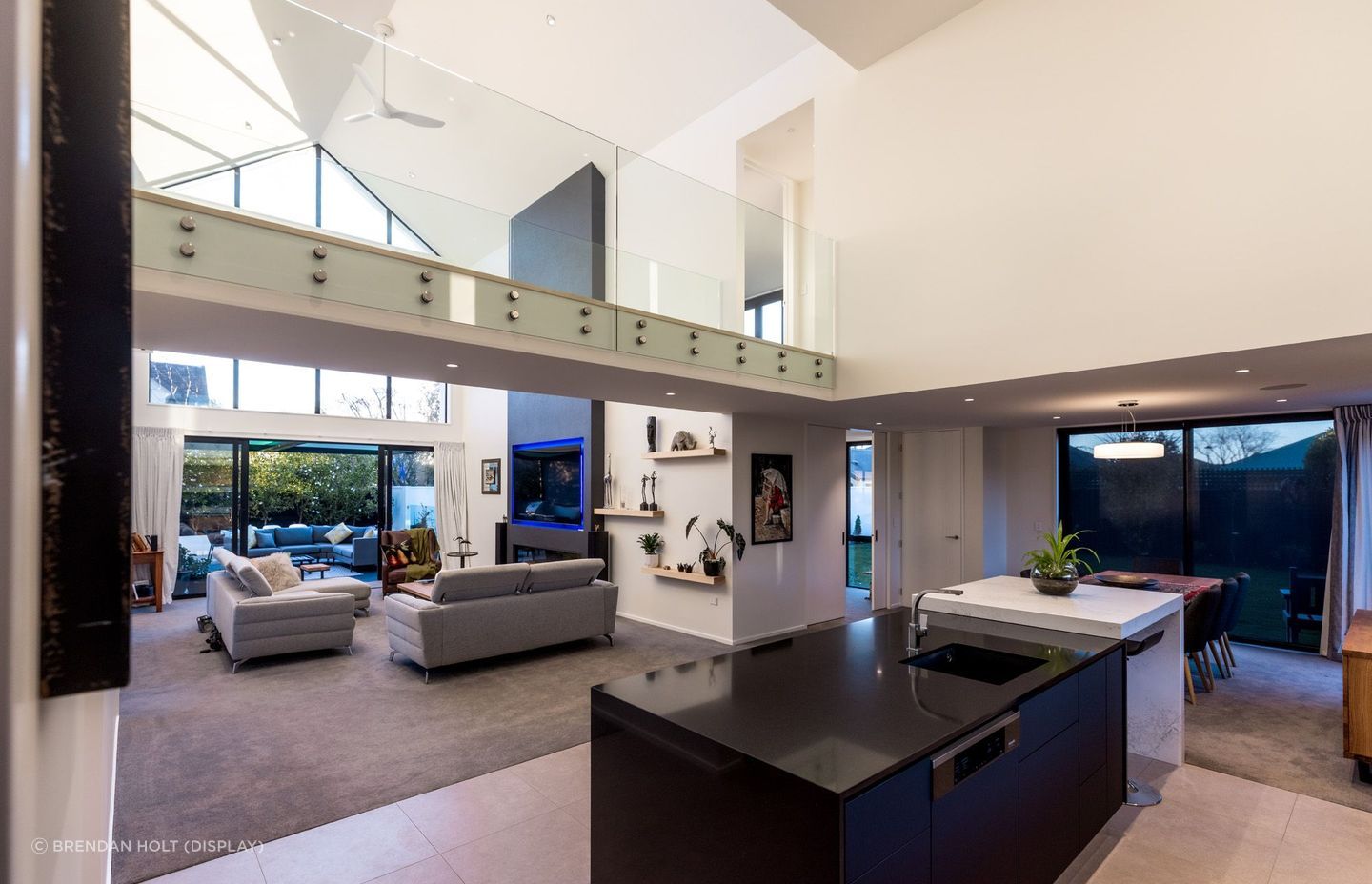
It can be admired from multiple spaces and it provides something a bit different when walking to the master bedroom.
With extensive glazing accentuating the height and shape of the raking ceiling, the living area opens out through sliding doors onto the outdoor entertainment area – complete with a covered outdoor living area and pool.
Back inside, the home continues to impress with a footbridge above the living area that connects the master suite to the rest of the home.
“The purpose of the bridge is to provide a focal point to the main living areas. It can be admired from multiple spaces and it provides something a bit different when walking to the master bedroom,” says Joe.
The ensuite features a bespoke double vanity unit with floating stone benchtop and oval vessel basins with wall-mounted chrome tapware. A walk-in shower, organic shapes and neutral colour scheme give the space a 'resort' feel.
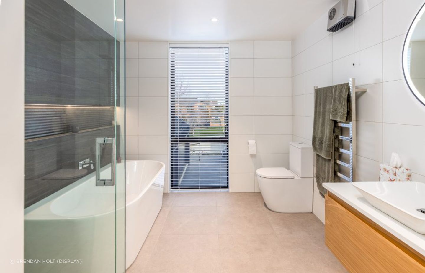
Neutral tones and natural textures have also been used for the main bathroom, featuring a back-to-wall bath and wall-mounted timber vanity.
Cost and timeline
Achieving this modern, architecturally designed home cost $1.2 million at the time of construction in 2020, and while challenges were involved in realising the form of the roof, it all played a part in the desired final result.
Joe explains: “The low recession angle on the east elevation proved problematic as we wanted to avoid resource consent, but with it being two storeys, we had to think outside of the box to make sure we didn’t breach it. This had a huge part to play in the overall design of the roof, but we’re very pleased with the outcome as it helped to produce the window above the bridge, which adds an abundance of light to the living areas.”
Explore projects by Choice Architecture.
Words by Cassie Birrer