Which Colours Suit Which Interior Design Style?

Did you know that you can emphasise a particular interior design style by using it’s associated colours?
So, if you love a particular design style and want to create this in your home then read on. We provide some guidance on which colours to use to suit which design style.
Art Nouveau
This style is seen as the predecessor to modern design. It’s credited with being the first design style not to look back on history for inspiration. Instead it looks at nature and the environment, and as such, curves and organic shapes came to the forefront.
During the Art Nouveau period soft muted colours were used extensively. Think sage, greens, olive, mustard yellows and brown, lilac, purple and violet were used extensively.

Classical/Traditional
This style tends not to date and symmetry is an important aspect. Colours tend to be in the mid tone range with formal rooms using dark red or russets for dramatic effect.
Contemporary
The style of today, often connecting the inside with the out. Contemporary boasts clean lines and simplicity. Therefore, Colour palettes tend to be neutral such as whites, beiges and greys. However, they are occassioanlly complimented with an accent colour here and there. These accents can vary from reds through to oranges, turquoise or greens. Emphasis is placed on artworks and accessories.
French Provincial/Shabby Chic
Both these styles have similarities as they each create a cosy, warm and rustic space but also a feeling of elegance. Muted shades such as lavender and pink, cornflower blue, soft grey and faded greens are beautiful colours for these styles.
Minimalist
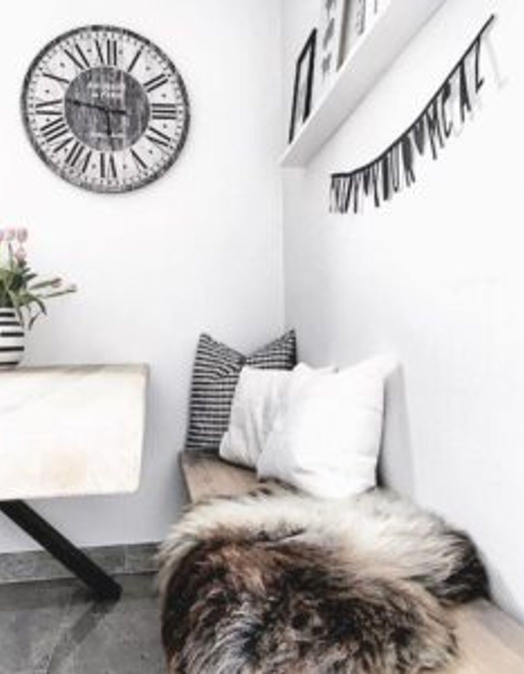
Spaces with simple form and little ornamentation. Furniture tends to be low and simplistic in neutral tones and often leather. Commonly a white on white colour scheme with pops of colour used in accessories.
Moroccan
This style is influenced by Arabian, French and Spanish design. It’s a mixture of texture, colour and pattern. Deep rich colours such as browns and purples, alongside vibrant colours such as tangerine, yellow, red and fuchsia. The key to this design style is in the detail of the patterns and textures to ensure they are in harmony with each other and balanced.

Asian
This style is exotic and intriguing. Colours vary depending on the origin of influence. Darker timbers and earthy colours teamed with bright orange, cobalt or fuchsia for an Indonesian influence to black, glossy lacquer accented with gold or red for a Chinese effect.
Beach Style/Hamptons
Hamptons design is a classic and sophisticated style, yet the key to this design is to have a relaxed feel and a simple colour palette. Natural colours of the beach and sea are paramount such as taupes, blues, whites and aqua’s.
Retro 60’s
There’s a saying that if you can remember the 60’s you were not there! Influenced by pop music and the abandonment of strict moral protocols of the time. Think free love and flower power. Colours are vibrant and diverse. Anything from red, pink, purple, and yellow, orange, silver in psychedelic patterns. Furniture influenced by the use of polypropylene allowed the use of strong colours in furniture.
Scandinavian
Influenced by Alvar Alto from the 1930’s and is currently very popular. Characterised by moulded furniture and veneers. Light coloured, muted tones and off whites suit this style, along with tones of nature and honey coloured timbers.

Now you’re able to select colours to suit your chosen style, maybe you need some advice on how to choose window treatments? If so, please click here for some tips http://www.inspiredspaces.com.au/window-treatments/
Otherwise, for more professional advice on interior design, decorating or materials for your home or commercial space please contact the team of Inspired Spaces today!
