The Wellington new build with wild ideas and a cosy heart
Written by
03 July 2022
•
4 min read
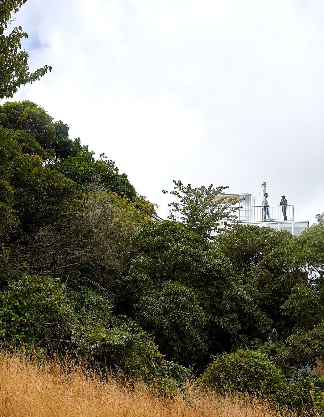
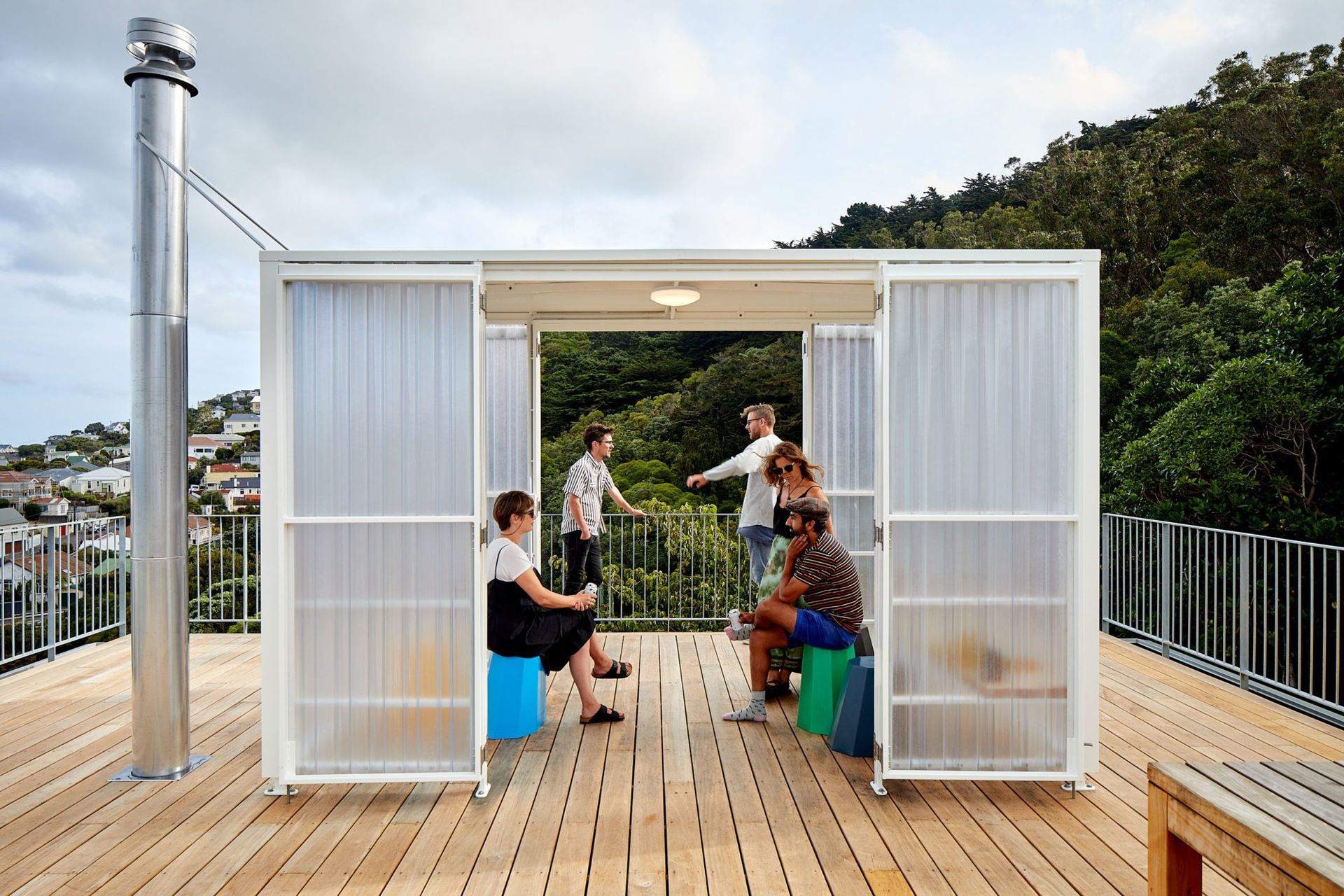
On the exterior, this home by Patchwork Architecture tends towards the experimental. It’s balanced atop a rocky outcrop in Wellington’s Kilbirnie; an awkward site on a busy road. It’s wrapped in aluminium, and there’s what looks like a fibreglass bus stop on the roof.
“It was a project for a builder that we’d worked with previously,” says Ben Mitchell-Anyon, who created Patchwork Architecture along with Sally Ogle. “He asked us if he should buy this 200sqm, triangular, steep, south-facing site.”
They said yes.
The site was small and difficult, they concede, but from a compliance point of view it had some advantages. A wide road frontage and few neighbours meant the planning regulation constraints were slightly less onerous. Plus it was close to the city, and had a nice outlook.
“We climbed to the top of the site, and realised we could have quite good views. And if we could get up out of the ground enough, the sun would be quite good, too,” says Ben.
So the builder, Adam Pierson of Dorset Construction, went ahead and bought it, with the idea that Patchwork would design a home for his young family and he would build it.
“He's always up for a challenge,” says Sally.
“He had worked with us on some difficult sites,” says Ben, “so I think he just thought we could make something good.”
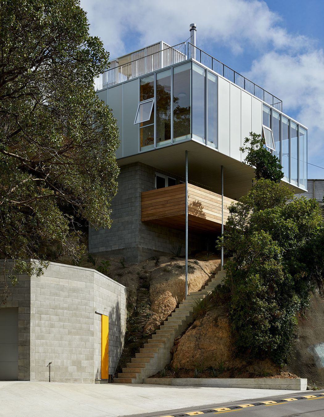
So the constraints of the site and the goal to find some views and the sun all generated the shape.
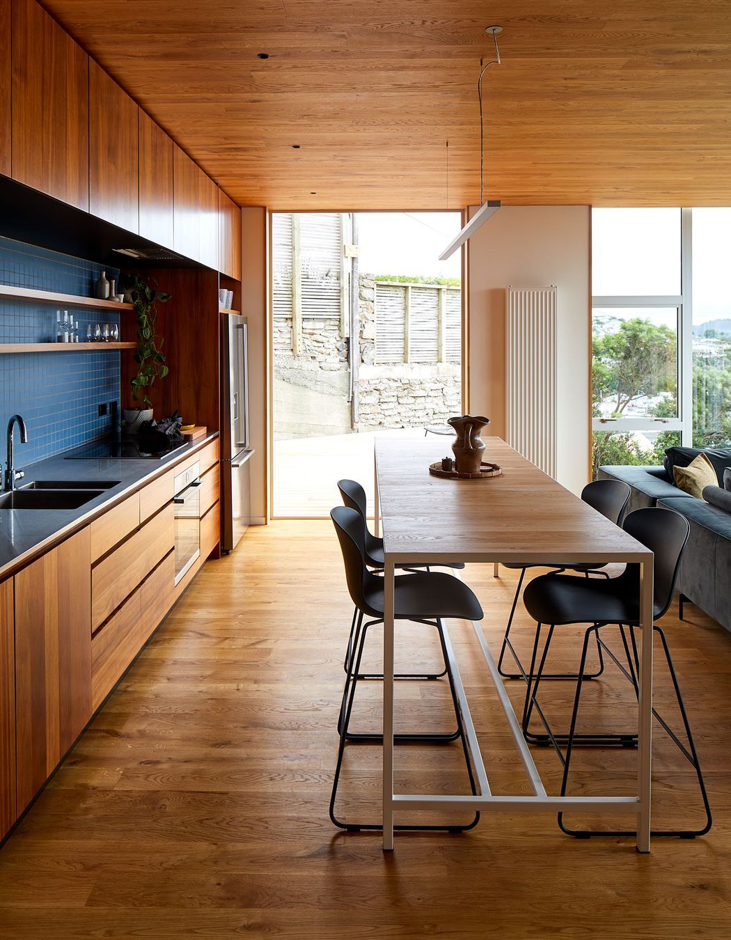
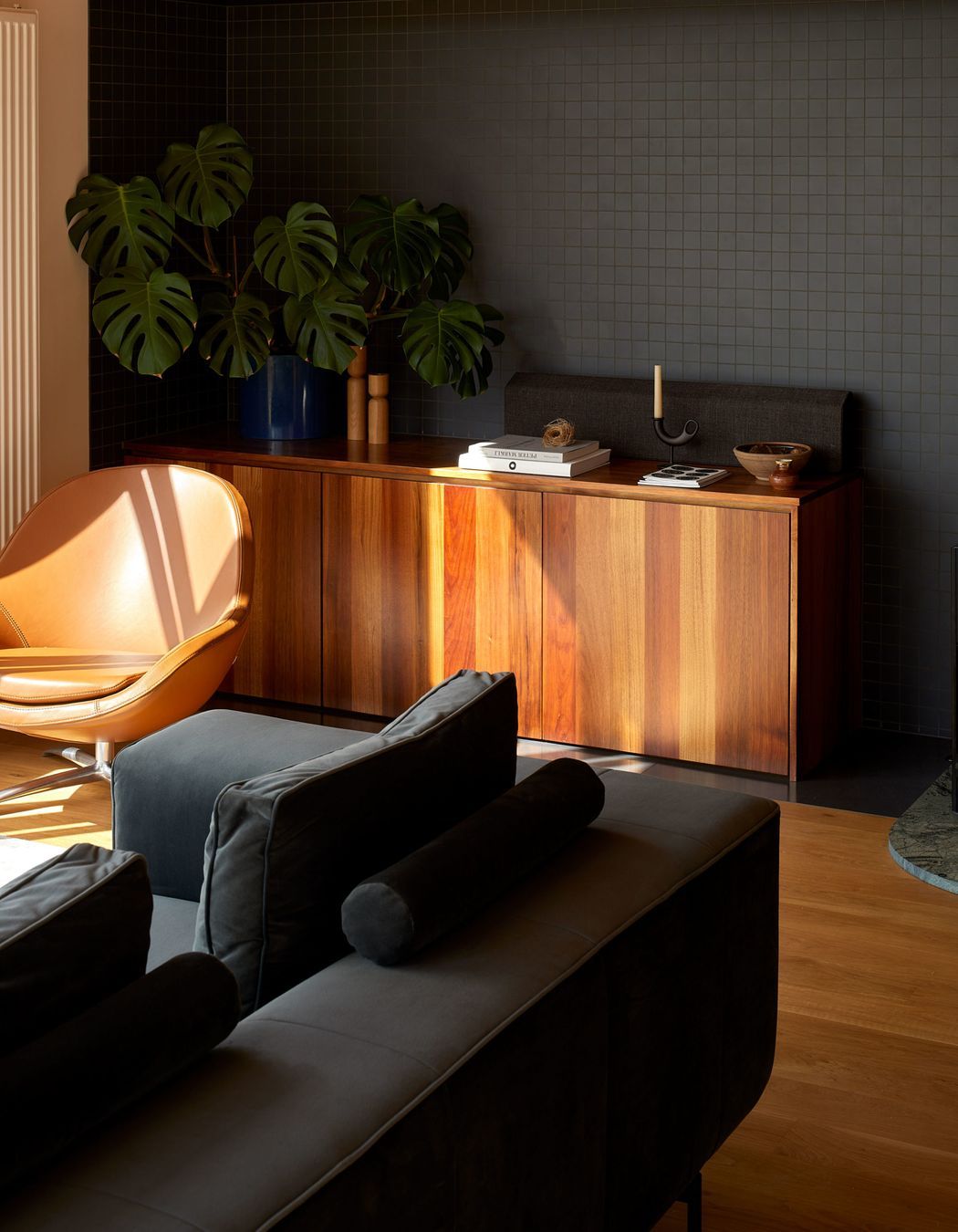
But the real surprise is not the unconventional exterior, but that it holds a simple, casual and comfortable family home.
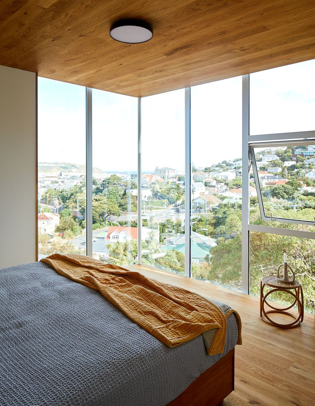
“It has three bedrooms,” says Sally, “and all of the living areas are on that level. So once you’re up in the house, it’s on a single level. It was about turning a really difficult site into a house that’s easy to live in, with good connections to outdoor spaces. They talked about wanting to know where their daughter was playing and having that connection to her when they’re in the house.”
The simplicity comes from the symmetrical square 10m x 10m layout of the main floor. “We play with geometries all the time,” says Ben. “So it's quite satisfying when you can stick to something that has that clarity of a pure shape, and work it out inside like a puzzle.”
With much of the street access given over to a garage and driveway, outdoor space was challenging.
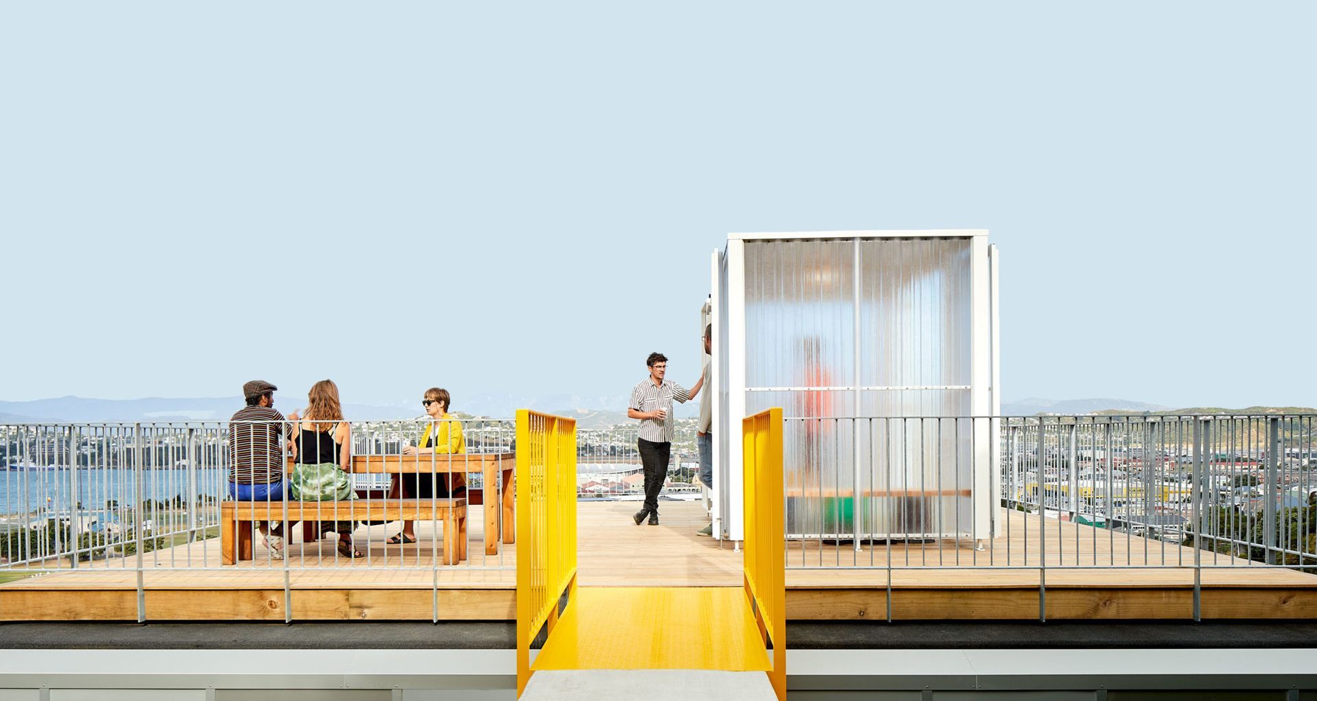
“On a site that had zero flat ground, we carved out terraces and balconies,” says Sally. “And then we thought, let’s create a full roof deck. The higher you get the sunnier it is.”
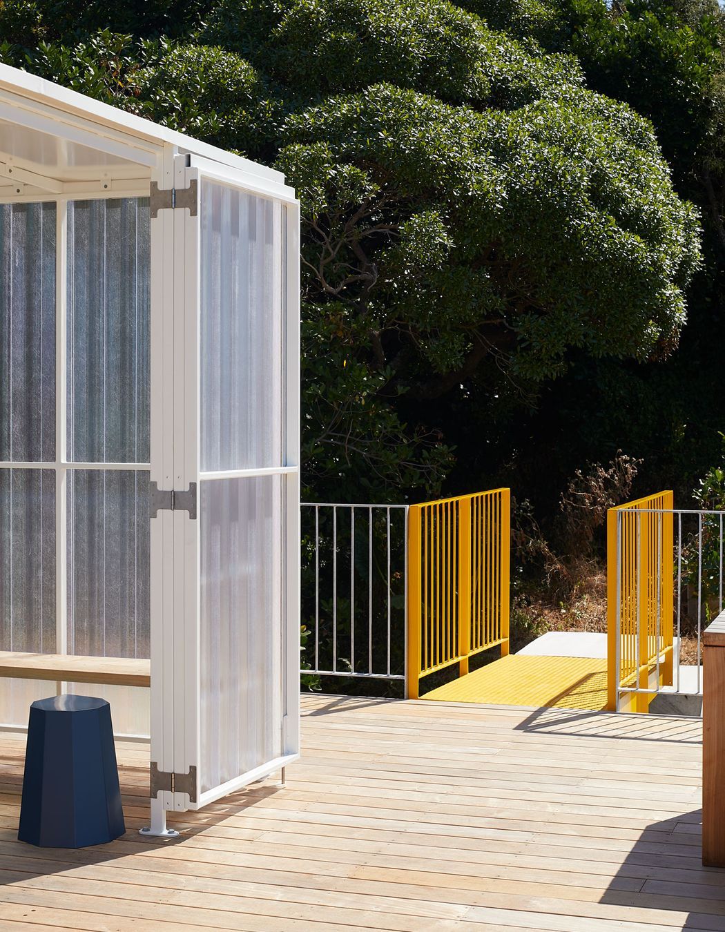
Access to the roof deck is via external concrete stairs and a yellow metal bridge.
And the fibreglass shelter?
“That’s so you can actually use it,” says Ben. “It's a bit windy. But you can also have a barbecue in it, and there's a sink and power in there. It really makes the rooftop much more useful.”
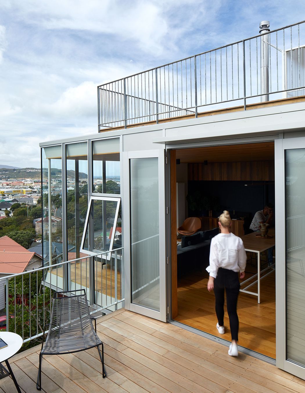
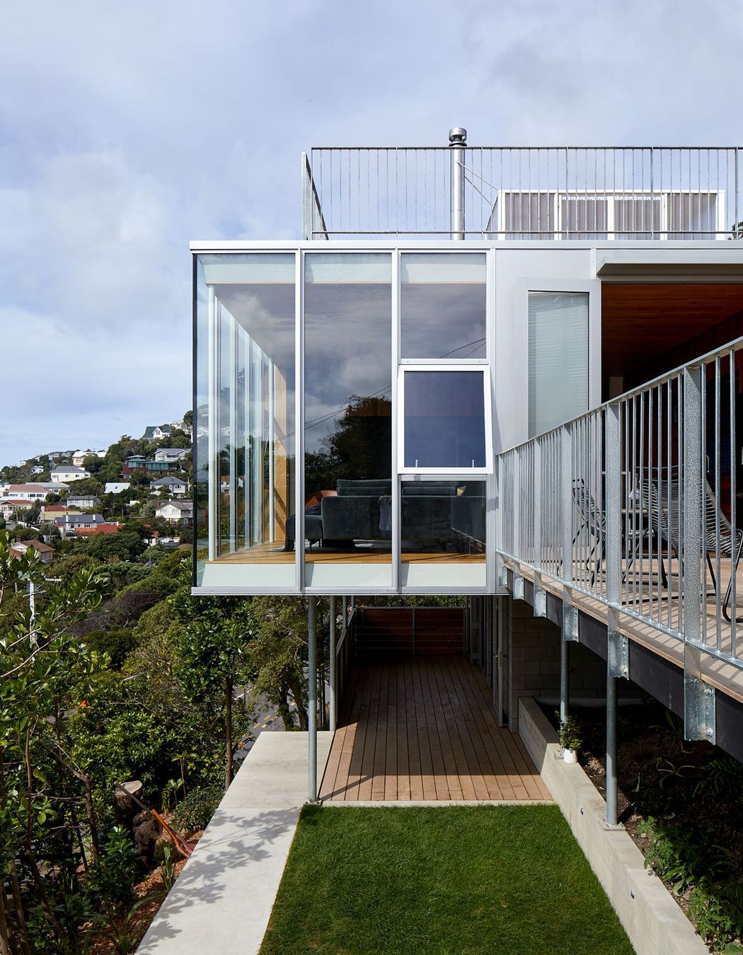
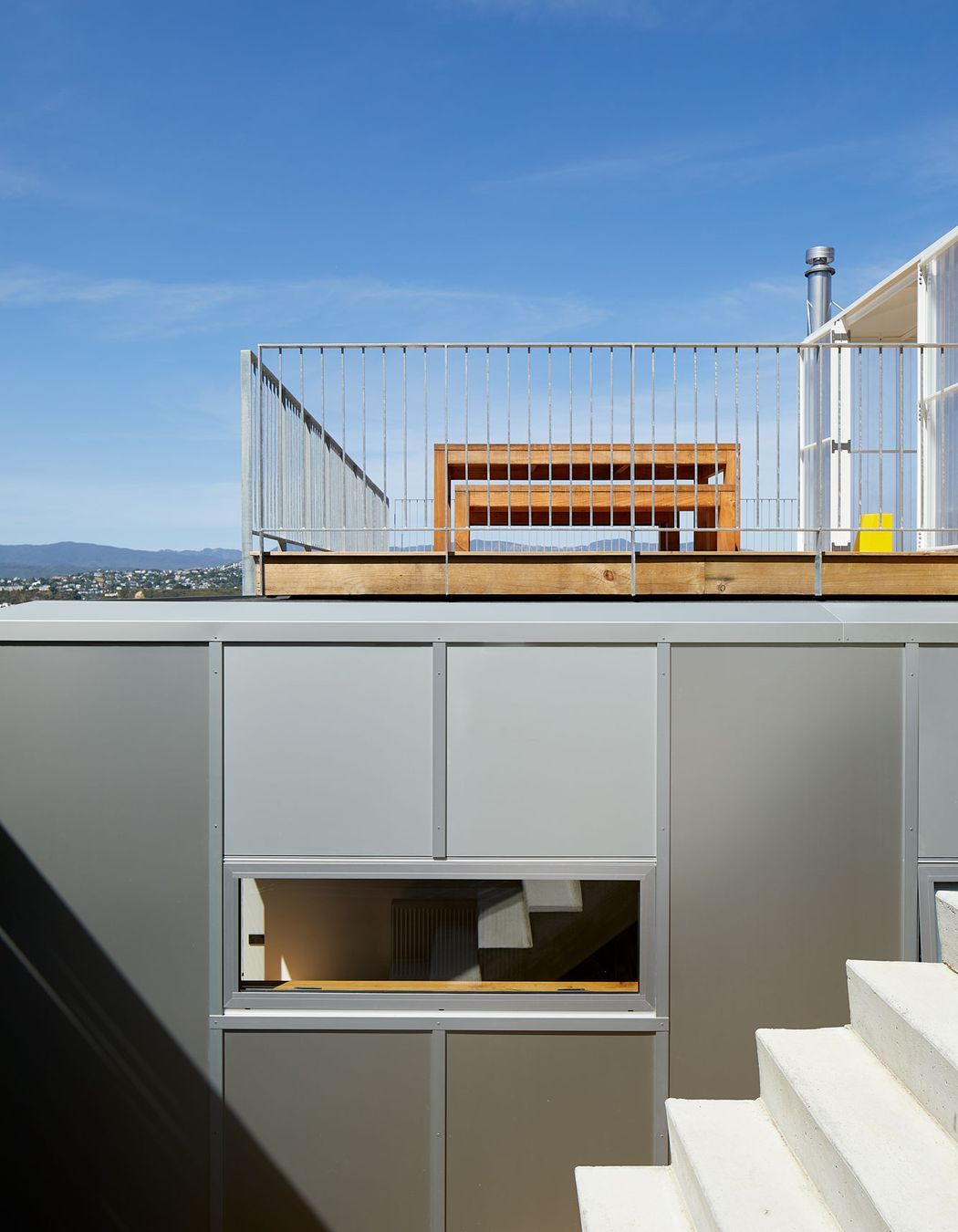
Another quirky touch is the cladding. “It’s clad in aluminium panels, two millimetre thick panels, which was something we've never tried before,” says Ben. “We did it all in an anodised finish, which picks up the light really beautifully.”
As homeowner and builder, Adam was interested in the details. “He had a lot of questions about what’s what, how are things going to work,” says Ben. “The floor plan we came to quite early but it was really about the the nitty-gritty of the materials.”
He approved of the cladding choice. “He really liked the the durability and the easy-clean aspect,” says Sally. “It's an incredibly smooth finish. And I think it's pretty bulletproof in terms of durability. Something that can stand up to that environment is important.”
It’s not a common material. “Some people don’t like shiny metallic houses,” says Sally. Nevertheless they plan to use it again, maybe in a colour next time.
They're not afraid of an eye-catching design. “It’s a really busy road so a lot of people drove past that house as it was being built,” says Sally, “and you can see it from quite far away. So it was quite visible.”
Ben says it was nice to receive positive feedback, including from other architects. “It’s such a cool project.”
Images: Simon Wilson
