A fun and functional extension transforms a Fremantle Federation
Written by
16 May 2022
•
6 min read

Built in the early 1900s, the two-bedroom red brick cottage in East Fremantle had the standard layout of the time: four rooms coming off either side of a central hallway and little connection to the outdoors. A lean-to had been added out the back, and some rundown sheds sat neglected in the backyard.
The homeowners had made a start on having the house redesigned to meet their future needs by having a building designer draw up some plans, but a friend - one of Nic Bunsdon’s clients - suggested they seek Nic’s advice on whether a more creative approach could deliver the results they were really after.
“I picked up the house after the schematic had been done by a building designer,” Nic explains. “There were some good first moves, but also some ugly, horrible things that just needed to be rationalised.”
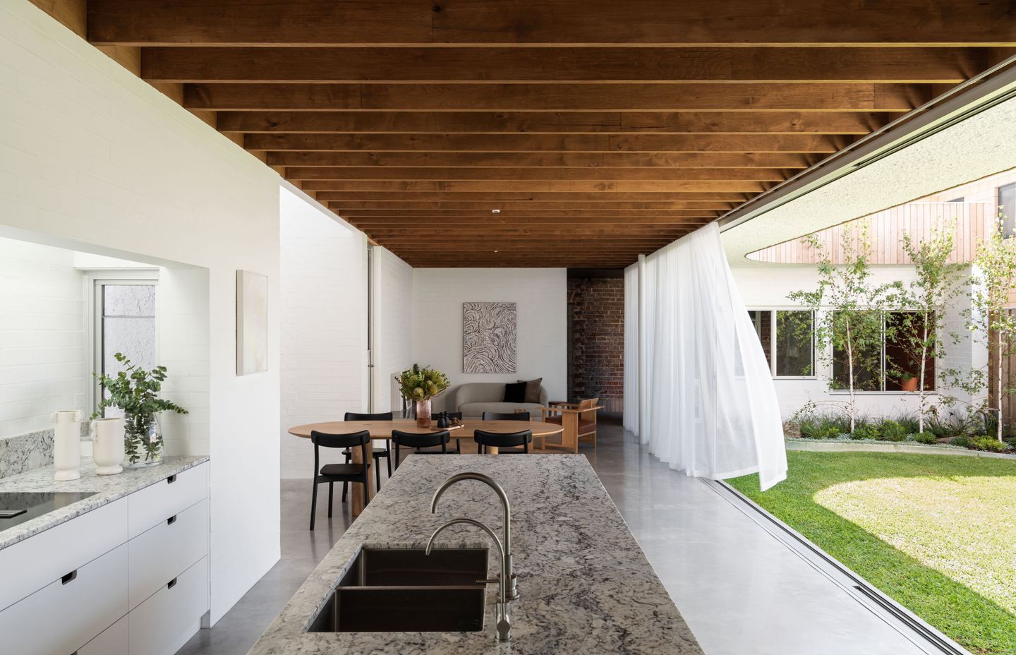
Nic’s plan added a playful touch and an extension that not only delivered the extra room the owners wanted for children and visitors, but also plenty of natural light.
The challenge, however, lay in the narrow confines of the block, along with a heritage overlay preventing the facade from being altered.
The easiest solution would have been to double the footprint backwards into the backyard with the garden at the rear, but Nic opted to turn the addition 90 degrees to take in the northern aspect and invite light into the house.
“On a skinny block like this, that northern aspect was so important, so it was almost like locating and placing a garden first and then the house becomes secondary around that.”
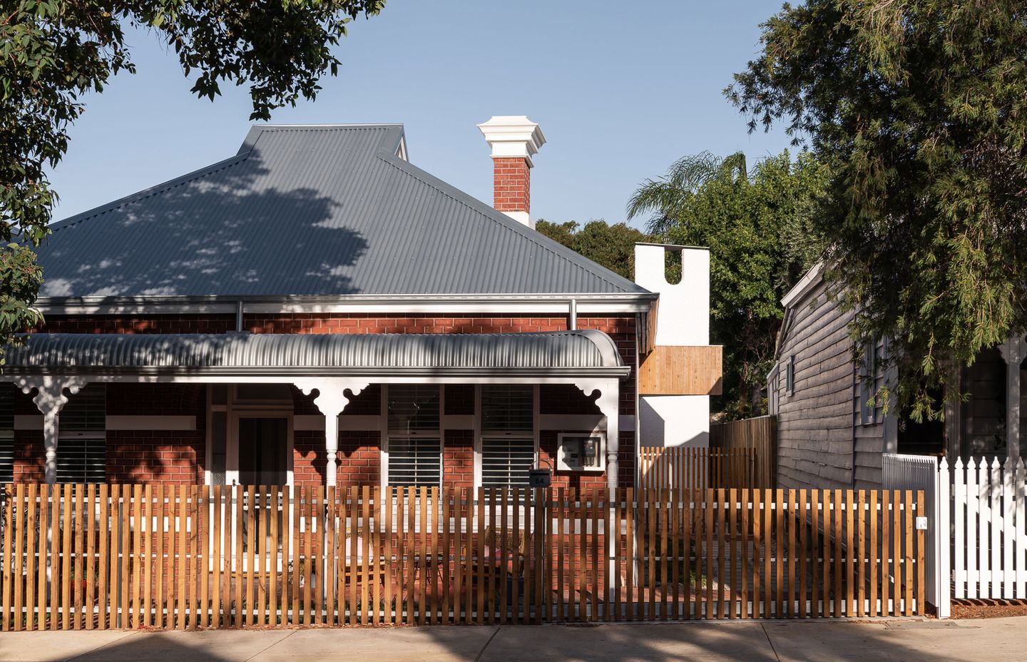
Before the build could begin, however, the lean-to and old sheds had to be demolished - leading to the project’s first delay.
“When the demolishing started out the back they found an old hand grenade,” Nic says. “The digging stopped and the whole street was shut down while they figured out if it was actually live or not.”
Fortunately, it wasn’t, but another delay was soon to come their way: the builder went bust. This builder’s quote had come in much cheaper than the two builders Nic had recommended to his clients but the clients opted for the lower quote. He now uses the experience as a cautionary tale for other clients hoping to save money this way. “I didn't do too much ‘I told you so’ but I did a fair bit,” says Nic.
When the demolishing started out the back they found an old hand grenade. The digging stopped and the whole street was shut down
Waiting for a new builder to become available meant the total time from design to completion extended to four years. Now that the home is finished, however, the homeowners couldn’t be more pleased.
“They seem really happy and comfortable there,” Nic says. “The doors are open, the sun’s shining, the breeze is flowing through, there’s music going in the sunken lounge and the kids are running around and playing out the back … it just kind of feels natural, comfortable and easy.”
In the original part of the house, there are now three bedrooms, a spacious walk-in robe and new bathroom. The main entry to the house has been moved from the front around to the side through a curved entryway located between the existing house and the extension.
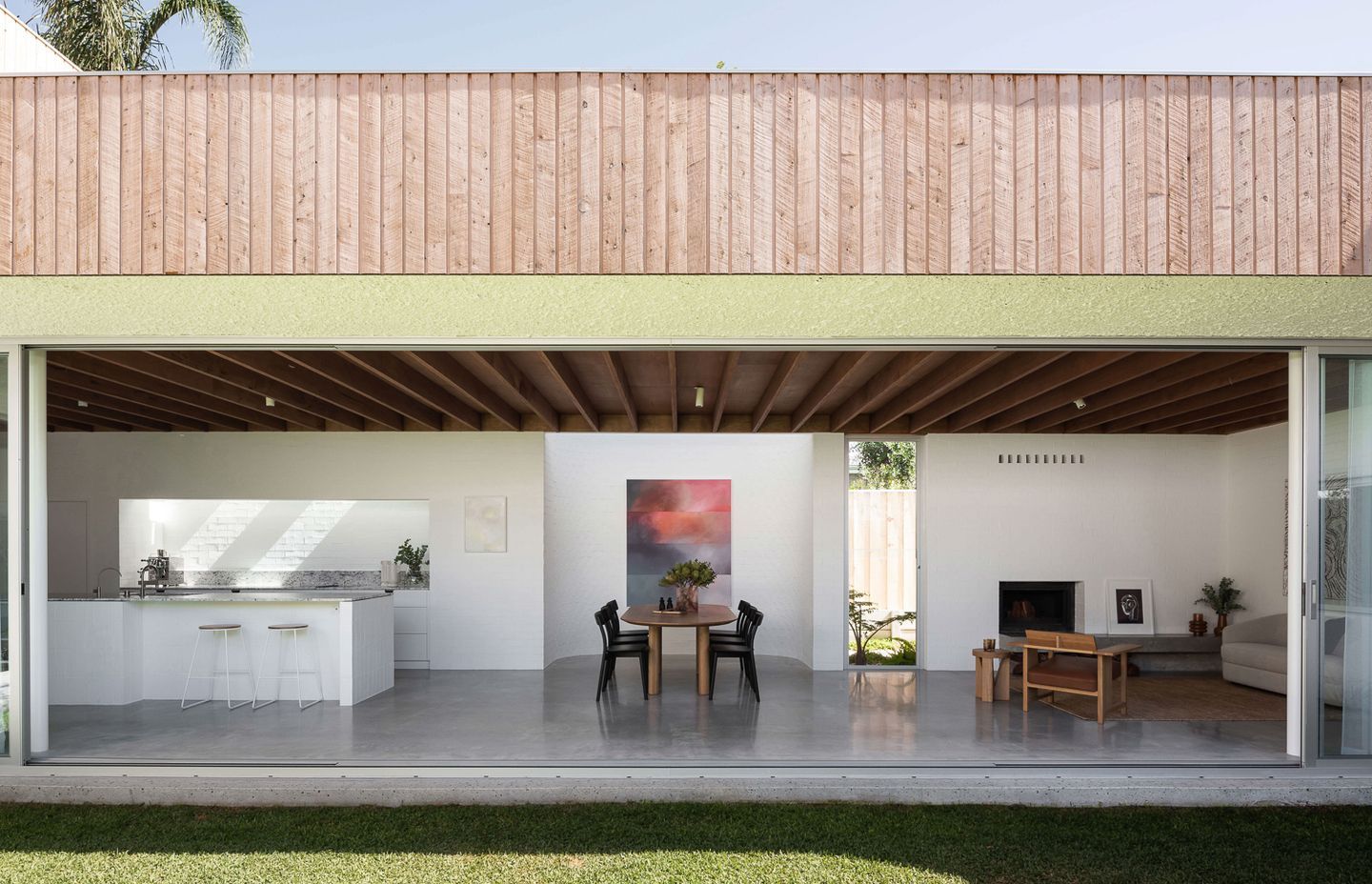
In the extension, the ground floor facing north to the garden houses the kitchen, sitting area and dining area, along with a sunken living room. Upstairs, a north-facing master bedroom, spacious ensuite and walk-in robe creates a sanctuary.
The house does have air-conditioning, but Nic says the family of four hardly ever uses it even through the warm, dry Perth summers.
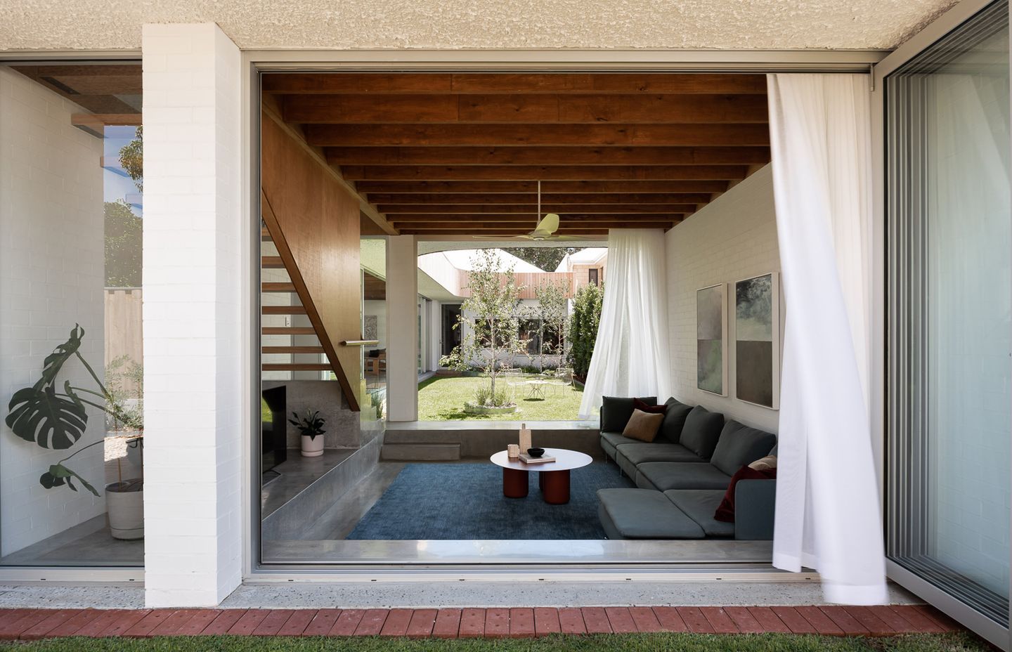
Sustainability has been woven into East Fremantle House from the inside out. “Sustainable design is not about the bells and whistles, it’s part of the DNA of good house design,” Nic says. “If you get it right, Perth has a moderate climate and you can live with your doors open nine months of the year.”
With passive-solar principles in mind, the ground floor is “brick and heavy and masonry and white, and then everything above that is timber and light,” Nic says. The upper floor being light and breathable, hot air rises up through the stairwell and out through the upstairs louvres.
The downstairs doors and windows can be opened up to the prevailing breeze on both sides to flush out the heat from the ground floor slab’s thermal mass and the eaves have a one-metre overhang to keep out the summer sun. In winter, sun can more readily enter the house, the slab’s stored heat releasing into the home through the night. Needless to say, these measures make the house comfortable to live in throughout the year, day and night.
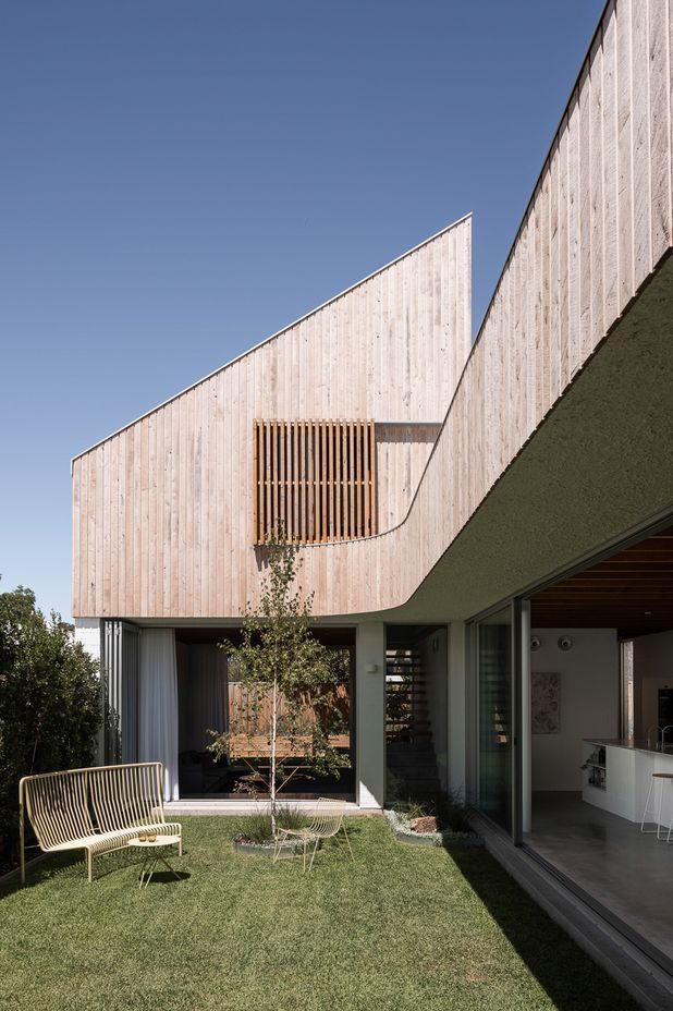
The client has a good design eye and was open to fun and the unexpected
Aesthetically, curves and sculptural forms add an element of delight.
“The client has a good design eye and was open to fun and the unexpected,” Nic says.
The triangular chimney stack rising from the living room fireplace features a U-shaped cut-out, a triangular portico hovers over the new entry door, and the roofline soars to a peak before swooping down into a curved eave sheltering the glass-fronted addition.
A curved wall greets visitors coming in through the front door into a tiled entryway and study nook. While the addition is filled with light, the softly lit entryway provides a pause and allows the eyes a moment to adjust before entering the brighter common areas. Curved walls reappear in the powder room and dining area. The curves and shadows inside the home become “dancing, expressive forms”, Nic says.
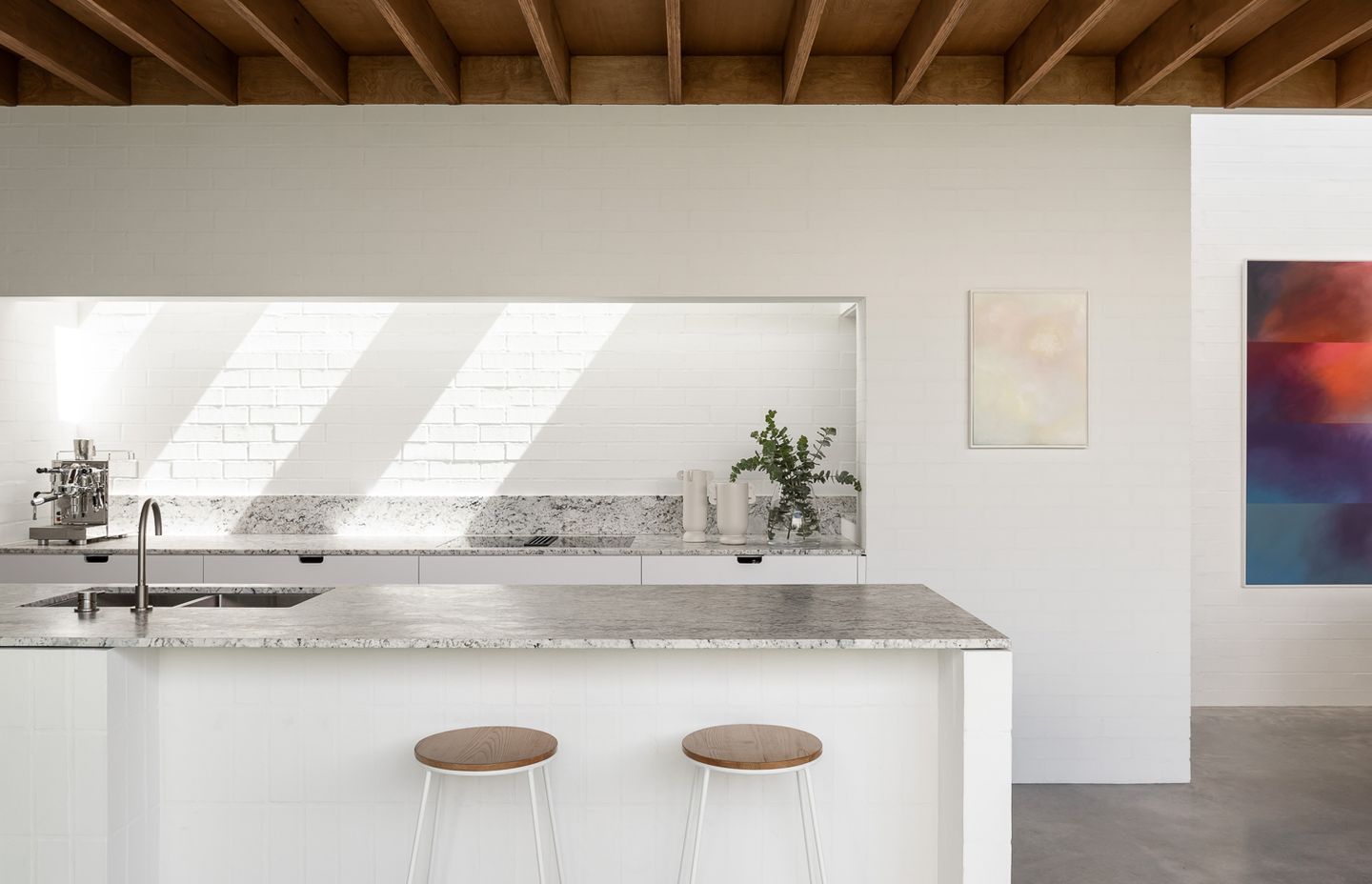
In the kitchen, which sits on the south side facing out to the garden, a skylight above the benchtop brings in light and shadows. A small window alongside the benchtop opens to the southwest to invite breezes in through the kitchen.
“It’s lovely, it’s a lovely space to be in,” Nic says of the kitchen.
The entire length of the addition opens to the garden via floor-to-ceiling stackable glass doors.
“The front side is clean,” Nic says. “It’s about the light, it's about the garden, it’s about the greenery and the sunshine.”
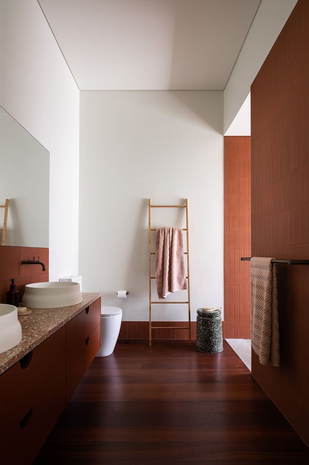
The tiles used in the bathrooms vary in colour, but their format and vertical layout create a sense of continuity.
The earthy terracotta-toned tiles in the main bathroom downstairs speak to the red bricks and rooftops of the area’s Federation homes. “We're not just deleting the past and pretending it never existed, we're kind of bringing that back in,” Nic says. “It’s contemporary but linked to the heritage fabric.”
See more of Nic Brunsdon's work and get in touch.
Words by Joanna Tovia