An intimate understanding of brand identity produced a workplace rich with colour, pattern and materiality
Written by
12 December 2022
•
5 min read
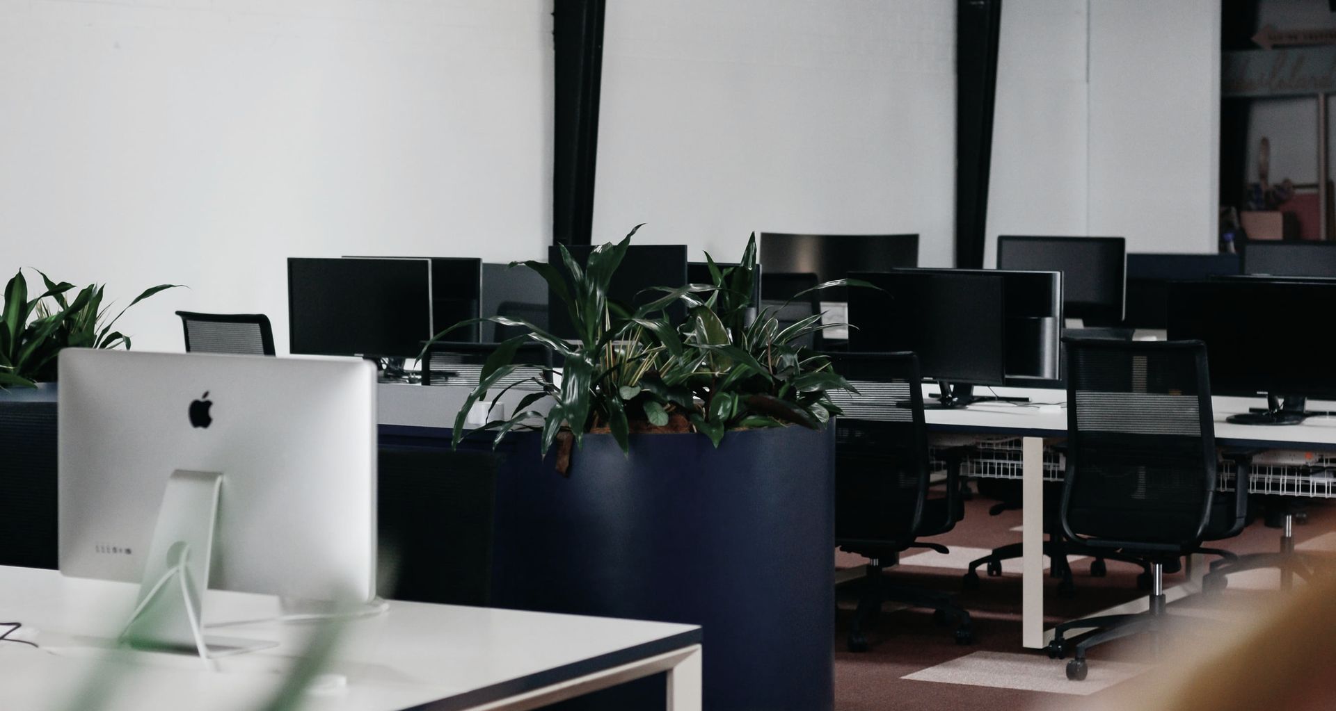
It’s hard to believe the personality-packed interiors of the Frank Body and Willow & Blake headquarters in Melbourne were designed, constructed and finished in just four months. Cara Stizza, founder and director of architecture and interior design firm Made For, connected with the client through the real estate agent who was showing the Frank Body team potential workplace sites. “We helped Frank Body determine what site would be best for them by providing some initial test plans. These test plans provided the Frank Body team with the information they required to determine if they could fit in the space and what the benefits of each space provided,” says Cara.
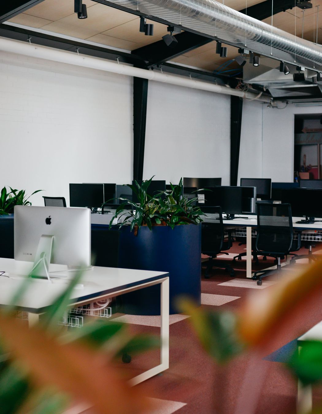
The Cremorne warehouse was a former retail space that has been stripped back, leaving the site with little more than a ply-lined ceiling, some surviving structures and basic services. In order to craft a design solution for the space, Cara immersed herself in the Frank Body story and workshopped ideas with the leaders of the business to establish a clear understanding of their working processes and functionality requirements.
Planning
“We drew inspiration from Frank Body’s distinct identity. This is a brand that really pioneered the familiar voice that has become so ubiquitous on social media today, so we wanted to capture that bold and fun identity,” says Cara. “We landed on a concept for the project: ‘a fistful of self care’, which pays homage to the act of grabbing a gritty coffee scrub and taking a moment to do something special for yourself. There’s an elegant juxtaposition at play in the space: playful textures, colours, shapes and patterns grounded against timeless materials.”
Read now: A conscious copper-clad gin distillery in Melbourne
Construction
The Made For design team worked with the existing architecture of the warehouse to minimise waste, but building functional, comfortable rooms with great acoustics within an expansive warehouse environment without losing the ceiling height presented a challenge. However, Cara managed to carve out a breakout space for staff towards the front of the building, as well as two entrance points and a meeting room all while maintaining the integrity of the warehouse.
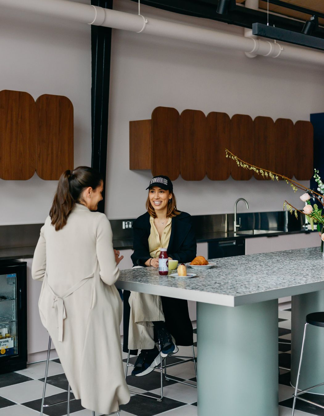
“We created two entrance experiences, one through the breakout area so staff can make a coffee and have an informal chat, and one for a more formal experience via the main door that draws you down a hallway, with meeting rooms off to the side,” says Cara. “This area provided a space to have meetings internally or externally, with a proper ceiling for services. We liked the idea that when moving out of this space you were then thrown back into the expansive warehouse, which has a different feeling.”
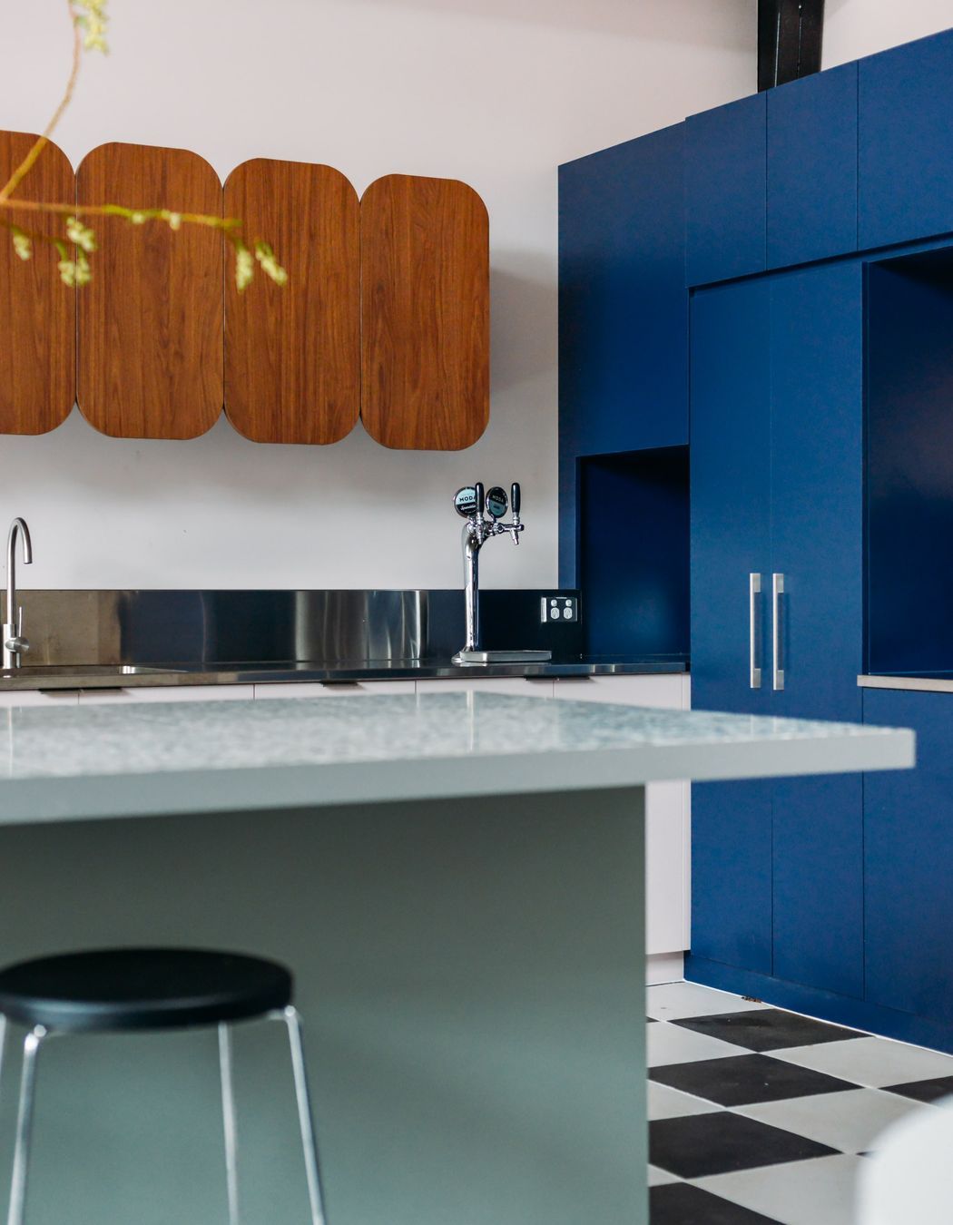
The breakout space has become Cara’s favourite room within the warehouse conversion as it embodies the concept on which the design plan was formed. “We’ve got the terracotta checkerboard floor, the playful furniture, the whimsical shape of the overheads – it’s just so much fun,” says Cara. “Then it’s capped off with this perfectly balanced mural by the incredible Bobby Clarke. Frank Body gave us a lot of creative freedom, and it’s all at play here.”
Read now: This Melbourne showroom offers a meticulously curated gallery-like experience
Interior design
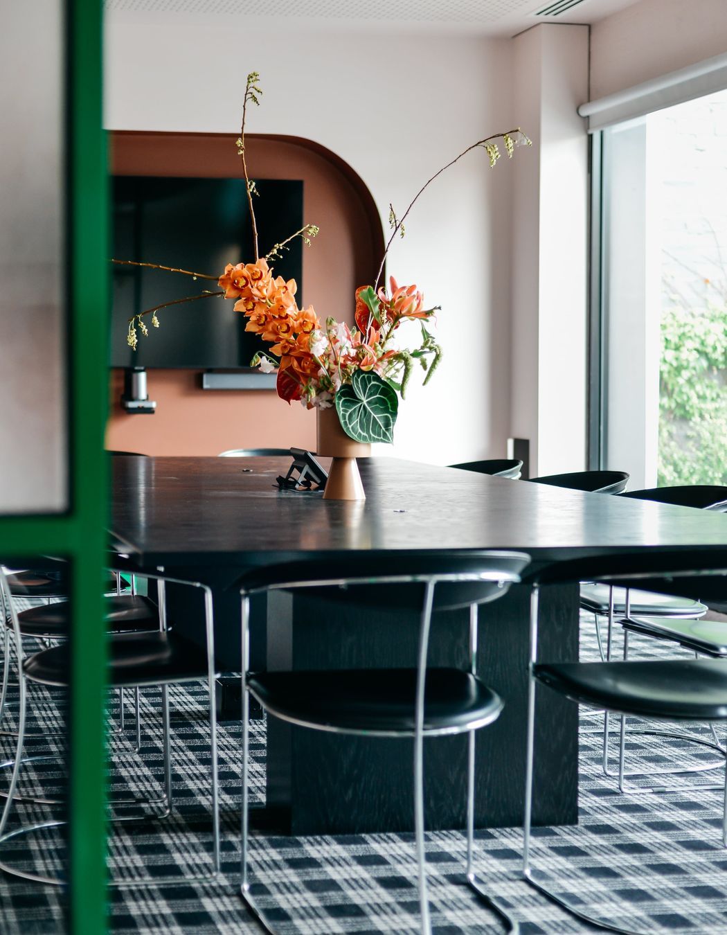
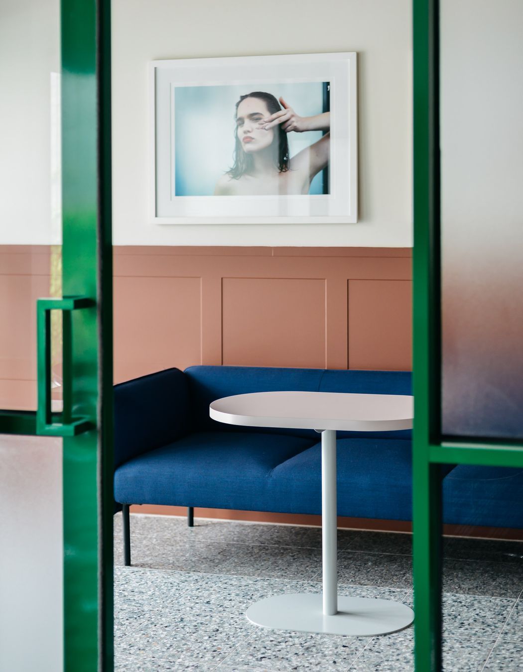
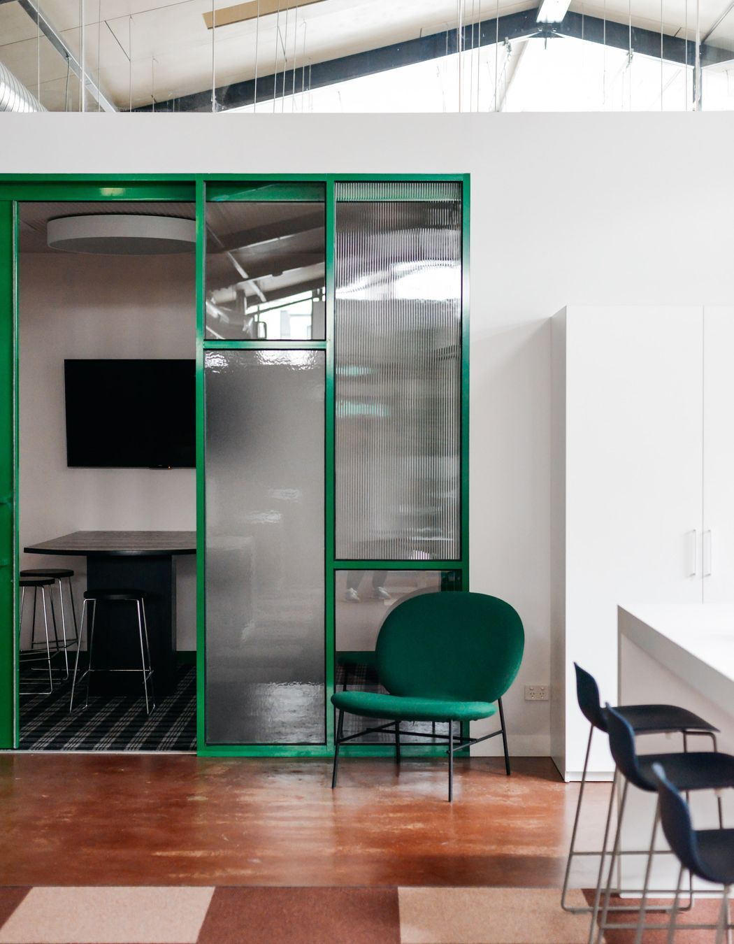
The Frank Body brand oozes confidence but doesn’t take itself too seriously, and Cara composed the interior design scheme to reflect this character. Clashing patterns and colours have been paired with playful furniture and retro features, yet there is a sense of calmness throughout the workspaces. The meeting rooms are bold and dynamic to inspire creativity, while the main business floor is pared back to encourage productivity. The three key colours of the scheme are mistletoe green, burgundy and soft pink, while black timber, stainless steel and terrazzo appear throughout.
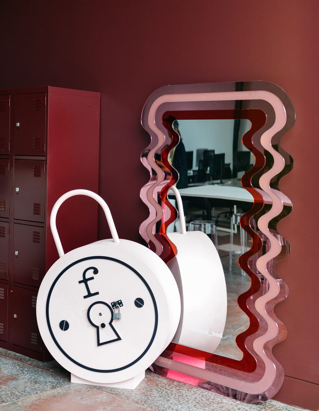
“The green provides the boldness we were looking for, while burgundy and pink not only complement the green beautifully, but reflect the softness we were looking to capture in our original concept,” says Cara. “With all the interesting shapes and patterns at play in this space, we were drawn to natural materials to ground the space with a sense of timelessness.”
Read now: Explore the look: Seen Skin by S&K Group
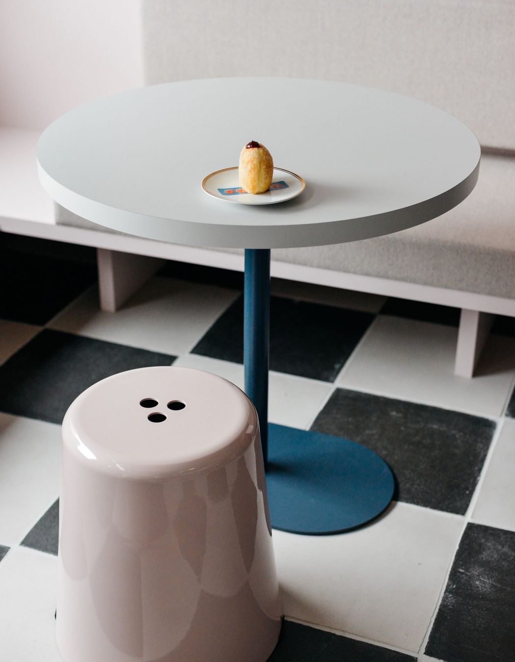
The furniture selection is a juxtaposition of vintage and playful influences against sleek, highly-resolved elements, with a focus on showcasing Australian furniture designers such as Dowel Jones and Ross Gardam. The Made For team also crafted some custom pieces for the project, such as the boardroom table.
Made For specialise in workplace and residential projects and while each design solution is bespoke, each share a commonality, explains Cara. “Workspaces have to accommodate multiple people with various needs while embodying the essence of the brand or business,” says Cara. “Well-designed workspaces enable function and form to work hand-in-glove and need to be well-equipped with zones that encourage social interactions, high focus work, collaboration and productive meeting spaces.”
Discover more projects by Made For on ArchiPro.