At the top of this driveway in Whitford in Auckland’s rural east, timber gates open to reveal an undulating 1.8 hectare section that falls away towards the sea. Across the fence, a flock of sheep run gainfully toward the visitor; a welcome that serves to reinforce the immediate sense of calm this property exudes.
Designed as a family home to house several generations, architect Jon Smith of Matter Architects says the clients were focused on the most important things in life; family and friends, and that focus needed to translate into spaces that would comfortably house different family groups in private yet connected wings.
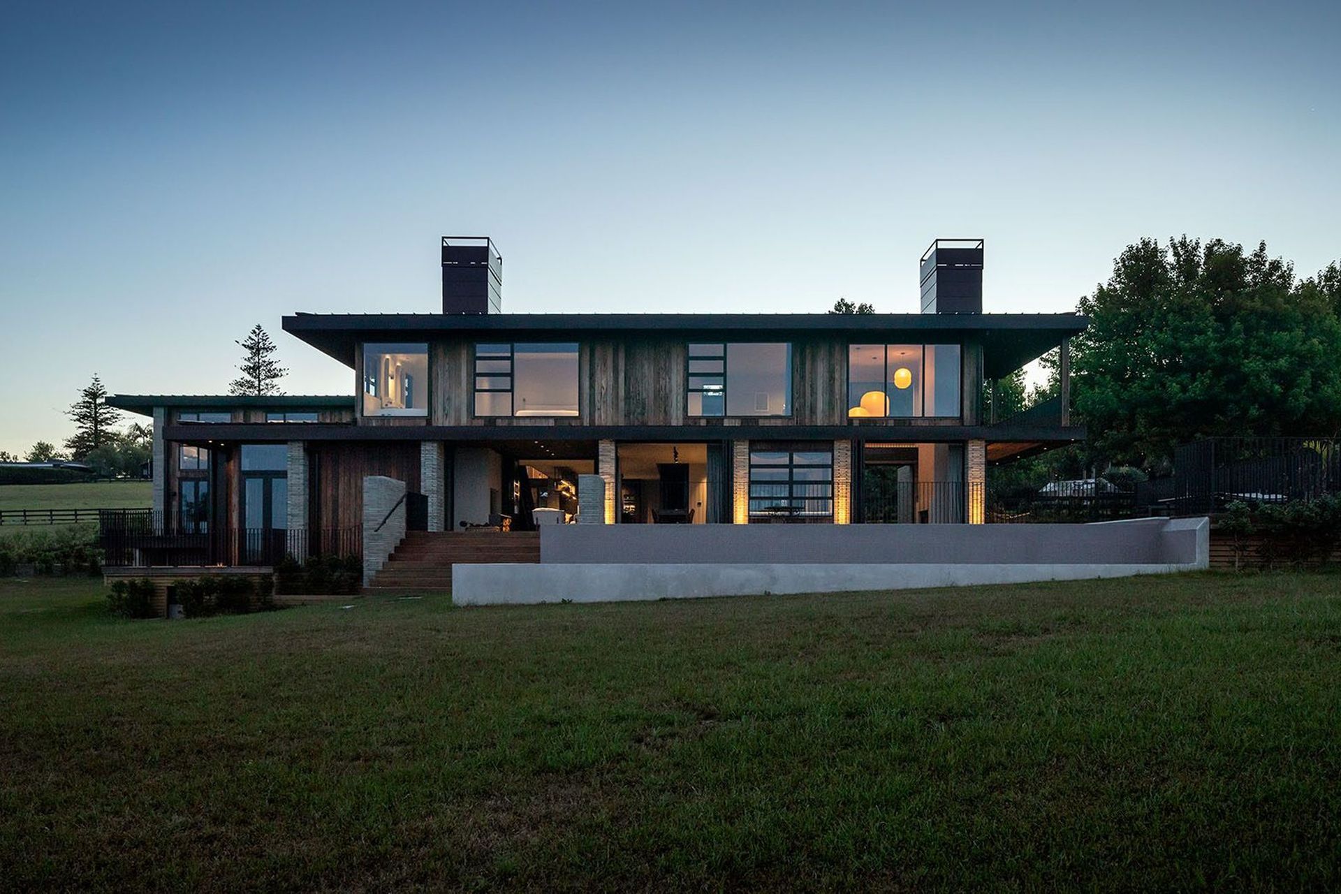
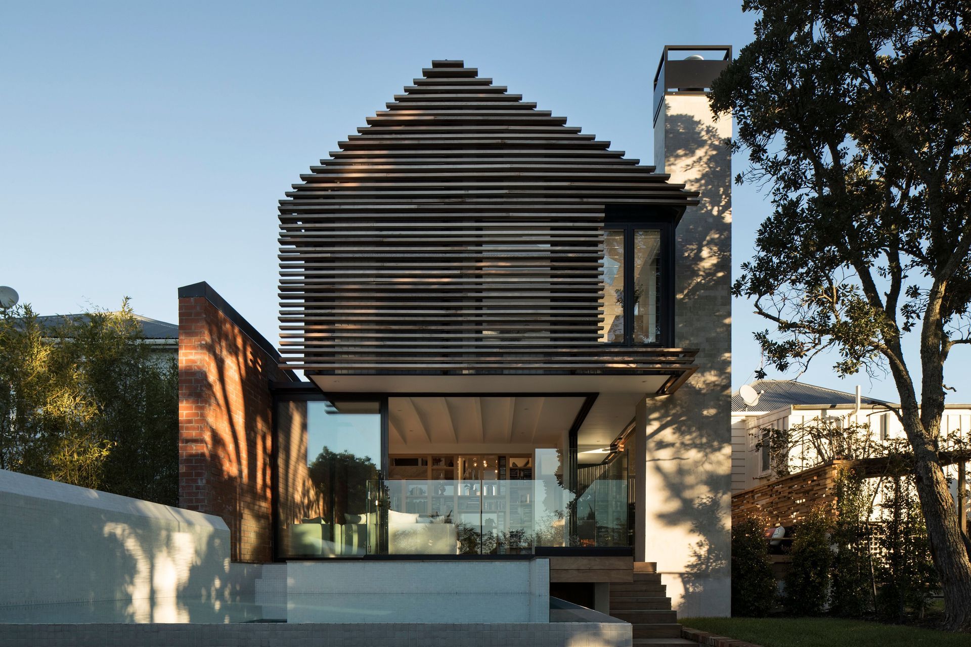
“To achieve this the design was conceived as a series of pavilions, interlocking with the landscape and allowing the site to flow through the built forms. The pavilions themselves are both linked together and separated by numerous courtyards as well as a cloistered walkway, which leads from the main building to a separate double-storeyed guest house; a building clearly delineated from the house in proper with a gabled form that juxtaposes the flat roof of the main building.”
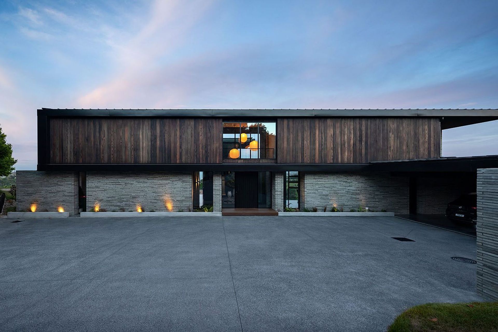
From the entrance, the views are obscured by the lower wall plane of the south western, rear facade. Clad in brick, it is almost continuous aside from the small aperture that is the front door, an intentional deprivation of view from the entrance to the property that dissolves as you move within the home where the bricks reduce to small wing walls set between joinery.
“The lower levels have been settled into the land and this is reflected materially with the use of Petersen bricks, which were handmade in Denmark. They maintain a human feel and scale. Each lower exterior facade is clad in the same Petersen bricks, yet depending on the light and shadow each takes on a distinctive appearance. The beauty of these bricks is that they create a real sense of character in their unique texture and irregular finish. In some, you can see thumbprints - details that offer a real sense of grounding and narrative to the lower level.”
Above the brick base walls are rich, timber-clad forms that contain the private spaces of the home.
“The clients, a couple with two primary school-aged children, both had a love of Japanese architecture and one of the clients has Chilean heritage so another key part of the brief was to incorporate elements of both Japanese and Chilean architectural concepts into the design,” Jon explains.
“Chilean residential architecture is known for its use of courtyards, as is Japanese, and so it seemed the perfect transition between this home in rural Auckland, where a connection to the outdoors and these two ultimately very different styles of architecture were desired, that courtyards were a key part of achieving a convergence of all three.”
Perhaps the most obvious connection to Japanese architecture though is the use of charred timber, or shou sugi ban, to clad the upper level of the main house and the guest house in its entirety. The ancient technique of charring timber originated in Japan in the 18th century primarily to preserve cedar and extend its lifetime when used as a building product. “The finish is absolutely stunning. It creates what I’d describe as a velvet cloak, full of warmth and texture that accentuates the grain,” Jon explains.
Downstairs, and in fact throughout both dwellings, full height glazing, well placed courtyards and the layering of the house on the site, stepping down with the land as it falls towards the sea, ensures sight-lines are maximised so no pavilion takes away from the views of another, a vital ingredient of a successful home perched on a site such as this.
Sweeping rural valley views stretch out and across the Waitemata and beyond; a vast tapestry of deep green and blue hues towards which the house reaches out from every angle.
The kitchen, located in the ground level pavilion, is defined by two elemental forms; one of marble that is reflective of the green and blue hues of the surrounds, and one of timber that references the shou sugi ban of the exterior. “These two benchtops reach around five metres each in length and were designed as statement pieces; we wanted them to appear as if they were solid blocks of material.”
Smoked timber cabinetry acts as a bookend with integrated appliances and a wine fridge. Behind, a butler’s pantry houses further appliances and another benchtop designed for food preparation and cleaning. The kitchen is framed on one side with a unique steel balustrade paired with an oak top and treads leading to the upper level. On the other side, full height glazing opens up to a large, sheltered courtyard.
“We wanted to sew the landscape into the structure, and we’ve done that with the use of multiple courtyards that connect spaces both with each other and with the site and wider surrounds.”
Beyond the kitchen to the east, an enclosed deck conceives an ambiguity between inside and out. Here, an open wood fire takes pride of place, while the charred timber of the exterior wraps around to form the ceiling of this undefined space that looks directly over the section and towards the sea.
Adjacent, full height bifolding doors allow the living and dining area to open up to the outdoors, with light curtains that dance in the breeze; a transitory element in juxtaposition with the permanence of brick. On the north western end of the room, a gas fire acts as a centre piece and sits beneath a double height space in which lanterns, made by Japanese designers Barber & Osgerby for Ozeki & Co, both illuminate and dominate, further elements of fragility amidst a fabric of materials overt in their strength and permanence.
An infinity pool stretches out in front of this area, further affirming the directional gaze and connection with this rural coastal landscape. “The idea of the pool is to further integrate the built structure with the surrounds. In this case, the pool appears to fall away to the sea despite the site’s proximity from the coast. As the end of the built forms on the site, looking out over the pool you feel like you are completely released into the landscape,” Jon says.
Because this house was designed specifically to house different generations, various living spaces were integrated into the design including a ‘snug’, which is stepped down a level from the main ground floor and is the only area of the house that turns its back on the view. “This is a room that is more intimate than the larger proportions of the main living area, with a full height bookshelf, gas fire and a noticeable inward focus unlike the other spaces that turn outward towards the sea.”
Upstairs is clearly delineated from the lower, public level as a series of private spaces divided into different wings. The master bedroom has pride of place, adjoined on one side by a further lounge area and on the other by an ensuite that exudes luxury in its full height glazing in front of which a freestanding bath is flanked by an elegant floor mounted copper mixer. Behind, the elemental theme is continued with sculptured wall hung basins set against marble walls and floor and a shower with double rain heads.
“We wanted to continue the sense of groundedness by using these very elemental forms and classic materials that offer moments of luxury while keeping the interiors as a whole as simple as possible.”
The second bedroom wing is located to the south east and houses a further three bedrooms. The wings are linked by a glazed hallway, in the middle of which another lounge area is located.
The guest house, the final pavilion, is located at the highest elevation on the site, and connected to the pavilions of the main house by a cloistered pathway that traverses another courtyard and a triple carport that opens towards the east by way of two timber barn doors. When open, they frame a stunning rural view out across to the other side of the valley.
“It can be difficult to be sustainable when building at this scale but we wanted to make sure we did everything we could to use materials that have minimal impact. By choosing to use shou sugi ban for example, we were able to avoid more common chemical treatment for the redwood cladding, using only the charring process to seal it in the most natural way possible.”
The intention to use the most natural materials possible followed through into the interiors, interior designer Jane McAulay-Frame from Bespoke Interior Design explains. “Having that honesty and naturalness that comes from the Japanese-inspired elements of the architecture in conjunction with the light-toned Danish brick and beautiful matte black aluminium joinery provided the framework for a palette of materials that were similar in their honesty and natural characteristics,” she says.
“This house is dramatic in the sense that it imbeds itself into the landscape in the most beautiful and subtle way so inside we needed to continue these themes and chose to use a smoked timber floor that is devoid of chemicals, along with a range of natural materials such as pure New Zealand wool carpets and 100 per cent linen drapes. These elements further introduce a softness in the interior layering while continuing the colour palette that is articulated in the architecture.
“They are materials that are the best from a sustainability point of view, but they also work to create a sense of calm and exude a certain luxury,” Jane says.
For Jon, who recently visited the house again following its completion at the end of 2019, the spaces offered a new experience. “Visiting it again now, it’s nice to experience it in a different way. I think the events of 2020 have given us a new perspective in terms of the way we live and the different ways and possibilities that exist for...


