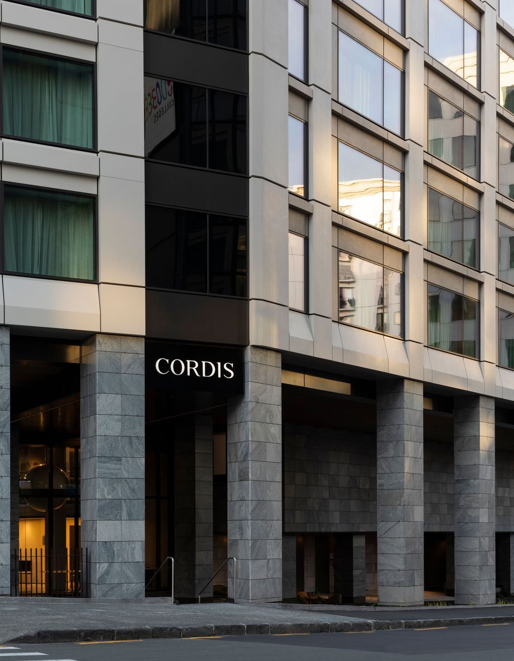
The Cordis brand has long been recognised as a premium hotel experience with a particularly international sensibility. Each of the Cordis hotels and resorts across the globe displays a sophistication and contemporary style that is enhanced by local art pieces, collected and curated on behalf of the aesthete Hong Kong owner. In Auckland, the five-star 411-room Cordis is celebrated for its luxury accommodation and its grandeur, which is expressed through classical elements, such as the elaborate chandeliers in the entry foyer.
This classical-meets-contemporary aesthetic was key to the interior fit out of the new Pinnacle Tower extension – a boomerang-shaped 17-storey tower that is connected with the original building via a glazed gallery space.
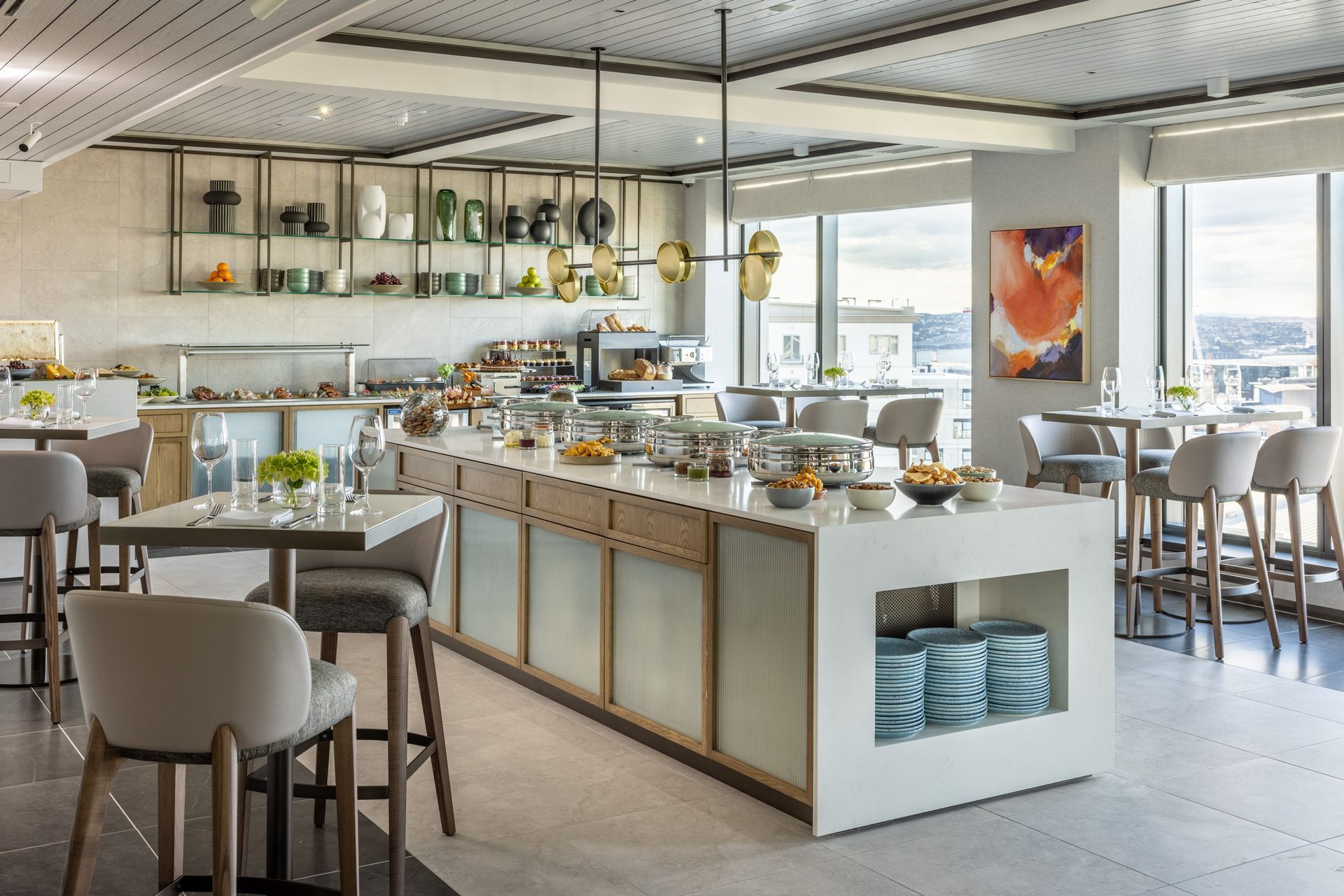
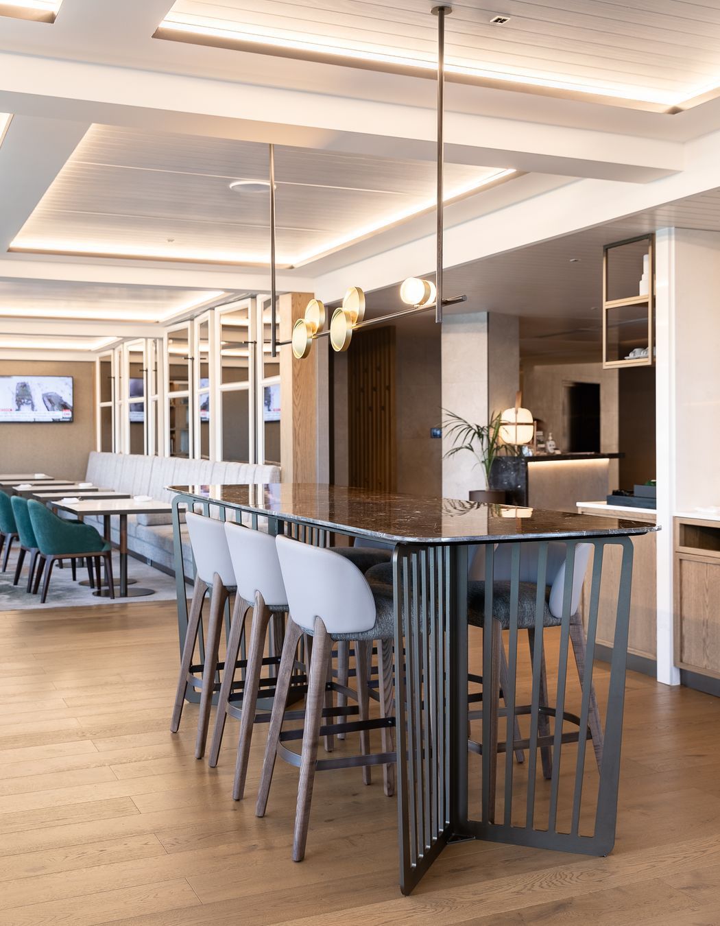
Space Studio worked alongside project architects Jasmax to realise the interior of the new 244-room tower (including 10 premium suites, club lounge, boardroom, two restaurants, events space, pre-function areas, public toilets, new lobby and gallery).
Space Studio had previously completed the refurbishment of the original building when it was rebranded from the Langham to Cordis, and designer David Sweatman says integrating the existing interior design into the new tower was a key part of the brief.
“We were particularly mindful of the existing building and the existing work that we've done at the hotel. The key question was ‘How do we add all of these rooms and have them enrich the existing spaces rather than detract from or supersede them?’”
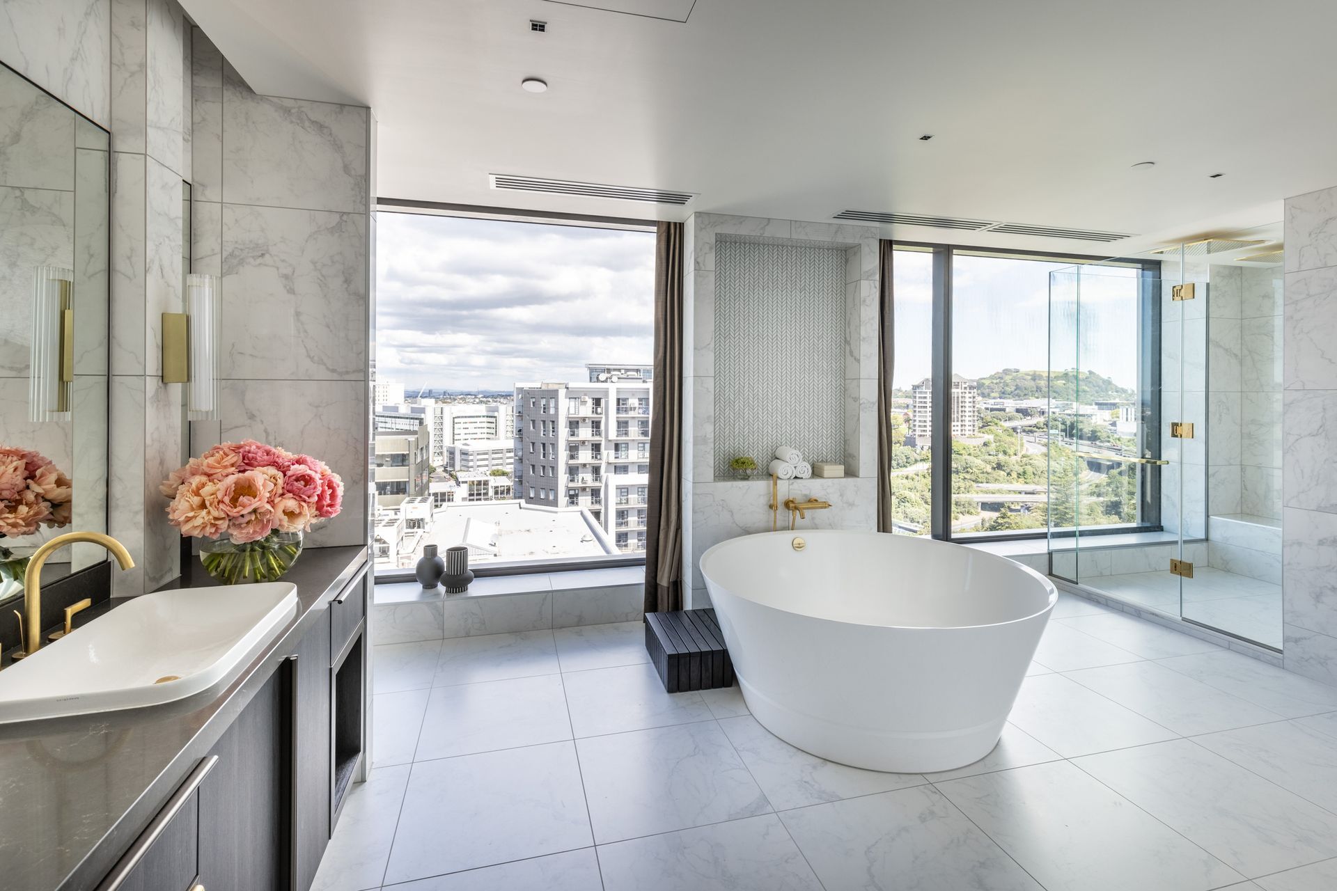
The new tower receives a lot more natural light and has a greater connection to the city than the original building, with views out to the Auckland harbour and the volcanic cones. Working alongside the mana whenua, Ngāti Whātua Ōrākei, Space Studio developed a narrative for the interior that comes from the Māori concepts of te whai ao (light), manawa (heart) and kaitiakitanga (guardianship).
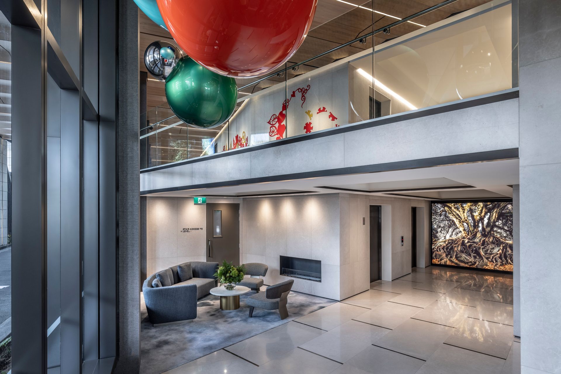
This narrative means that guests are “led towards the light” on their journey through the building. This journey begins at the hotel foyer in the original building and takes visitors through a gallery space that features artwork from local artists, carefully curated in partnership with art consultants Coupland Cormack.
From the lifts at the end of the gallery space, a feature artwork takes pride of place on the lobby of each floor, and guests are led down a subtly lit corridor to their rooms.
“On reaching your room, you open the door and you experience the view immediately, and the natural light beaming into the room, so that movement towards light culminates in your own light-filled space.”
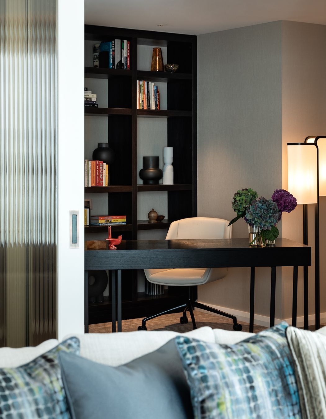
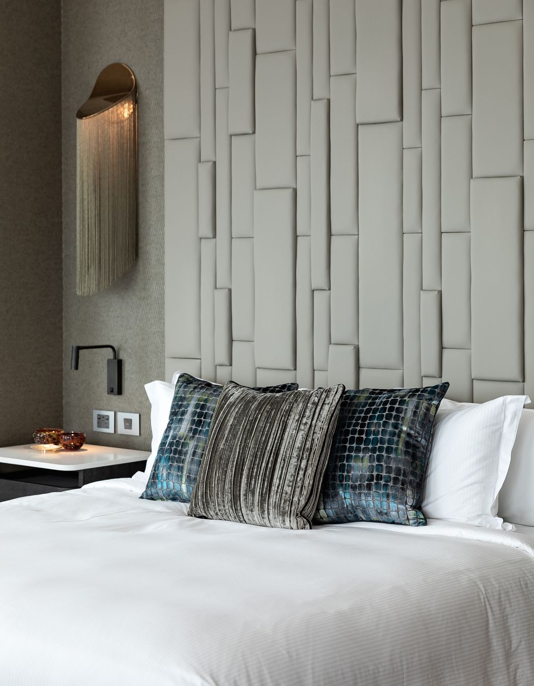
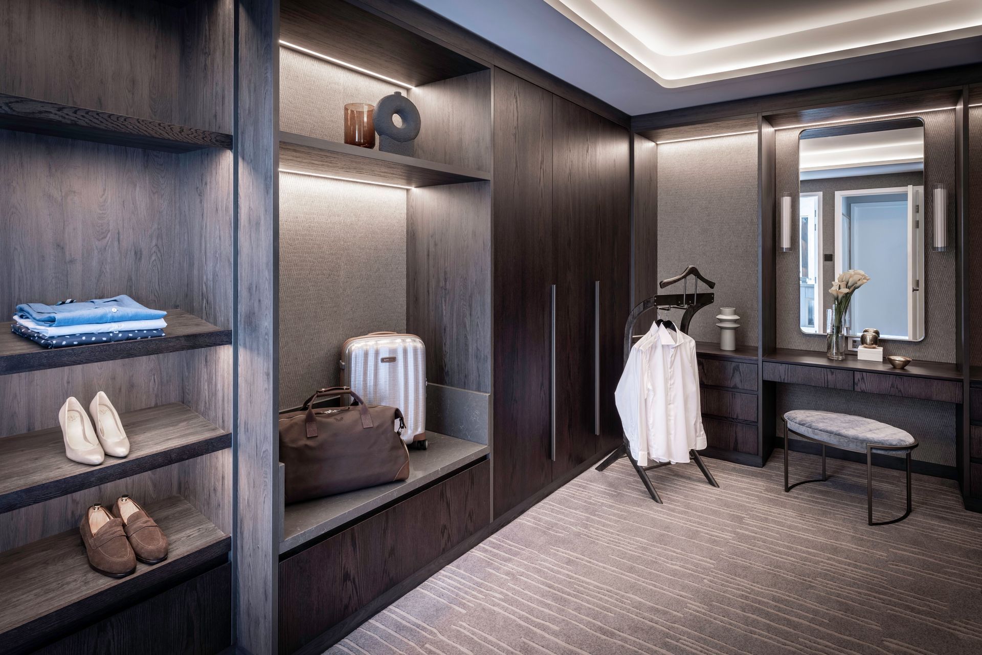
The materiality of the hotel rooms also celebrates a connection with the light and the natural environment, while paying homage to the restrained and sophisticated aesthetic of the original building.
“The original building is classical and crisp. The interiors add warmth and temper the spaces with restrained accents, taking notes from the harbour and the surroundings.”
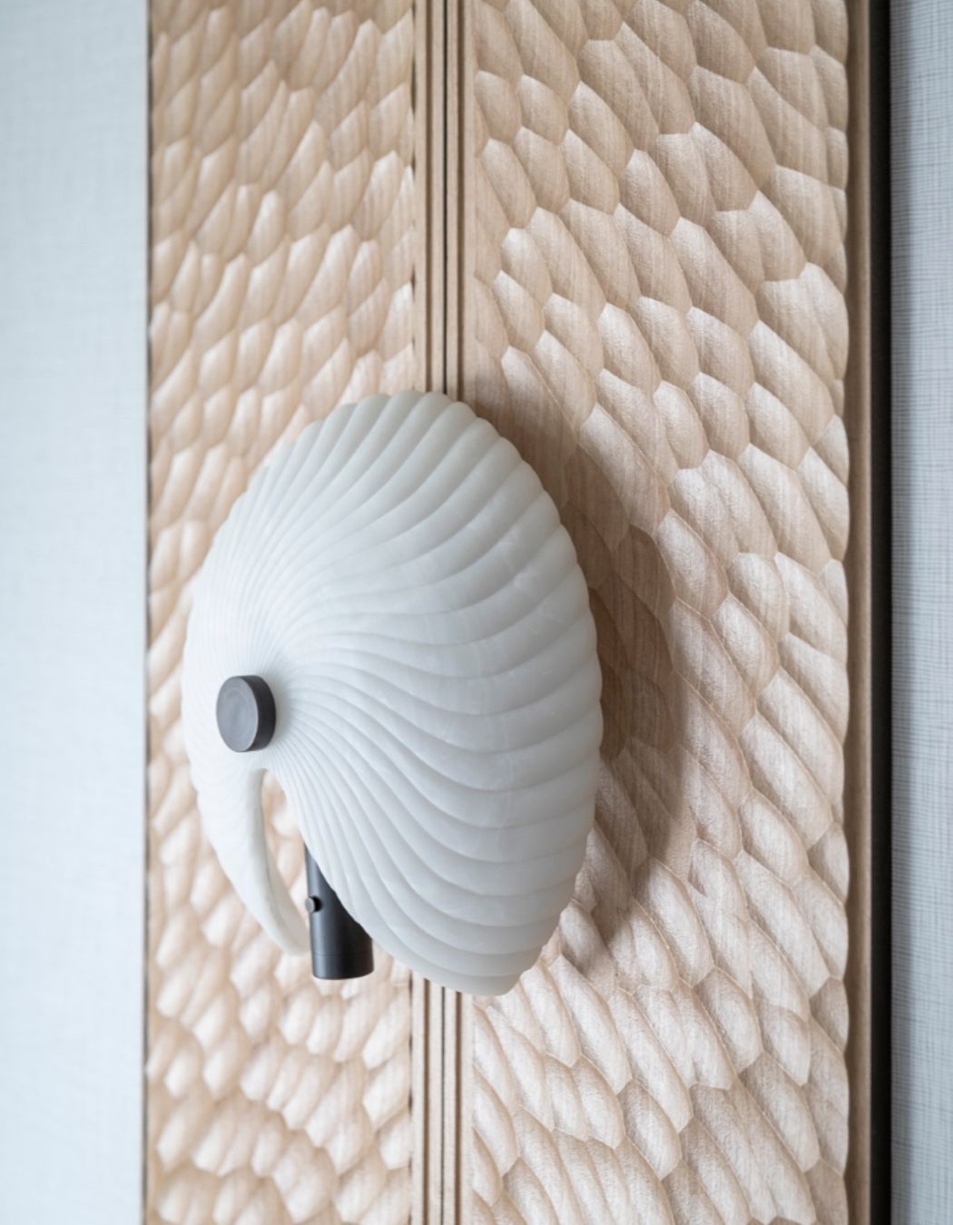
Layers of texture are used throughout the rooms, with many references to nature and weaving. Working closely with Ngāti Whātua Ōrākei, Space Studio developed a story around the “paper nautilus” – an octopus that makes a parchment-like shell to carry incubating eggs into shore – which plays out in the woven artwork panels present in each room.
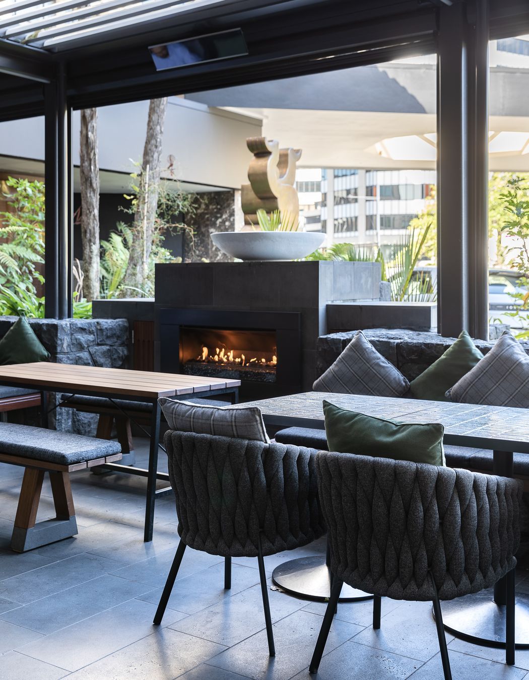
Decorations and objects created by New Zealand artisans create a feeling of home that grounds the rooms to the region, while all the furnishing is bespoke to suit the building’s irregular shape.
The lower floors are in line with the existing building and the upper floors take in more height, so multiple room configurations and shapes are accommodated. Modular designs were created that could be adapted for the different room configurations, thereby minimising the quantity of bespoke furniture and fitting components.
The steel structure provided challenges with reticulation of services. “Careful design planning and technical coordination with the wider consultant team was required to manage and maximise ceiling heights.”
In spite of these challenges, the success of the building is in its consistently premium, yet local feel, and creating that “movement to light” was key to creating the unique journey experience through the space.
Words: Jo Seton
Photography: Michelle Weir, Studio Weir
