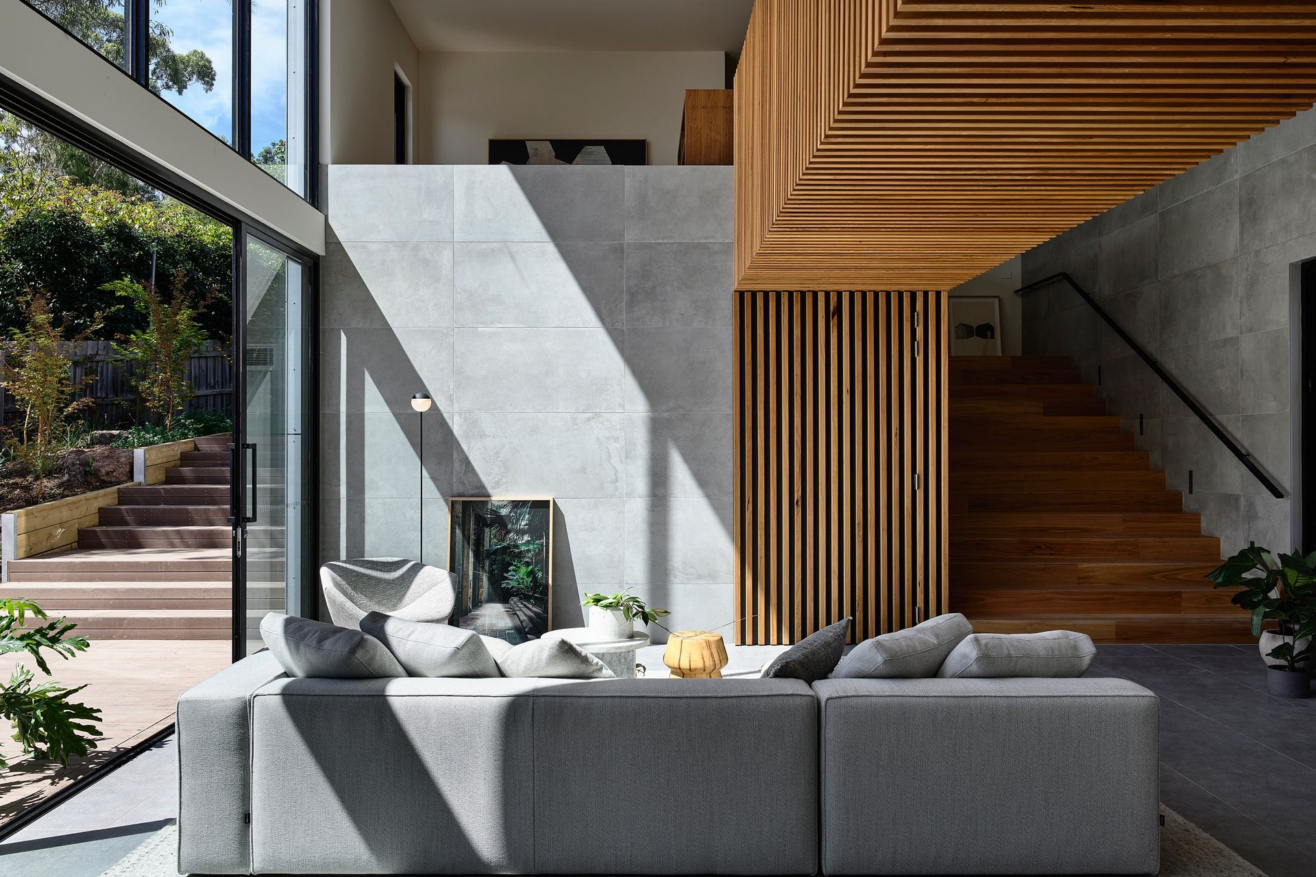
The client first approached us with a brief for an extension to their existing house, with a specific need for multi-generational living, the importance of cohesive family life is very much at the heart of this project. The spatial planning of the design integrates a separate living zone for each of the three generations that are distinct, and not too distant in connection to one another. As the exterior of the existing house retained its original form with simple touch-ups, the interiors were renovated with improved lighting and space usage to accommodate the living needs of the older generation. It steps directly into the open living zone for all to gather, which is at the heart of the extension. The zone for all contains the new kitchen, dining and living space. Leading upstairs of the extension is an extra wide feature stairway landing first at the client’s study nook, where quiet reading can take place and still stay connected to the rest of the family activities as it overlooks the double-volume living space at ground. Upstairs is also where you find the private quarters for the second and third generation of the house inhabitants. Separation is a crucial part of spatial planning during design, but so is staying connected. The link bridge from the Client’s zone to the next zone encourages independence for the younger generation, but also provides direct access to assistance when needed. Externally the extension is designed to blend into the streetscape and neighbourhood. The extension takes advantage of the upward-sloping site to maximize the volume usage. It is a simple boxed form inserted at the rear of the existing house, hidden from the street front and hugs onto the ascending landscape, starting as a two-storey extension where it connects to the original house, and becomes a single-storey structure at the rear of the site. This also provides ease of access to the deck at the rear of the existing house and the small orchard planted in the newly landscaped garden, all of which encourage more outdoor living activities. The design of the interior is similarly kept simple with muted colour finish. Using cost-effective products and finishes to give focus to the living space for all. Double height windows were used to elevate the high ceiling, to bring in an abundance of natural light and connect to the outdoor landscape. The link bridge, functions both as a sculptural piece and as access, it divides up the double volume space and is cladded with timber battens to bring warmth to the central family space. A similar timber batten feature is likewise used in the original house as a marriage of the past and the present. Comfort and sustainable living are a priority with high-level insulations, heated floor slabs and solar panels installed, the future is well covered. Tranquillity emanates throughout the simple form of the extension, yet the dramatic features in the living space encourage family gatherings. The finished building accomplishes the client’s brief by providing individual zoning for each generation, as well as a central space where they can spend time together.
Photography: Itsuka Studio


