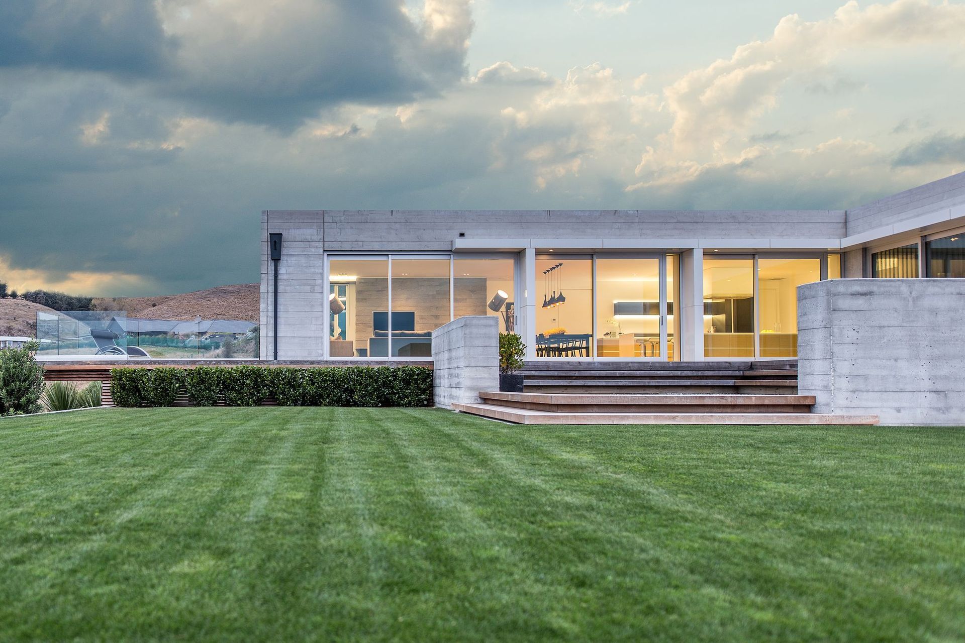
Located within the relatively recently developed suburb of Kennedys Bush, this property offered unobstructed views across the Canterbury Plains towards the Southern Alps on one side and a network of mountain biking trails on the other—both high on the list of selling points.
With few restrictions other than the usual height-to-boundary ratios, as well as the need to tame the famous ‘Christchurch easterlies’, Architectural Designer Robert Weir was free to design and build a home that would, literally, be all things to all people.
“It’s always an interesting proposition when you’re both the designer and the client in terms of being able to choose a particular style or set of parameters and then stick to that, particularly when you’re being constantly ‘tempted’ by the latest options for products and technologies in the market.
“With this house, I had to back myself that it would be what it needed to be. I had a few ideas in the back of my mind of what I wanted to achieve—opening the home up to the north, maximising light and views and so on. The design concept came together while we were on holiday and aside from being further refined, was pretty much what ended up being built.”
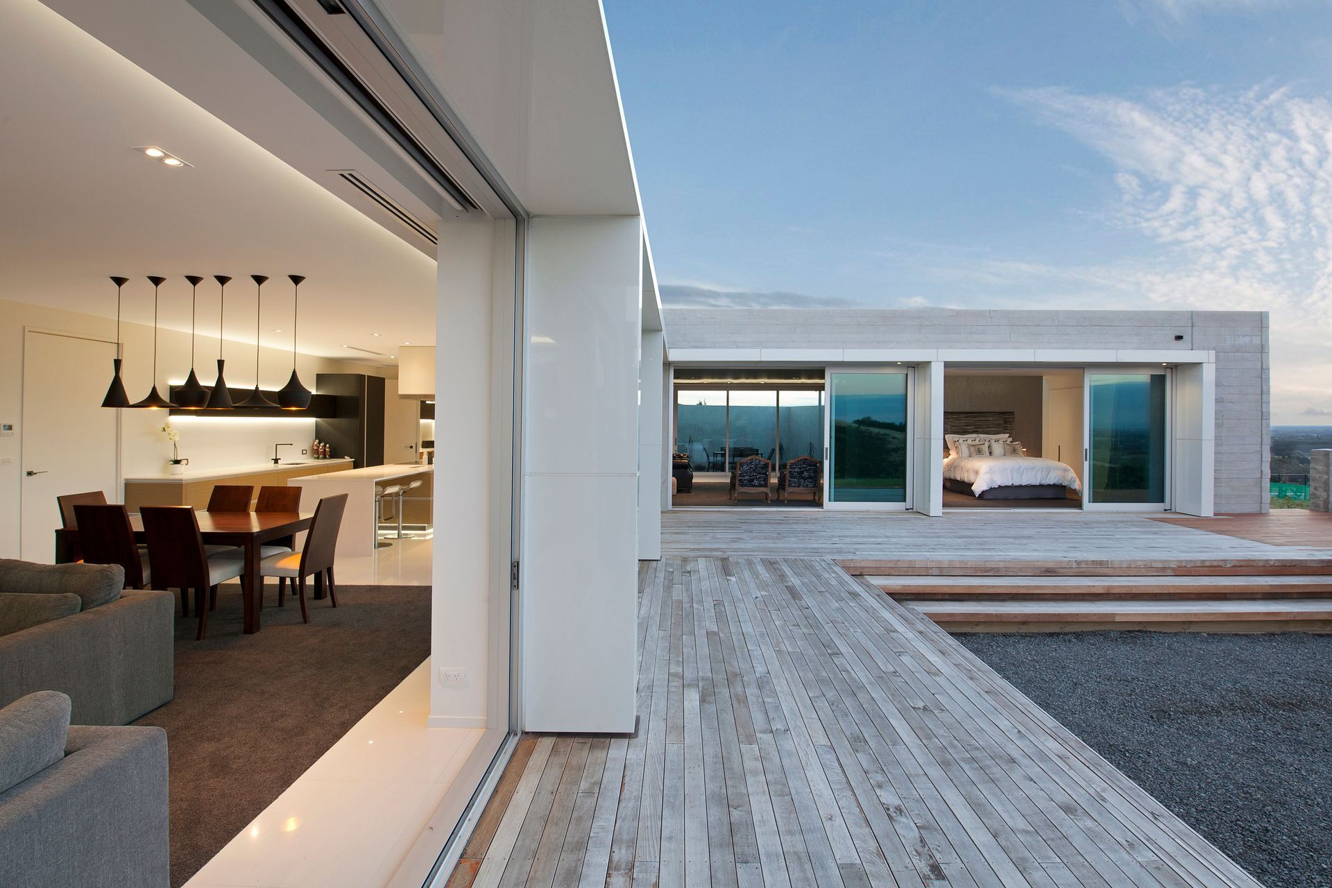
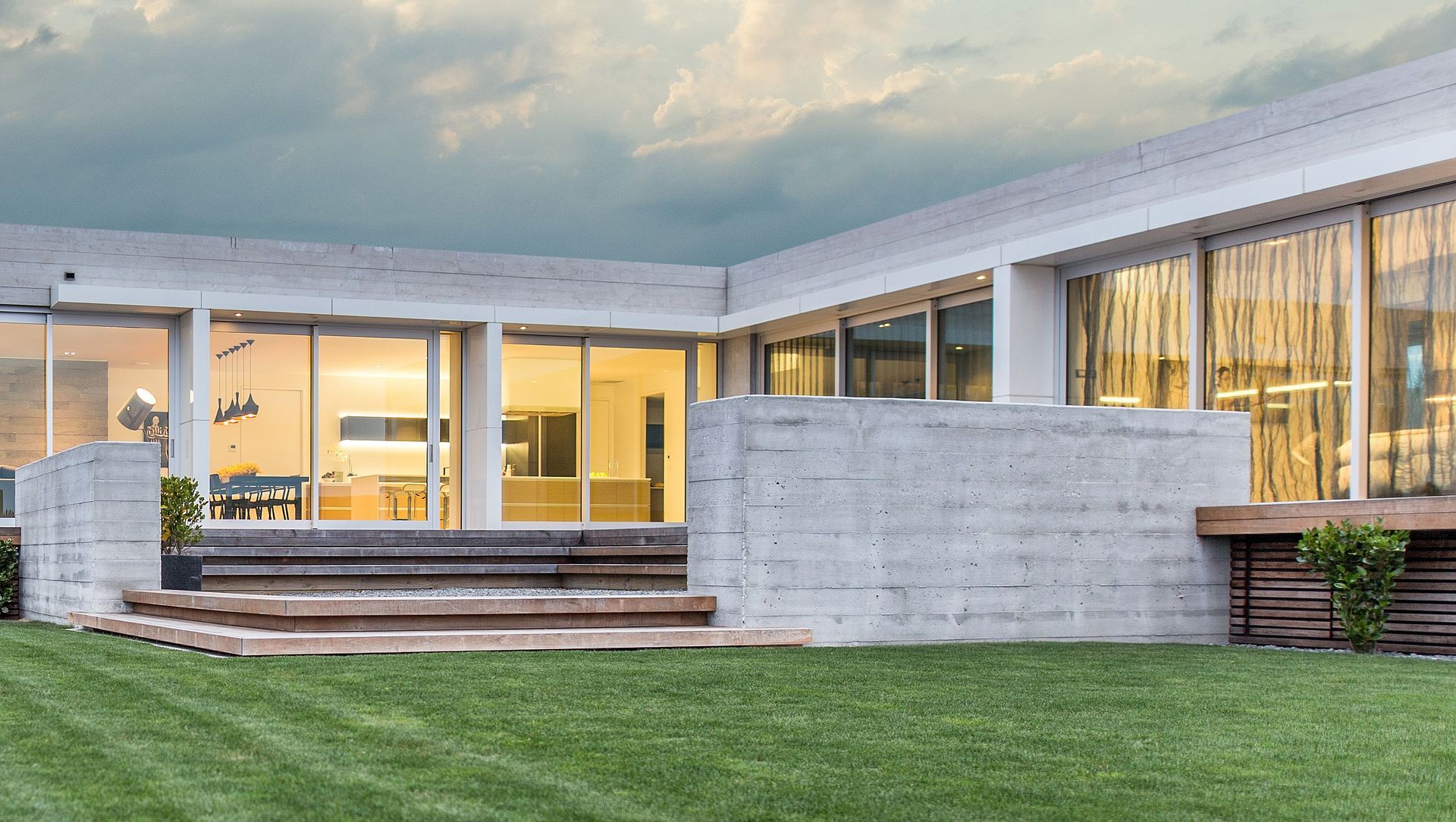
Robert pulled the house back into the southwest corner of the site creating a large north-facing courtyard along the east-west axis. A smaller courtyard on the western boundary creates a sheltered, private outdoor sanctuary accessed from the formal lounge.
“I’ve incorporated a precast concrete wall on the street-facing side of the home to enclose the courtyard and then utilised this as a recurring device within the larger courtyard to block views of the neighbouring house.
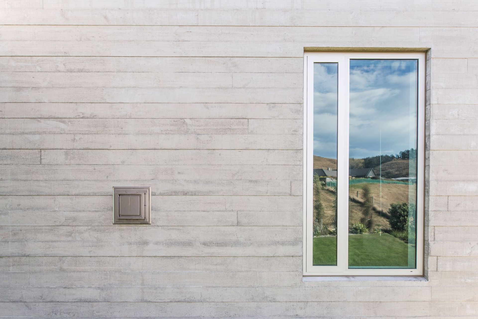
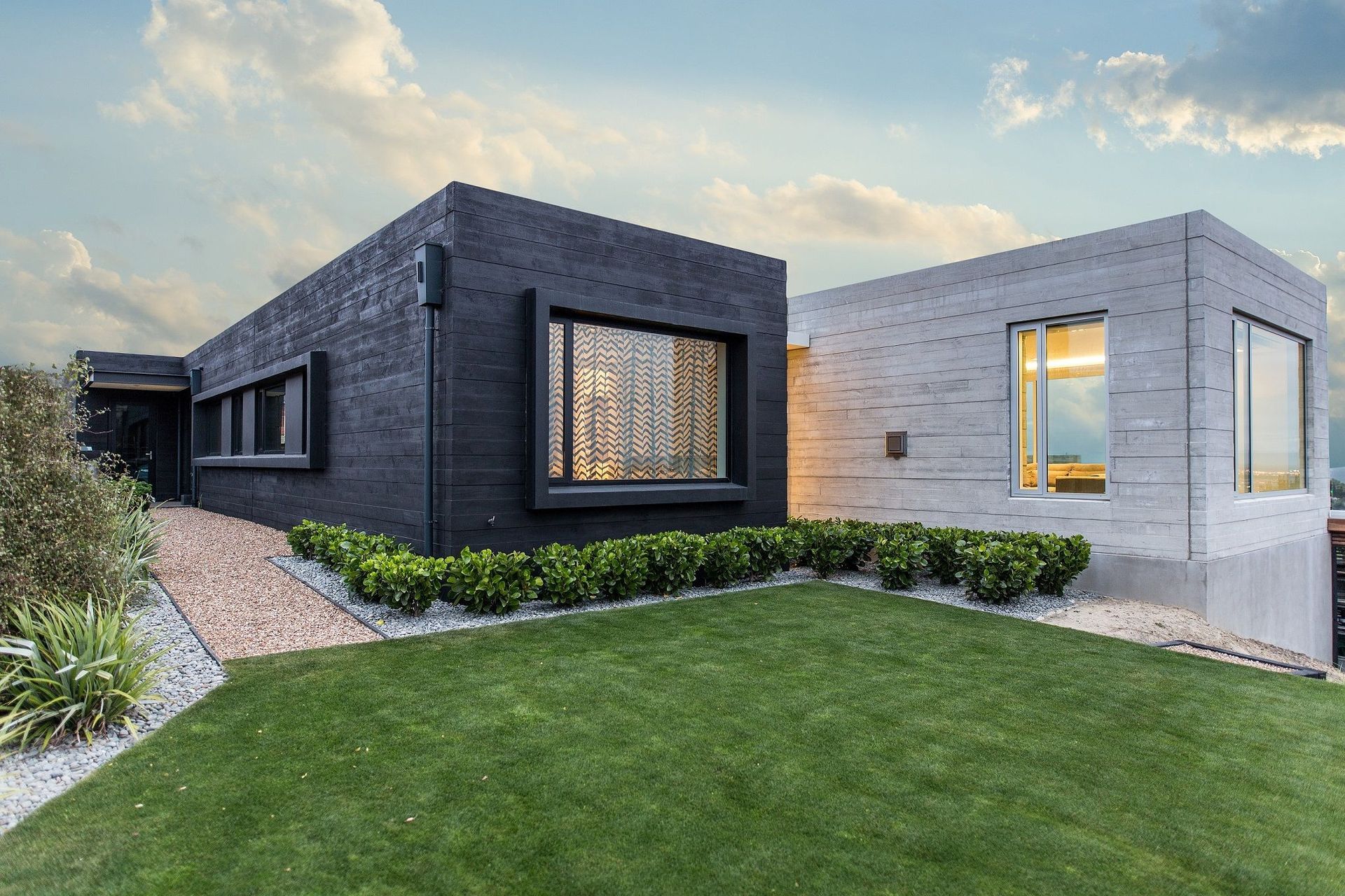
“The house is constructed from precast concrete. I have always loved concrete, the textures you can achieve and the ‘rawness’ of it. I also really like the fact that you can use other materials to change the texture and colour, which we’ve done, in part, using black timber stain to colour the bedroom wing of the home, setting up a visual demarcation of the private and public spaces—which we’ve left as raw concrete.
“Inside, the central spine of the house has been given over to gallery space and is the physical division between the two areas of the home. It’s something I like to do with every house I design—set up a division between public and private spaces. I do this for a couple of reasons; firstly, it gives the homeowner the opportunity to create a sense of sanctuary—although it’s more than that—within the home and, secondly, there really is no need for anyone else to go into those areas unless expressly invited to.”
Having designed the house, Robert says he and his partner, Fiona, made the decision to go with an interior designer to bring a different eye to the space.
“The look of the house itself is quite brutalist; it is essentially a big concrete box, so with the interior we wanted to soften that and create something that was, while still refined, more homely feeling.
“Bringing a practiced hand on board to achieve that meant that, yes, we relinquished a certain amount of control over the final look, however, I believe, as a designer, that it’s quite nice to be challenged in that way. What we’ve gained as a result is a home that suits us completely but that also, ultimately, appeals to a broad audience.”
Broad appeal was something that Robert was conscious of when designing the home, creating a plan that was adaptable and engaging.
“One of my skills as a designer is to create a choate living environment, which comes down to getting the dynamics well thought out before putting pen to paper. With this house, I devised a plan that would comfortably span multiple life stages—the spaces can be closed down for a couple to live comfortably or opened up to provide multiple zones ideal for accommodating family living.”
Another aspect to that, was designing a home that maximised its connection to the surroundings and was as comfortable as possible.
“As I’ve said, the house really is just a big, concrete box, which, if not handled correctly could have resulted in a cold, uninviting home. Wall-to-ceiling glazing on the north-facing facade has allowed us to expose as much of the floor as possible to solar gain throughout the day, while motorised blinds act to regulate afternoon heat.
“Twenty-plus solar panels and three-phase power then allows us to sell excess electricity back to the grid; giving the house sustainable longevity. Likewise, we’ve over-insulated—R6 and R7 values—meaning the house requires minimal mechanical heating to maintain a comfortable interior environment.”
Robert says the stand out features of the home, for him, are the precast concrete and the amount of light that suffuses the interior.
“Also, the landscaping, which we started on as the house was being built, which meant by the time we moved in it had matured quite nicely.
“If I was starting out today, I truly believe I would design the same house again.”
Words by: Justin Foote
Photography by: Wendy C Photographer


