About
Westpac Signature Branch.
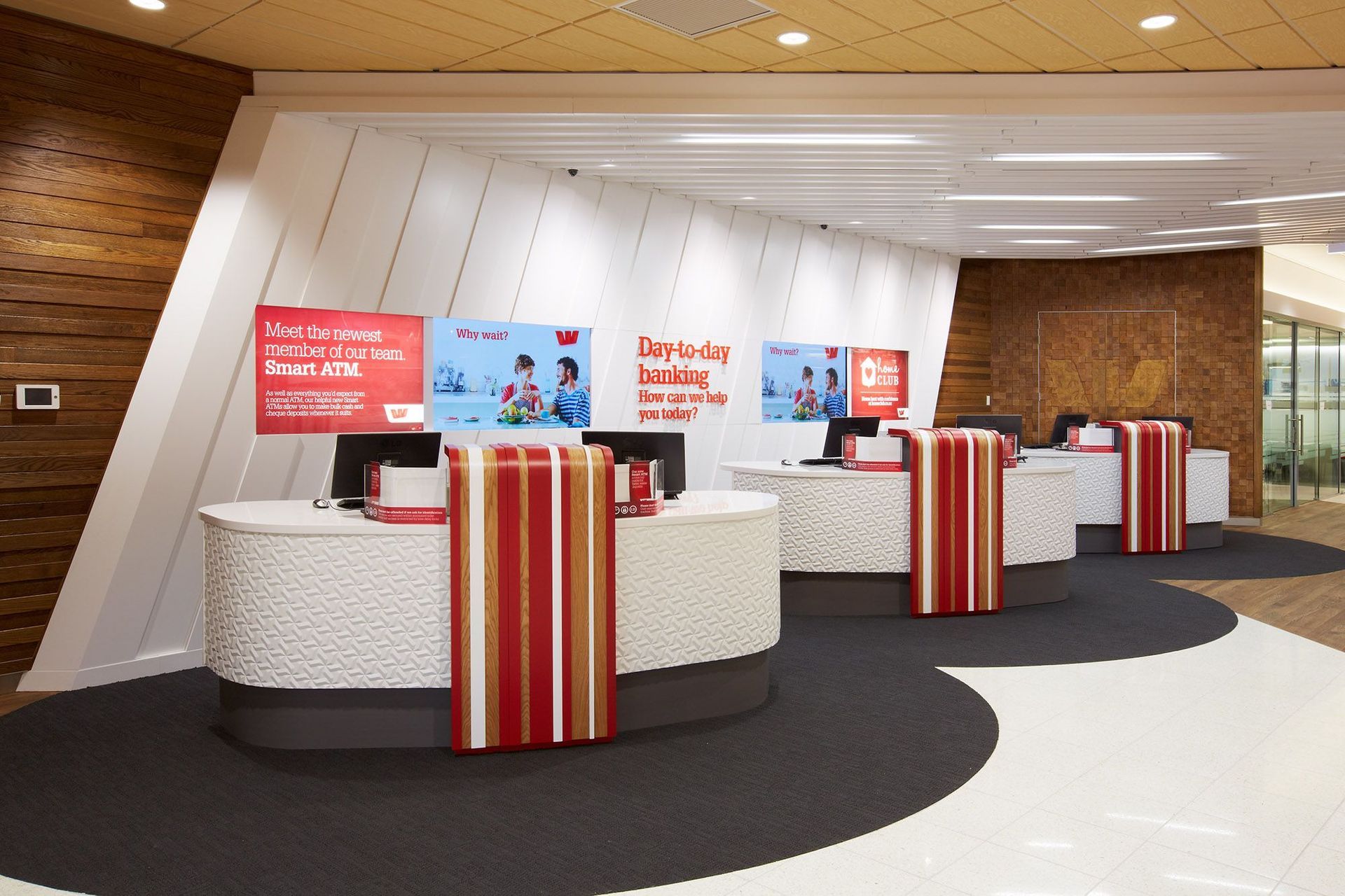
ArchiPro Project Summary - Award-winning Westpac signature branch in Auckland, featuring a water’s edge theme, innovative open façade, and dynamic design elements that redefine banking experiences while embodying the bank’s core value of customer engagement.
- Title:
- Westpac signature branch, 79 Queen St, Auckland
- Architect:
- Context
- Category:
- Commercial/
- Retail
Project Gallery
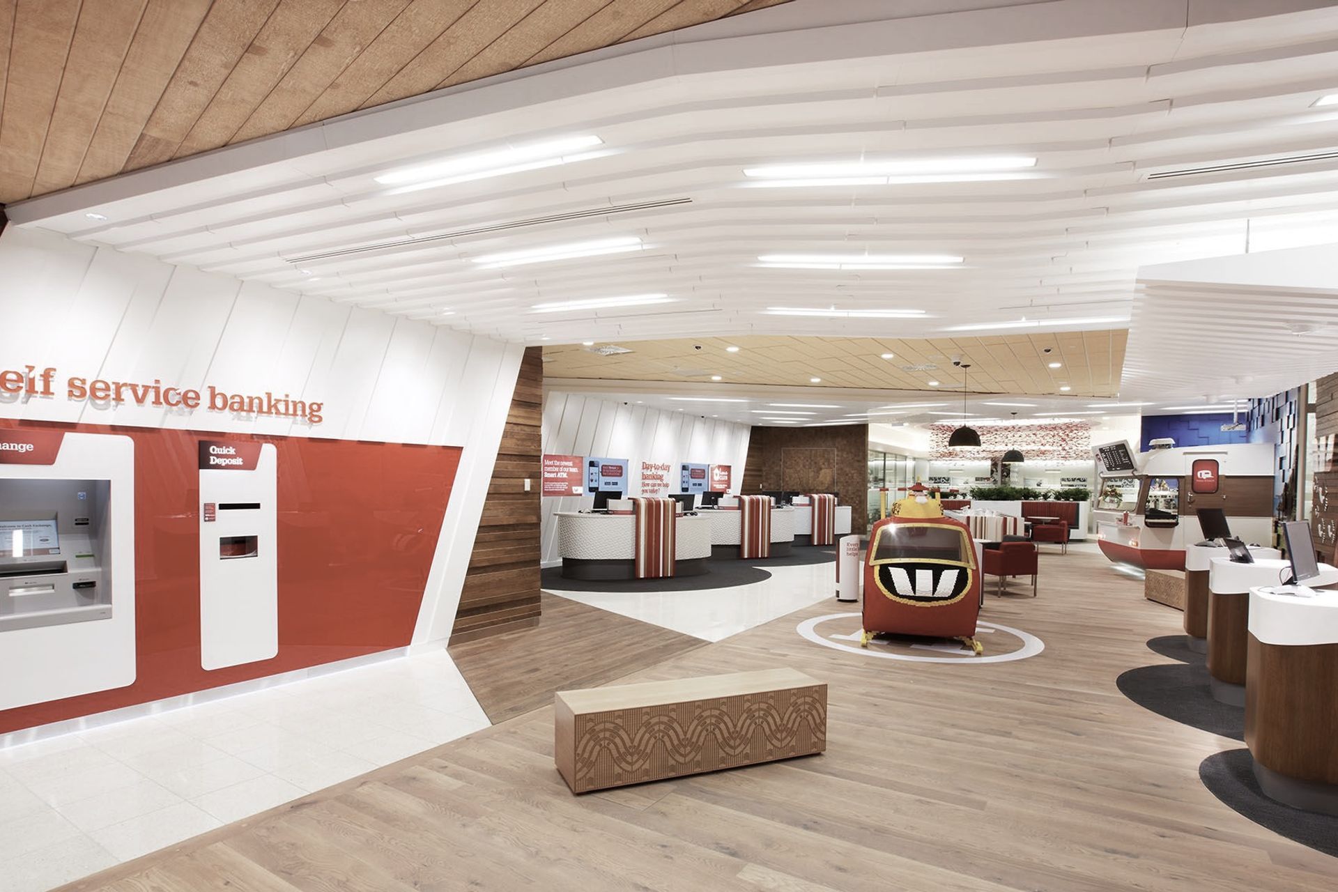
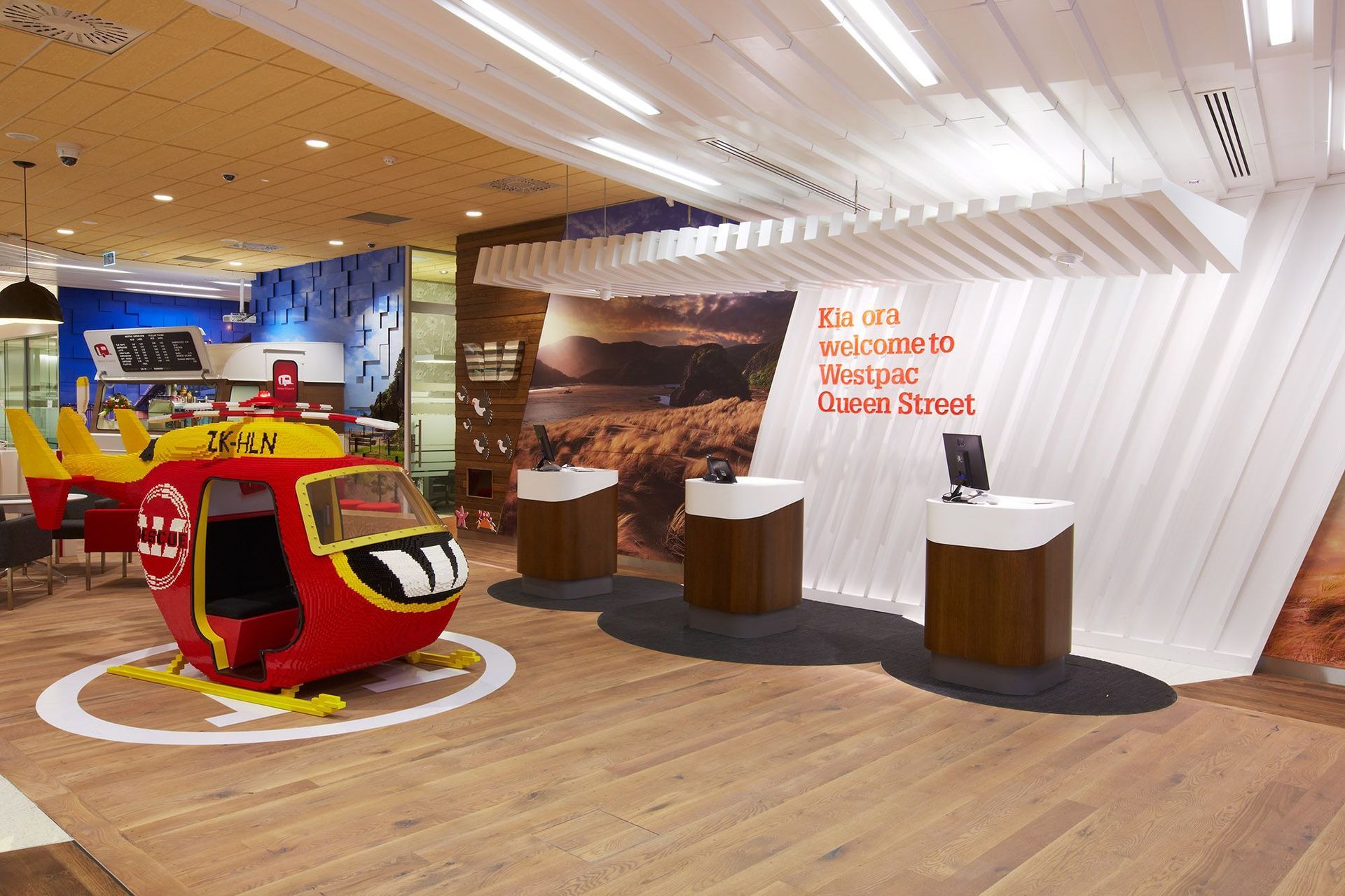
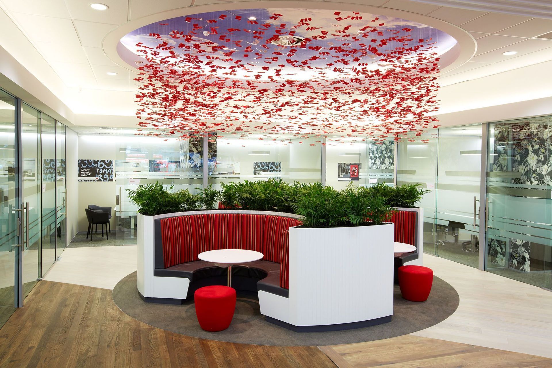
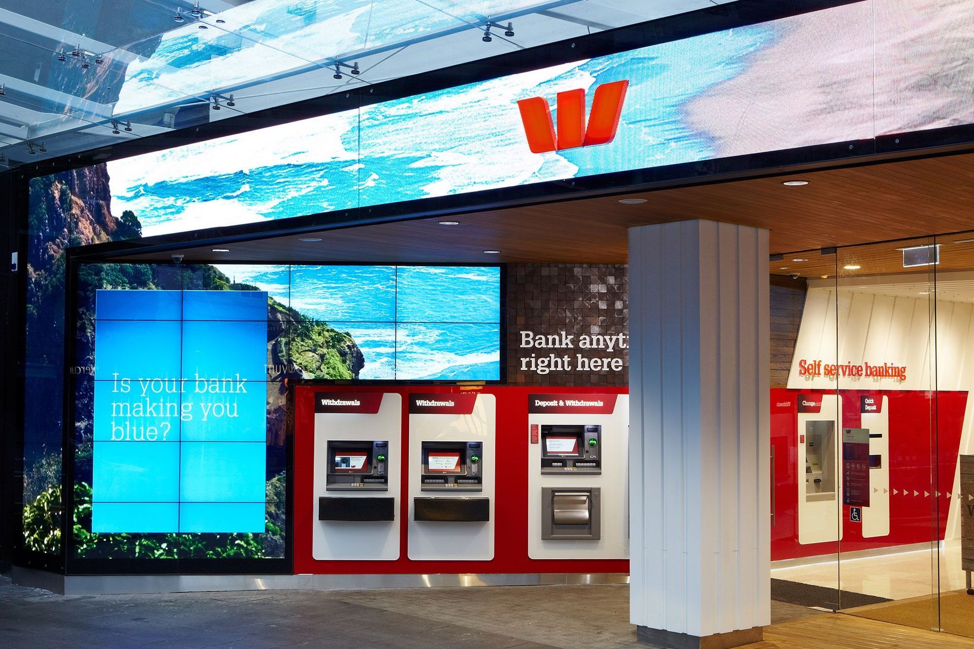




Views and Engagement
Professionals used

Context. We’re a passionate team of urban designers, landscape architects, architects, interior designers, digital experts, and sustainability advocates. Our wide range of disciplines allows us to approach projects from multiple perspectives.
Our goal is simple, to help people live better lives – at home, in the workplace and when they’re out and about. With a focus on sustainability, we create future-proofed buildings and communities in context with their environments.
We exist to design for life.
Year Joined
2015
Established presence on ArchiPro.
Projects Listed
17
A portfolio of work to explore.

Context.
Profile
Projects
Contact
Project Portfolio
Other People also viewed
Why ArchiPro?
No more endless searching -
Everything you need, all in one place.Real projects, real experts -
Work with vetted architects, designers, and suppliers.Designed for Australia -
Projects, products, and professionals that meet local standards.From inspiration to reality -
Find your style and connect with the experts behind it.Start your Project
Start you project with a free account to unlock features designed to help you simplify your building project.
Learn MoreBecome a Pro
Showcase your business on ArchiPro and join industry leading brands showcasing their products and expertise.
Learn More


