Chris Tate was fortunate to be given a blank canvas as a brief from his clients, a fairly unique opportunity for any designer of homes.
“I really enjoyed having free reign with the design of Takapuna House; it was such a unique experience,” says Chris. “I was basically asked to design a high-end modern home with a family in mind – but that was the extent of what they requested and I was left to do what I thought was right for the house.”
Architecturally-designed homes are typically built to a specific brief but Chris designed this house for the owners to on-sell once it was completed. He responded by considering a hypothetical family who wanted lots of space to entertain as well as plenty of privacy, located near Takapuna Beach on Auckland’s North Shore – a sought-after location that offers both inner-city and beach lifestyles for potential buyers.
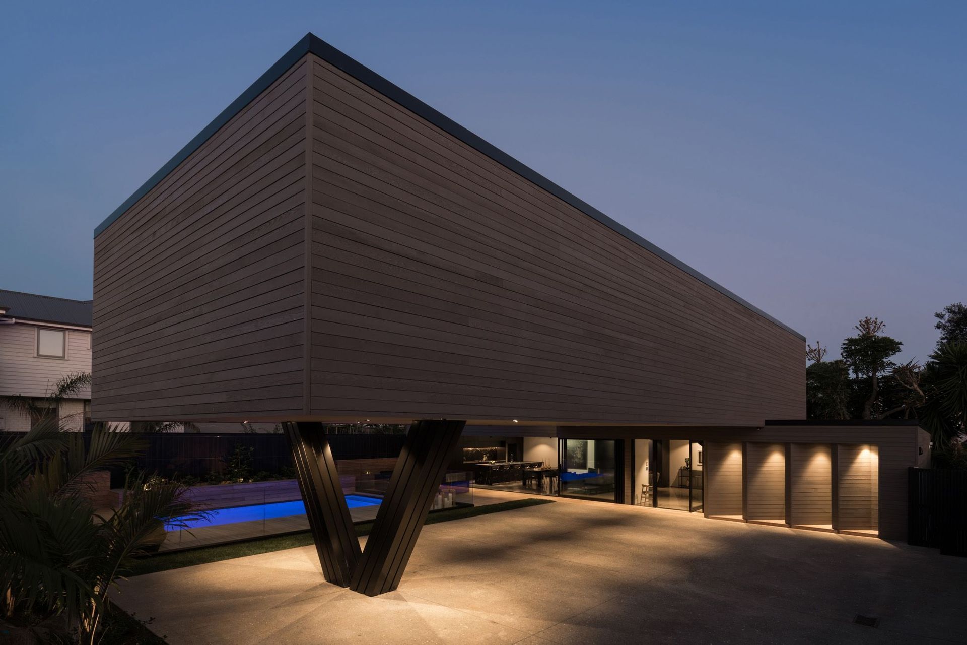
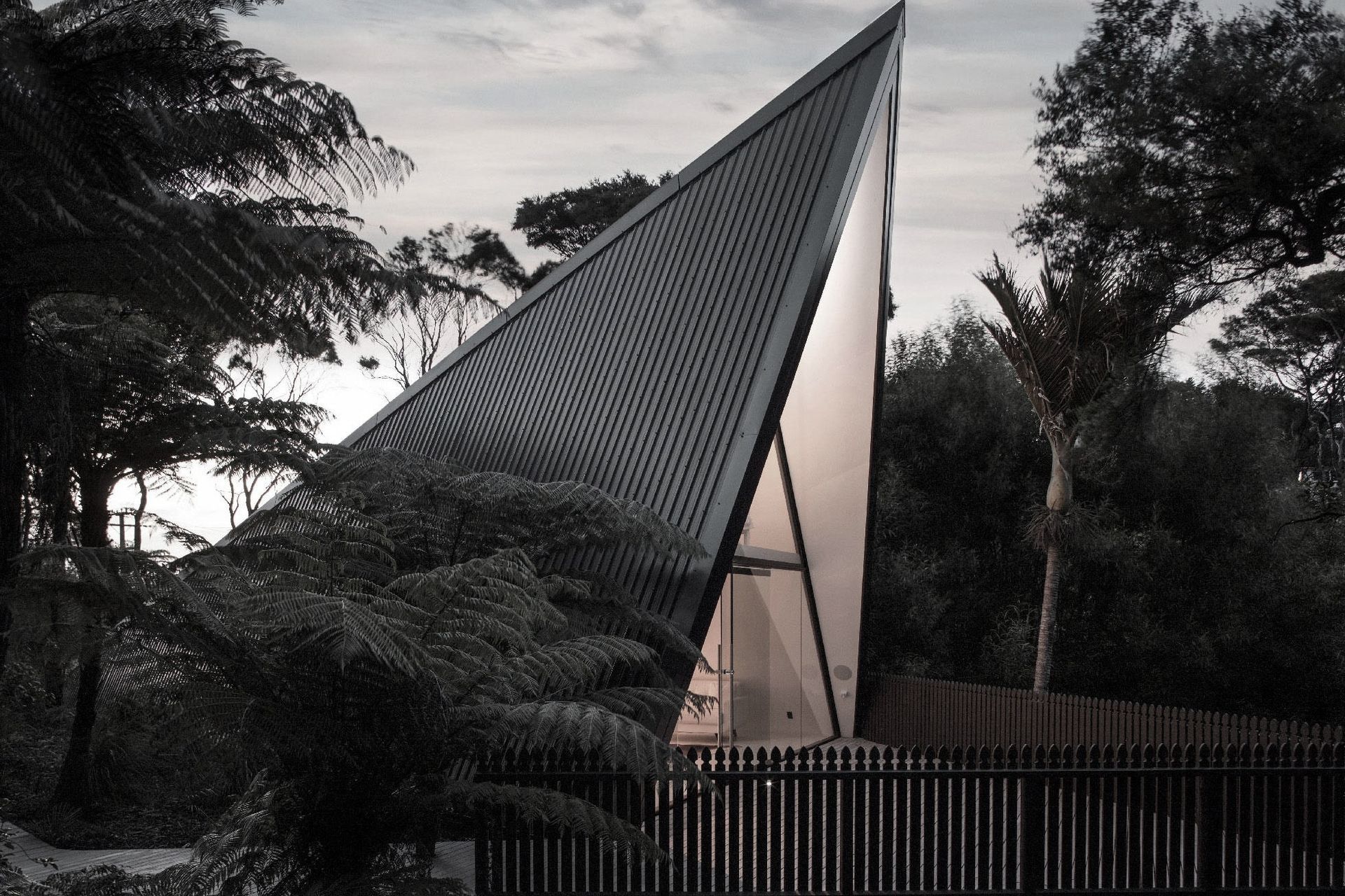
Takapuna House and its sister house next door, also designed by Chris, create a visually striking duo on the street, although they are very different in form and materials. “I wanted one home to be a Hollywood Hills type building,” Chris explains. “A classic 1960s pavilion house, similar to the house that I grew up in, with its brick cladding and courtyard. I wanted this house to be quite different, clad in horizontal-shiplap cedar that silvers off and ends up looking almost like concrete. It's really beautiful finished off with black joinery and with the lush greens of the native planting. So the combination of silver, black and green make up the natural colour palette of the house – it's very New Zealand actually."
Chris designed each home as a private entity, with separate outlooks and outdoor living spaces. “I had to maximise the 587-square-metre site to make sure the houses would fit onto it really nicely, which was tricky because the site size and the set-backs dictated a lot of elements in the design," Chris says.
There are openings on just two of the eight faces of the building so, to bring plenty of light into the interior as well as views out, the wing walls have been angled 45 degrees to the building. These work like a louvre system, offering shade and atmospheric patterns of sunlight and shadow on walls and floors.
The layout of the home also helps to draw natural light into the interior. “I wanted to create a beautiful dynamism internally, with lots of layers and materials,” says Chris. “It's almost like two houses: the downstairs is the public area, while the upper level contains private spaces with luxurious bedrooms and bathrooms. I wanted the master bedroom and ensuite to be really comfortable, like a hotel suite – a space to escape the children!” he says.
To gain plenty of outdoor courtyard space, as well as a decent-sized living area on the ground floor, the upper level cantilevers out over the courtyard, supported by a steel 'v'. Chris hopes that the new owners of the house will set up trestle tables underneath and host summer dinner parties and Christmas celebrations for family and friends.
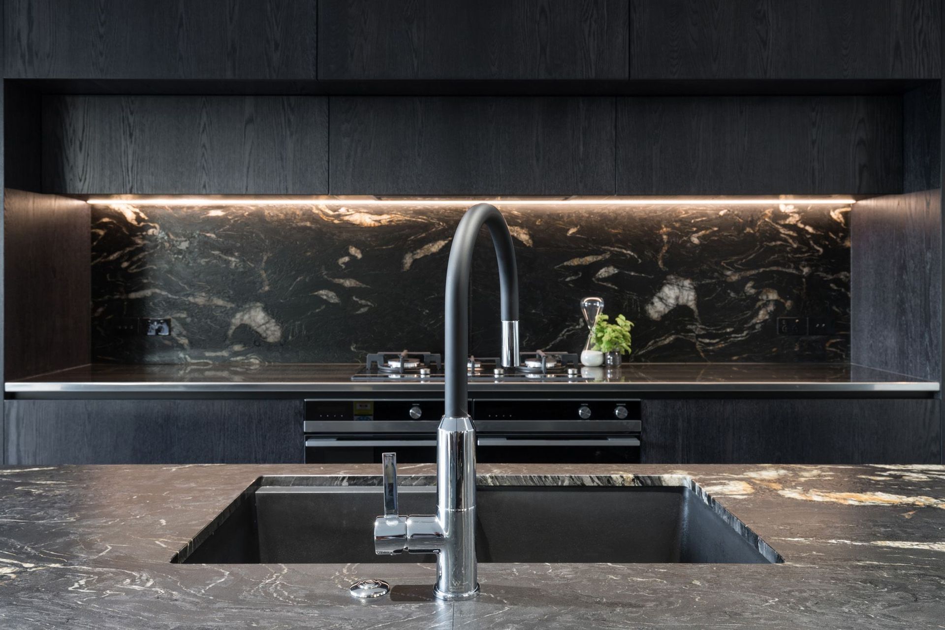
Inside, the open-plan kitchen flows into the two main living spaces: a public living area and a separate den-like media room. The large entertainers’ kitchen helps to fulfil the party vibe. A big island bench incorporates numerous plug sockets so members of the family can easily work there. “Modern families spend a lot of time in the kitchen, not just cooking but doing homework and work on phones and other devices, so I thought it was critical to incorporate materials that were tactile and warm to make the space feel good,” explains Chris.
A gorgeous spiral staircase connects the upper and lower levels, elegantly winding upwards like a ribbon. “It’s like a piece of art,” he says. “It’s made from steel plate, which is a versatile material and has an interesting rigidity to it – it feels strong. I’ve made a few spiral staircases in steel and I love the way they make captivating sounds that become part of the make-up of a building.”
Above the staircase, an open space with a circular skylight creates a stunning light effect down the staircase. “It wasn’t easy to create, but the end result is beautiful,” he suggests.
The surrounding landscape has been designed for low maintenance with plenty of New Zealand natives. “I’m a huge fan of natives and wanted to recreate a New Zealand forest in the landscaping – with soft grasses, dwarf flaxes, kawakawa, cabbage trees, nikau, ponga, and so on – to bring birds and seeds into the space,” Chris says.
“This was such a great opportunity to design what I think a family house should be. I think that working from a blank canvas with no real brief is probably why the house is so successful. I feel as if everything I wanted to achieve, we achieved. I actually want to live here!”
Writing by ArchiPro managing editor Justine Harvey.
Photography by Mark Scowen.


