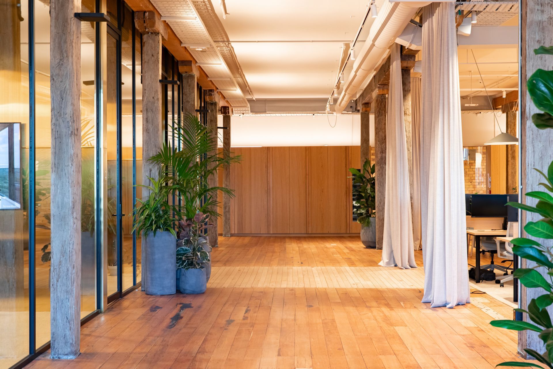
Deconstructing the formality of the traditional office in Parnell's historic Textile Centre
The concept of an 'office’ has changed radically in recent years. Today, many find their place of work in the quiet corner of a cafe, the flexibility of a co-working hub, or sprawled across their home's dining table. This change was inevitable — just as all change is. But where does that leave us? What has the optimal work environment become? And is there any balance to be found between tradition and modernity?
In mid-2022, architect Andrew Mitchell of Patterson Associates was engaged to design a Head Office for a tech company, with a turnaround time of four months from concept to completion. The client had a site located in Parnell's historic Textile Centre, set within a single-level 900m2 space. And while the short timeline was critical, it was most important for the design to deconstruct the formality of a traditional office. QBS IT came on to lead the build, dedicating a great deal of time and passion toward executing the contemporary design on time.
The Textile Centre is located in central Auckland on the lower end of St George's Bay Road, which runs through Parnell. The area was historically developed for industrial purposes, with the Textile Centre being one of several warehouses constructed in the early 1900s. In its early years, the building predominantly stored wool and hemp. However, with time, the building became home to several businesses in the farming industry and was eventually converted into office spaces in the 1980s.
The tenancy that Patterson Associates were engaged to design was formed by two previous tenancies, last fitted out in the 1990s. "The space was largely closed in with plasterboard and low-height glazed partitions", says Mitchell. "When we first looked at the space, it was clear to us that the previous fit-out had to be stripped back to expose the original artefact that is this beautiful building."
"The client had three main requirements," he explains. "The first was to turn the physical space into an exceptional place to collaborate and create from; the second was to link the tenancy fit-out to the brand identity; and the last was to turn the project around within four months."

Patterson Associates’ initial planning involved analysing the tenancy to determine how the original structural grid of the building could be best utilised. "Working within the framework, we created a central place for the team to join and collaborate that was away from their workstations. This design feature is formed by a row of meeting rooms which sit symbolically in the middle of the tenancy, forming a centrepiece within the office." Quite quickly, the rooms became the bustling heart of the workplace, facilitating informal and casual meetings, and interestingly, they're the only design aspect that incorporates walls.
"We designed the meeting rooms with brushed brass walls and floor-to-ceiling glazing that provides vistas through the space", says Mitchell. "Throughout the rest of the tenancy, full drop sheer curtains offer privacy for the work zones, with a hint of what's behind, and allow the entire space to change from open to closed within an instant."


The client's company comprises several teams; some perform best in quiet environments, while others find productivity in more vibrant spaces. This nature was particularly important to Patterson Associates when designing the office, and, as a result, the tenancy was created with two distinct work zones flanking the central meeting rooms. The noisier area is designated to the left, near the main entrance, kitchen, and dining room. And over on the right, a more peaceful atmosphere has been established, pairing suitably with the boardroom positioned in the back right corner.
In addition to supporting different working styles, it was just as crucial for the client's office to feel like home. They wanted to establish several living areas to work within and to use residential products where possible, opting for a muted material palette that's uncommon in commercial tenancies. To achieve this spatial experience, Patterson Associates designed the office with a generous kitchen that hosts a dramatic cantilevered island bench, a dining space with a table that seats 40, and a lounge that lolls across the back brick wall, capturing the sunlight that pours in through the heritage casement windows. "It functions as a contemporary work environment with the comforts and warmth of 'home', whether you're working up at the kitchen island with your morning coffee or over in the lounge with your team", says Mitchell.
"We really sought to deconstruct the formality of a traditional office by not having a reception area and instead creating more opportunities for visitors to connect with the team", Mitchell adds. The sheer curtains were specifically placed to support this functionality and can be moved around in unique arrangements to host events or social functions.


"In its original form, the tenancy has an incredibly high stud, jarrah beams and columns, timber flooring, and beautiful brickwork. Most of this had been covered up — so this was an opportunity to restore and celebrate the heritage of the building", Mitchell smiles. Subsequently, all of the tenancy's original features have been re-exposed and restored while also setting the tone for the new material palette.
“We wanted any new elements to be noticeably contemporary and seen as insertions within the historical framework", adds Mitchell. An example of this integration is the brass blade walls that line the central meeting rooms. "These are quite obviously a contemporary product, but they complement the brickwork's tonality and will patinate visually over time, just as the existing building does." The lighting throughout the office is also notably residential and has a warm colour tone that ties together the new and inherited materials.
"Where possible, we sought to utilise New Zealand-sourced products, such as the oak desks, the sofa, the curtains, and the natural wool carpet, which was also a nod to the fact that this building used to store wool back in the early 1900s."
When asked about his favourite aspect of the project, Mitchell didn't need to pause for thought. "It's the vistas. As you move around the tenancy, you get these beautifully layered vistas stretching across the space, and every time I return, the curtains have been repositioned. So that view continually changes."
Learn more about the Parnell Loft Office.
