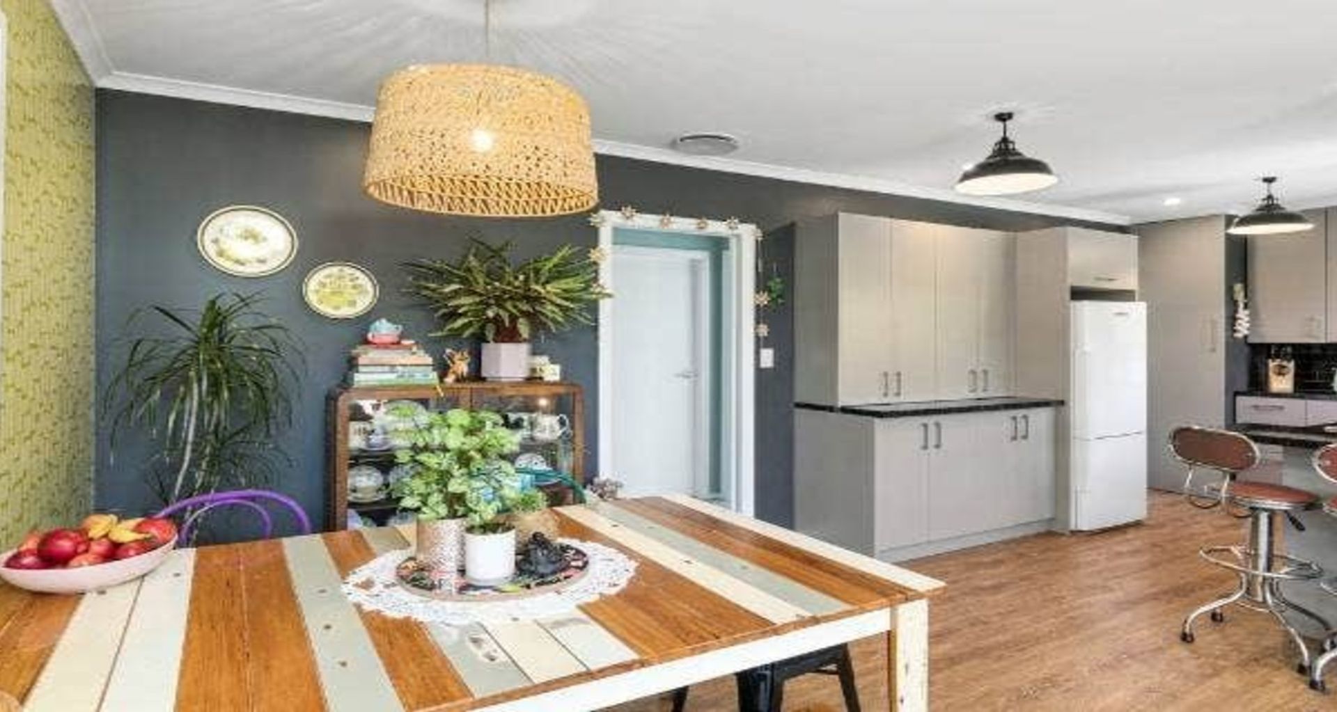
Designer's own home 'cold, dark' and smelled 'horrendous'
Written by
23 July 2023
•
5 min read

Interior designer Carley Lloyd relished the chance to practise on her own “cold, dark” first home in Lower Hutt.
The Korokoro home needed “a huge interior overhaul and significant upgrades to the water, insulation and heating,” says Lloyd, whose business Colourbolt Interior Design is based in Māpua, Tasman.
“At the time though, it was perfect. We have never shied away from hard work and a challenge, and that is exactly what the next 10 years consisted of,” she says.
CARLEY LLOYD:
It was worth it in the end to have a house that we had transformed into a beautiful home for ourselves and our three little kids. What attracted us to the western hills in Lower Hutt was the native bush and birdlife. It was a seemingly unknown suburb that to us was paradise.
The house was right in the middle of nature, and when it came to planning the different stages of renovations over the following 10 years, it was this feeling of being out of the hustle and bustle of the city, that gave me the inspiration for the interiors.
The first step was to remove the old rotten wooden windows. The smell was horrendous!
Replacing these with new double-glazed aluminium windows, and framing that didn’t compromise the view of the outside, was a game changer. It was instantly lighter, quieter and warmer.
Mike Pethig's tiles were designed and created by him and his family.
Adding smaller windows at the top meant there were large expanses of glass, and including the wooden louvres in the window design allowed airflow into the room, added a natural feature into the interior design and added a point of difference for the street appeal of the house.
The whole room, including some damaged ceilings, had to be significantly skimmed to get them to a paint finish quality.
Like with all of my designs to date, Resene Alabaster was used to transform the ceilings and door, giving a crisp and clean finish to contrast with the wallpaper and paint that was about to be added.
At the time, using grey tones alongside bold wallpaper was my design style.
What I loved most about the grey on the walls (Resene Half Grey Friars in this room) was that it allowed the greenery outside to be the feature when you walked into the room. When you use dark colours on a wall and dark aluminium joinery, it disappears. The outside now became the focus.
Wallpaper is one of my guilty pleasures. It’s art for the walls and it instantly transforms a space.
You need some criteria though: It has to work with the house as a whole. When designing a home, you need to see some cohesiveness between the rooms, otherwise it can become unbalanced and a bit like a garage sale.
For our Korokoro house, there were many wallpapers sitting on the wish list, but in order for them to make the cut for this house, they had to be green, grey, black or white, and they had to fit a nature theme.
In my daughter’s room, the forest green Cole and Son Palm Jungle wallpaper I chose was a perfect choice for the room and reflected the nature that surrounded our tree hut home.
If we’d been able to afford it, I would have done all four walls or at least two. Luckily, my husband had an amazing work colleague at the time who brought the wallpaper back from London in her hand luggage for us.
New Rhino carpet in a lighter colourway (dark carpet shows every bit of dirt and dust) and dark grey block out blinds from Window Treatments, were a no-brainer in order to allow maximum light into the room.
At the time this was my little girl’s bedroom. I found this pink floral duvet cover on special at Briscoe’s one day and knew it would fit both the theme and her tastes at the time.
The industrial lights were a secondhand find that my Dad had powder coated black for us. They feature in each room throughout the house and are still one of my favourite elements.
I love thinking about what stories a secondhand find is holding onto.
The Trade Aid hyacinth baskets are a great way to store toys and add another natural element into the room, as is a good jute floor rug, this one sourced from Mocka.
All of the units are solid rimu and have been lovingly restored to their former beauty by my very talented Dad.
When I came across the artwork by Mrs Mighetto, I knew that the washed-out pinks and greys would work well with the colours in the room, and add a sense of playfulness into the space. Who doesn’t love a good swing?
And the cat sheets, well my daughter loves cats and we don’t have one, so they had to stay.