The essential rules of interior design every homeowner should know
Written by
18 December 2022
•
5 min read
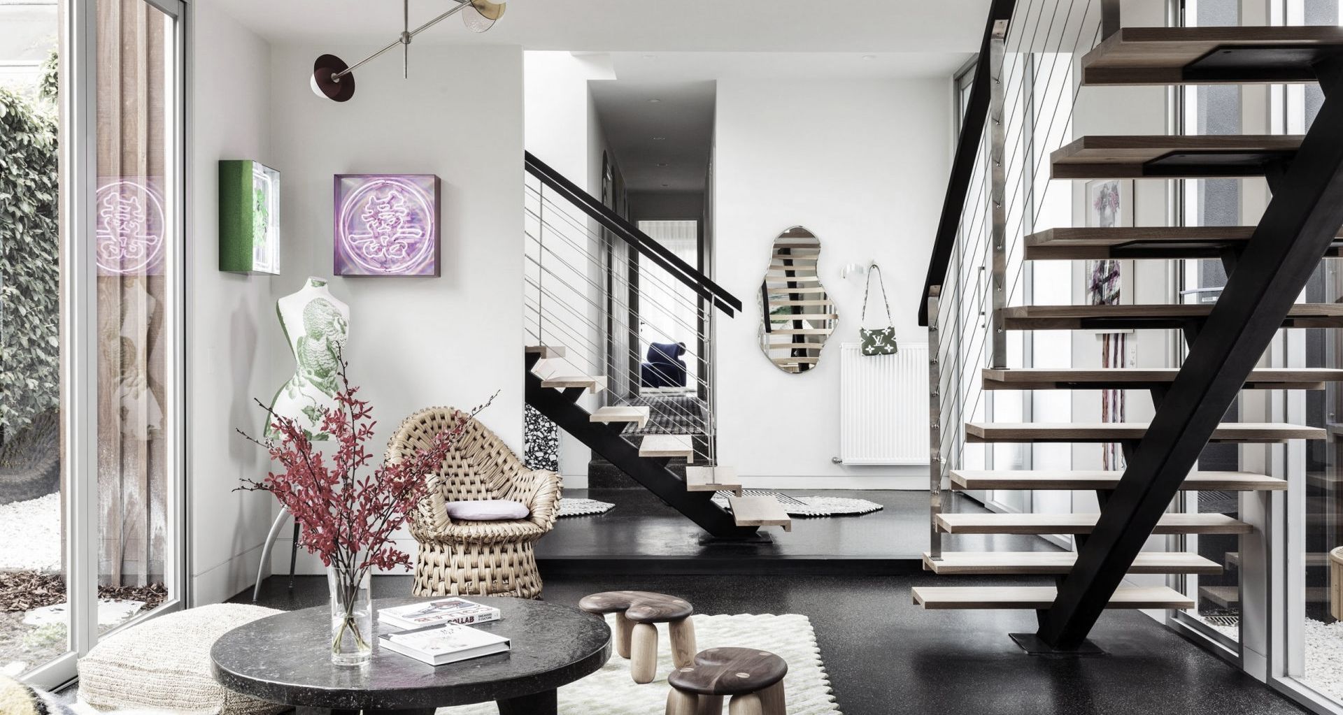
'There are no rules to good design' is a common refrain from many interior designers when questioned about how to create a beautiful space. While styling comes naturally for some, the vast majority of us find transforming a blank canvas into a home that’s equal parts aesthetically pleasing and liveable a challenge. Fortunately, there are a few general guidelines that simplify the process of styling a space and make selecting the right furniture, lighting, art and paint easier. Once you know the rules, it’s easier to – strategically – break them.
From hero pieces to lifestyle considerations, these are the basic rules of interior design worth knowing about.
Fresh and flexible
While a thoughtfully designed interior shouldn’t require a complete overhaul every season, it’s worth creating a space that can change with the times.
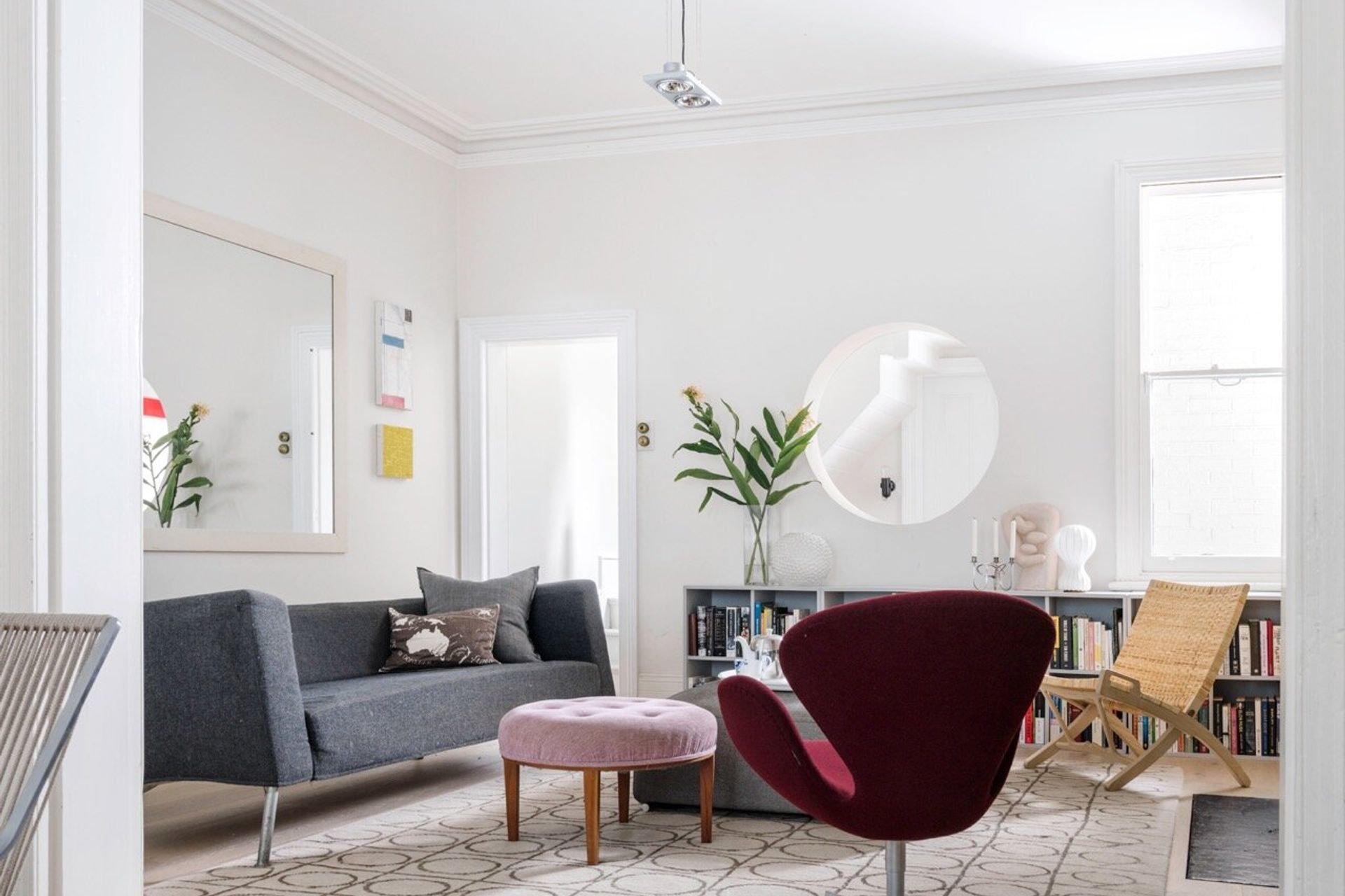
“Keep the base of your home neutral,” Lauren Lewis, creative director at BOWERBIRD Interiors, recommends. “This goes for your walls, flooring, cabinetry and big furniture items like your lounge. A neutral colour palette gives your home a timeless appeal.”
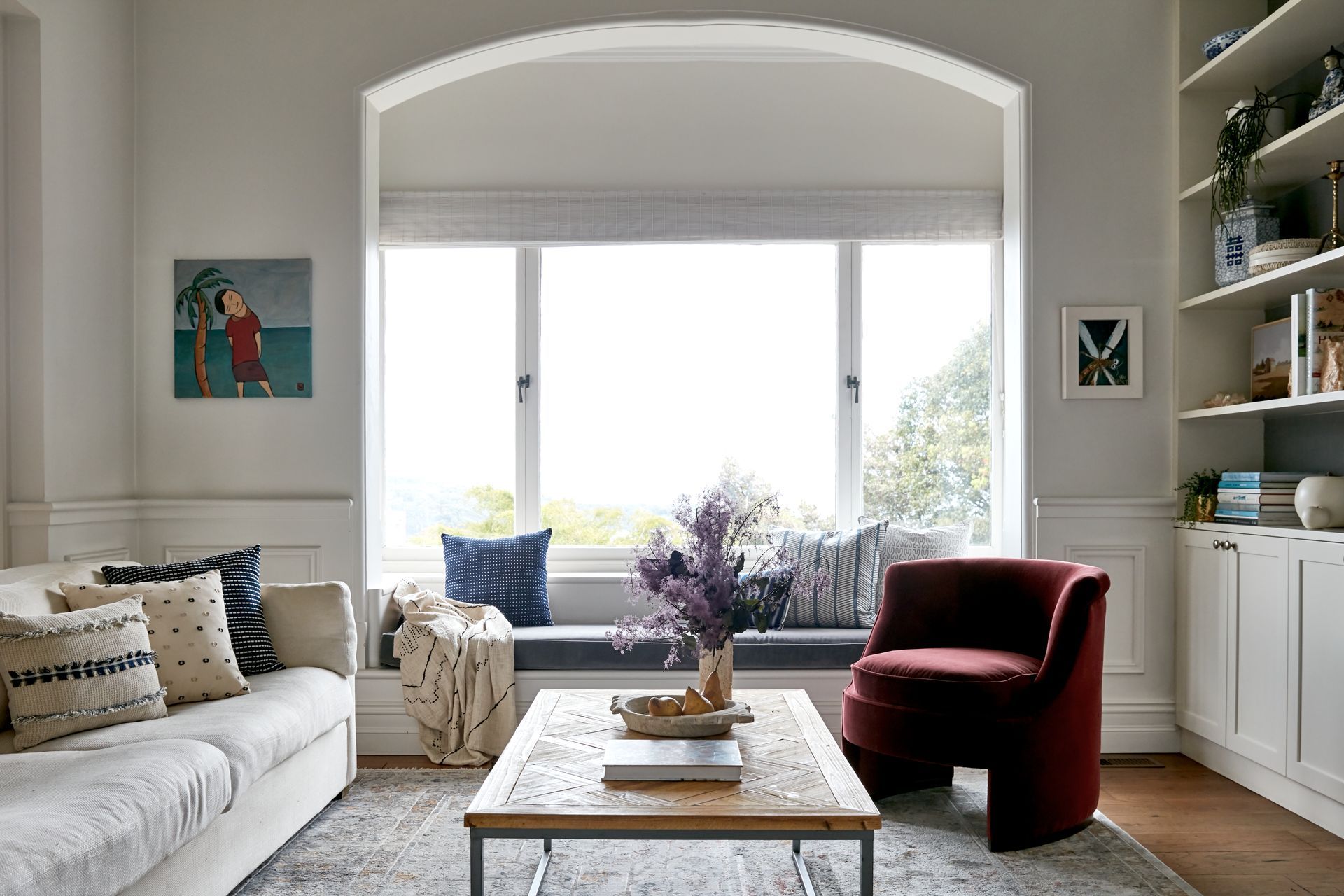
A neutral base needn’t mean a home entirely devoid of colour though. “If you love a pop of colour, add this through artworks, accessories and soft furnishings like cushions, throws and bed sheets,” says Lauren. “That way, if you want to switch things up with seasonal changes and trends, or simply refresh the look every so often, you won’t need to spend a fortune on replacing the bigger items.”
Layer your lights
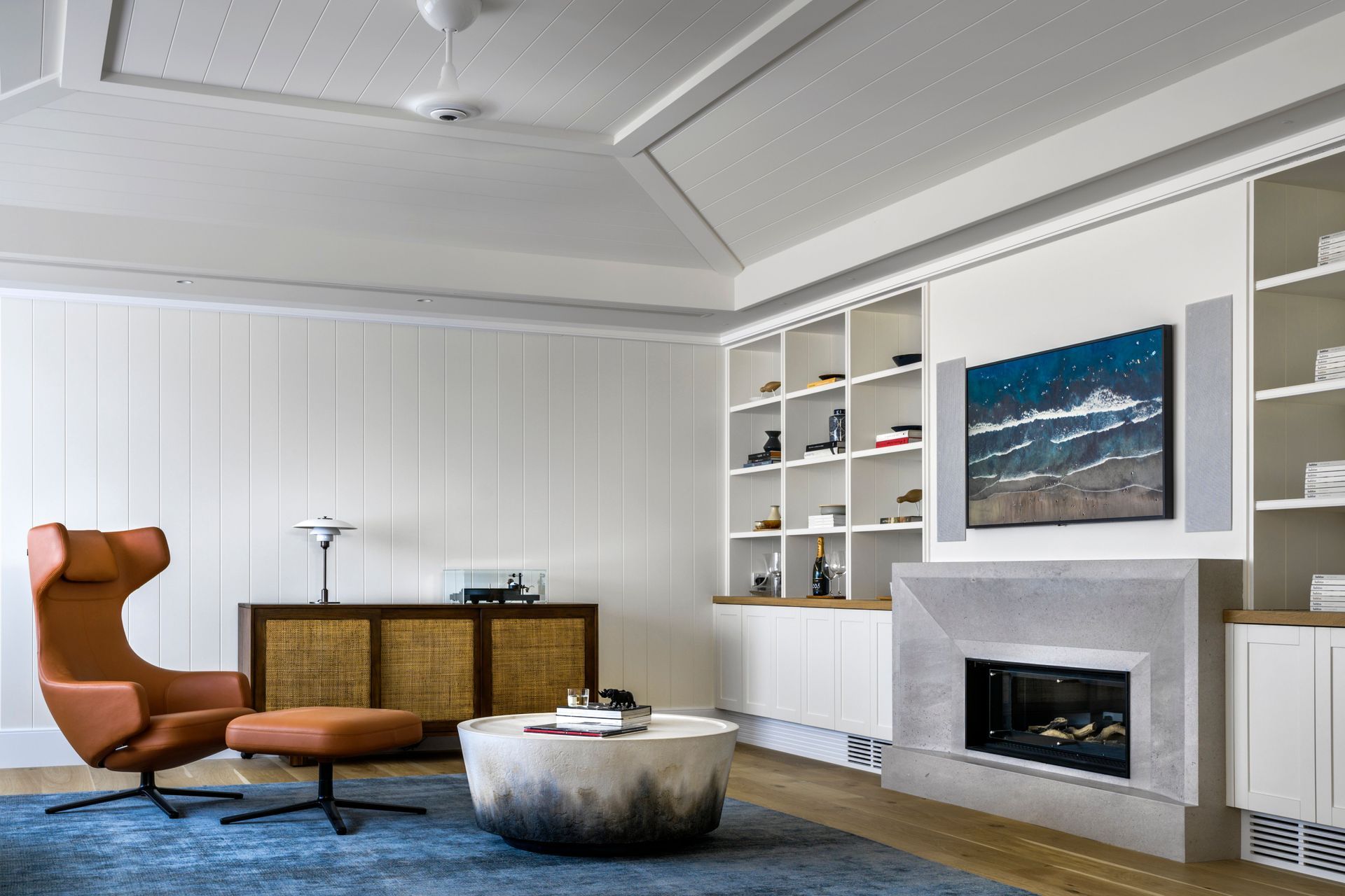
Having a single source of light can make a space feel one-dimensional. To create a flexible multi-use space, opt for a combination of ceiling fixtures, wall sconces and table or floor lamps. If using downlights, avoid having them facing straight down as this can create a clinical feeling. Instead, angle them towards elements of the room you’d like to highlight, such as a statement artwork.
Certain light setups are necessary. Dining tables and kitchen islands should always feature overhead lighting, whether in the form of pendant lighting, ambient track lighting, or a dramatic chandelier. Meanwhile, floor and table lamps can be used to illuminate dark corners of the room that have little to no access to natural light.
“If the lighting is flattering and considered it's going to look and feel better,” says Anna-Carin McNamara, founder and principal designer at Anna Carin Design Studio. “The way to accomplish that is to avoid unflattering downlights and use soft layered light consisting of wall uplights.”
Anna-Carin recommends ensuring all table and floor lamps used are dimmable, so they can be adjusted to create the desired mood.
Play with shapes and sizes
Symmetry can be used to create harmonious spaces that imbue you with a sense of calm. However, a space with everything lined up to a tee can feel somewhat unsettling and almost eerie. Avoid this by creating a dynamic, layered space that incorporates a variety of shapes, sizes, and textures. Think mismatched dining chairs, a feature wall of artwork in varying sizes, and rugs and throws in differing textures.
Fake height
High ceilings are a luxury. In their absence, height can be faked by strategically playing with proportions. Opt for low-profile furniture such as sleek coffee tables and sofas that sit closer to the floor. Juxtapose these with tall bookcases that work to draw the eye upward, creating the illusion of more space. Similarly, hanging mirrors higher on the walls can create a more expansive feeling. Though a chandelier or pendant lighting can create a sense of luxury in a space, they also bring the ceiling height down and are best employed in houses with double-height ceilings. If you have low ceilings, it’s best to stick with recessed lighting.
Choose a hero piece
To bring cohesion to a space, each room should have a hero piece. This doesn’t necessarily have to be the heaviest piece in a room, but rather the most interesting or dominant feature. Likely the piece that garners the most compliments upon entry, the focal point in your space may be a large-scale artwork, a statement sofa, a feature wall or even an interesting rug. The hero piece informs the decor of the rest of the room. If your hero piece uses vibrant hues, try incorporating pops of those colours in other areas of the room to tie the space together.
Consider your lifestyle
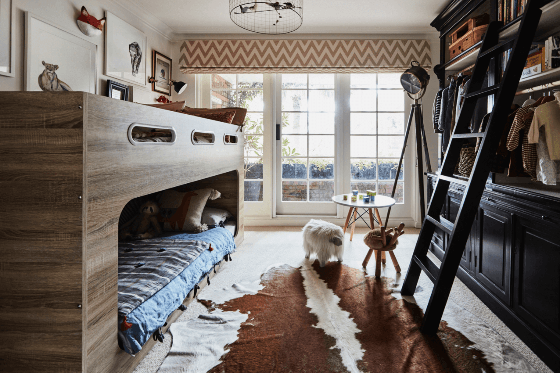
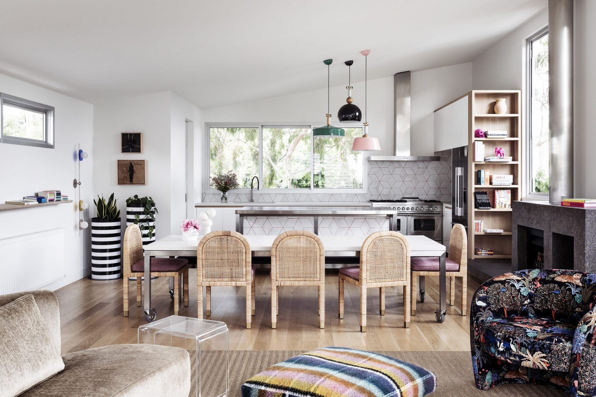
Live in a suburban home with kids under five? The pristine white sofa you’re eyeing may not be your best bet. Regardless of how steadfastly you follow the rules of interior design, if a style or piece doesn’t suit your lifestyle, it’s not the right one for you. Childfree couples or families with older children will be able to indulge their whims when it comes to incorporating statement art like sculptures, while those with younger children can create a space that’s both chic and family-friendly by opting for furniture in durable materials, soft seating such as ottomans and poufs in neutral (but not light) shades, and perhaps designating some adults-only areas.
Read more articles about interior design on ArchiPro.
