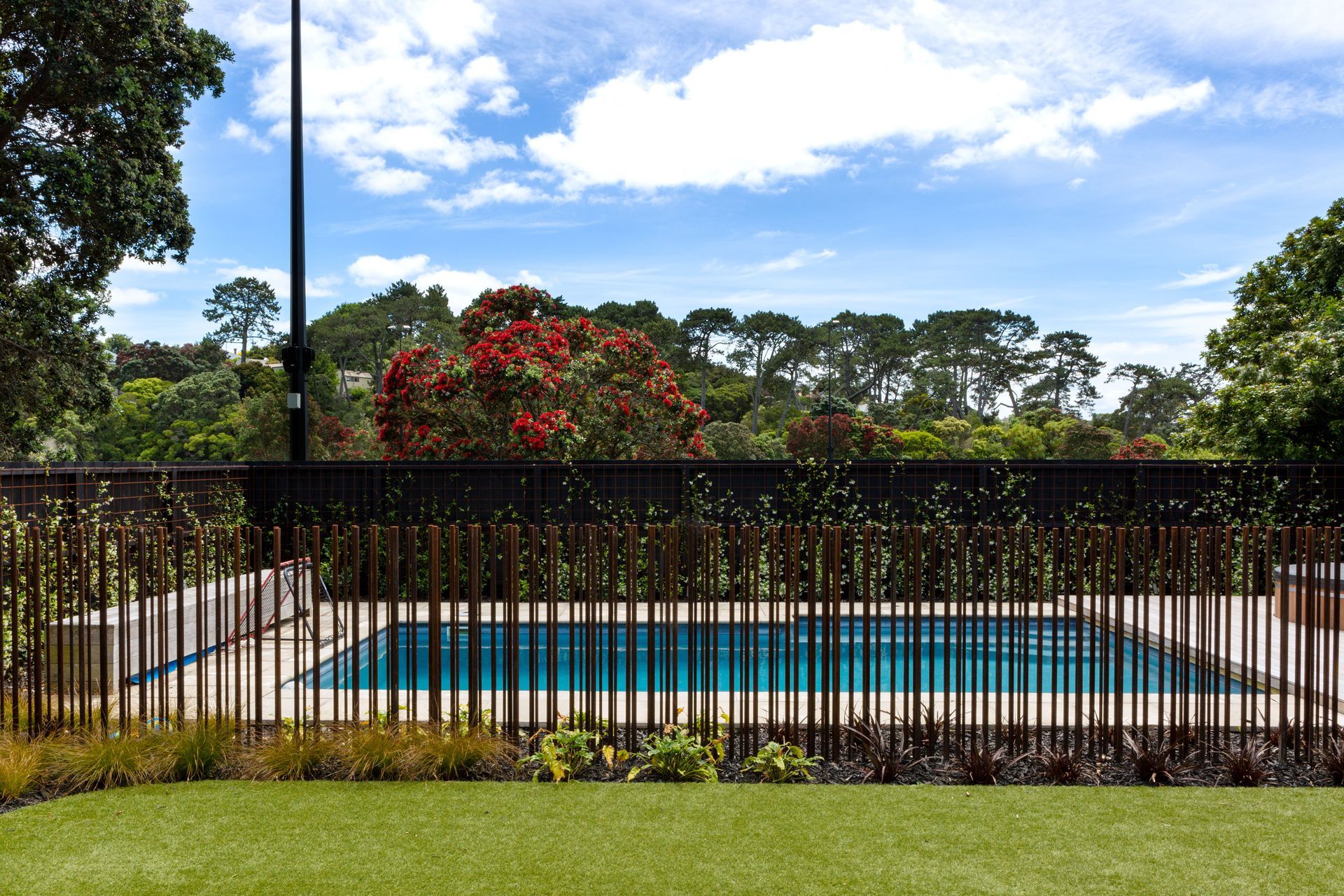
Fun and function in a new-build family home
Written by
16 May 2022
•
5 min read

“It seems like such a public spot but it’s so private,” says homeowner Rina Crawford. And that nicely sums up this house - both inside and out.
The property backs onto a popular park in Auckland’s Westmere, with a public path running alongside. The family is active in the community and, with three teens, loves to socialise, yet the home is still a haven.
With no windows and a hidden garage, the dark facade shields the home from the street. Despite that, it isn’t intended as a blockade. Architect Tim Dorrington of Dorrington Atcheson Architects used a cedar batten and shiplap system. “We made it as sculptural as it could be and as interesting as it could be to look at.”
The curve of the house encourages you around a corner, through a garden with circular pavers. “This garden was the driver in the original concept. It’s a staged entry, it feels like you’re walking through the garden to get there and there’s a layered privacy.”
And because of that, the home’s entrance courtyard uses extensive glazing by the front door. “You could not do that if it was opening to the street,” says Tim.


Beyond the gate to the entry courtyard, a curved black brick wall allows the family access to the pathway to the park.
With the front door down the side of the house, it delivers you to the centre of the home. “I didn’t want the front door to be off the street,” says Rina. “When people come into our house I didn’t want them to walk down a hallway past all the bedrooms. You can’t help but look in. Because we’ve got three kids I wanted to keep some parts of the house private.”
So the house was designed to pivot around the entry, says Tim. “That’s basically where you choose where you’re going to go.”
Turn right at the door, back towards the street, and you’ll find the teenagers’ annex – bedrooms, bathrooms and a lounge that can all be closed off.
“We realised that as the kids got older, they really needed their own spaces,” says Rina, “and we needed our own spaces from them. So the brief was always that there would be a kids’ area. All of our lockdowns have been in this house and each of the bedrooms has a desk so we have used the spaces even more than we imagined.”
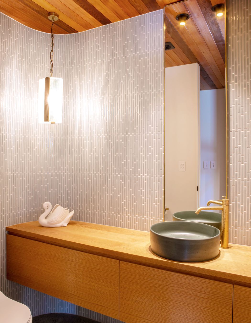
Under the entryway stairs hidden doors conceal a powder room, coat closet and music room. Up the stairs is the master suite that includes two walk-in robes.
And if you turn left as you enter the house you’ll find the entertaining areas - kitchen, living room and dining room that all flow to the backyard and pool.
Rina wanted a large area, but not cavernous. “I wanted it to feel full with just the five of us.”


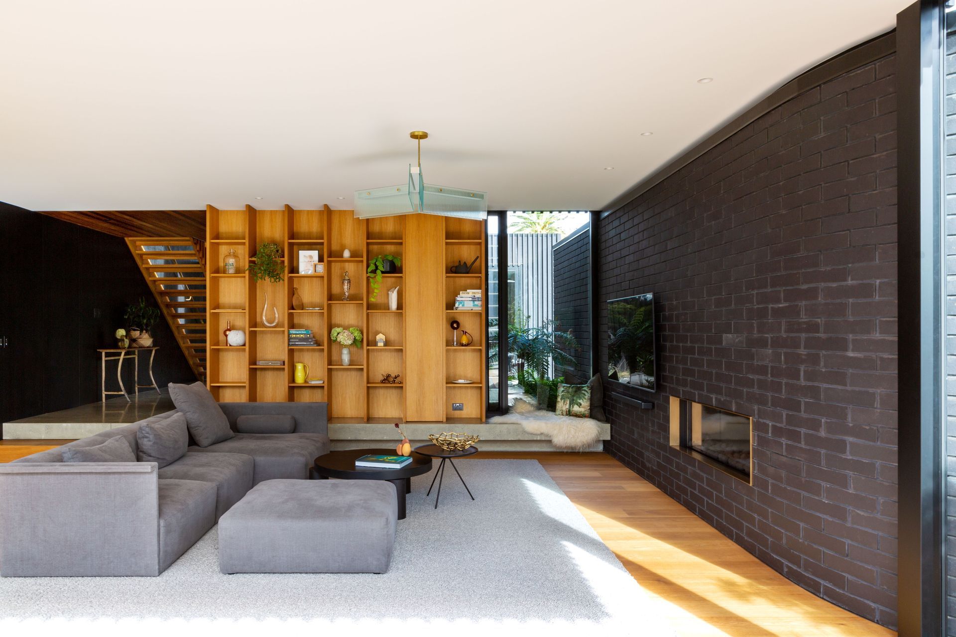
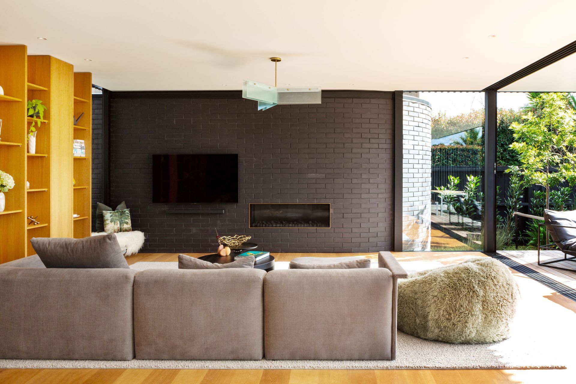

The feel is both classic and contemporary, says Tim. “You look at old retro lounge rooms, the amount of timber and soft furnishing versus hard materials, and they’ve always been pretty good entertaining spaces. I like the colour play and textural materials from the 50s, 60s and 70s. But you don’t want to just uplift an overseas mid-century style and put it in New Zealand. It needs to fit here as well.”
The trees and bush from the adjoining park inform that, he says. “Because we're parkside we wanted to draw your eye right through to the back fence and then further beyond. I always like having big windows and openings, but it's about careful positioning. You want that view to be slipping past. It feels like you're almost on a much bigger property than you are but it's walled away, it's completely private, nobody can see in.”
Tim says the design process was collaborative, with George and Rina contributing ideas. “There are certain stages in a project that are collaborative anyway, certainly the concept stage,” says Tim. “But usually clients more often know what they want, but are not quite sure how to get there. You want to show them something that they really like that they didn't know they wanted. Equally, it's not my house, so I'm not going to dictate what it should look like.”
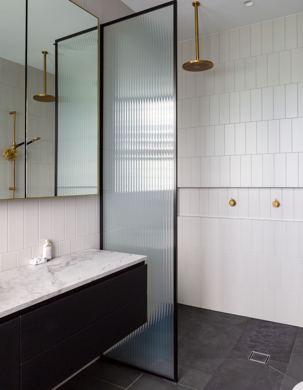
For the most part the project ran smoothly. But early on, there was a problem. Once the existing house on the section had been cleared, it was a surprise to discover that the site was unstable.
“When the digger arrived on site,” says Rina, “they realised quite quickly they weren't going to find solid ground. Tim was so good to work with. He was so cool and calm and clearly very experienced.”
George and Rina had originally intended to renovate the existing house.
“But we decided it was probably more cost-effective just to start again. And that's when I decided to go with Tim because he'd done our friend’s house and I love his aesthetic.
We all love this house, you can’t get lost in it, there are no areas that aren’t filled. We use the house exactly as intended.”
Images: Emma-Jane Hetherington
