How can you make the most of outdoor space?
Written by
02 October 2018
•
6 min read

Planning an exterior space can feel daunting because with no natural physical divisions in place it can be difficult to envisage where one area might stop and another one start. But Shafer Design’s Robin Shafer says it’s no different than planning an interior space – something which New Zealanders are very comfortable with.
She uses a model that imitates interior planning to map the plan of an outdoor space and shares how she does this here:
How will you utilise the space?
In architecture, every inch of the inside of a house is taken care of, says Robin. “The views, the light along with all the practical uses are all taken architecturally into account.” Therefore, the same level of planning detail should be used to map exterior spaces.
For clients, Robin draws up a bubble diagram to help understand what uses the space needs to cater for. The uses ultimately dictate the layout of different zones. These may include eating areas, cooking areas, utility areas, lounging spaces, focal points, storage space, views, private areas and play areas.
“In a house we have no wasted space, there’s no gaps or leftover spaces and we really need to think about outdoor spaces in the same way: How much utility space am I going to give up on for my lawn space? How much storage or living space do I need? How do the areas link to each other? If you approach outdoor space in this manner it becomes an eminently practical process.”
How much storage or living space do I need? How do the areas link to each other? If you approach outdoor space in this manner it becomes an eminently practical process.”
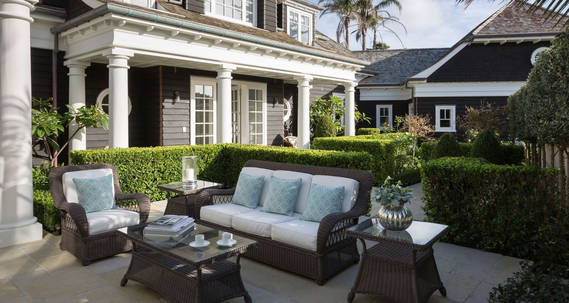
Once you have a clear understanding of how much space you are willing to allocate to each zone, you can begin to map out the proportions of each zone and place them in a logical layout. It’s important to think about linking the spaces so that they make practical sense and to consider lighting and views when deciding the layout. You may also use outdoor furniture as a way of understanding what your needs are in terms of space.
Negotiating layout may mean walling off a utility area that you would like to remain hidden, or plotting a path from a pool to a back bathroom entrance. The key is to understand how you will use the spaces and correspondingly how they should interrelate, says Robin.
Defining and linking zones
Once you’ve decided on a layout, zones need to be linked or divided with internal divisions.
“There are different kinds of divisions,” says Robin. “There’s absolute enclosure – where there’s very little view out, which is quite solid and impenetrable; and implied enclosure, where you’ve still got a little bit of visual penetration.”
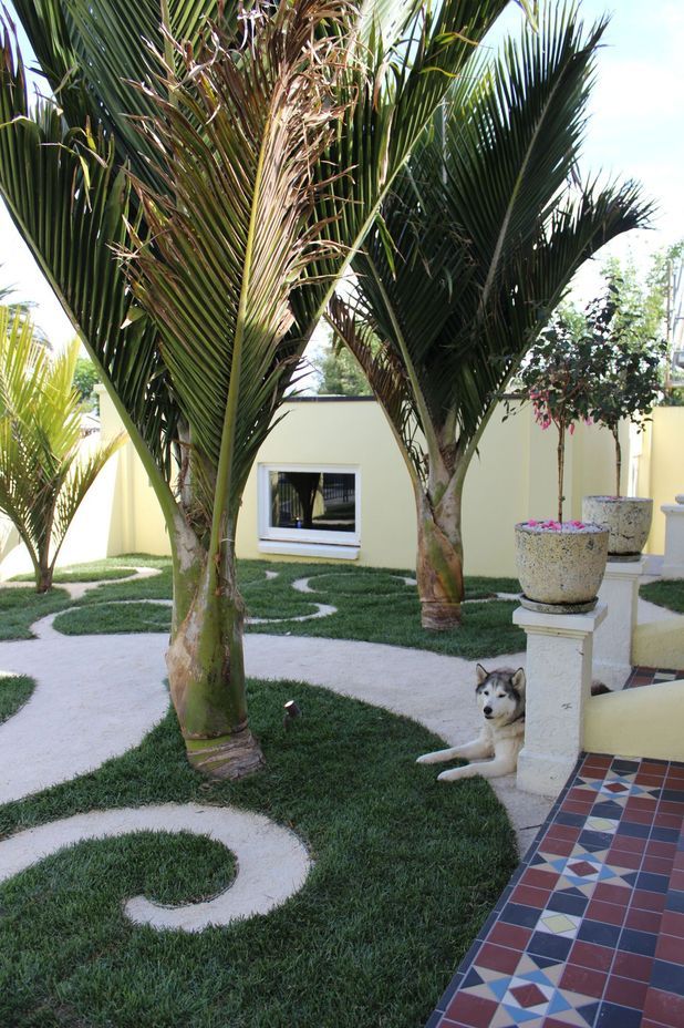
A solid enclosure might be a tall fence, a clipped hedge or a garden wall to create a “pool of privacy” – an area that you can keep private from neighbours’ views. Whereas an implied enclosure might be a grouping of palm trees with fluttery leaves that only suggest a delineation between spaces.
To decide on what kinds of division materials you want to put in place will depend on how much maintenance you’re willing to take on, says Robin.
“Ask yourself: Do I want to clip a hedge three times a year? How much do you like gardening?”
Walls and divisions, as well as paths, can be used to link zones.
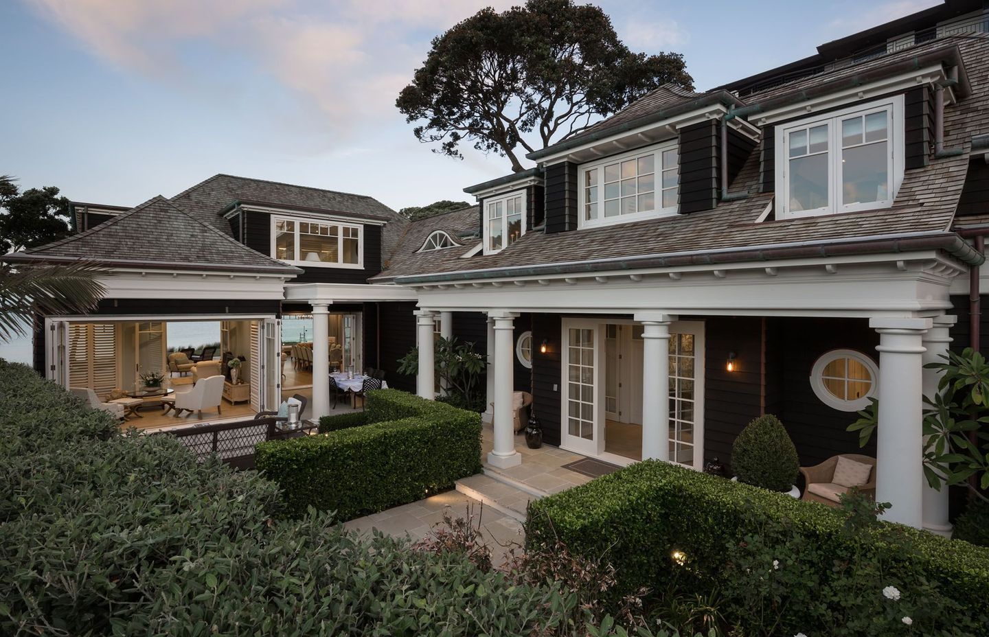
“Inside a house, windows and doors create links between spaces; it’s the same outside the house: big, wide lazy stairs will give you a greater degree of connection as opposed to a little garden gate that leads to a garden.”
Much like an open set of French doors, big open visual links with little division might open your eye up to a magnificent view, while a path may lead your eye to a “window” view.
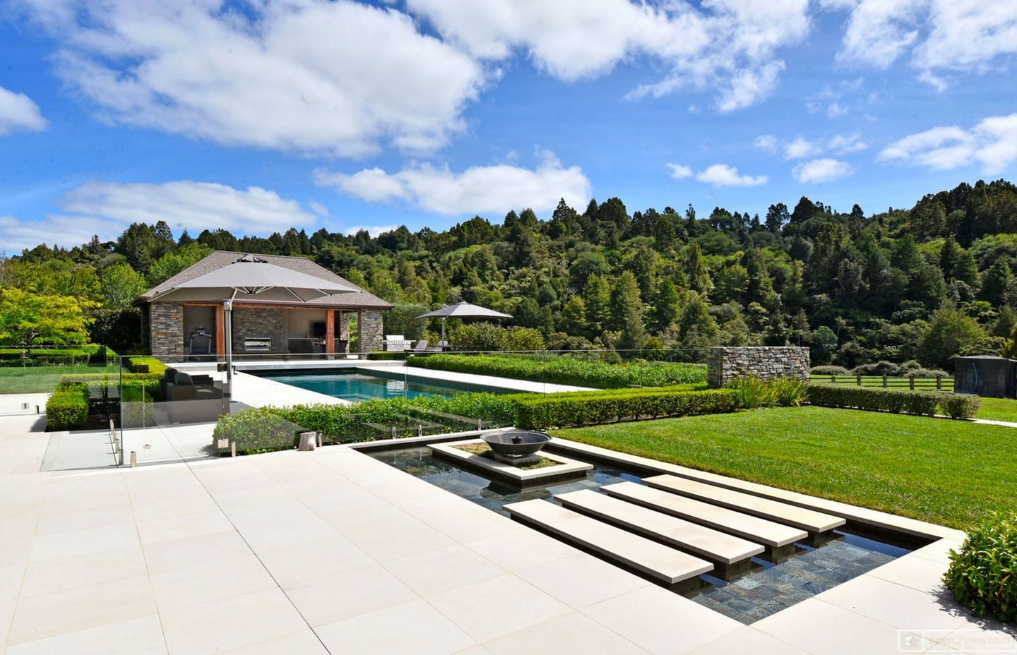
Robin says you want to create windows and doors to places you want to see, and walls where you want privacy or concealed services, for example. Material changes can also help to create a separation of zones.
Finding the right aesthetic
The very last thing to consider when planning your outdoor space is the aesthetic because from your layout plan you’ll know what screens, walls, windows and paths you need to create the divisions and links you require.
Robin says the first thing to look at when considering aesthetic is the shape of the space and the lines the architecture of the house offers up.
“One of the really key mistakes people make is they’ll create their garden, but what they don’t realise is that the garden creates the shape of the lawn. The space that you’ve created by the garden bed should pick up the lines of the house, for example.”
Plant choice is like “styling” so just as in a house, choosing a plant with big, bold or bright leaves is like choosing a very bold wallpaper, while a plant with dark, light-absorbing leaves “is like having a very simple paint colour in the house”.
Along the same lines, dark colours create recessed or shadow-like statements, while stronger colours, such as a Rimu-stained fence creates a focal point in a space.
It pays to be mindful of what you want the eye to be drawn to, says Robin, “Using complicated paving patterns is like a bright jazzy carpet, it’s going to change the feeling of the space, as opposed to simple pavers – you don’t want to detract from the beautiful garden you might have made.”
Outdoor trends
Robin says people are really interested in feeding their family and correspondingly she’s seeing more and more edible gardens designed to be seen in the backyard, whereas in the past homeowners tended to keep these hidden in service areas.
But if your outdoor space is limited, you can still have the beautiful look of edibles, says Robin.
“Citrus trees give you a pretty look and aroma in a small space. You can prune them into a considered shape, espalier them or use them as a hedge and still get fruit.”
Feijoa hedges are another way to include edibles – they have beautiful foliage and hedging them will reduce the amount of fruit – you’ll get “just enough rather than too much.”
Regardless of the amount of space you have, Robin says attention to layout and design will mean you can include all the elements you want.
Want to know more about designing an outdoor space? Be sure to visit Shafer Design on ArchiPro today or contact the Auckland office to learn more.


